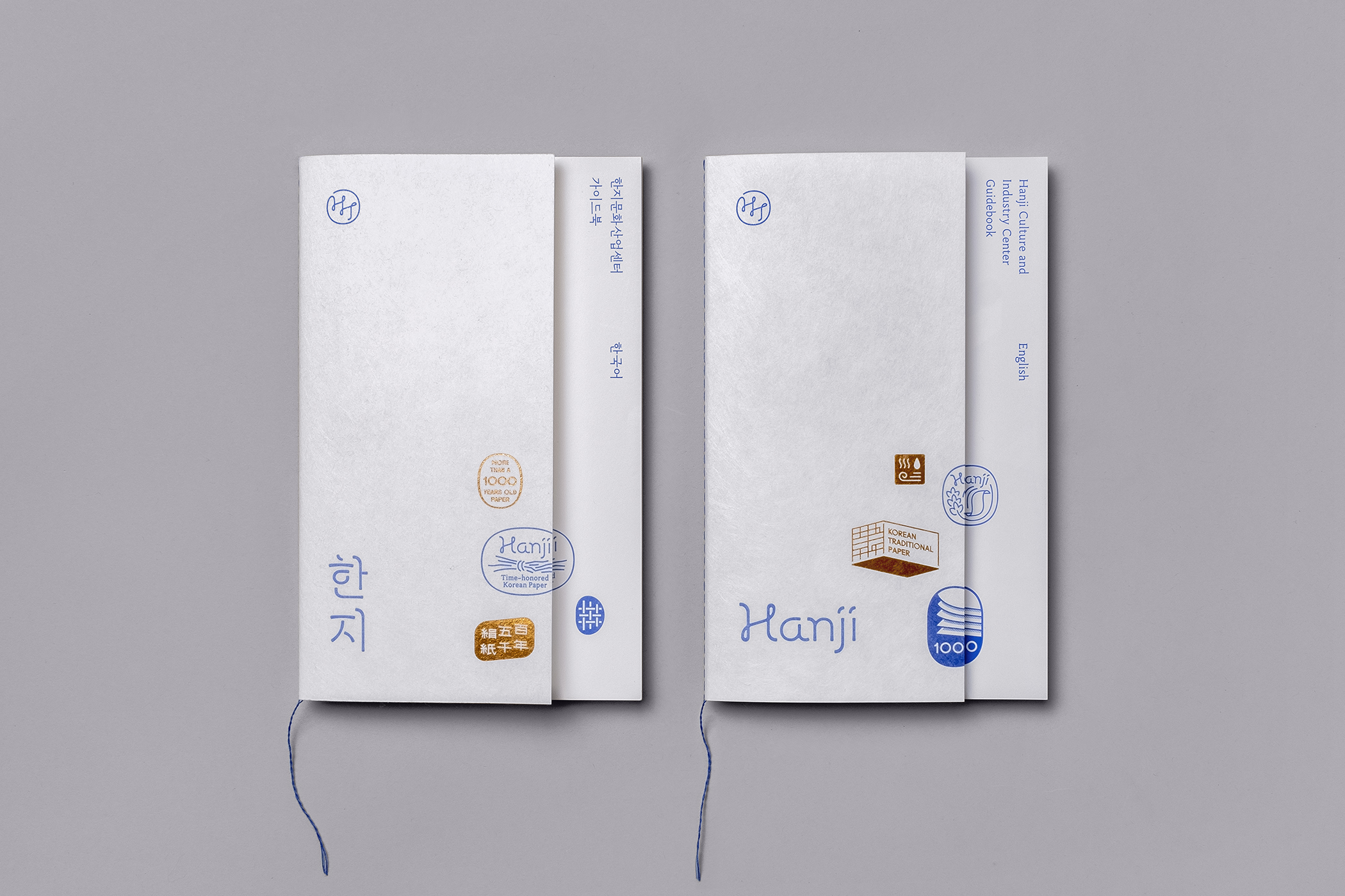
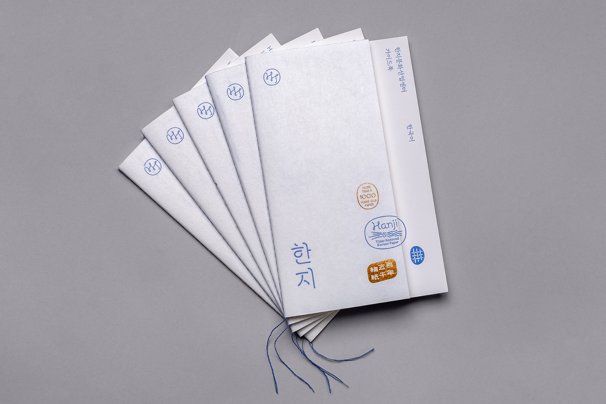
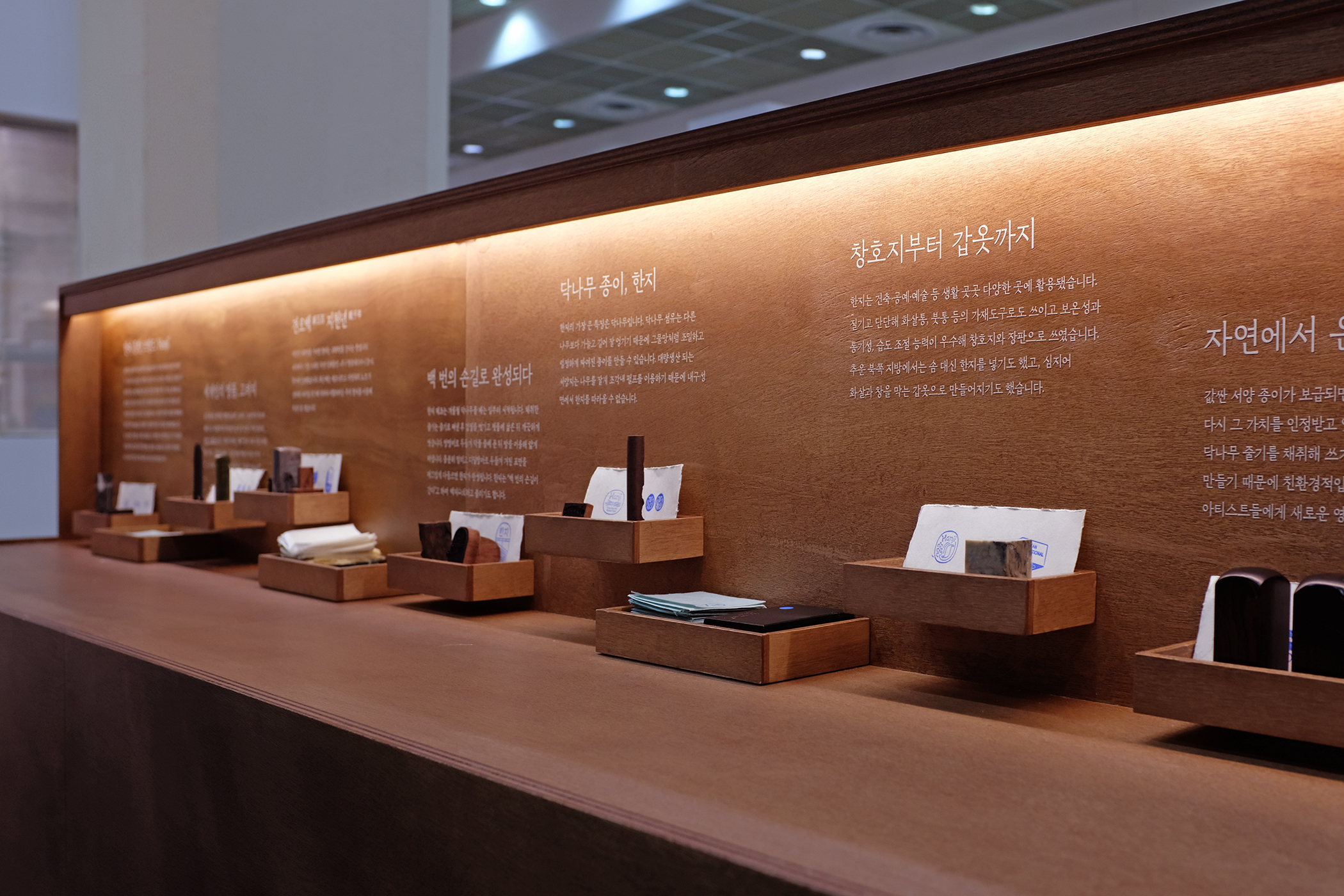
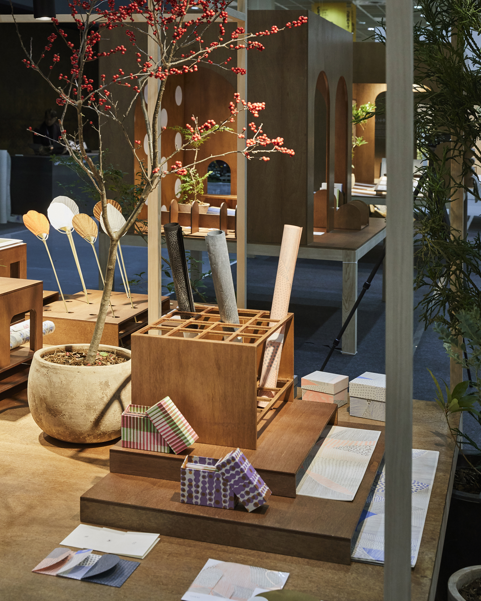
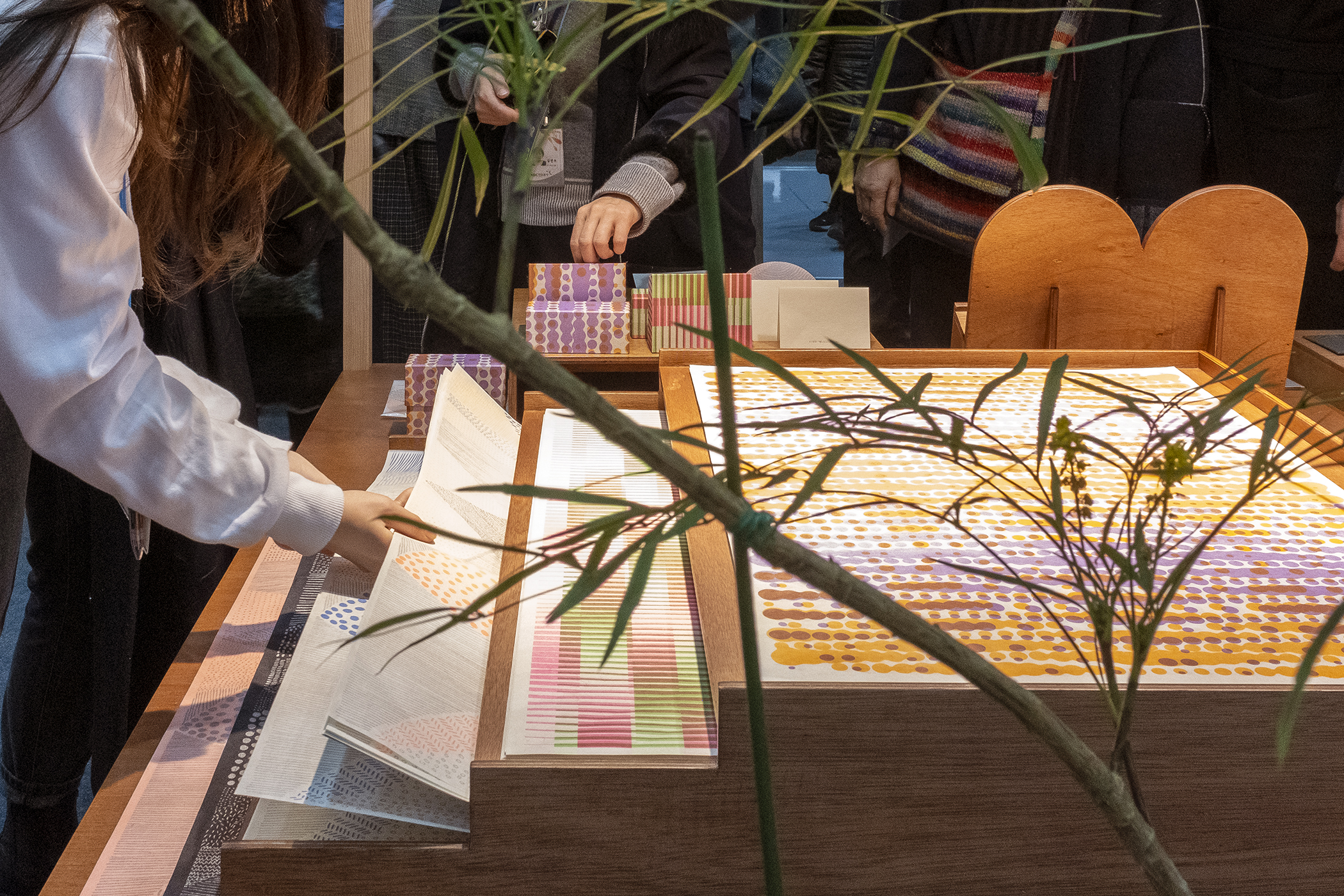
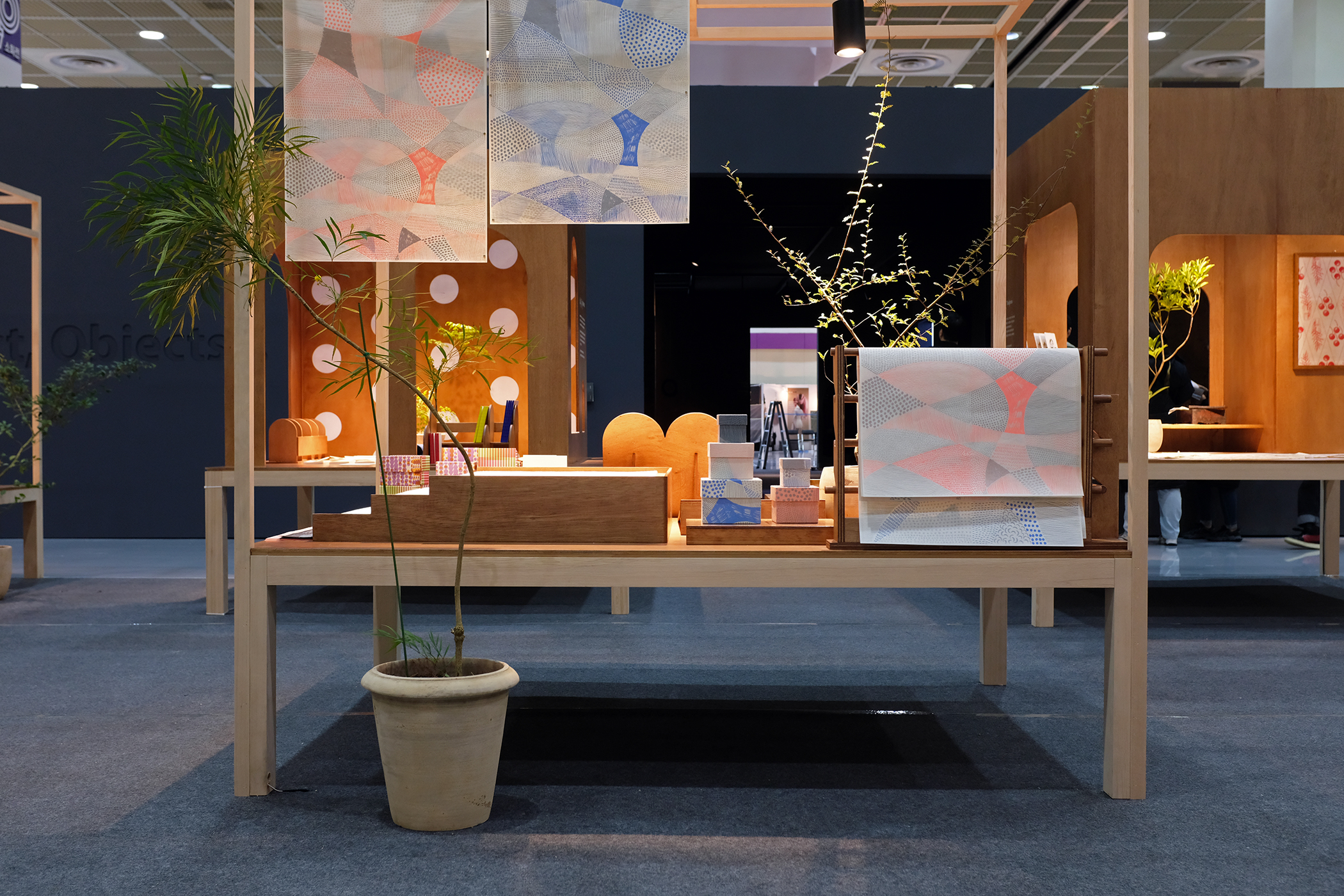
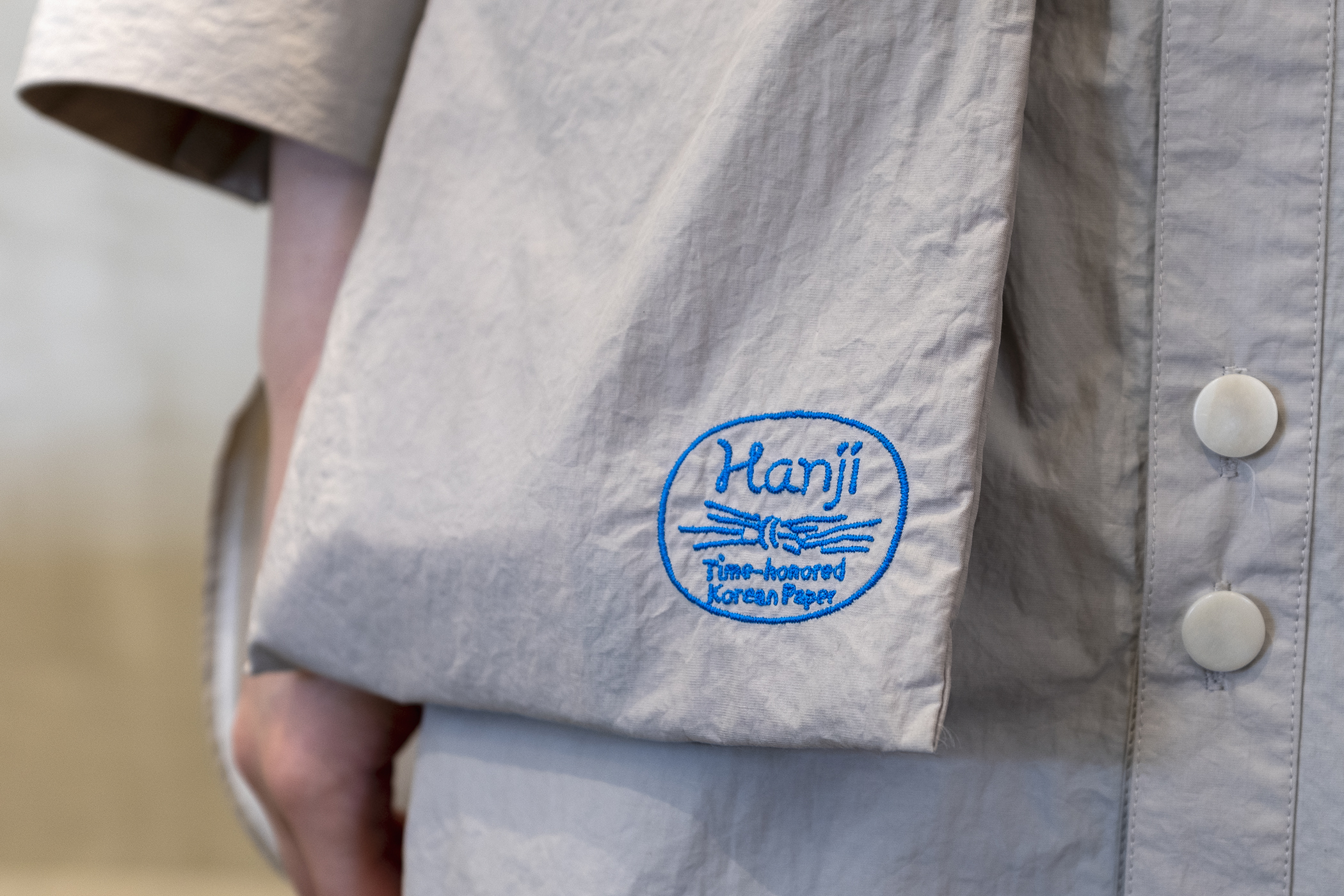
Hanji
KCDF commissioned studio fnt to develop a brand of Korean traditional papers (Hanji), to serve as a representative symbol of Korean Hanji and Hanji workshops. The aim of the project was to inspire interest in both professionals and the general public, in Korea and beyond, to promote excellence and immense possibilities of Hanji.
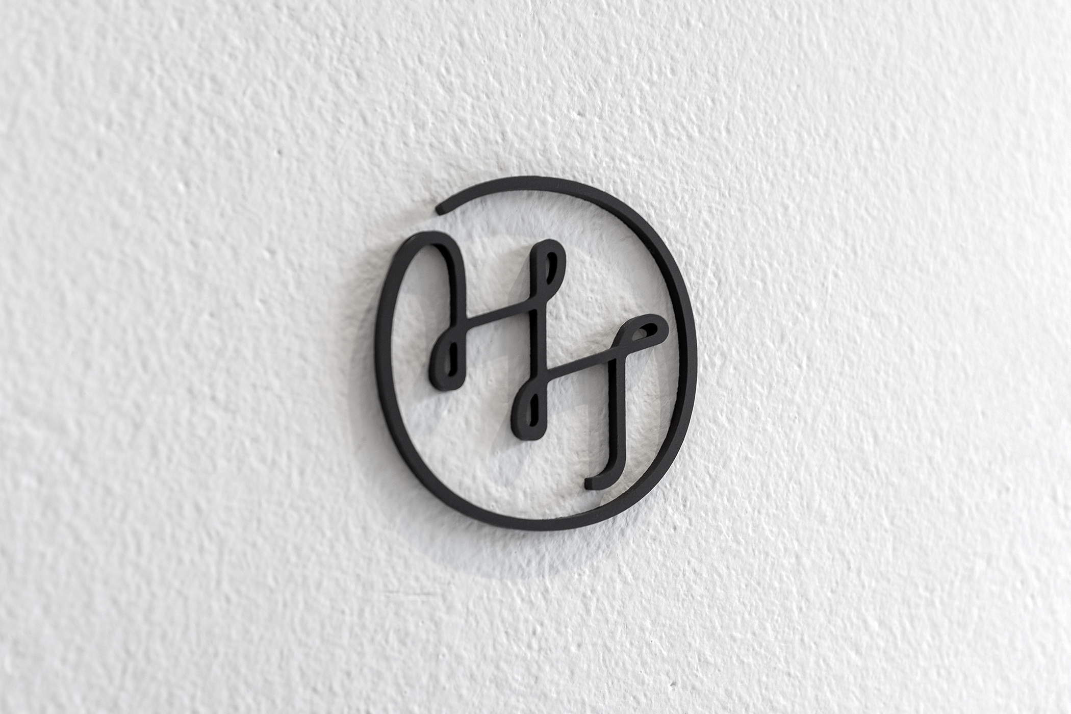
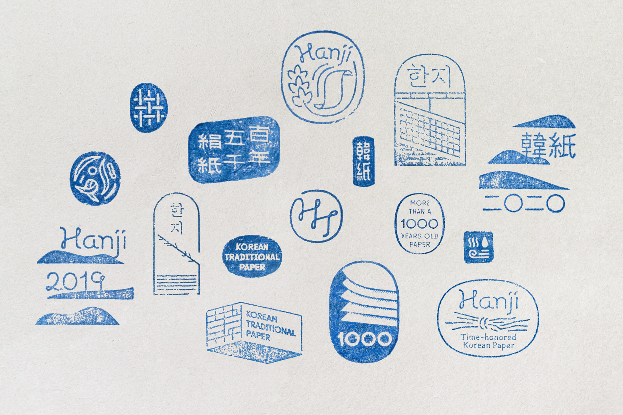
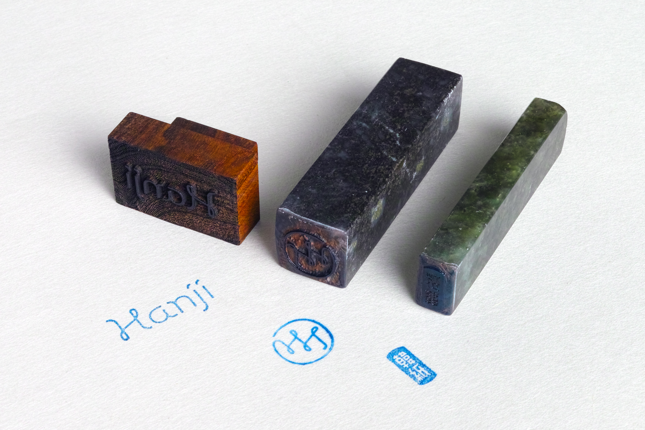
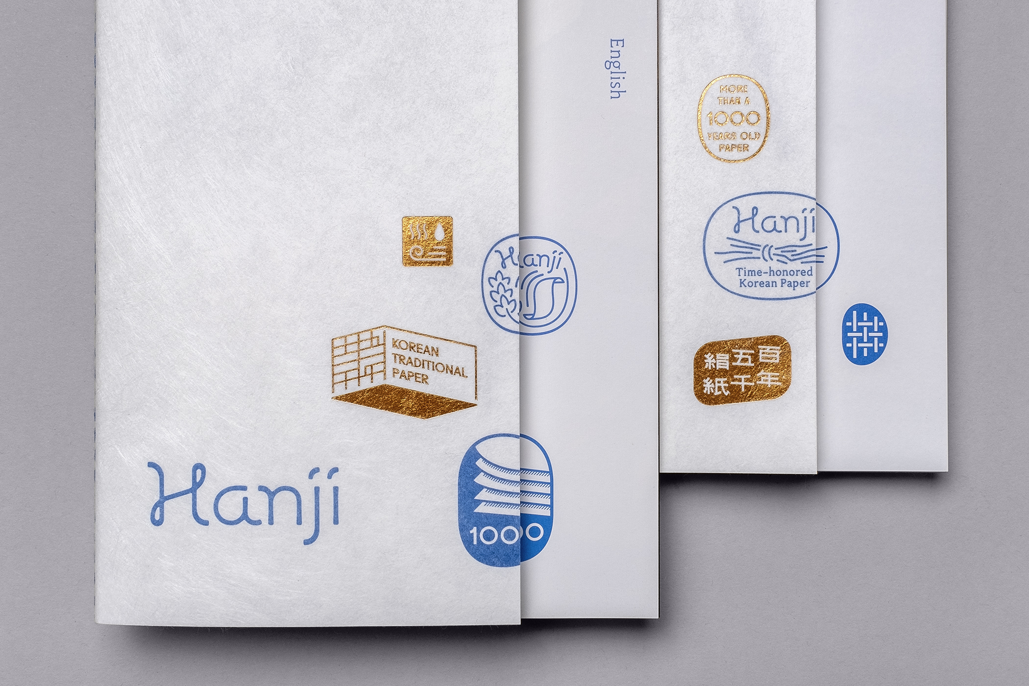
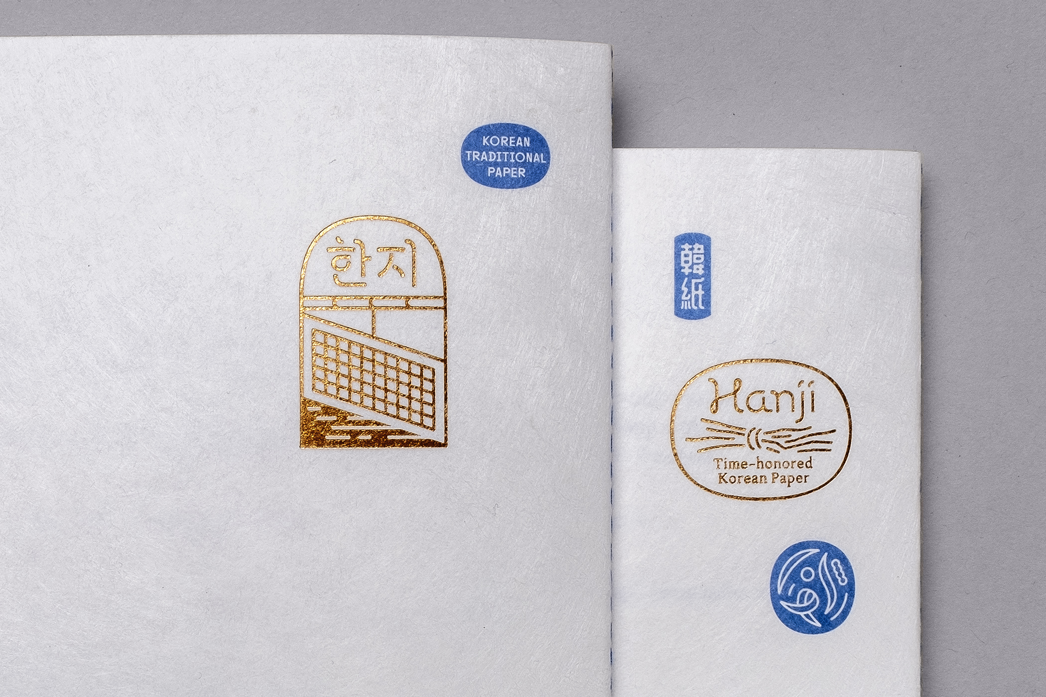
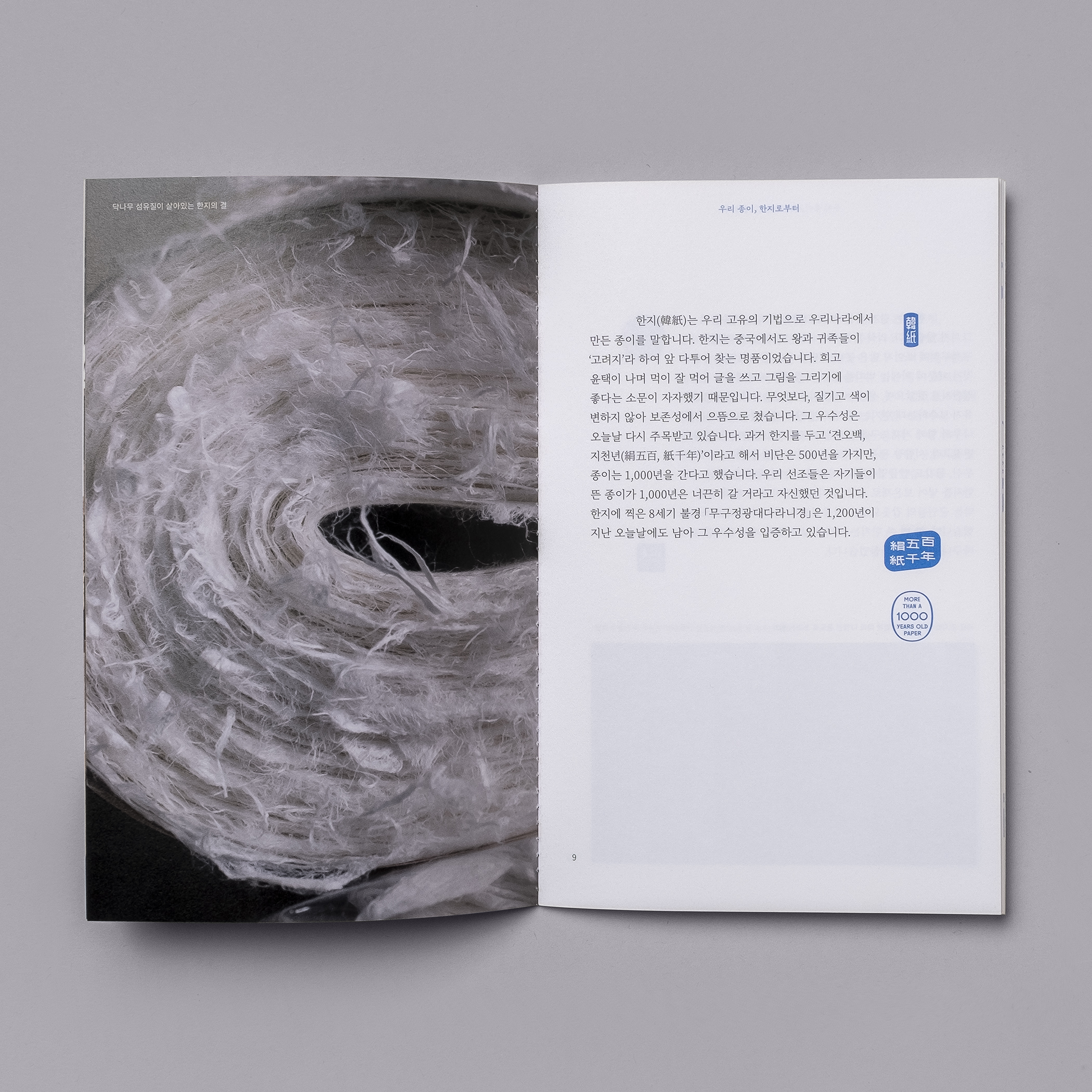
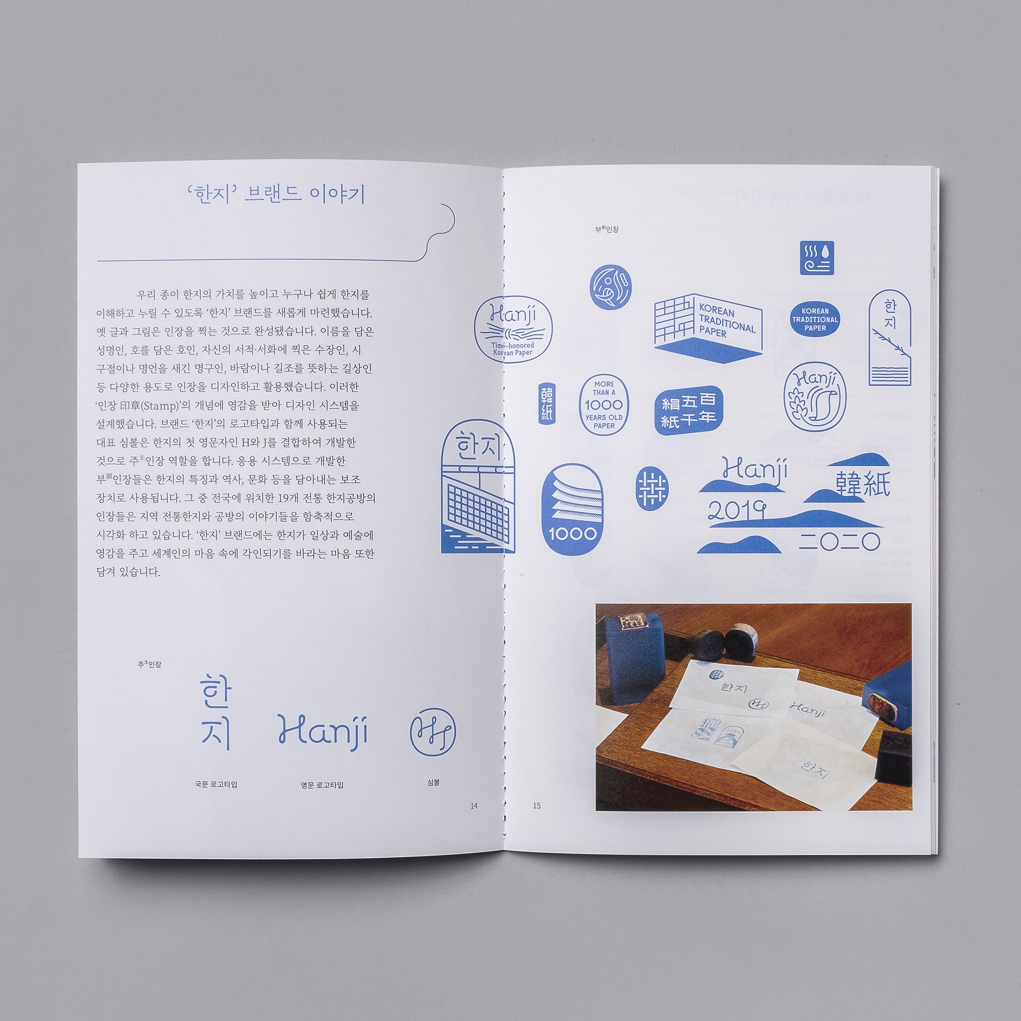
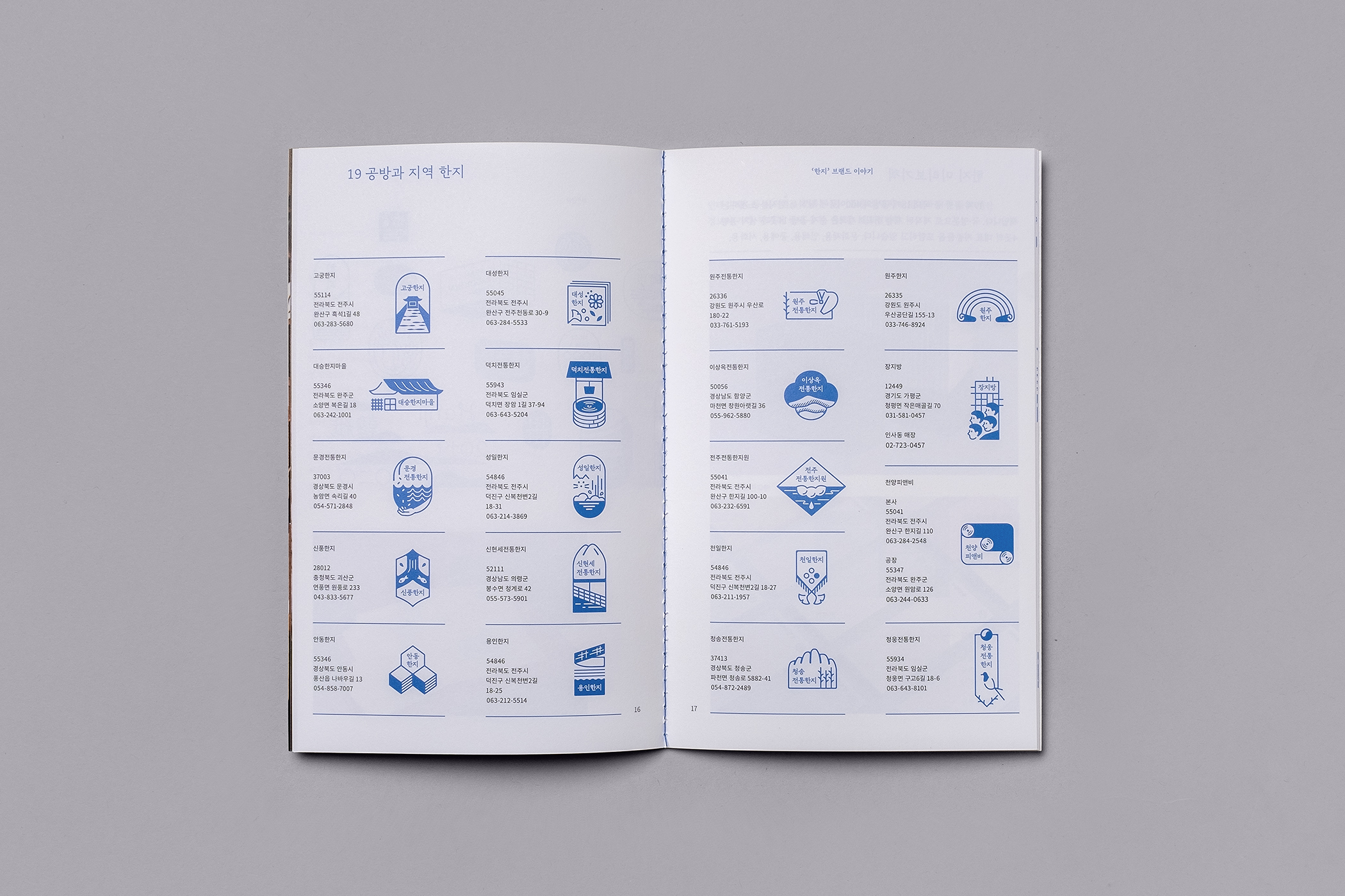
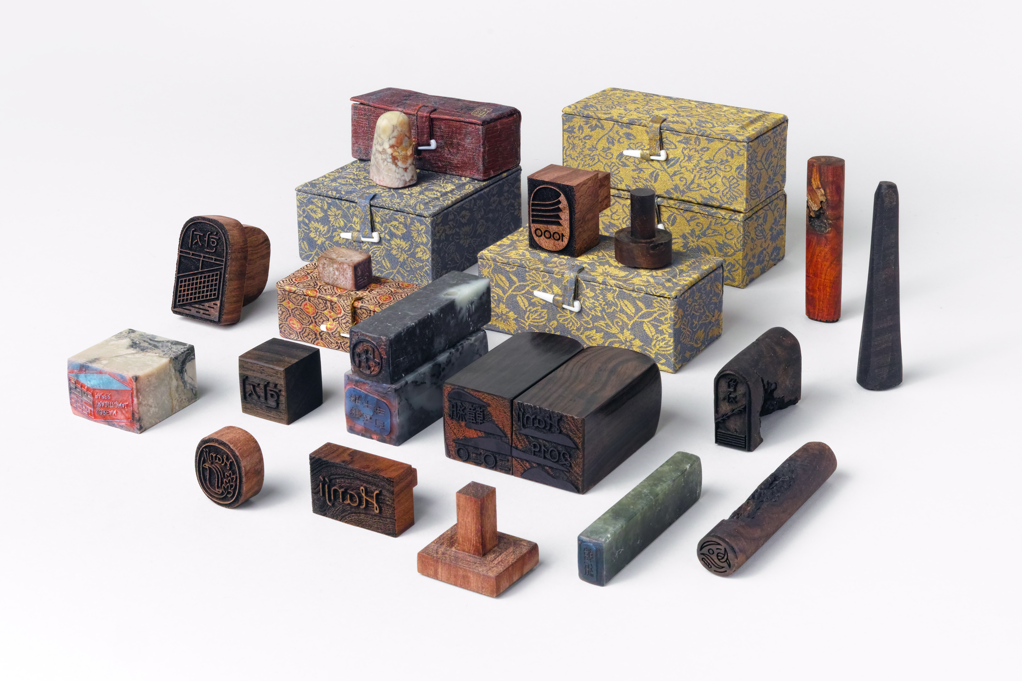
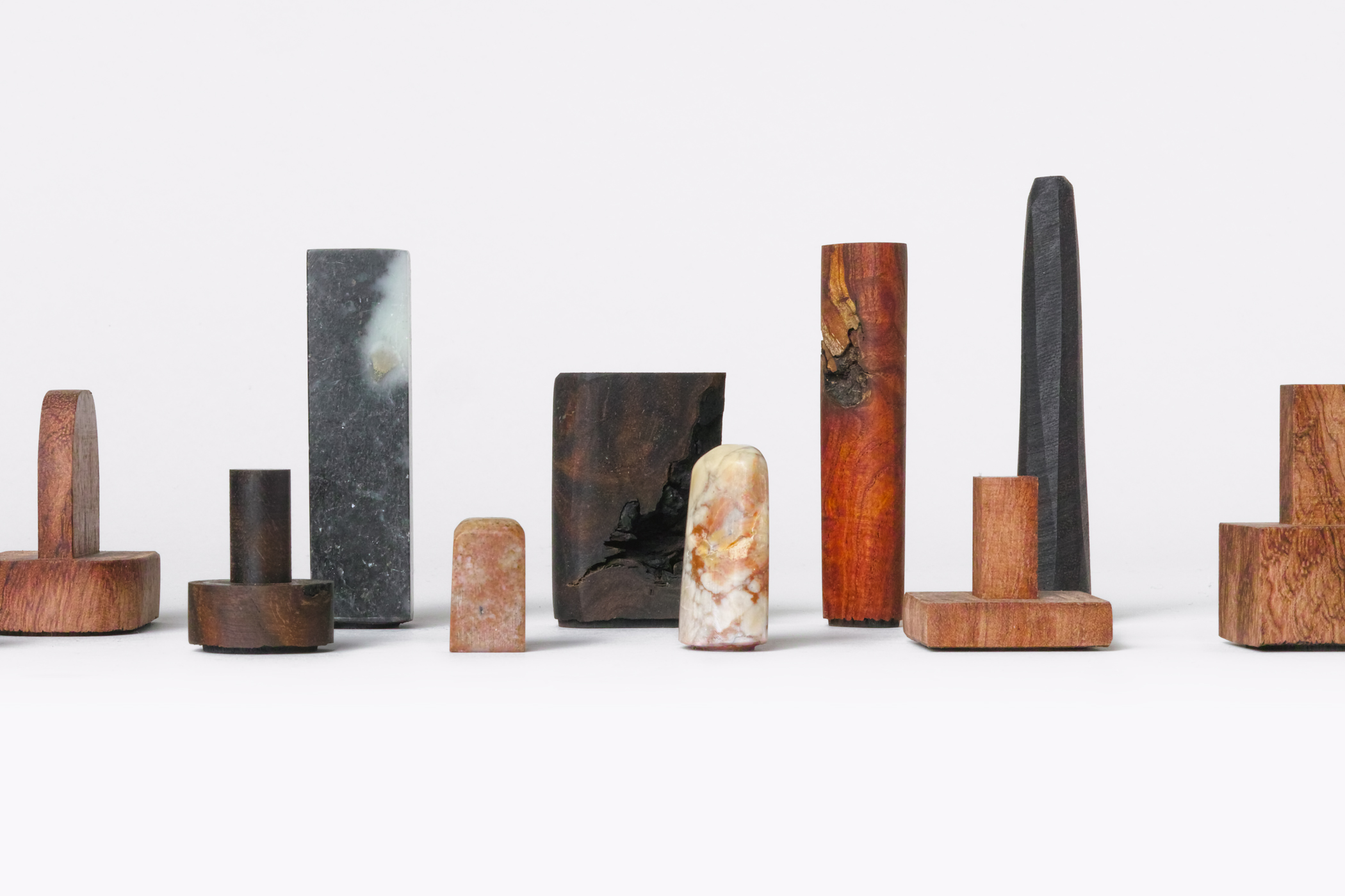
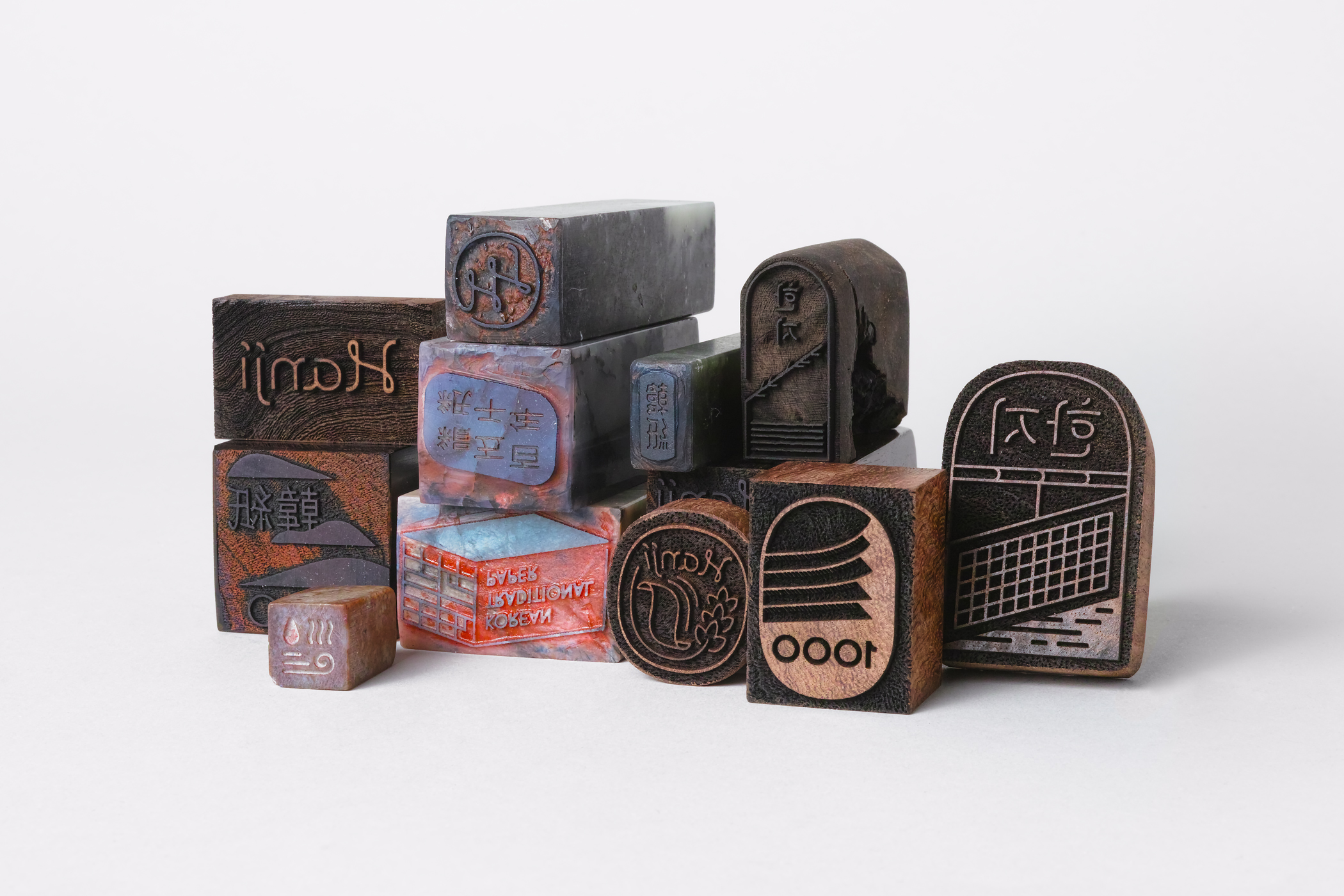
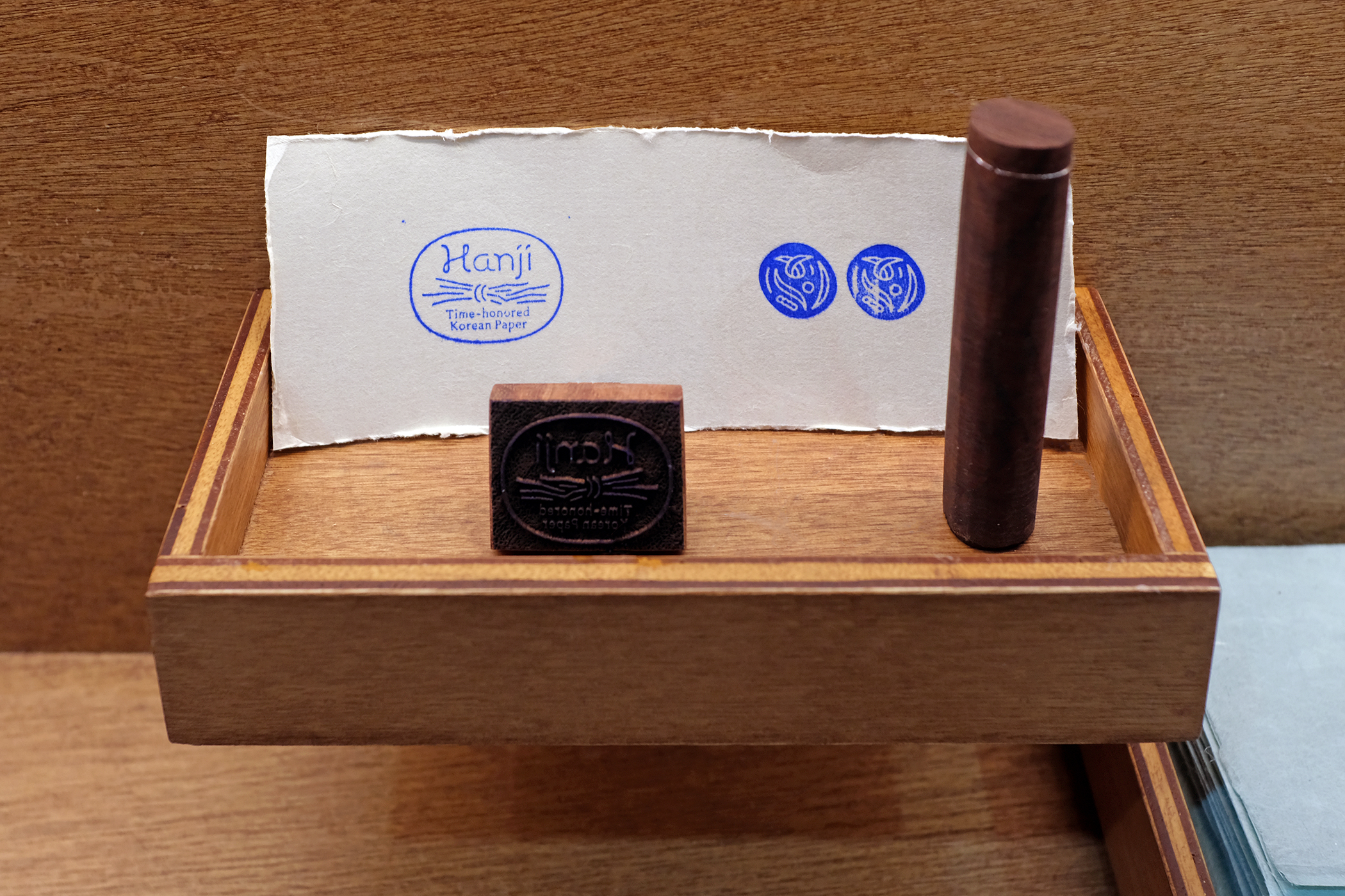
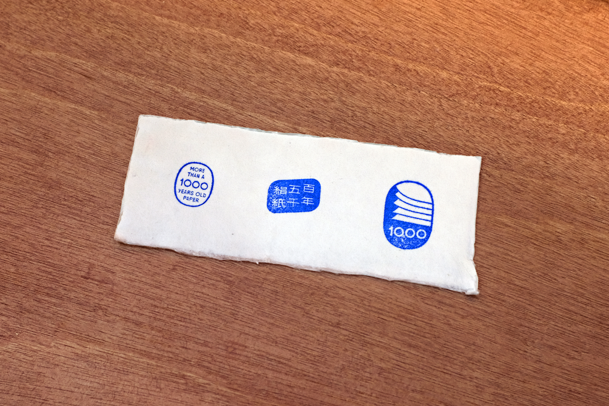
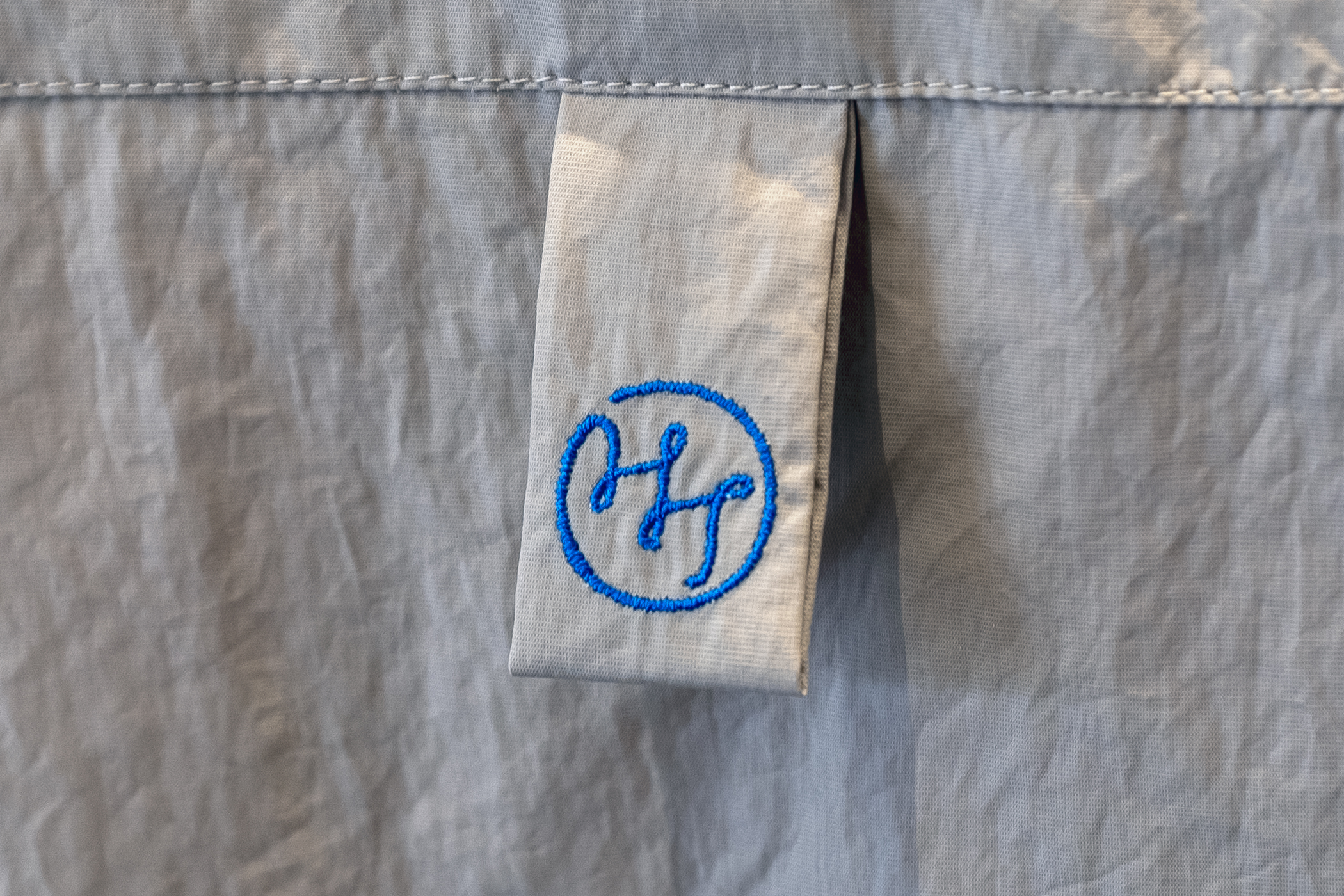
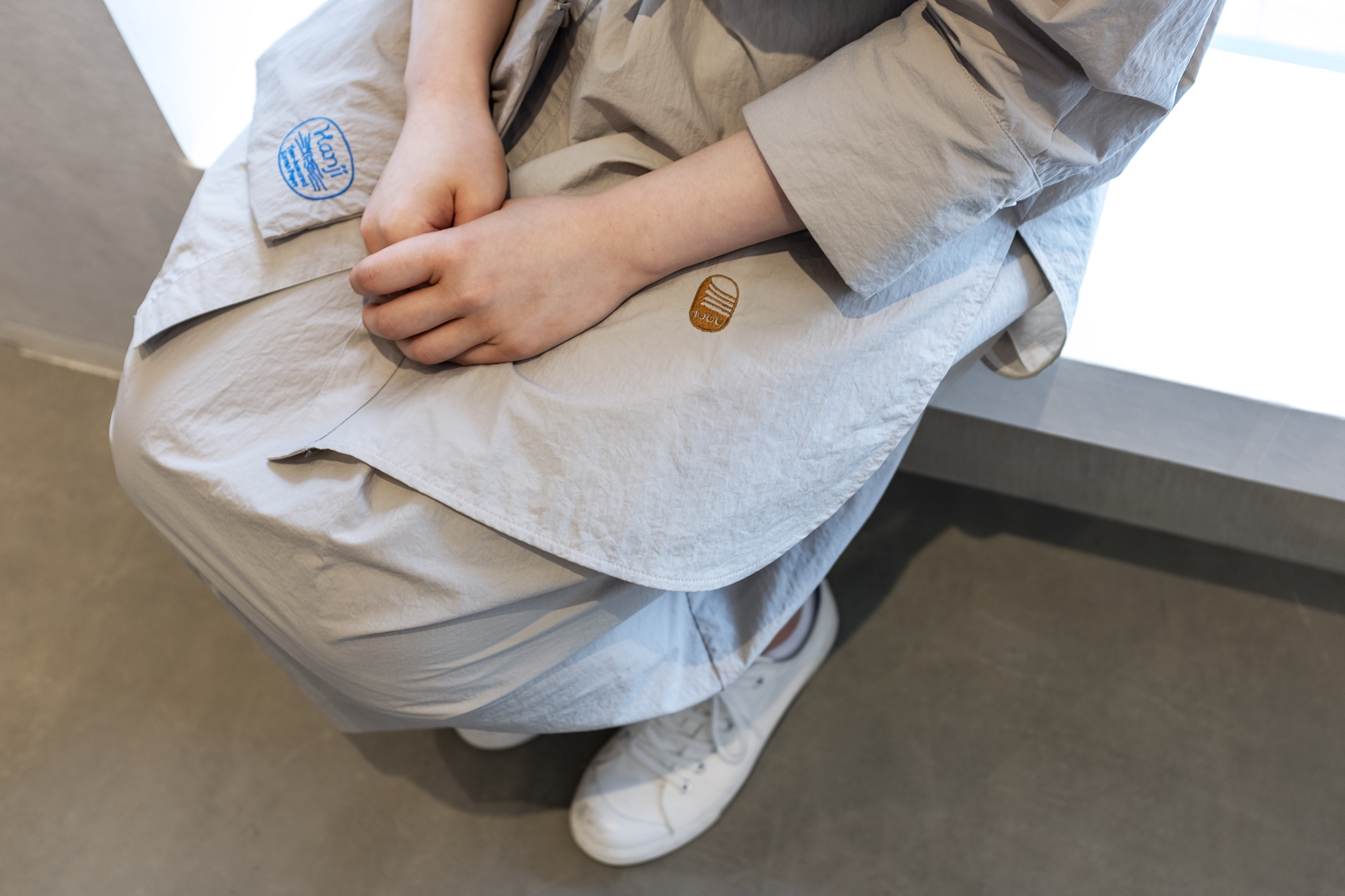
At the beginning of the project, we went beyond learning about Hanji, and we also looked at numerous examples of works that used Hanji as its canvas. There were old days when Hanji was basic paper, a material to contain writings and paintings. Interestingly, a seal was always used like a final touch to the work, as though a ‘period’ and an ‘approval mark’ of it. These old seals played a role similar to today’s ‘logo’ or ‘symbol’, in that they are ‘formations that imply existence and intention’. It was also intriguing that one person would own various seals, and use different ones according to meaning or use. With this in mind, we looked at Hanji as a person and happily imagined what kind of seals it would have owned, and why.
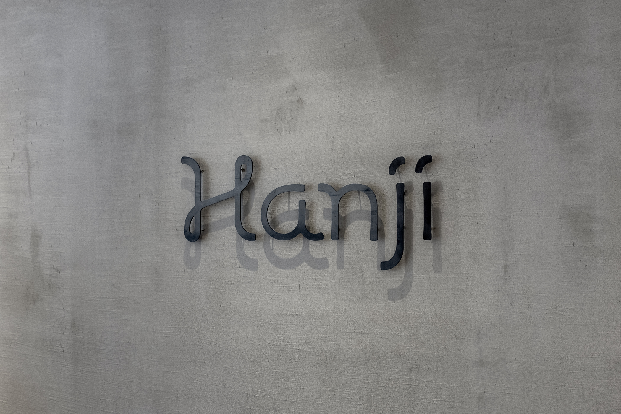
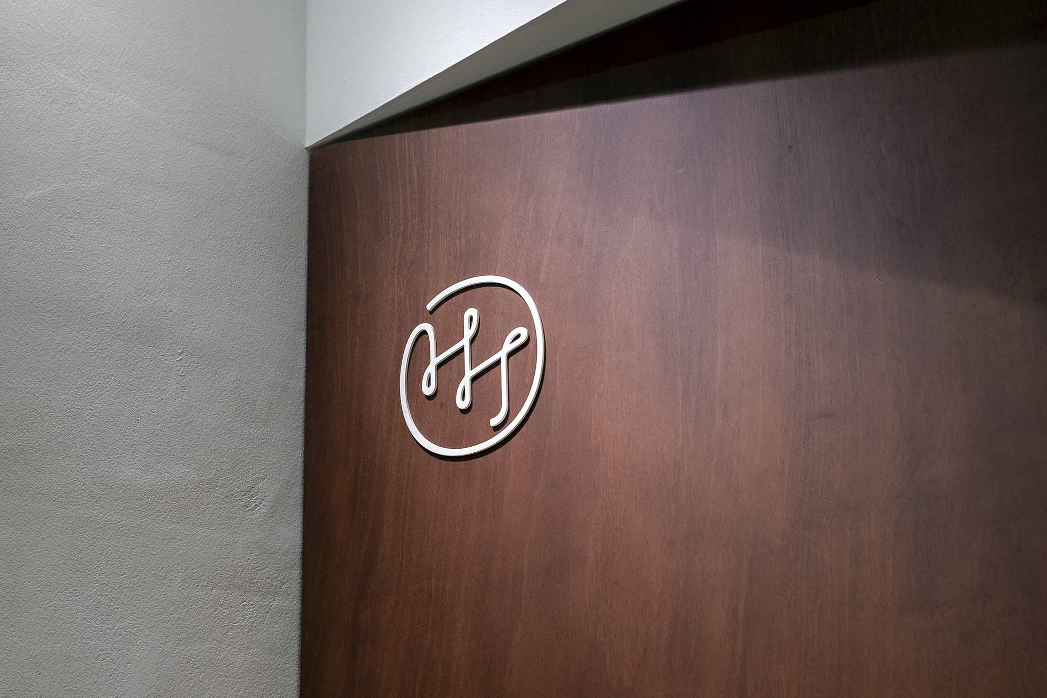
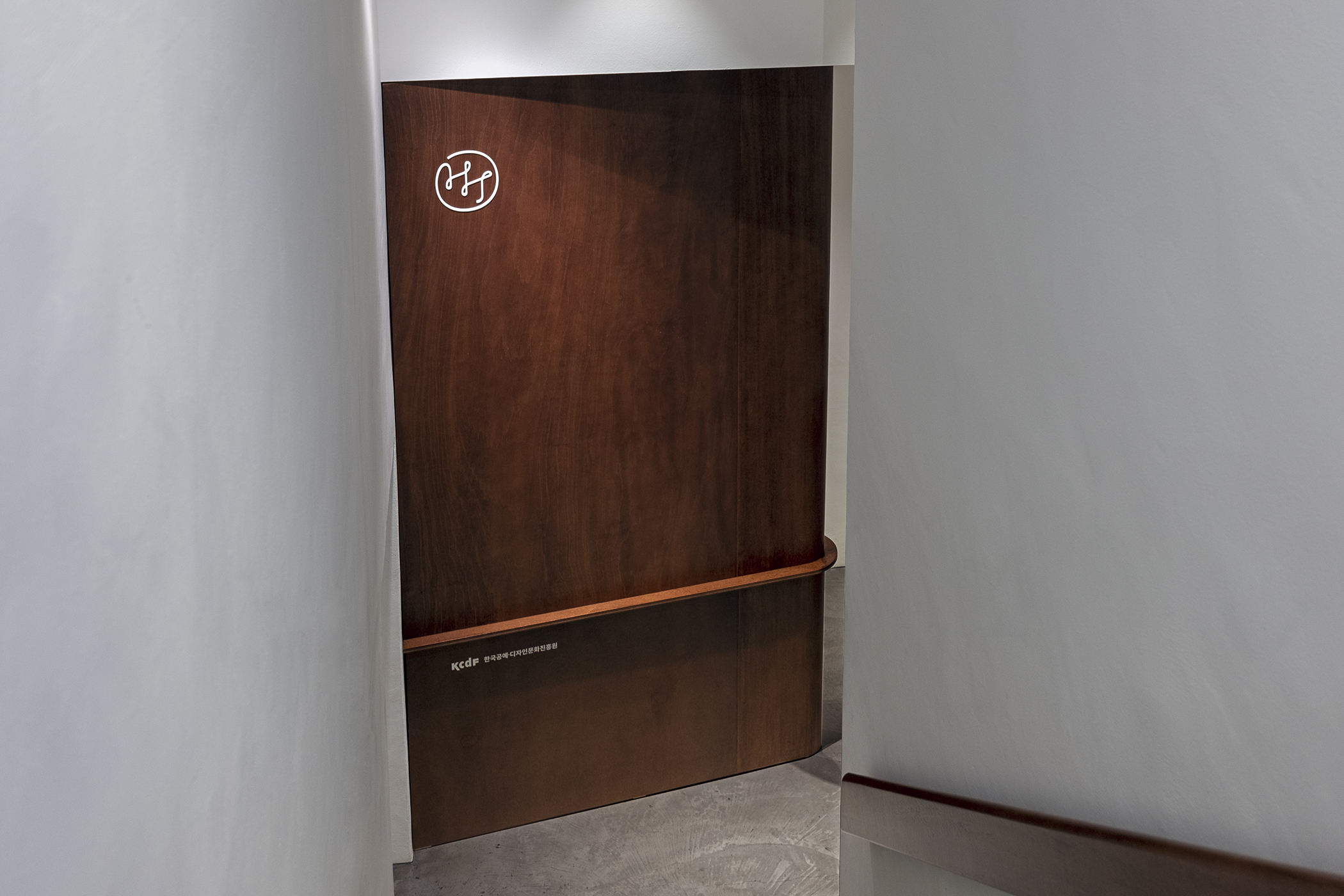
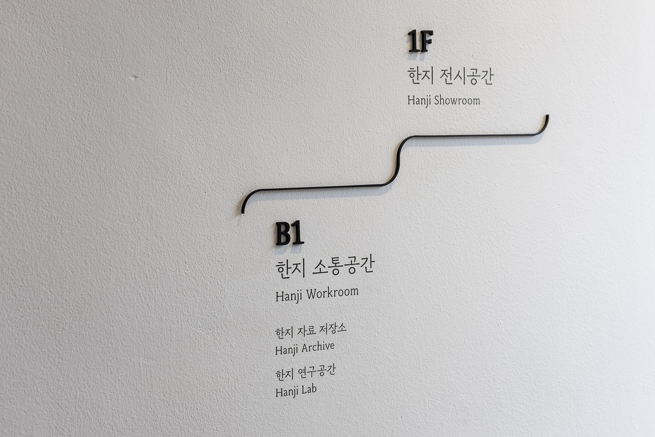
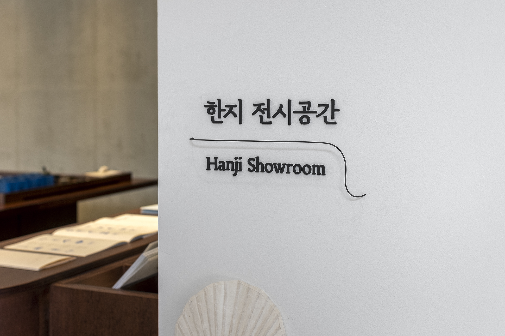
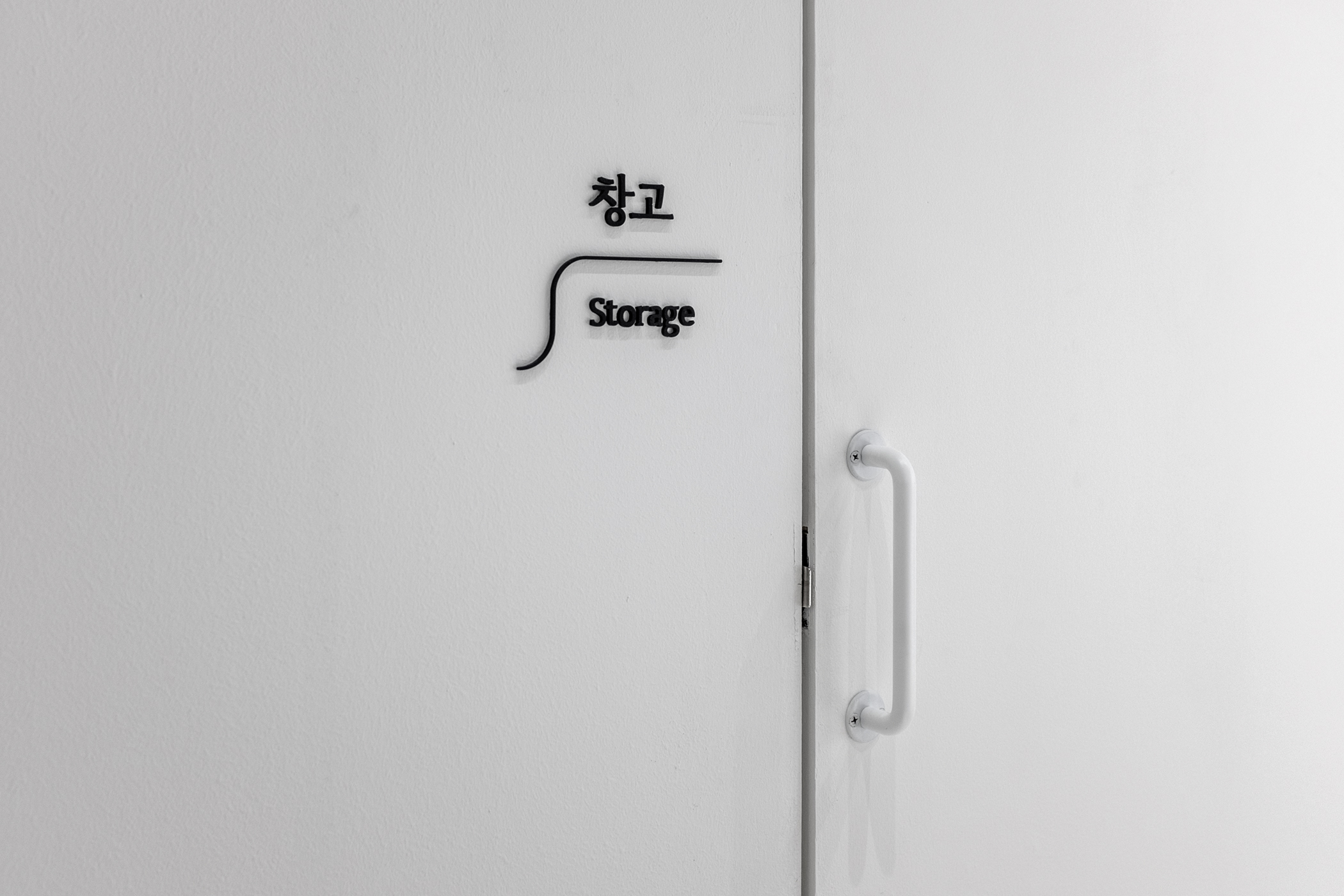
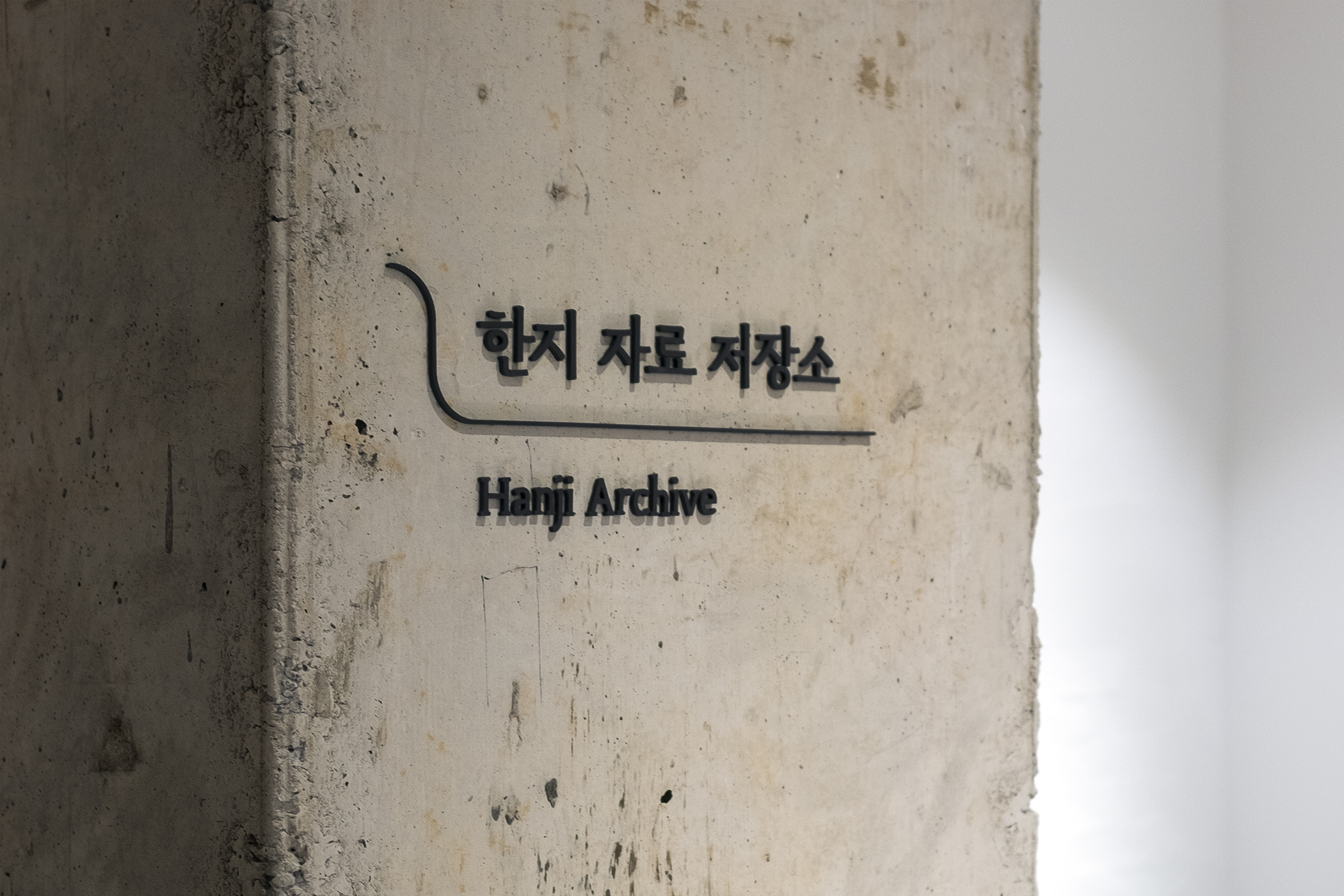
Formatively, the Hanji brand was designed with a good balance of ‘classic style’ and ‘contemporary aesthetic’. The visual elements are based on ‘uneven, flexible lines’ that embody the ingredients, production process, and final form of Hanji. This line is a motif found in the body movements of Hanji makers, fibers of mulberry paper, the daintiness of the un-cut natural edges, or the impressions of the seals. In addition to this, the logo design is completed in a light and elegant script form, with the intention for the project to continue and develop Hanji's traditional heritage in the current era. These lines also work as a graphic device that depicts Hanji materials that are from nature, and its eternal flow of time.
The main colors of the brand are blue and brown; blue is reminiscent of the image of the sky as a catalyst, as well as wind and water. Brown was inspired by the earth as a raw material, as well as wood and soil. Since a traditional seal uses red ink, the complementary blue color conveys the use of the seal concept in a new context.
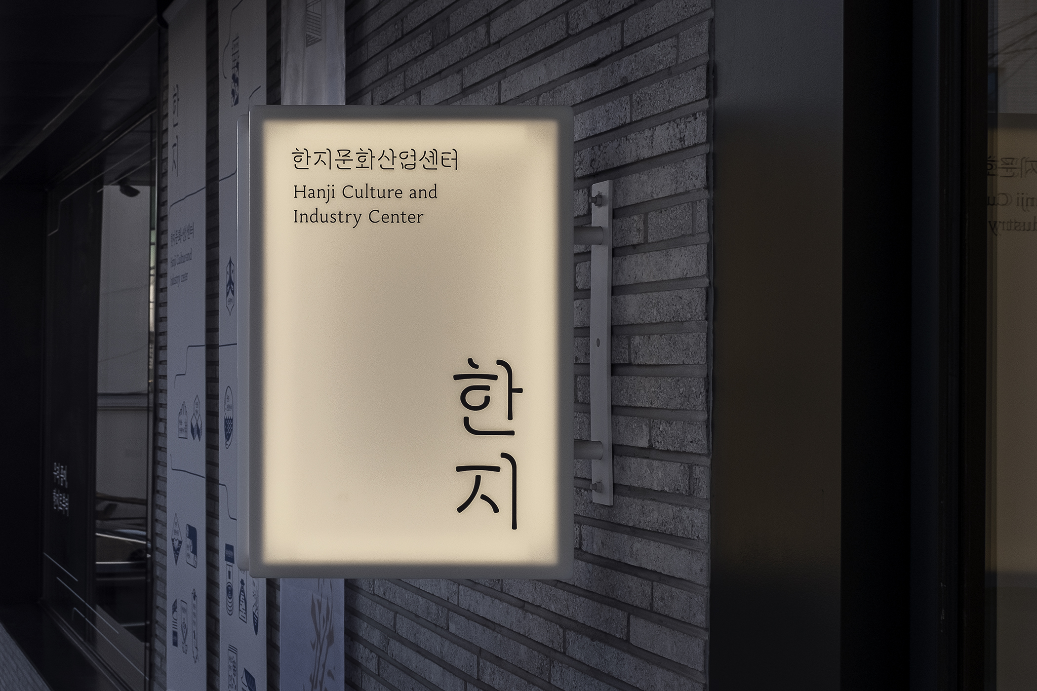
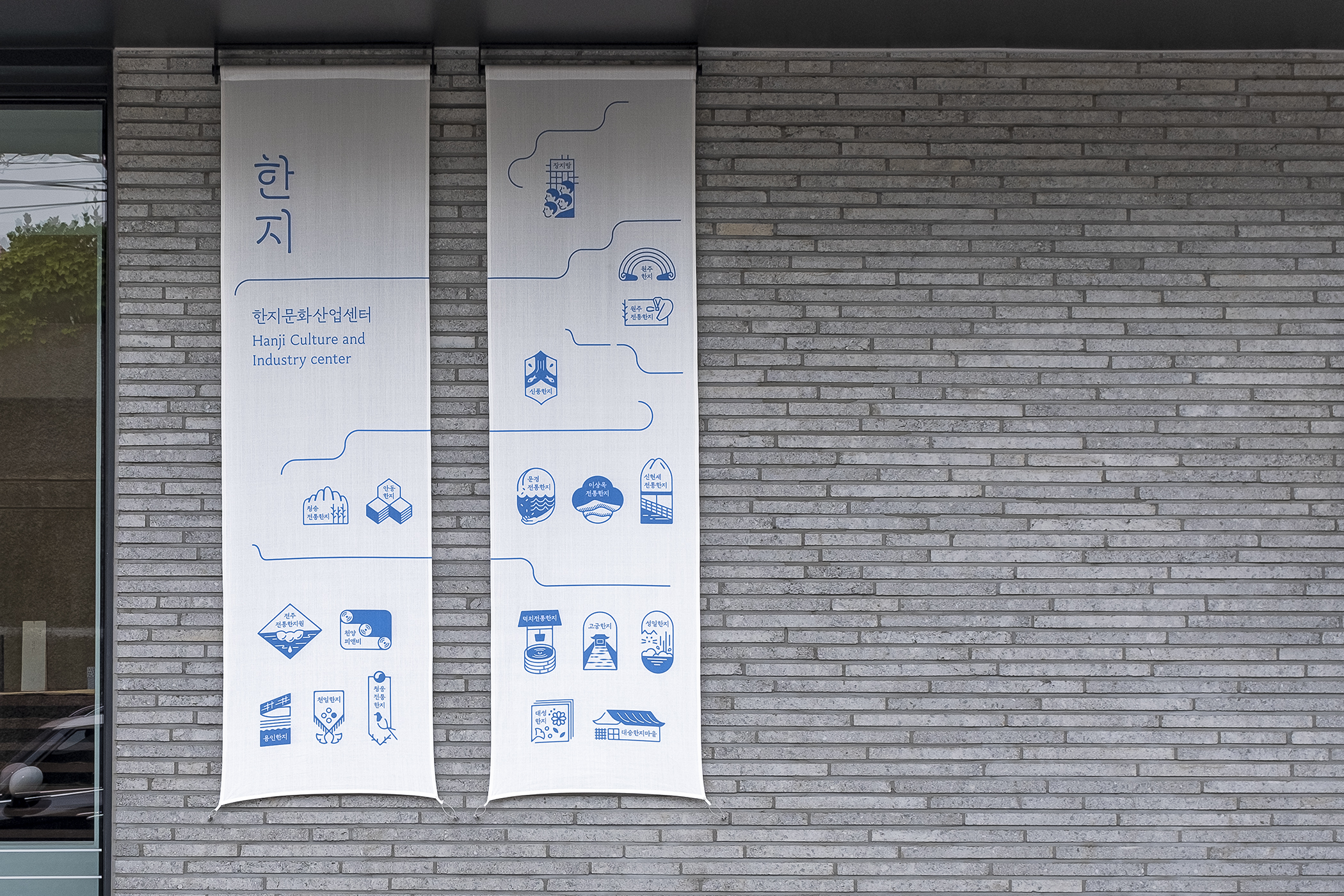
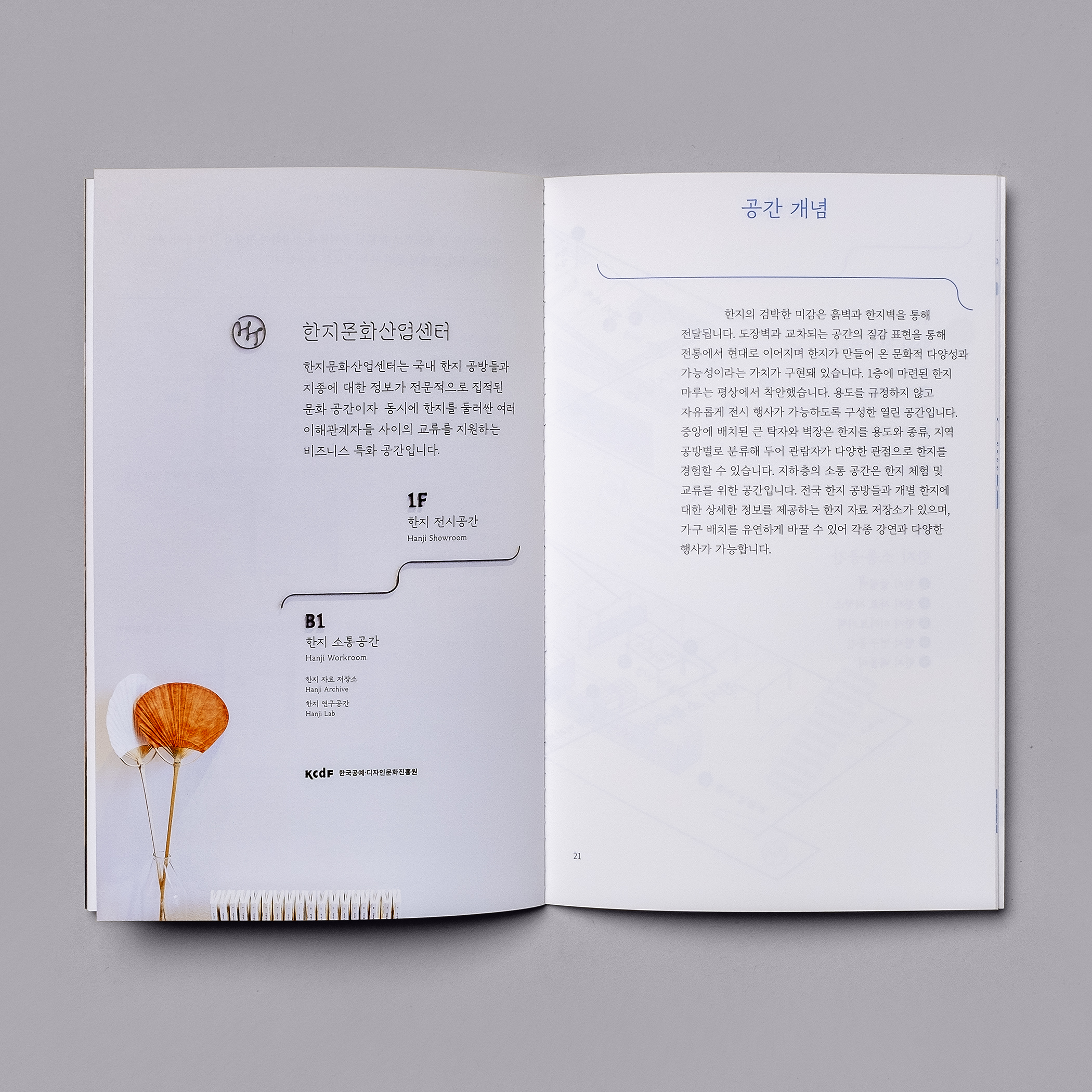
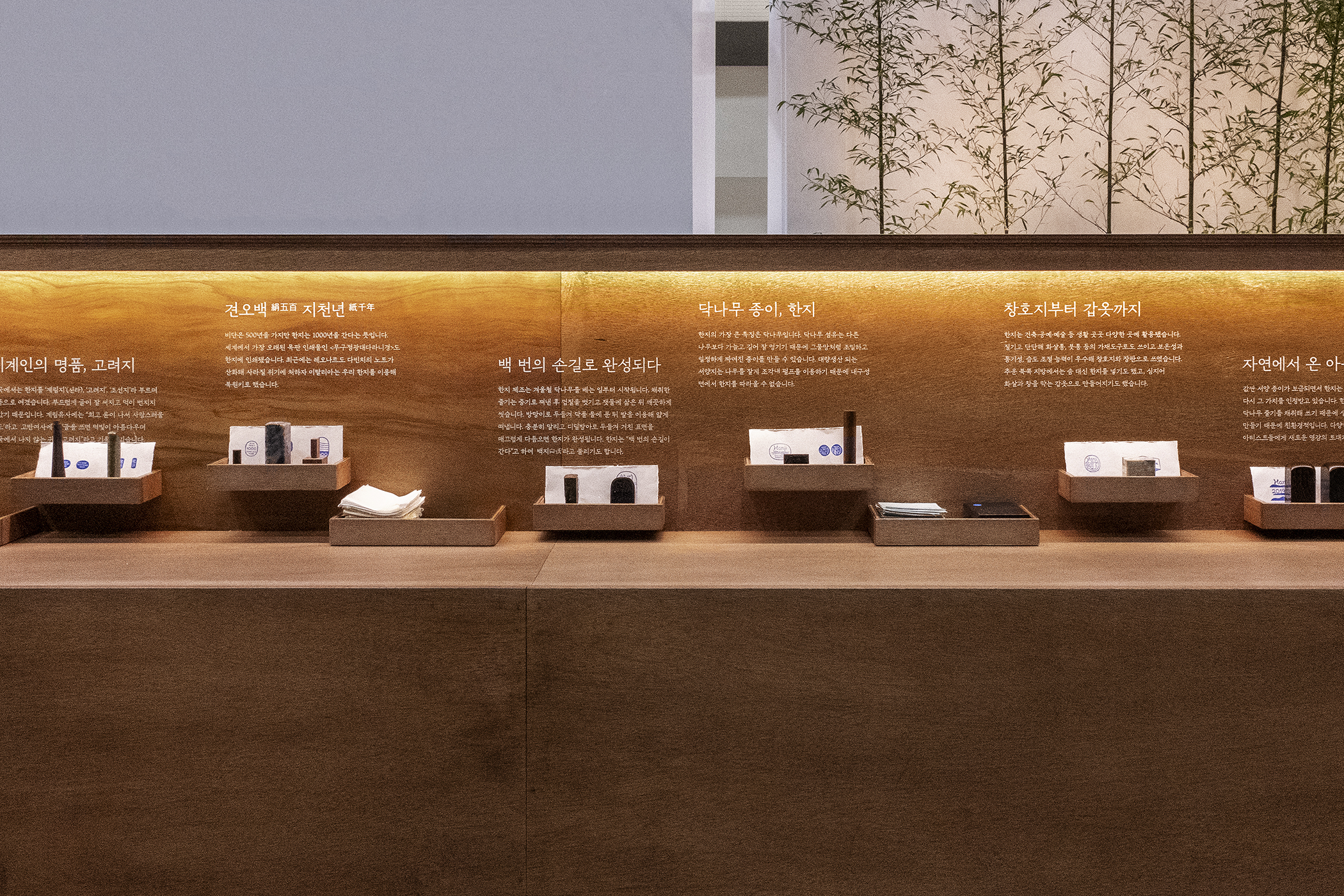
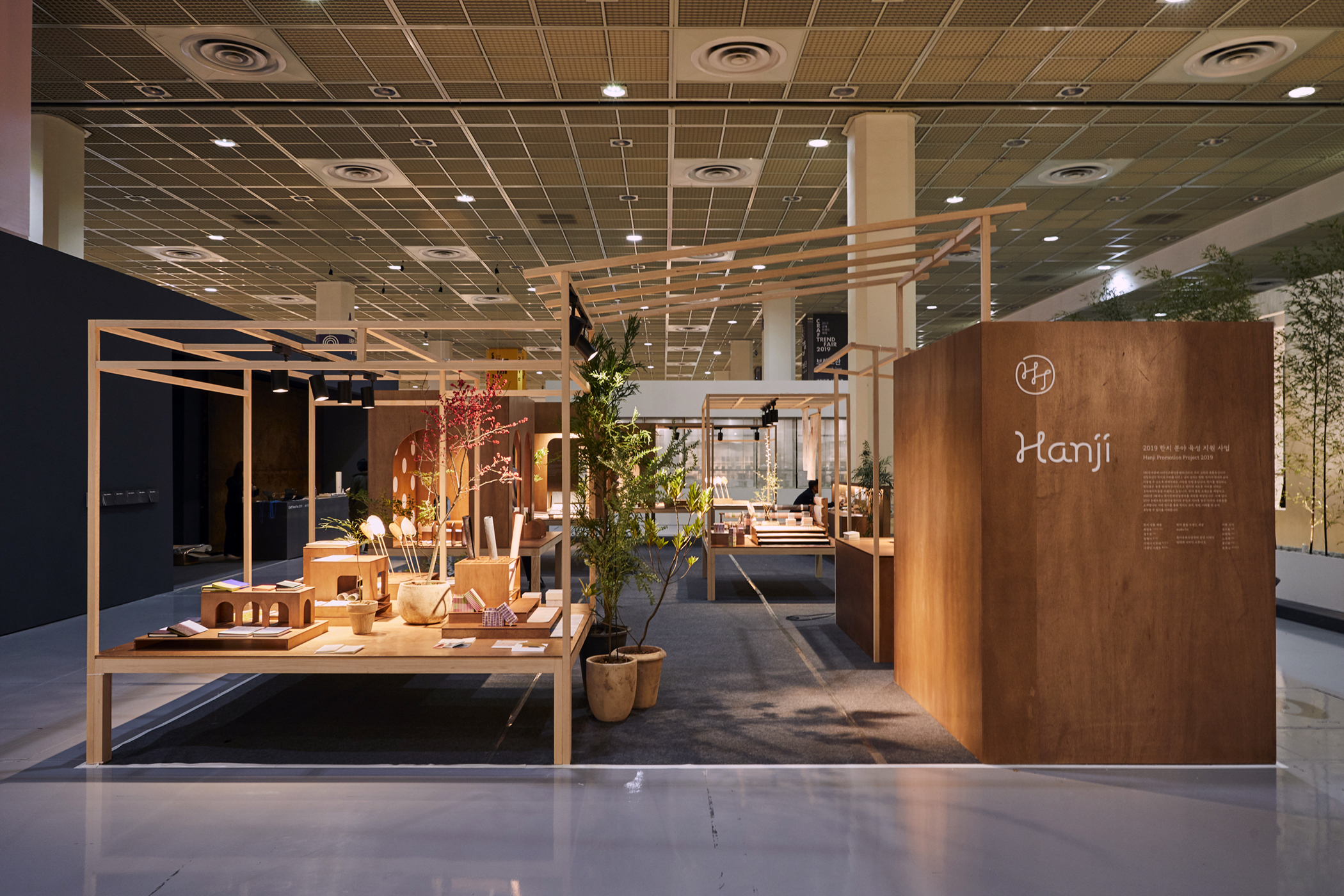
The brand Hanji first made an appearance to the public at the end of 2019, at the Korean Craft Trend Fair and Germany’s Paper World. In 2020, the Hanji Culture and Industry Center opened to serve as a strongpoint for introducing and promoting traditional Hanji. Working together with other teams who were in charge of space design and VMD, studio fnt was responsible for branding and signage, graphic design and editorial design of Hanji Cultural and Industry Center, as well as Hanji's booths at fairs.


- Creative director: Heesun Kim
- Art director: Jaemin Lee
- Design lead: Hyungwon Cho
- Graphic design: Youjeong Lee, Solah Koh, Jaemin Lee
- Client: KCDF
- Year: June 2020
- Art director: Jaemin Lee
- Design lead: Hyungwon Cho
- Graphic design: Youjeong Lee, Solah Koh, Jaemin Lee
- Client: KCDF
- Year: June 2020
- Space design: Limtaehee Design Studio
- VMD, design Application: Pointers
- Uniform design: Studio Ohyukyoung
- VMD, design Application: Pointers
- Uniform design: Studio Ohyukyoung
© 2023 studio fnt. All rights reserved.