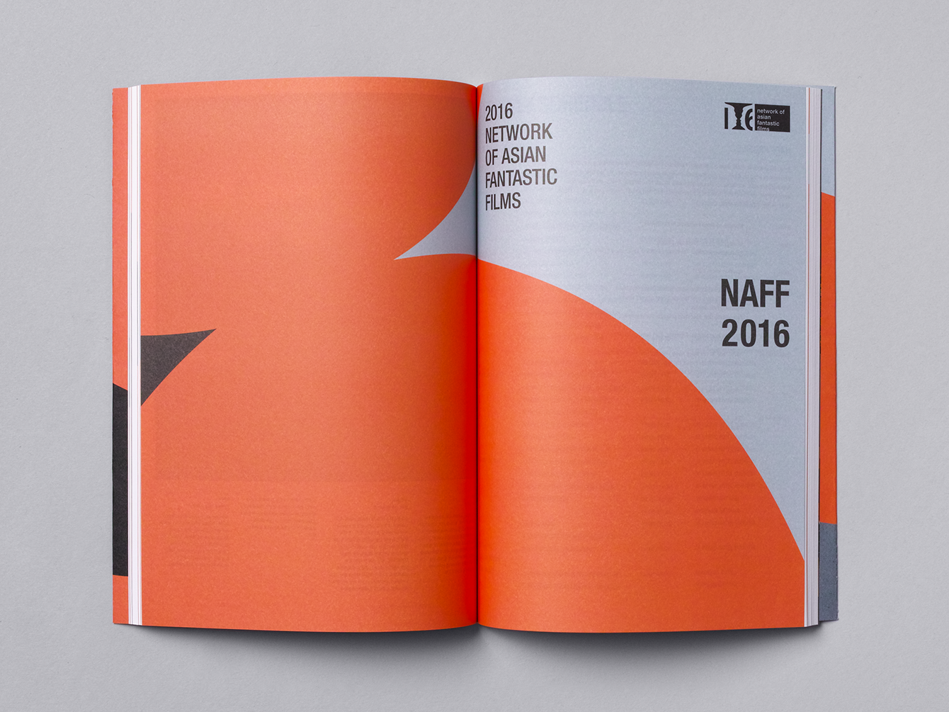
BIFAN
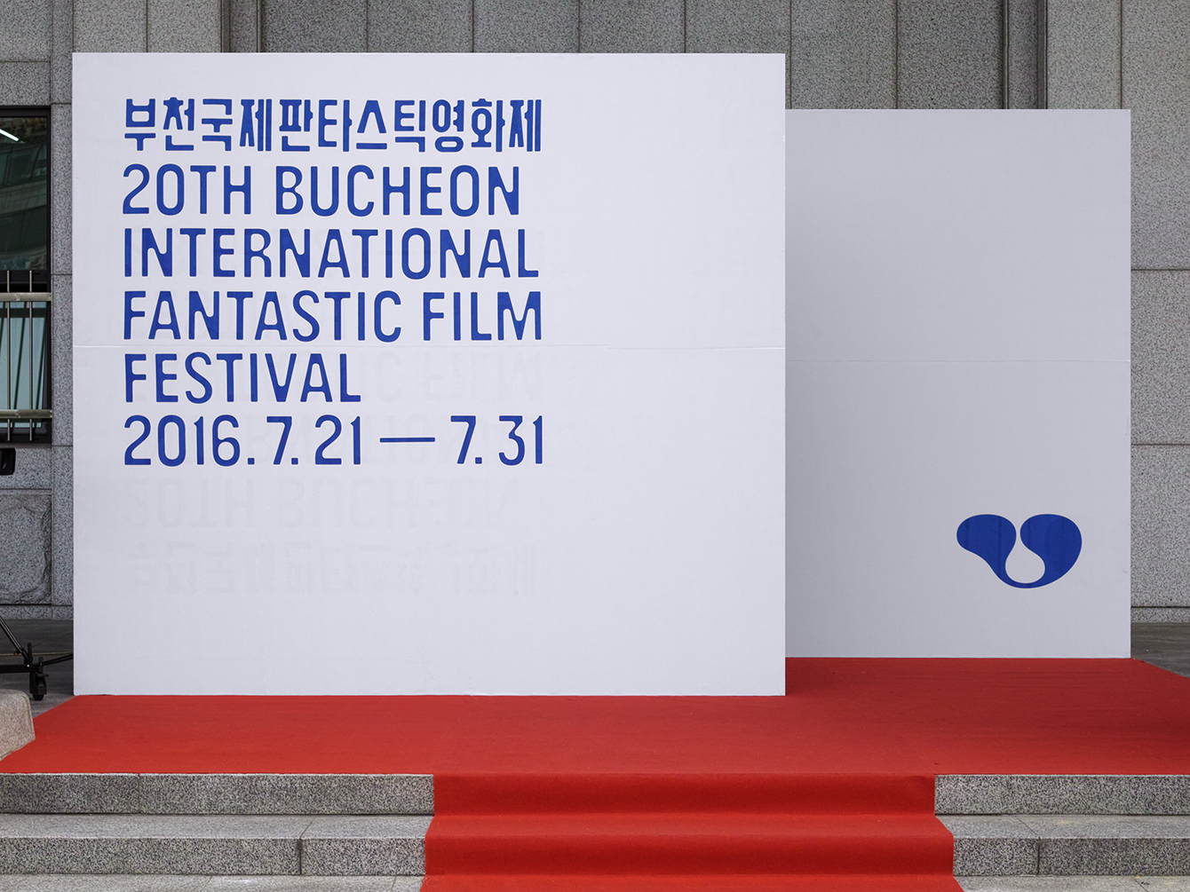
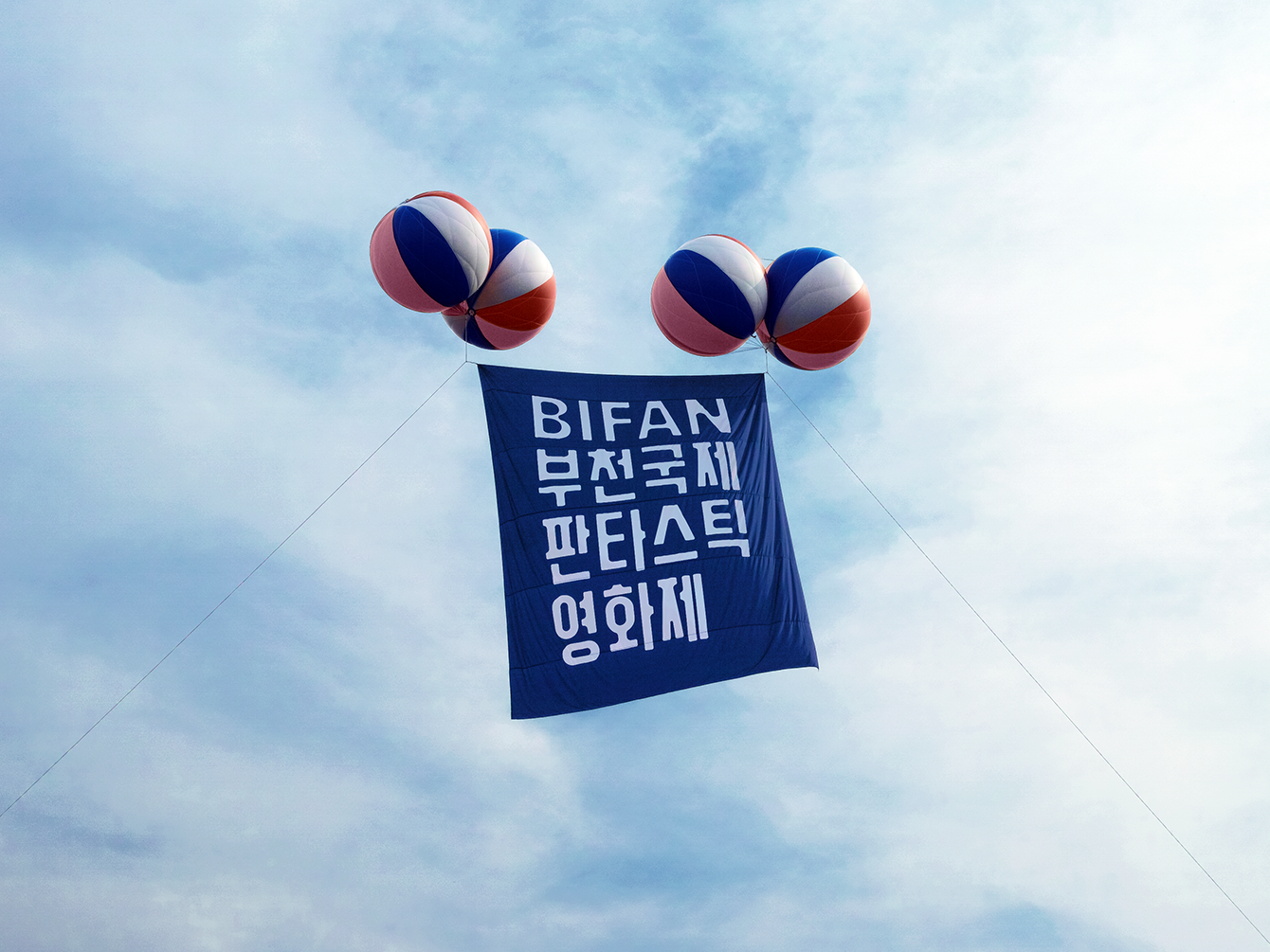
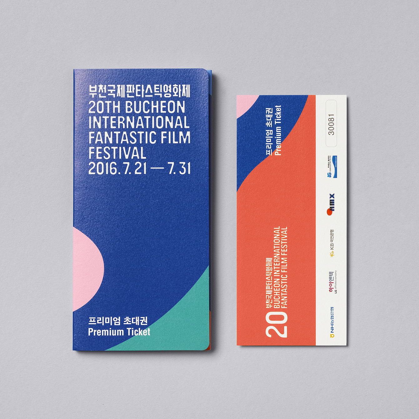
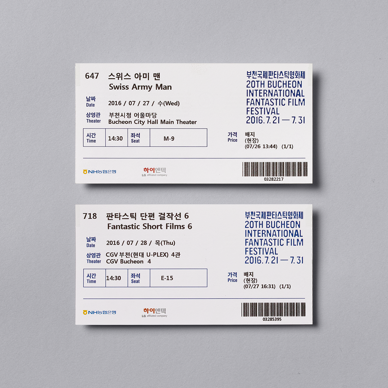
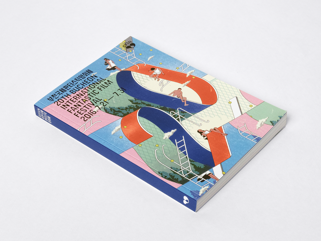
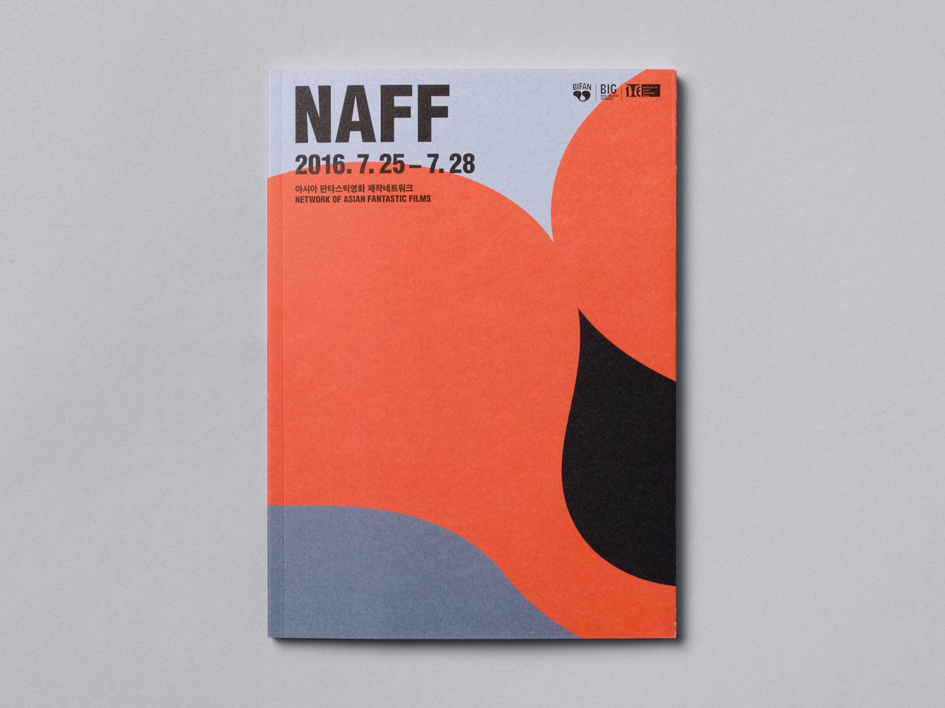
Project for BIFAN (Bucheon International Fantastic Film Festival) mainly consists of two large parts. First is to renew its identity including a new symbol and logotype along with the general graphic design system, and second is to make posters, banners, souvenir items and catalogue to promote its 20th anniversary.
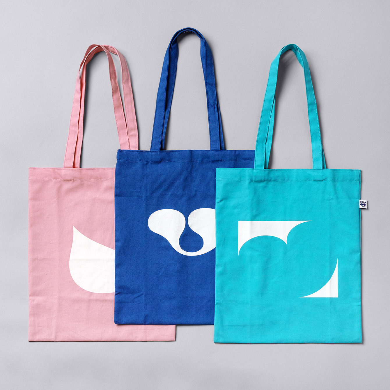
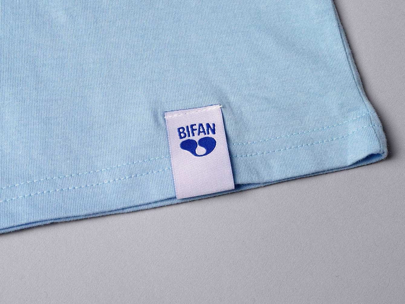
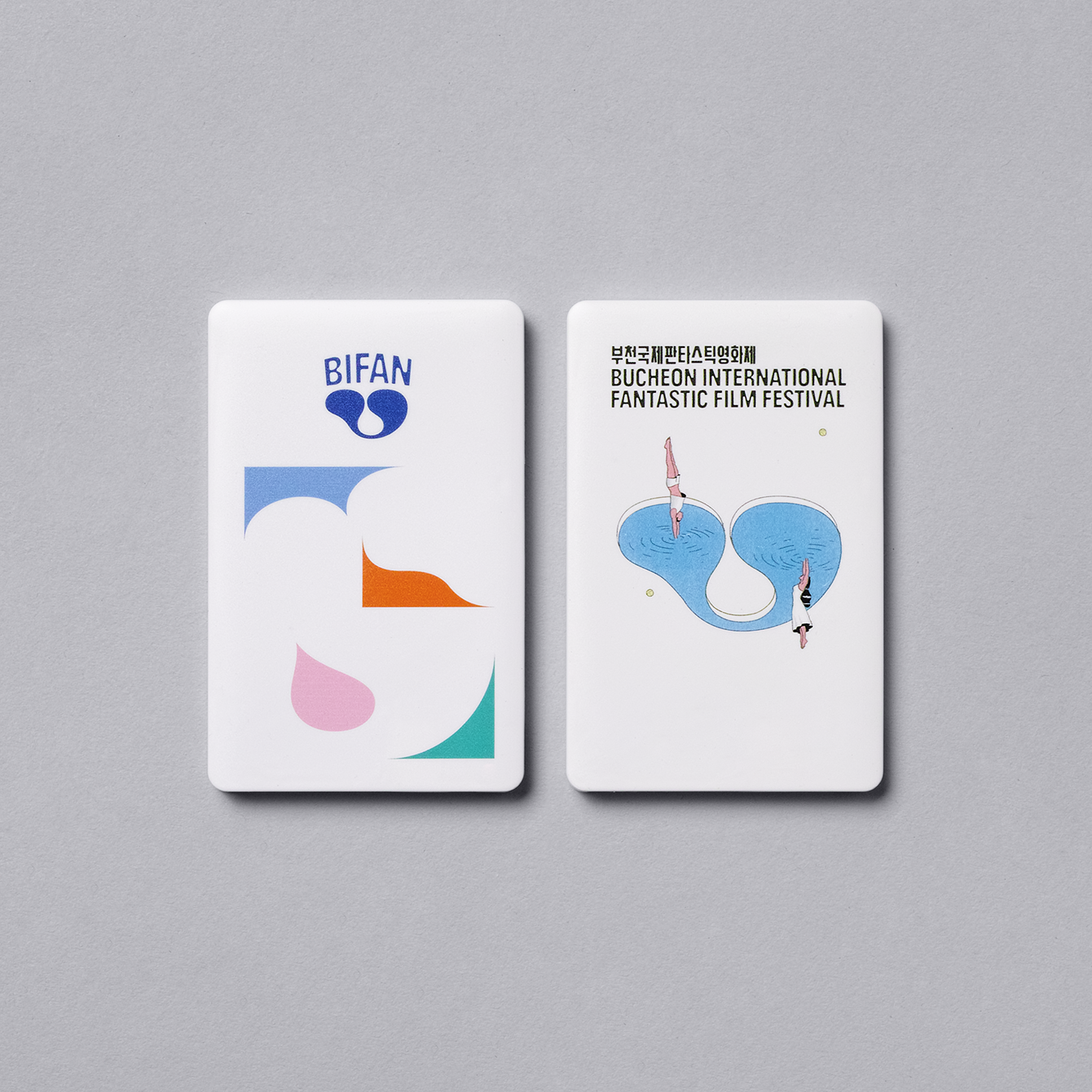
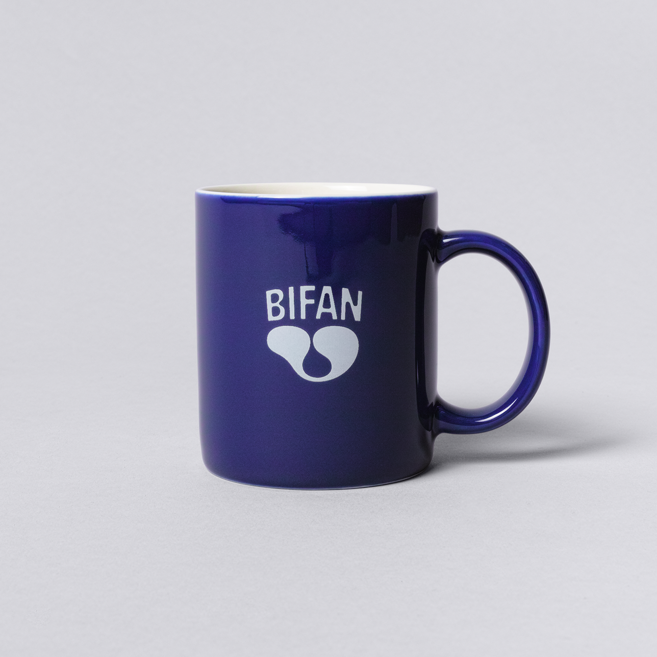
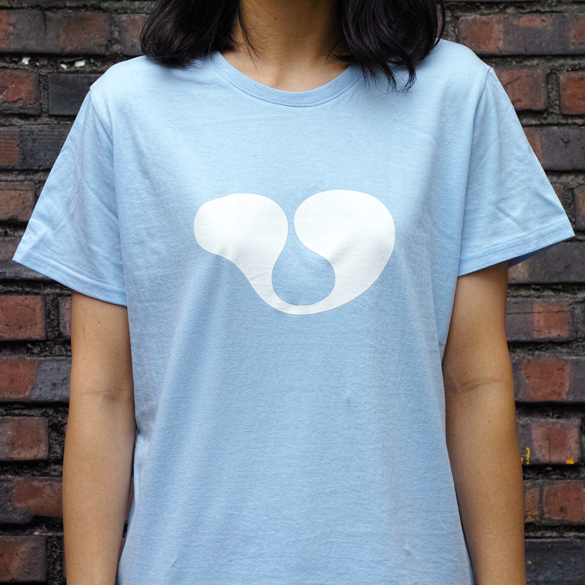
We focused on revealing BIFAN’s uniqueness that differentiates it from all the other film festivals, by emphasizing images of rich and dynamic adventures. Following such concept, a newly designed symbol for BIFAN is named ‘Cell of Fantasy’.


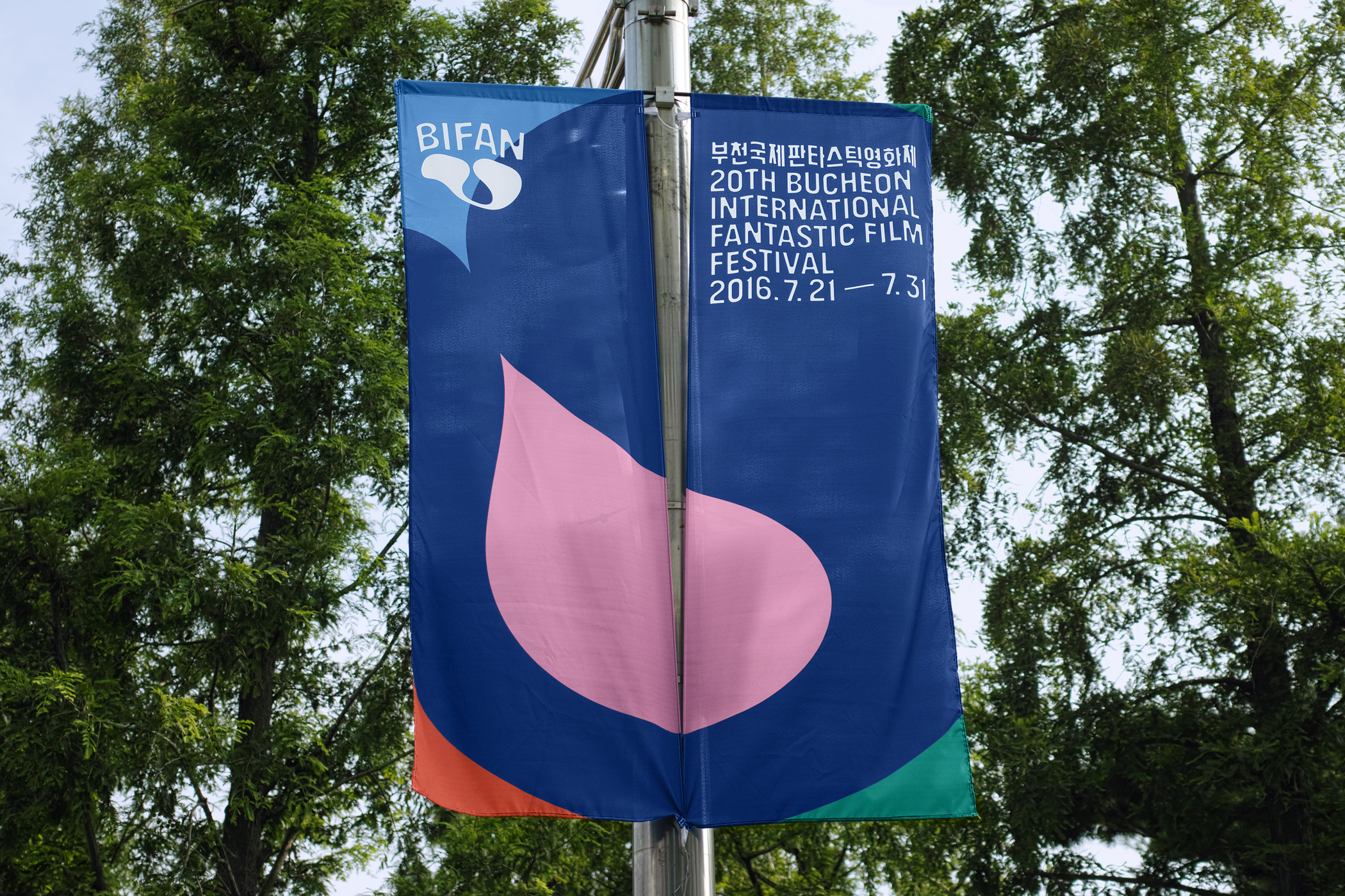
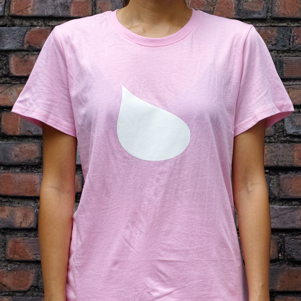
It holds diverse graphic possibilities, and symbolizes the energy and room for new imagination that BIFAN brims with each new year. On a stylistic level, the symbol implies close interconnection of contrasting visual cues such as 'yin and yang' or 'shrinking and expanding' in order to stimulate the eyes and the creativeness of the audience.
It can be interpreted in various ways, as ‘wing’, ‘heart’, ‘leaf’ and more, and delivers a sense of ‘Cell of Fantasy’ in diverse levels.


Project coordination:
- Kanghun Lee (Art Director of Bucheon International Fantastic Film Festival)
Creative direction, strategy:
- Heesun Kim (studio fnt)
Art direction:
- Jaemin Lee (studio fnt)
Graphic design:
- Jaemin Lee (studio fnt)
- Woogyung Geel (studio fnt)
- Dayoung Jeong (studio fnt)
- Ayong Son (studio fnt)
- Kanghun Lee (Art Director of Bucheon International Fantastic Film Festival)
Creative direction, strategy:
- Heesun Kim (studio fnt)
Art direction:
- Jaemin Lee (studio fnt)
Graphic design:
- Jaemin Lee (studio fnt)
- Woogyung Geel (studio fnt)
- Dayoung Jeong (studio fnt)
- Ayong Son (studio fnt)
Illustration:
- Jeeook Choi
Editorial design:
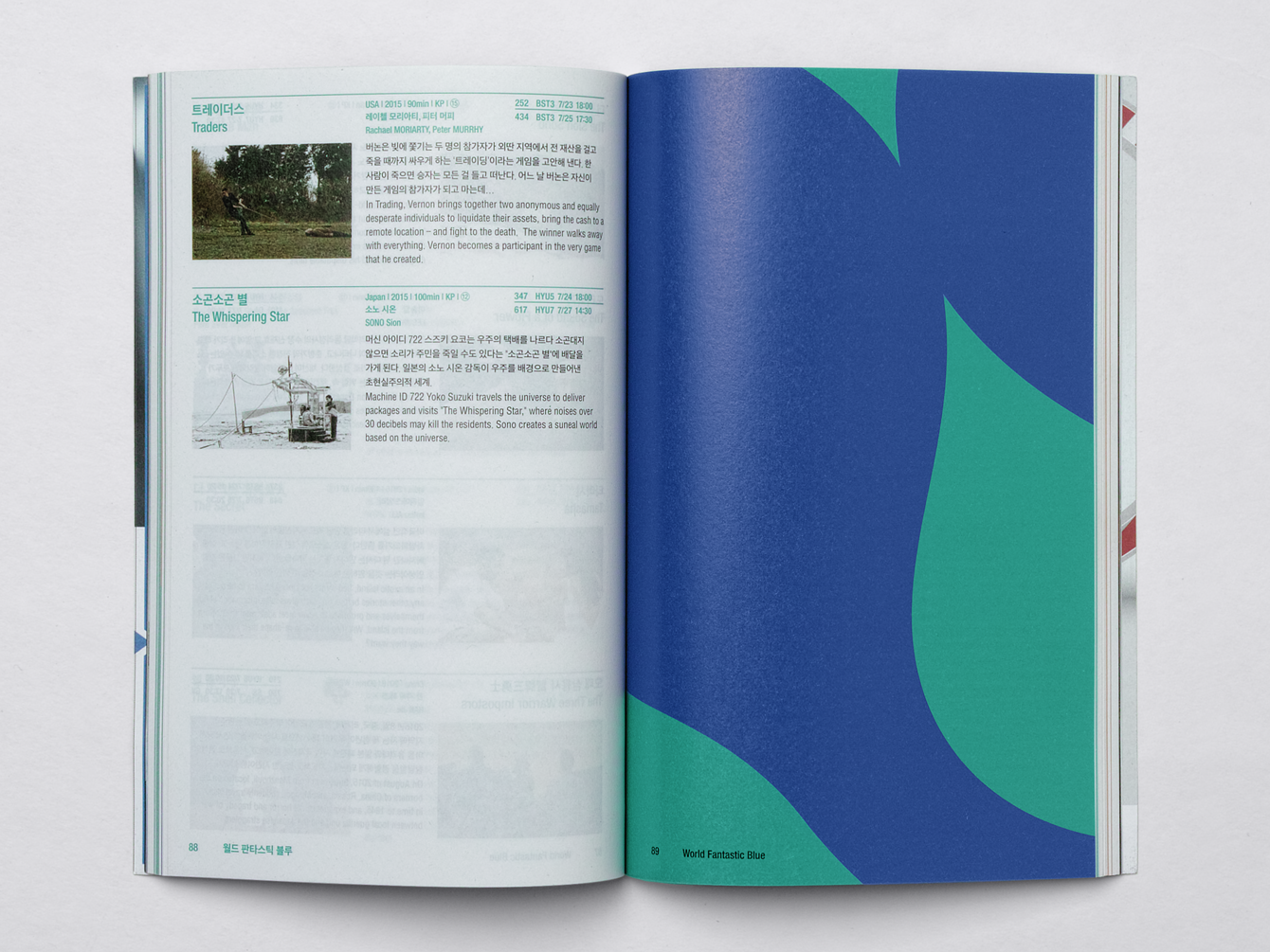
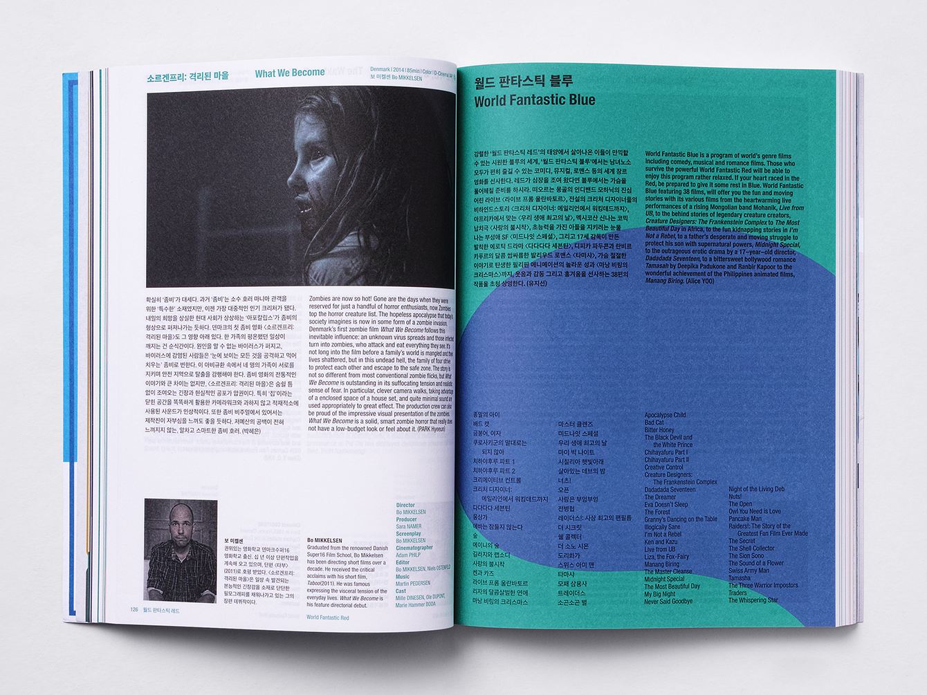
- Gunjung Lee and Youngchan Kwon (ticket catalog, main catalog)
- Hyung Cho (B.I.G NAFF catalog)
Photography:
- Jaemin Lee
- Jeeook Choi
Editorial design:
- Gunjung Lee and Youngchan Kwon (ticket catalog, main catalog)
- Hyung Cho (B.I.G NAFF catalog)
Photography:
- Jaemin Lee
© 2023 studio fnt. All rights reserved.