Daechung Park
This is a brand identity and graphic design work for Daechung Park, a cafe in Seoul. The word in their name 'Daechung' was chosen by our client, and it means 'half-heartedness' in Korean. I believe that they named their cafe this way with the intention to create and offer a space to let go of everyday pressure and stress, and just relax.
However, the word itself in Korean has a kitsch-y nuance, because its literal meaning reminds you of one being sloppy and not taking things seriously. The cafe, 'Daechung Park' is far from this negative nuance and so prior to diving into the project, we needed to establish a clear concept that would overcome the gap between the mischievous naming and cafe's brand identity.
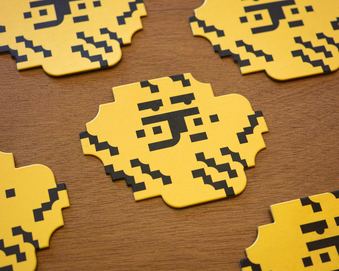
After investigating further on the word 'Daechung', we learned that in old days of Asia, tigers used to be called 'Daechung'. It is a homonym made up of Chinese characters, meaning 'big(Dae) bug(Chung)'. It was interesting that tigers were described as big bugs, but this is because for Koreans, tigers hold an exceptional meaning. They appeared regularly in various folk paintings, and in many fables and folk tales as a friendly animal. The mascots of the two Olympics held in Korea so far have all been tigers as well. We decided to use this concept to reveal an image of a tiger in a metaphorical way in the overall design and story behind the cafe's identity.
We created a graphic device inspired by tiger patterns, as a form made up of stair shapes and partial curves from a circle. This repeated cascade of curves and straight lines were used in a variety of ways; as a pattern on printed materials, or as a form itself, as well as a wall separating the kitchen from the store, as ceiling light shade, and sometimes as chairs and shelves.
These execution parts were done with 2 other partners who involved in this project, the FHHH Friends, who were responsible for the space design, and studio COM, who designed furniture and objects.
These execution parts were done with 2 other partners who involved in this project, the FHHH Friends, who were responsible for the space design, and studio COM, who designed furniture and objects.
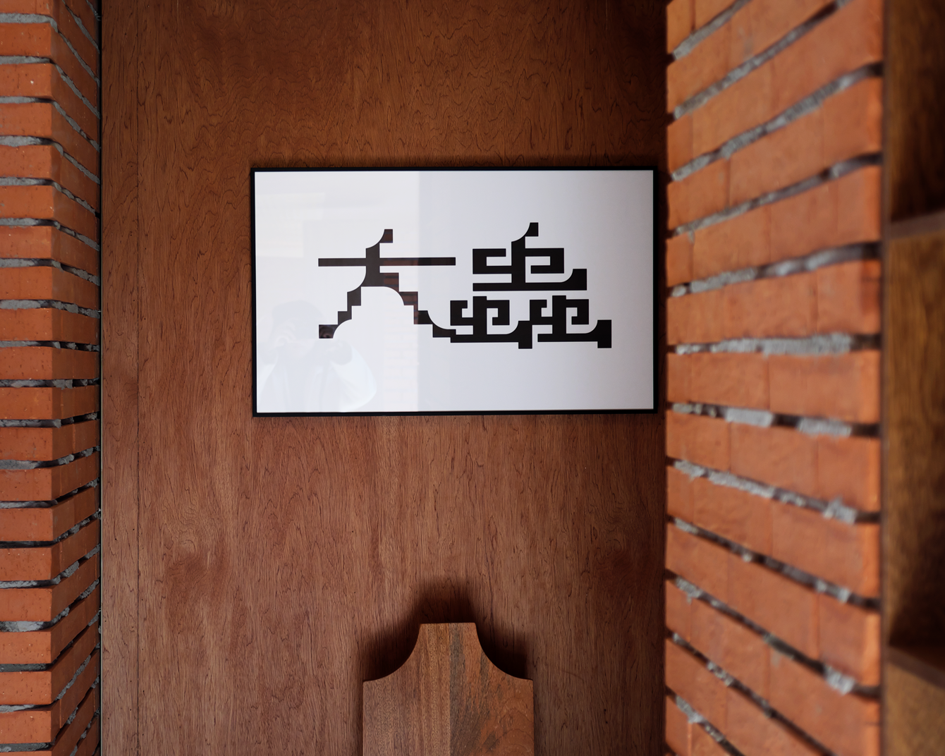


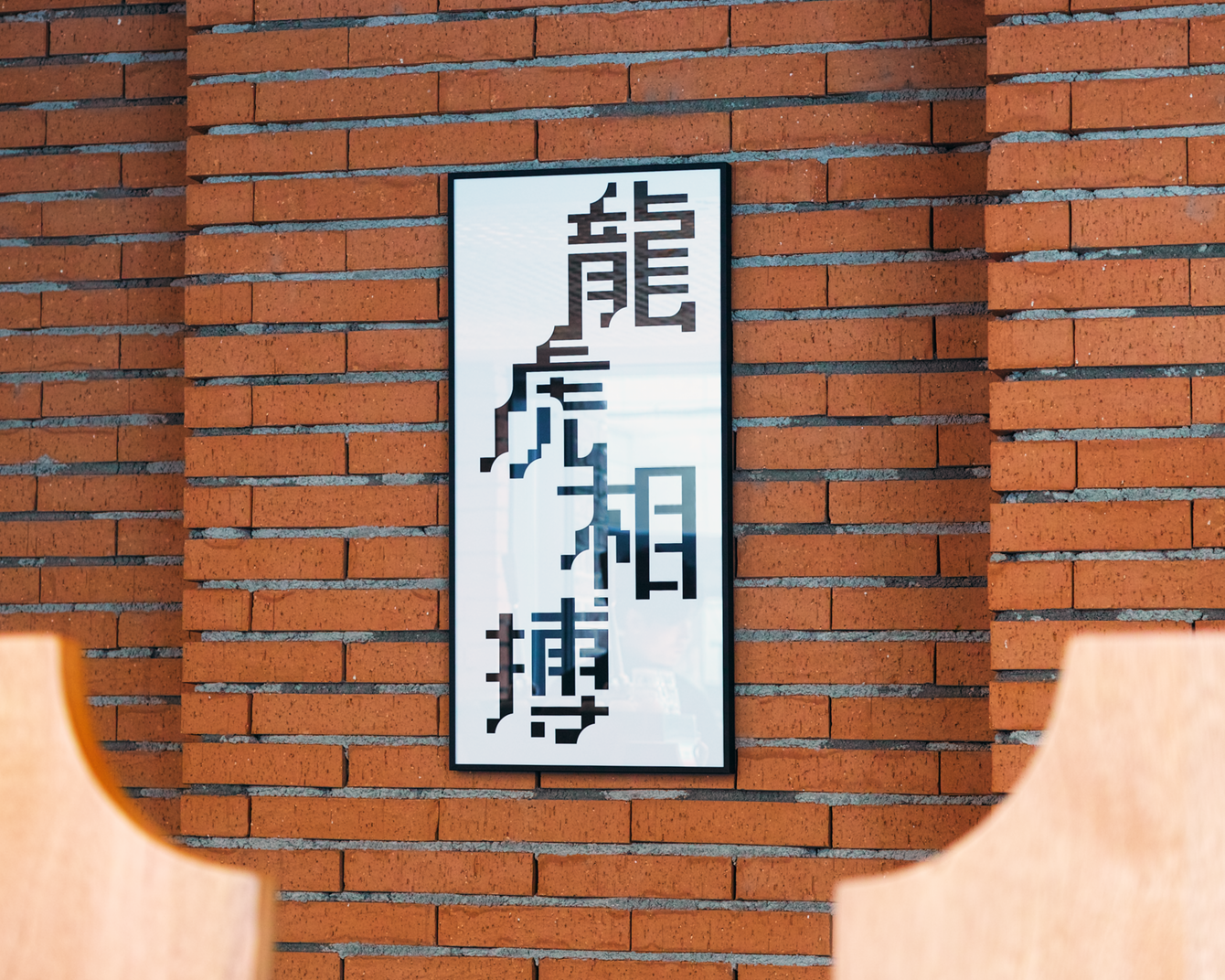
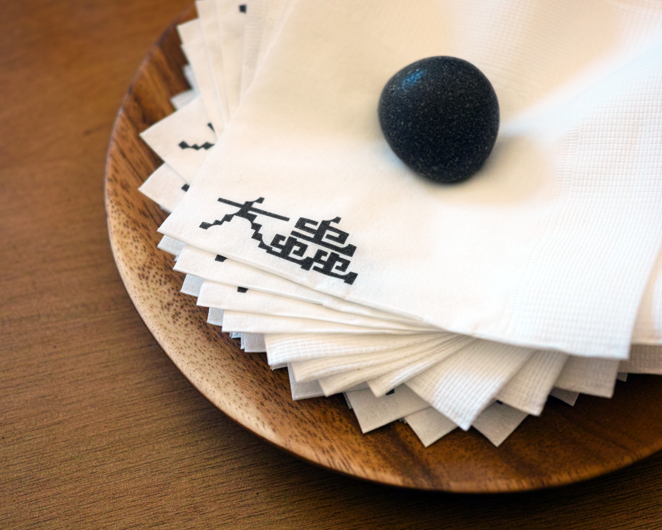
In Korea, it is an old tradition to hang a hand-written Chinese calligraphy of family dignity, or phrases that bless family reconciliation and health, on the walls of homes. We tried to express this in a contemporary manner, imagining what a digitalized calligraphy would look like. We wanted it to uniquely suit the space of the shop. Among numerous four-character idioms in Korea, we selected a few words containing a tiger in Chinese characters, and created a series of calligraphy images based on the graphical approach of the Daechung Park logo and in vertical oriental writing style.
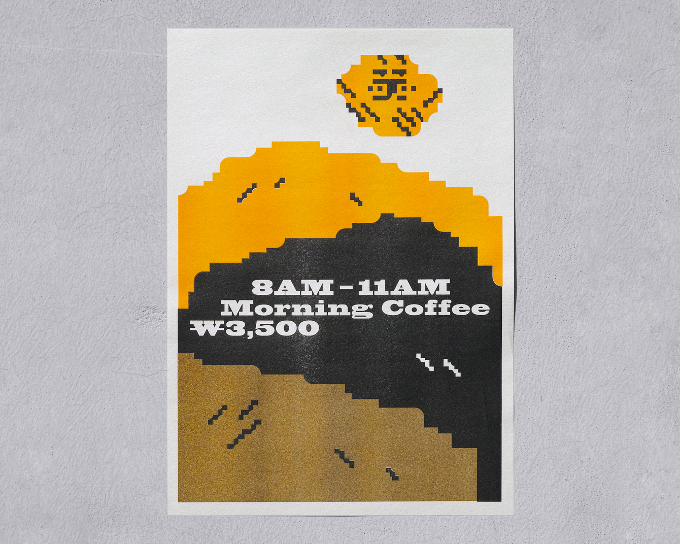
Moreover, we were responsible for posters, packages, and everything else necessary for takeout purchases. Daechung Park only officially opened in the beginning of this year, and in a matter of 3 months, it has successfully gained a reputation of being a 'hip' place of the area. It was a fun project where visual identity, space, and object designs empower each other in an effective way. From space to furniture, graphics, drinks, food, music, etc... there is nothing 'Daechung(half-hearted)' about Daechung park.


- Space design: FHHH Friends
- Furniture design: studio COM
- Photography: Jaemin Lee and Heesun Kim
© 2023 studio fnt. All rights reserved.