GREATING
fnt worked on renewing the brand identity and package design of Greating, a health-oriented food brand. Unlike most of the general food and ingredient delivery services, Greating is a specialized service brand for customers who need to improve their eating habits or who need consistent diet management for specific health reasons. Users can subscribe to customized meals such as a low-sugar diet for diabetes, a KETO low-carb diet for weight-loss, or a protein-up diet for post-workouts.
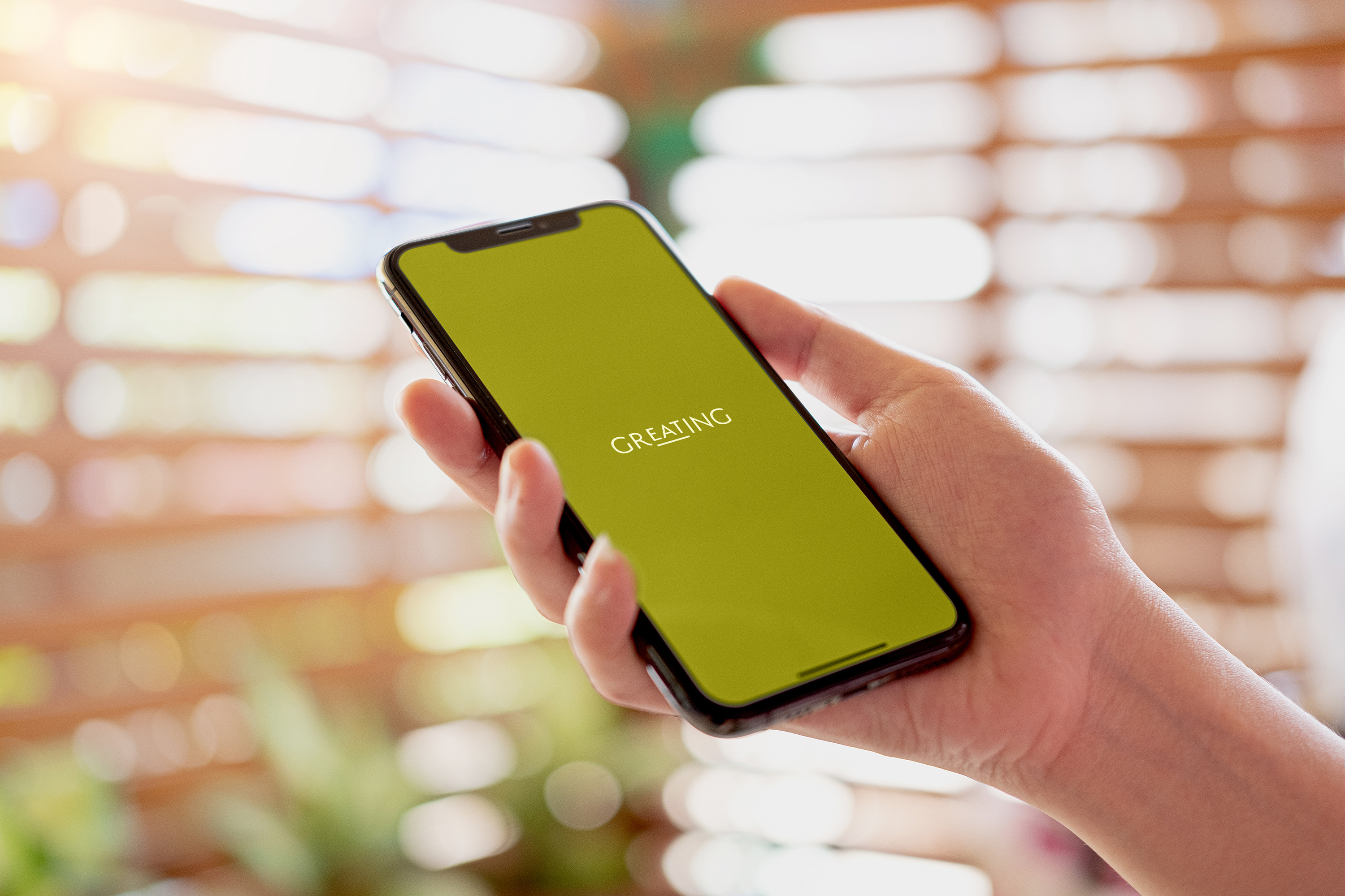
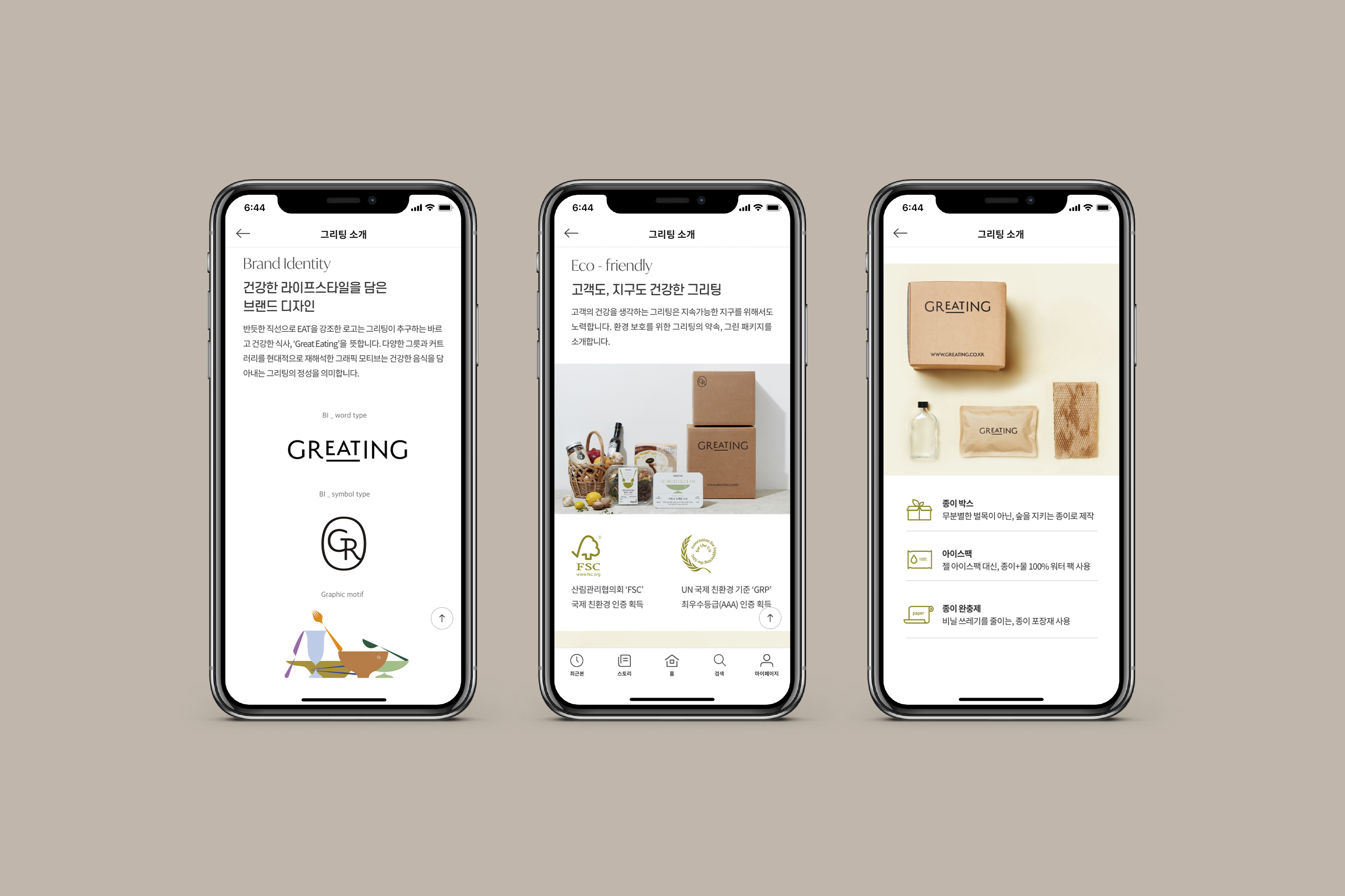
The new logo and symbol design for Greating uses a clean and refined form, expressing a premium brand image that provides a carefully crafted diet, filled with essential nutrients. In addition, the word EAT in the logo is emphasized with an underline, to intuitively reveal the principal customer experience.
The new logo and symbol design for Greating uses a clean and refined form, expressing a premium brand image that provides a carefully crafted diet, filled with essential nutrients. In addition, the word EAT in the logo is emphasized with an underline, to intuitively reveal the principal customer experience.
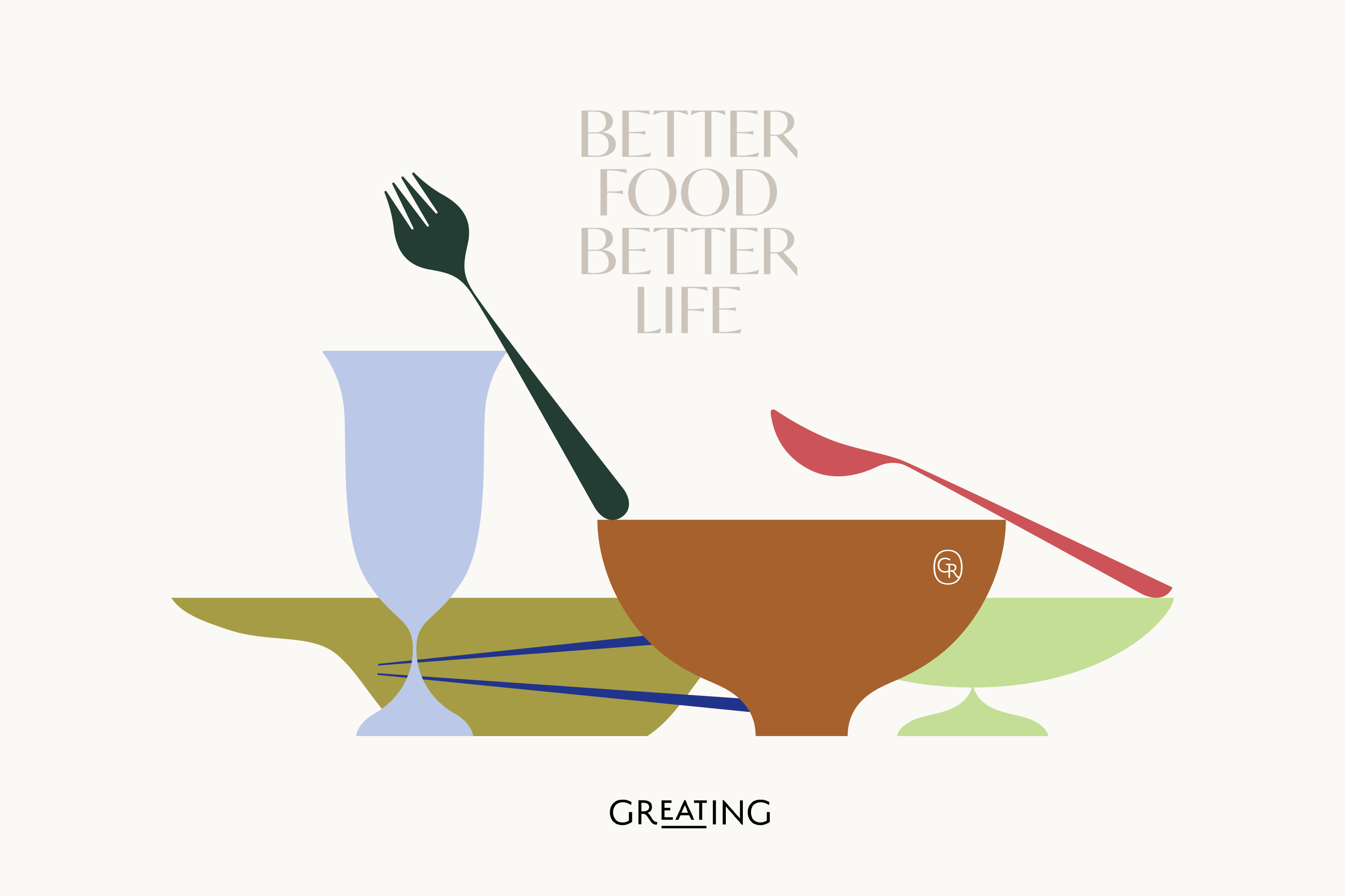
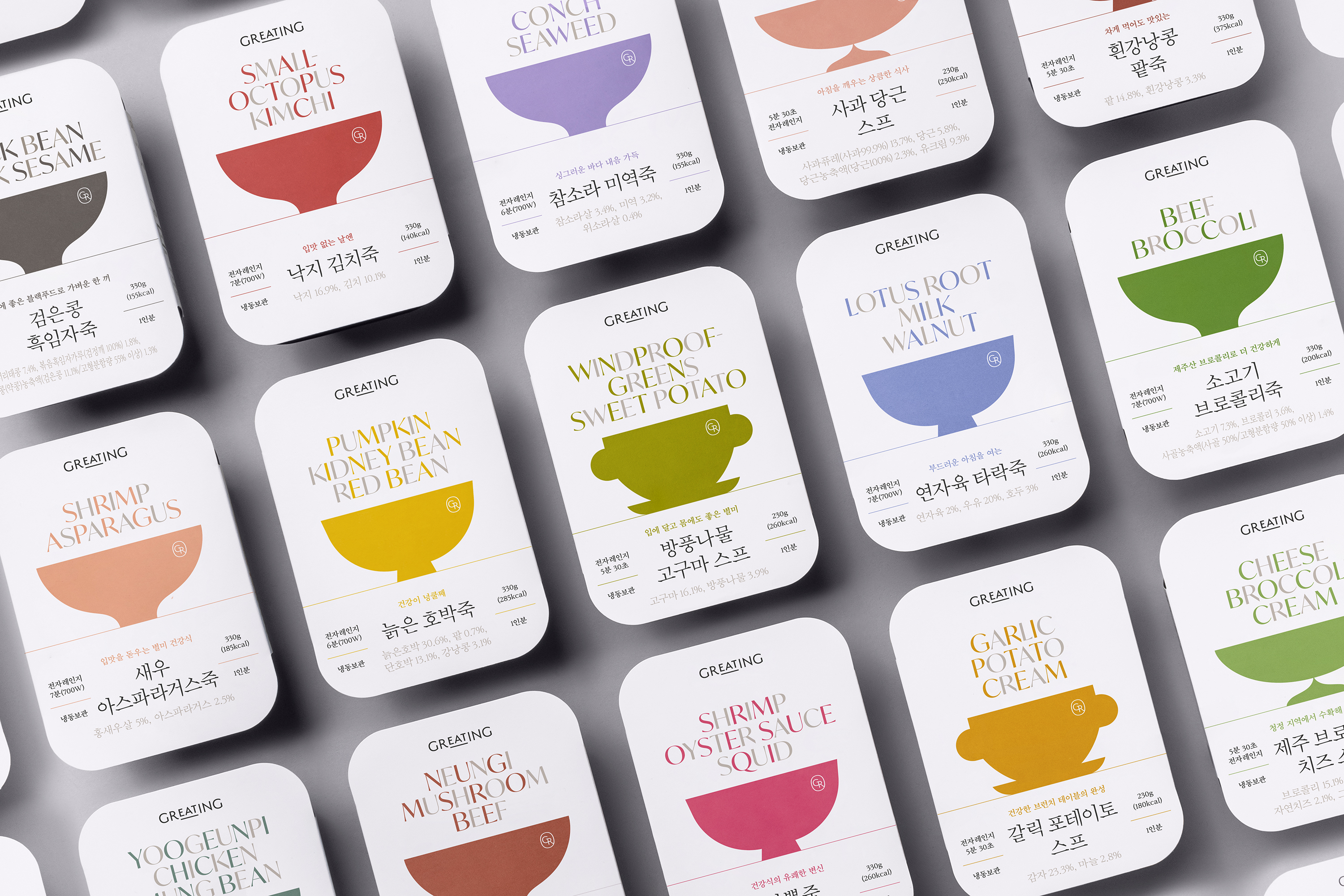
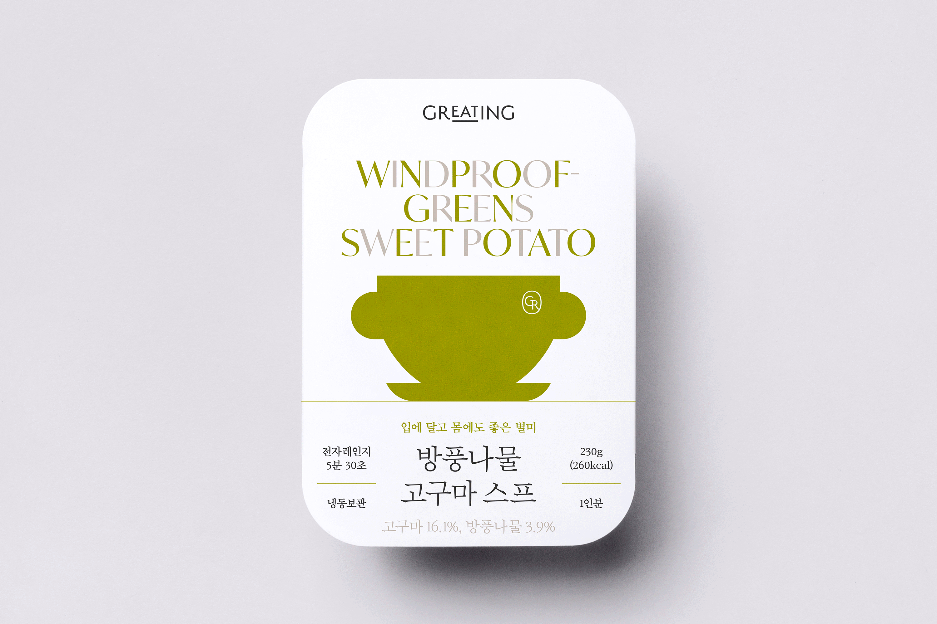
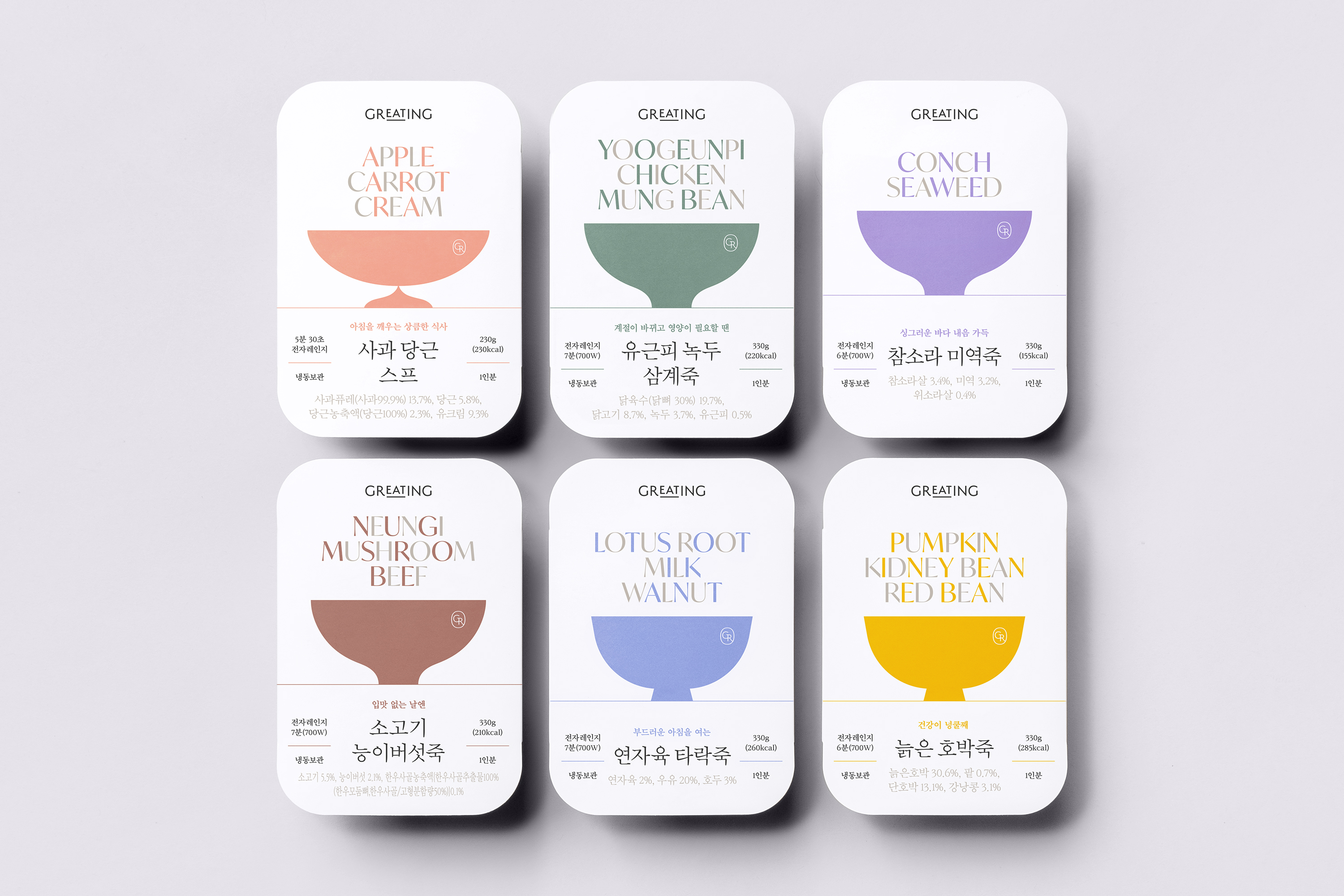
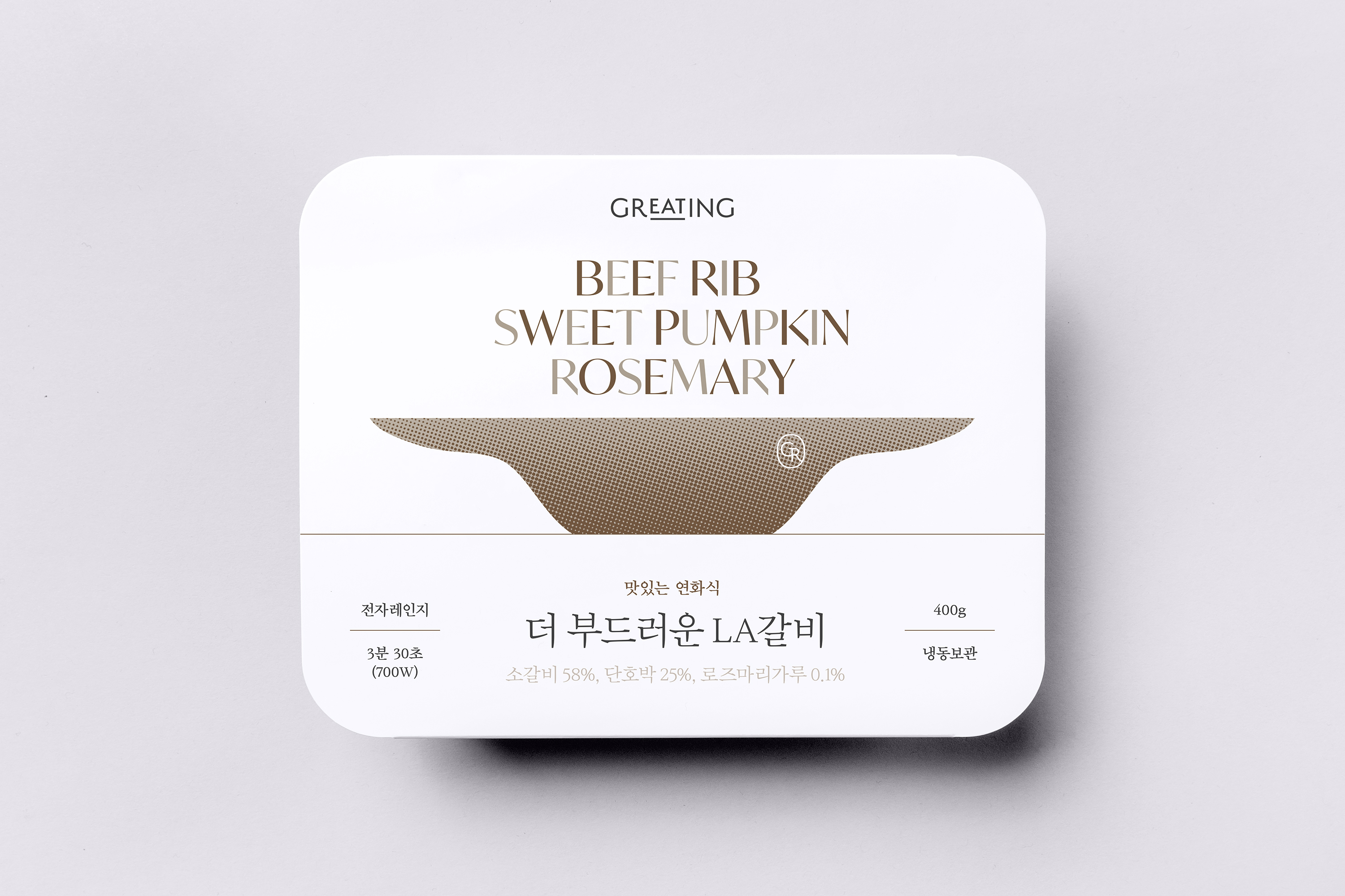
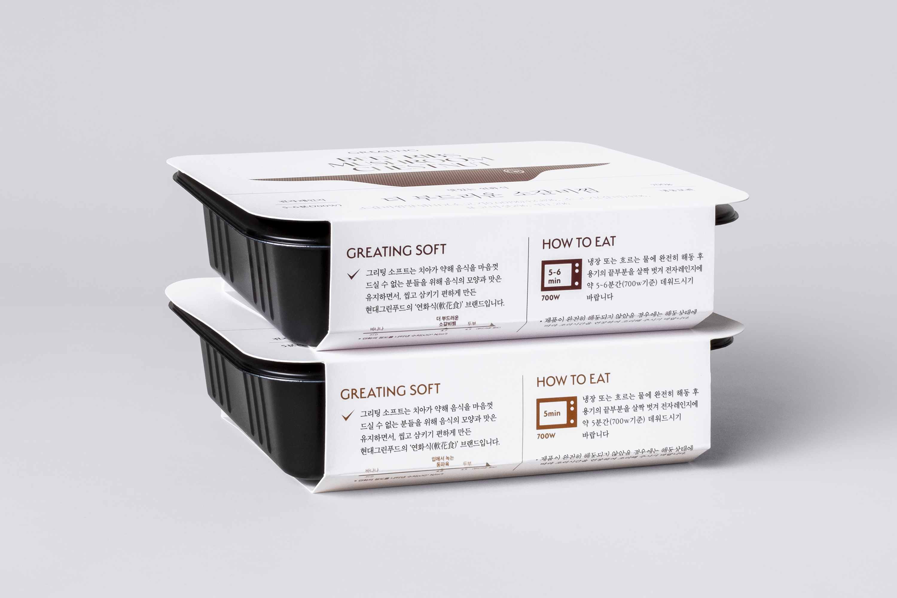
The new packaging system was designed with the graphic motif of ‘a well-prepared meal’ that Greating aspires to provide. We decided to be fearless and omitted ‘appetizing’ photographs of individual meals on the packages, and instead, used visual components such as cutlery and other tableware illustrations, with names of the main food ingredients. At the same time, we also established a layout system that embraces various information related to the different types of diet.
Tableware illustrations with elegant and sharp edges are categorized by product, so that customers can easily recognize the type of product with the visual elements. It is also used as the brand’s visual element to compose a look and feel of a rich and enjoyable dining gathering.
Tableware illustrations with elegant and sharp edges are categorized by product, so that customers can easily recognize the type of product with the visual elements. It is also used as the brand’s visual element to compose a look and feel of a rich and enjoyable dining gathering.


- Creative direction: Heesun Kim
- Art direction: Woogyung Geel
- Graphic design lead: Hyungwon Cho
- Graphic design: Solla Koh, and Youjeong Lee
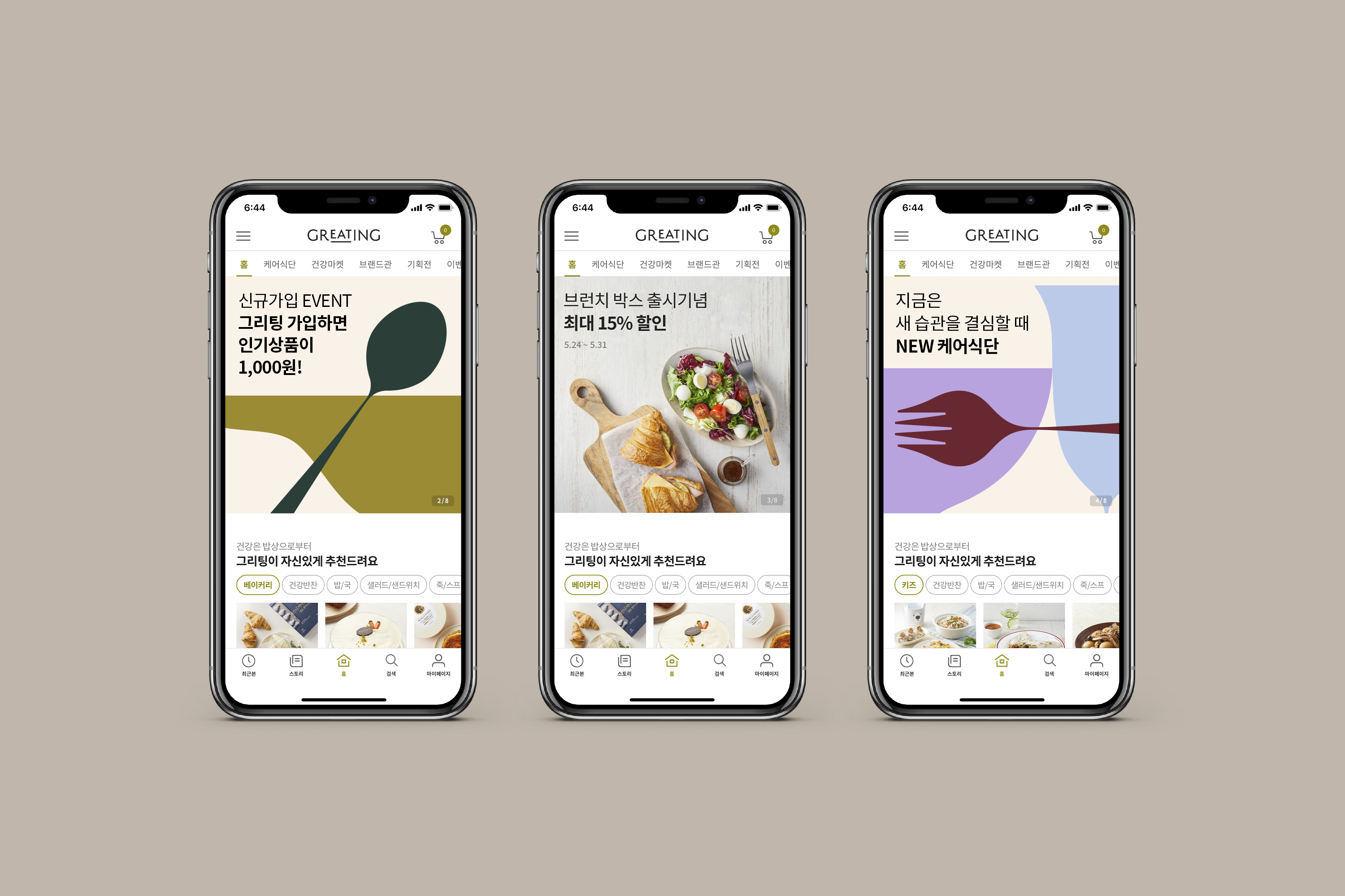
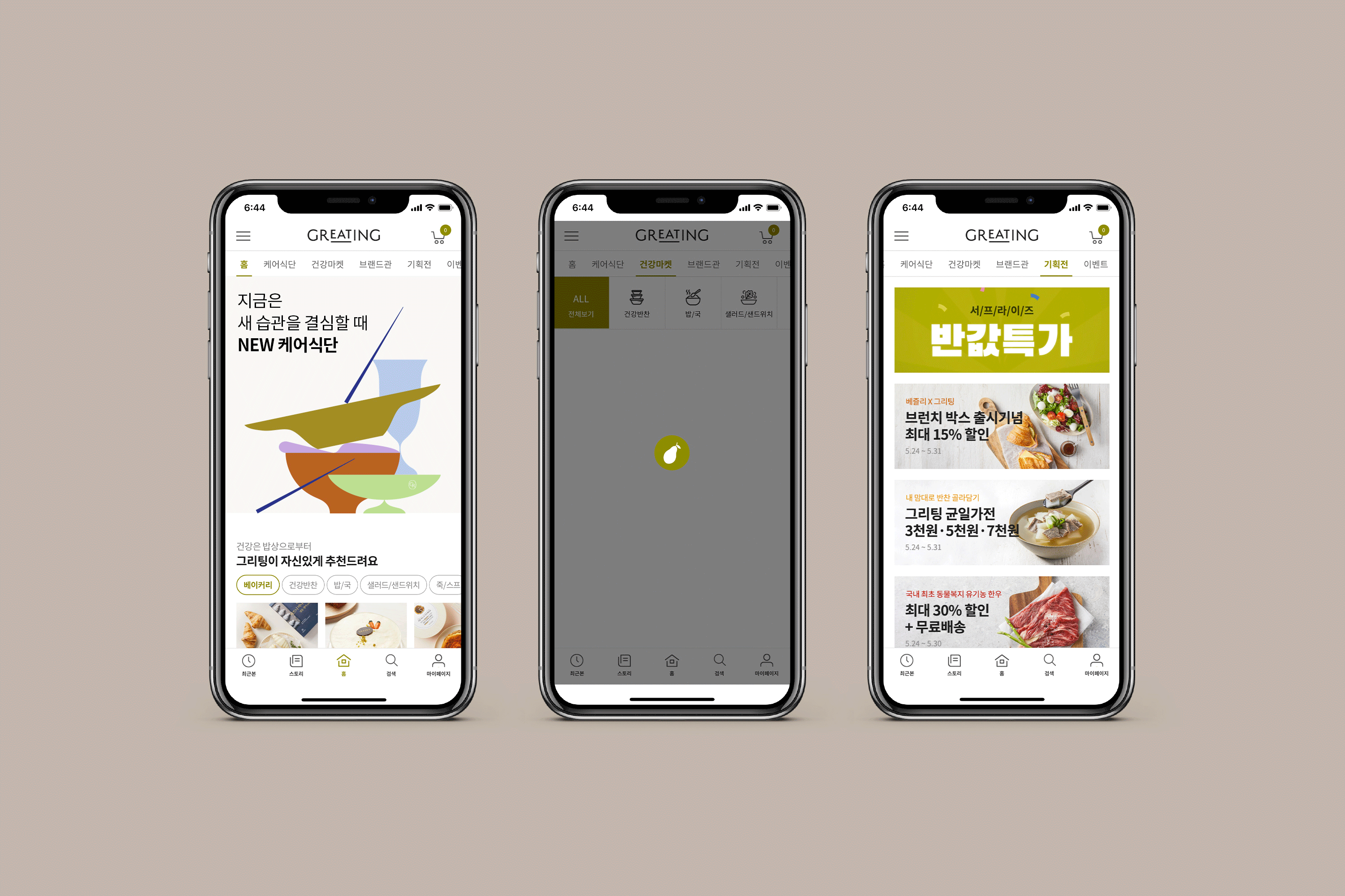
- Web and mobile app design: Hyundai Green Food
- Art direction: Woogyung Geel
- Graphic design lead: Hyungwon Cho
- Graphic design: Solla Koh, and Youjeong Lee
- Web and mobile app design: Hyundai Green Food
- Client: Hyundai Green Food
- Year: March 2021
- Year: March 2021
© 2023 studio fnt. All rights reserved.