HDC and IPARK
Hyundai Development Company (HDC) is Korea's largest construction company, and IPARK is the name of a well-known resident apartment brand that they build. In keeping with the existing logos, we were asked to create their corporate identity and brand identity, as they had virtually no other design elements in their brand, other than a single logo.
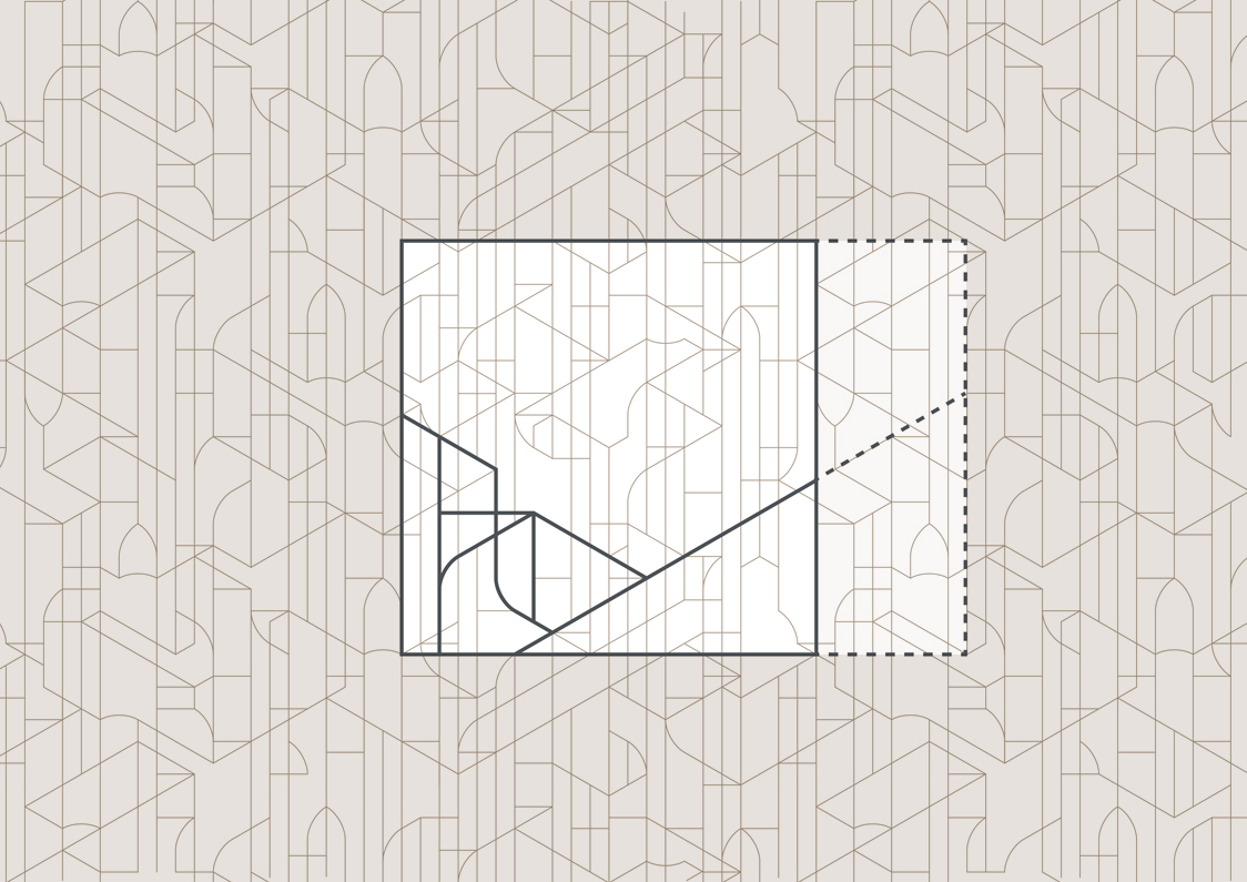
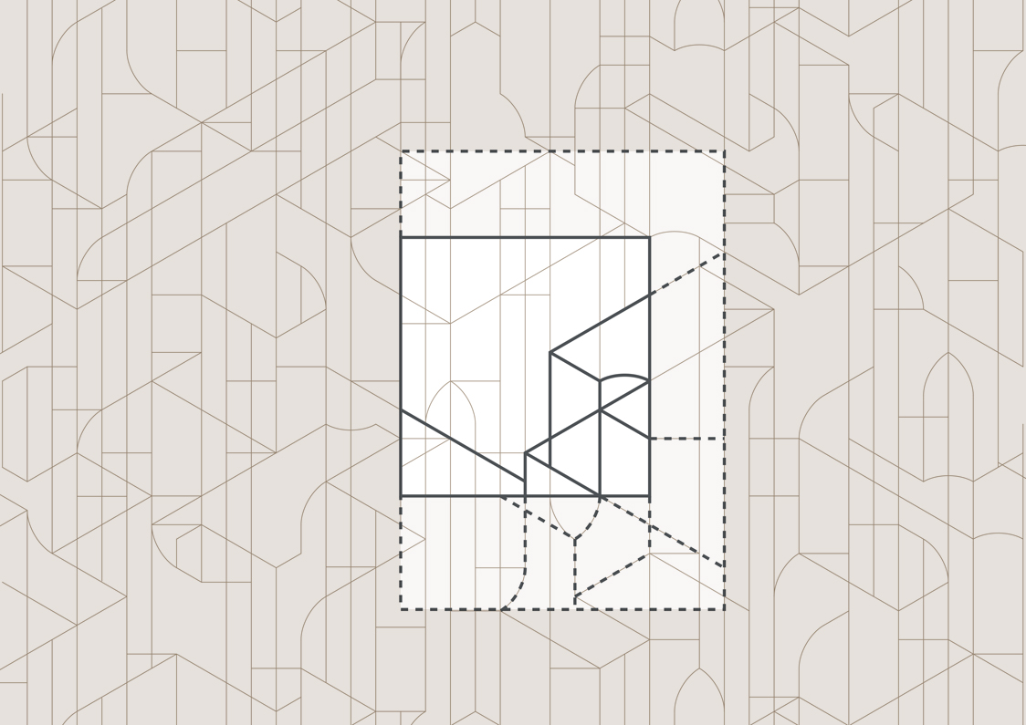
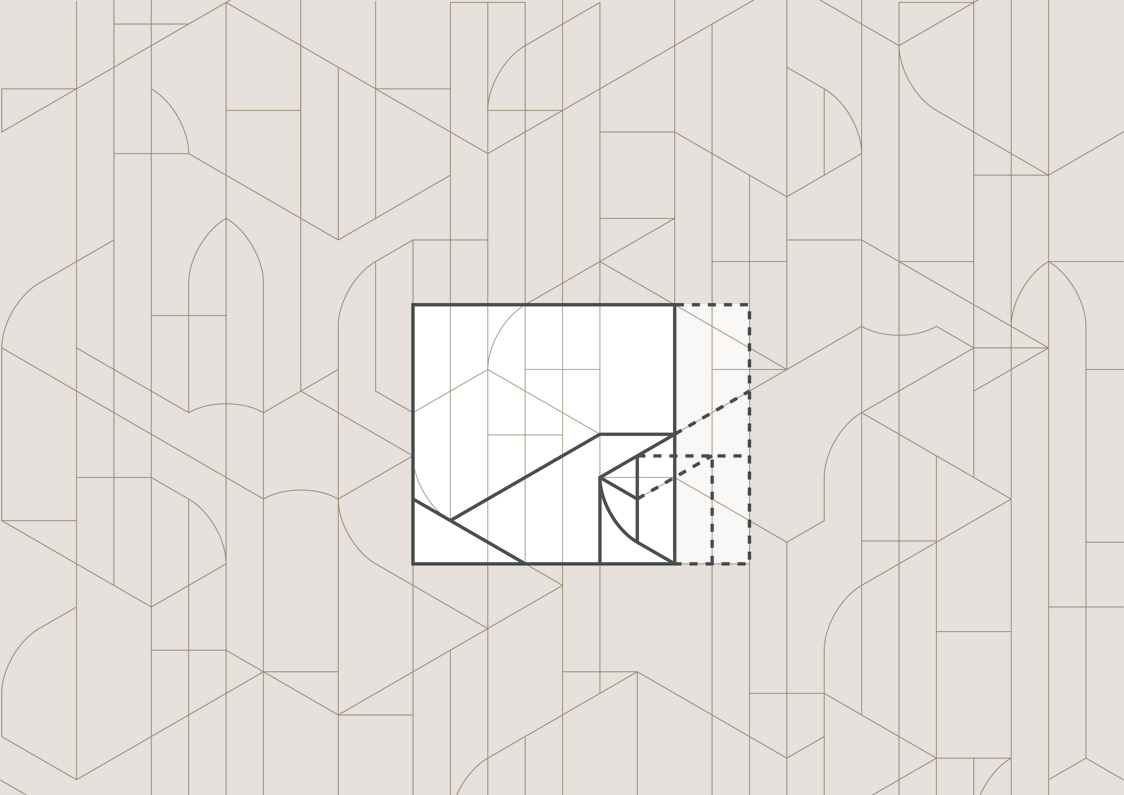
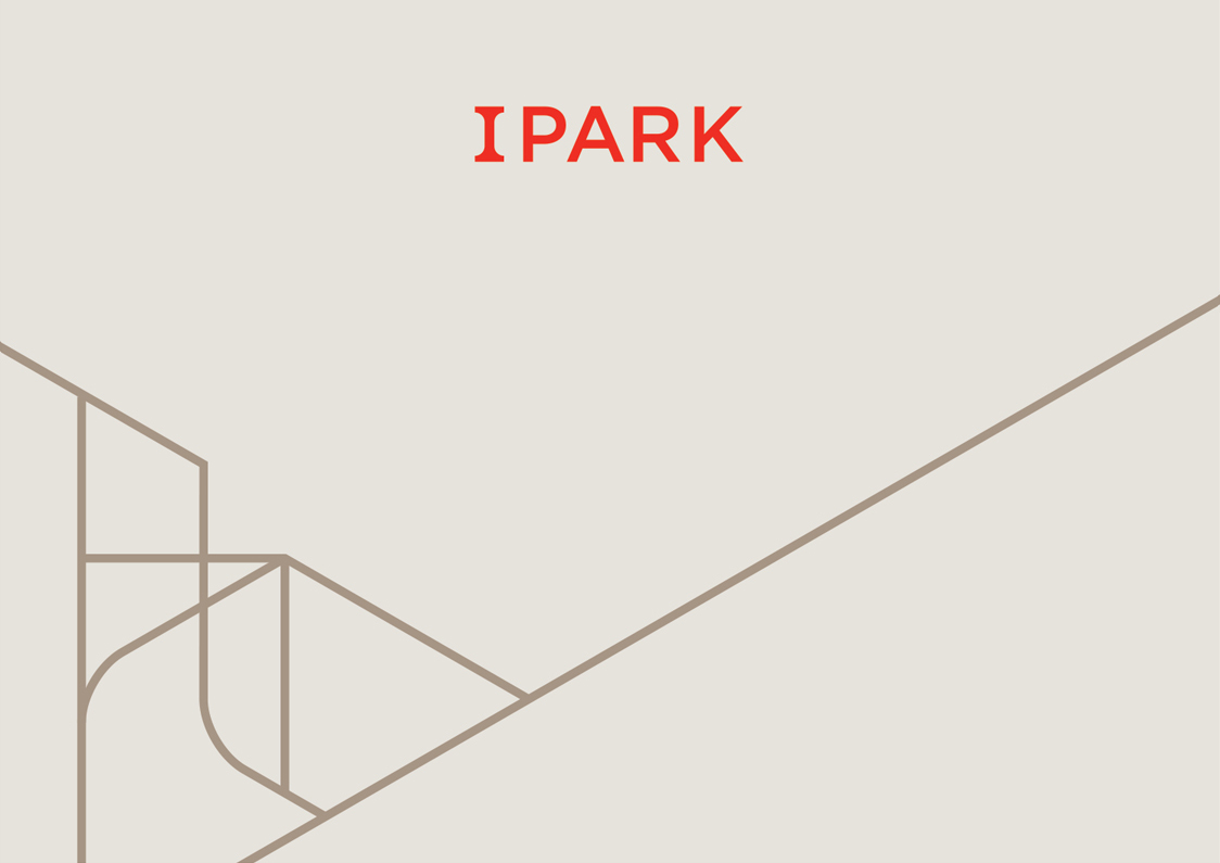
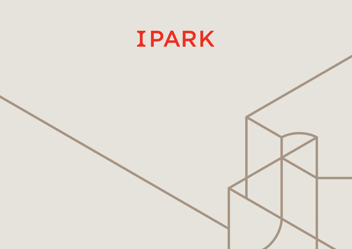
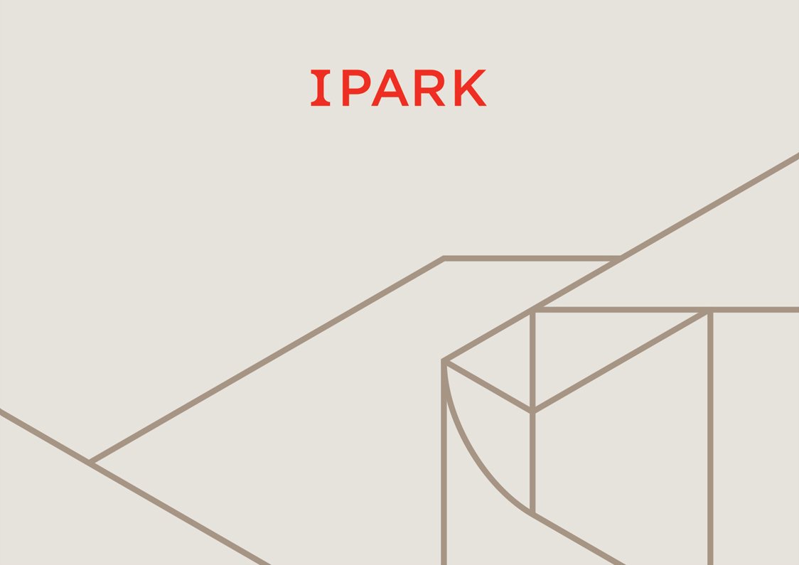
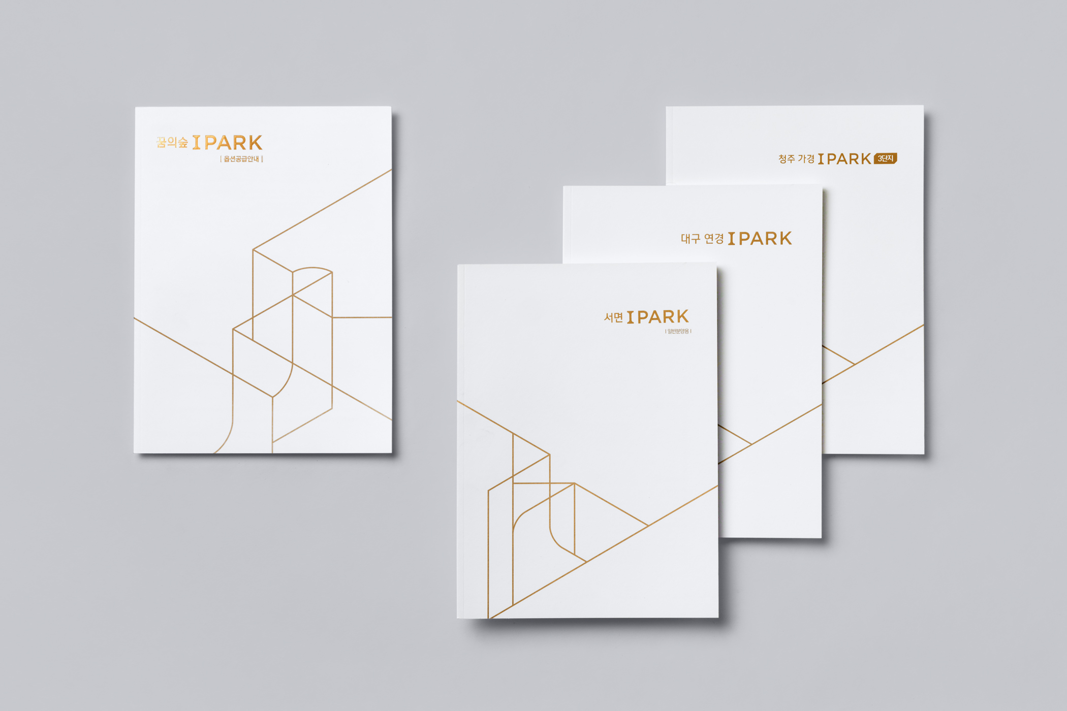
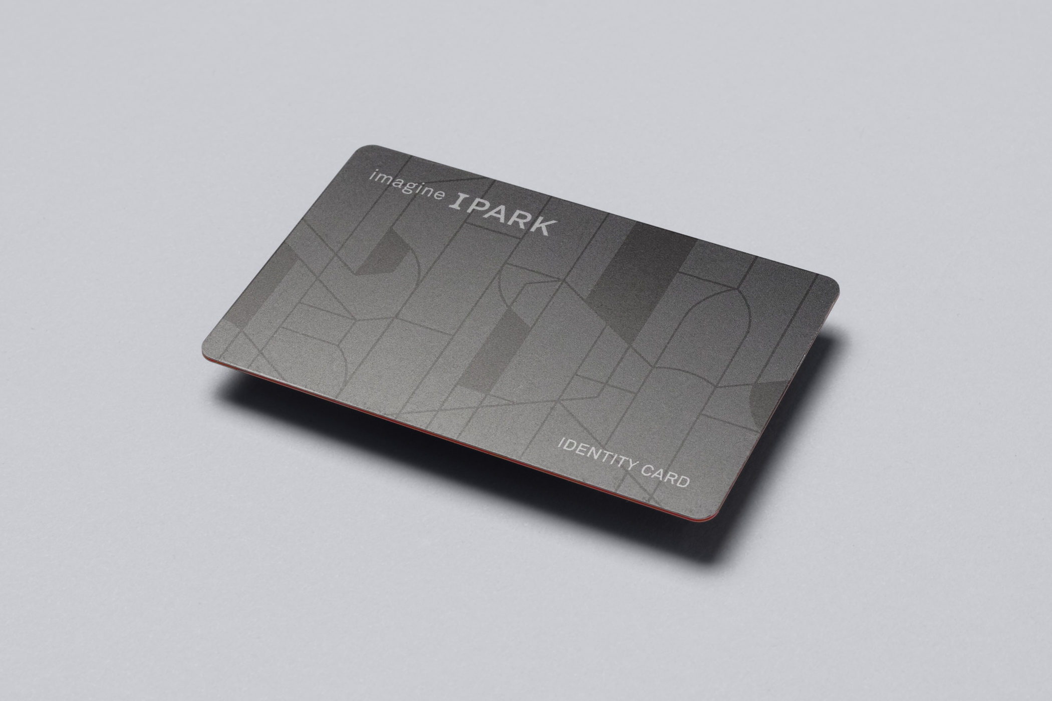
We felt that the slab serif-based logo reflected the personality of the company well. The bold letterforms were reminiscent of Doric columns, and they looked confident. We started with this form, and from there we imagined a three-dimensional space and environment. We used isometric perspective to create new shapes and (virtual) architectural forms. Through this, we conveyed an identity system that defines the character of a company and brand, without going overboard with the design.

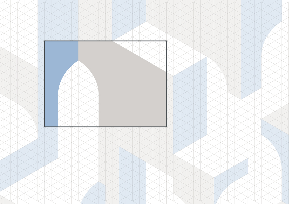


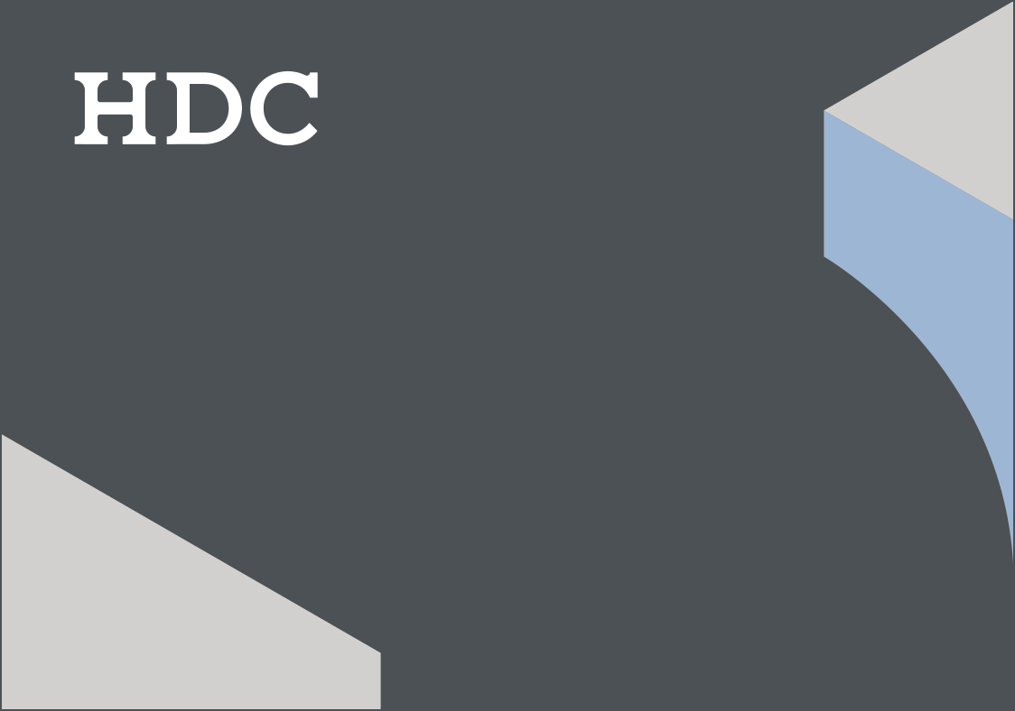


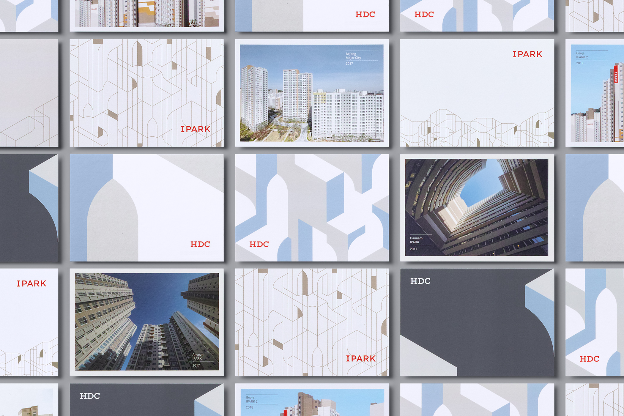


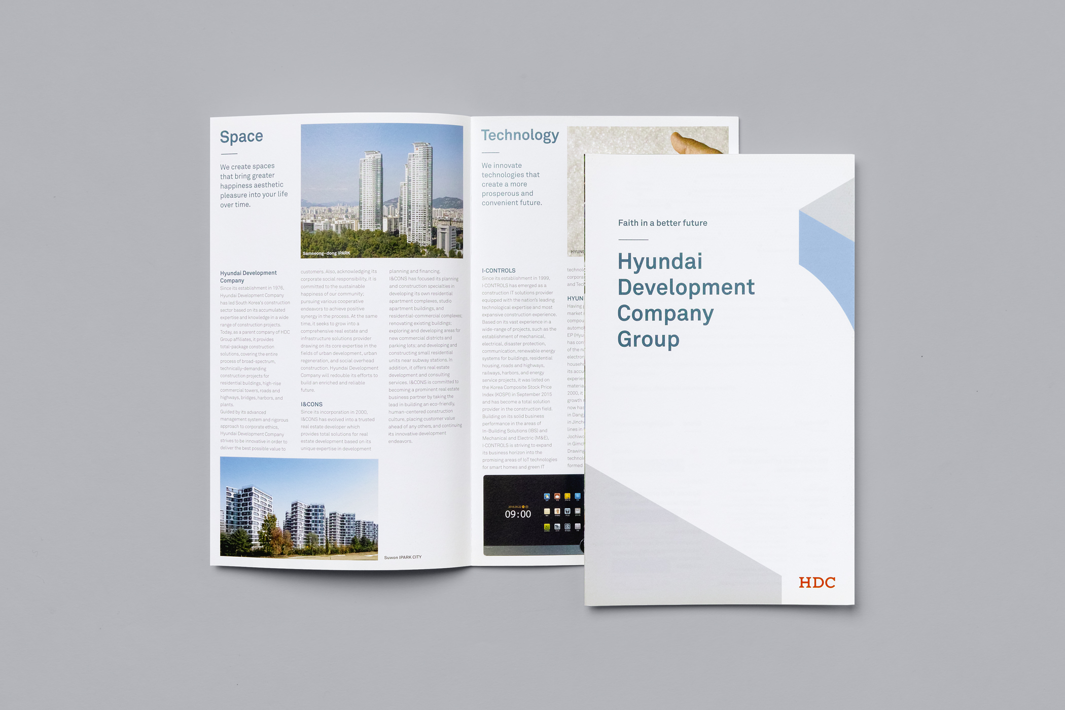


We added a soft skin-colored beige and gray to the existing red color of IPARK to create a wider palette of colors, to give it a warm image of a residential space. On the other hand, we used only one shade of red color for the HDC logo, with a combination of cool blue tones and calm gray colors, to communicate the trustworthy corporate image.
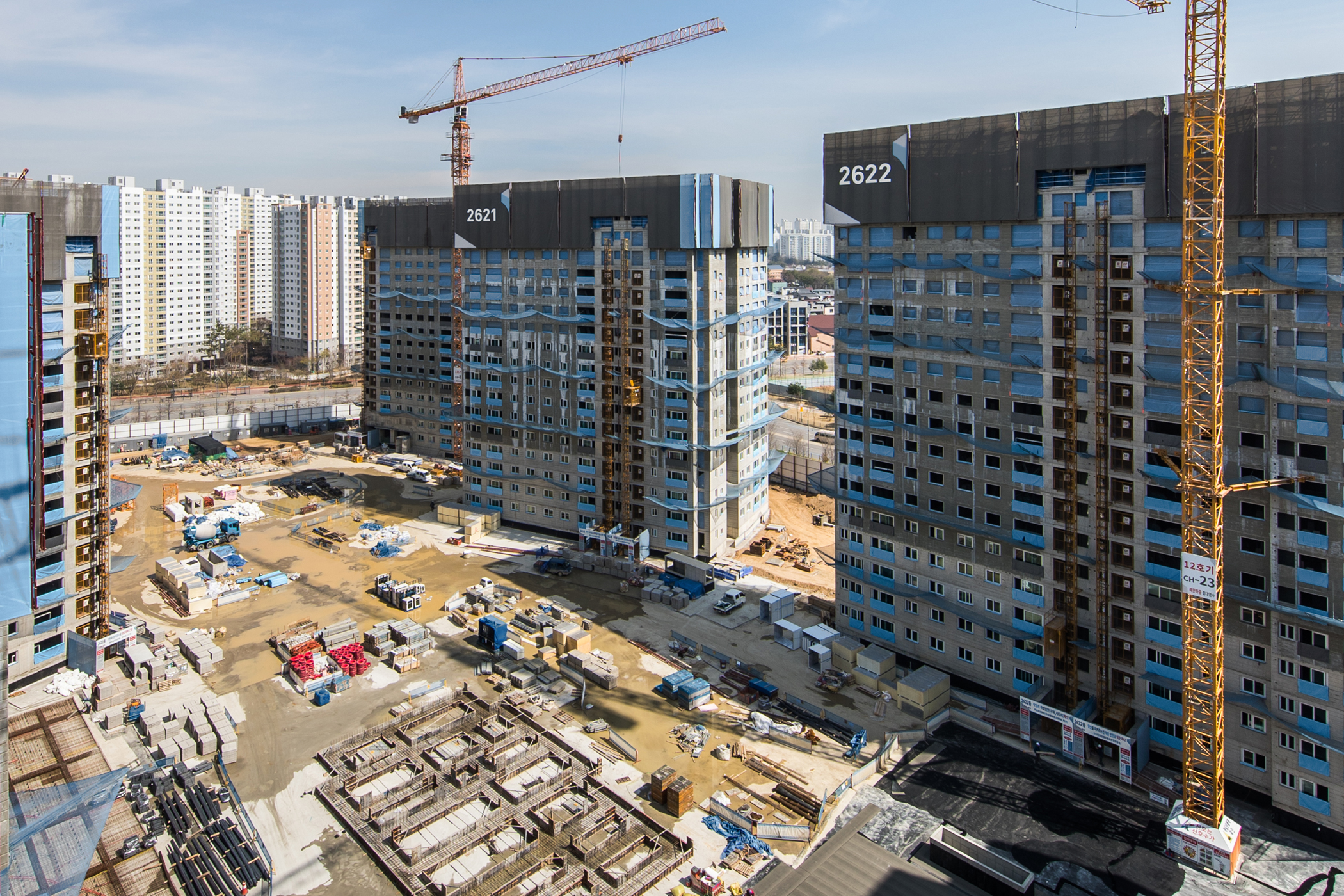
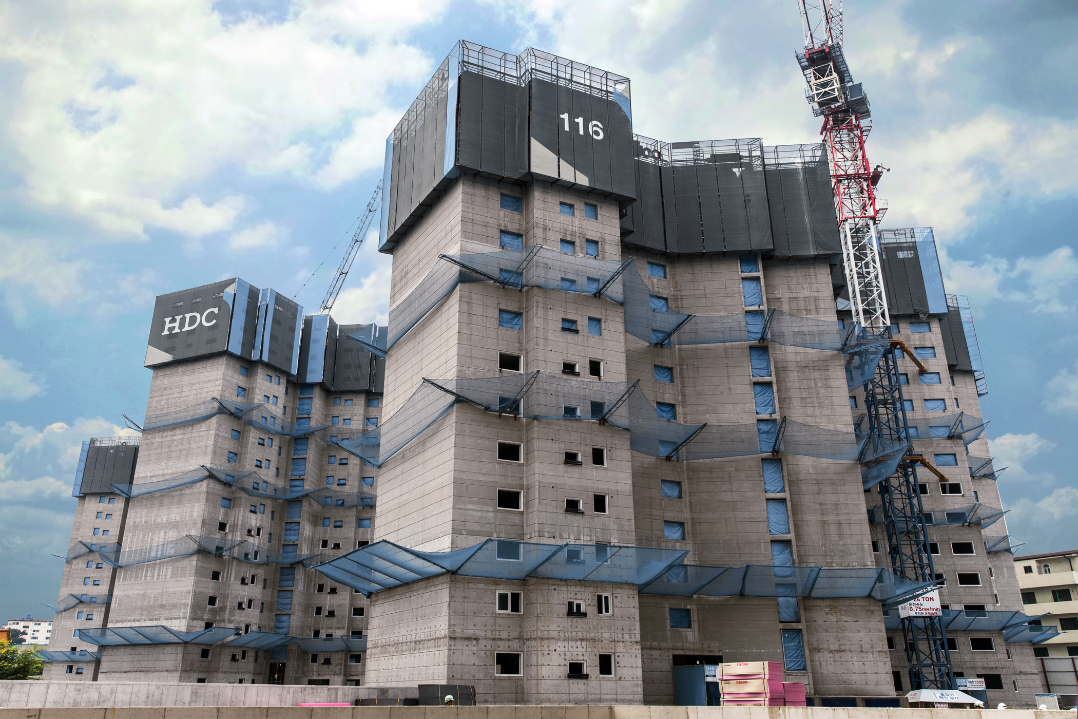
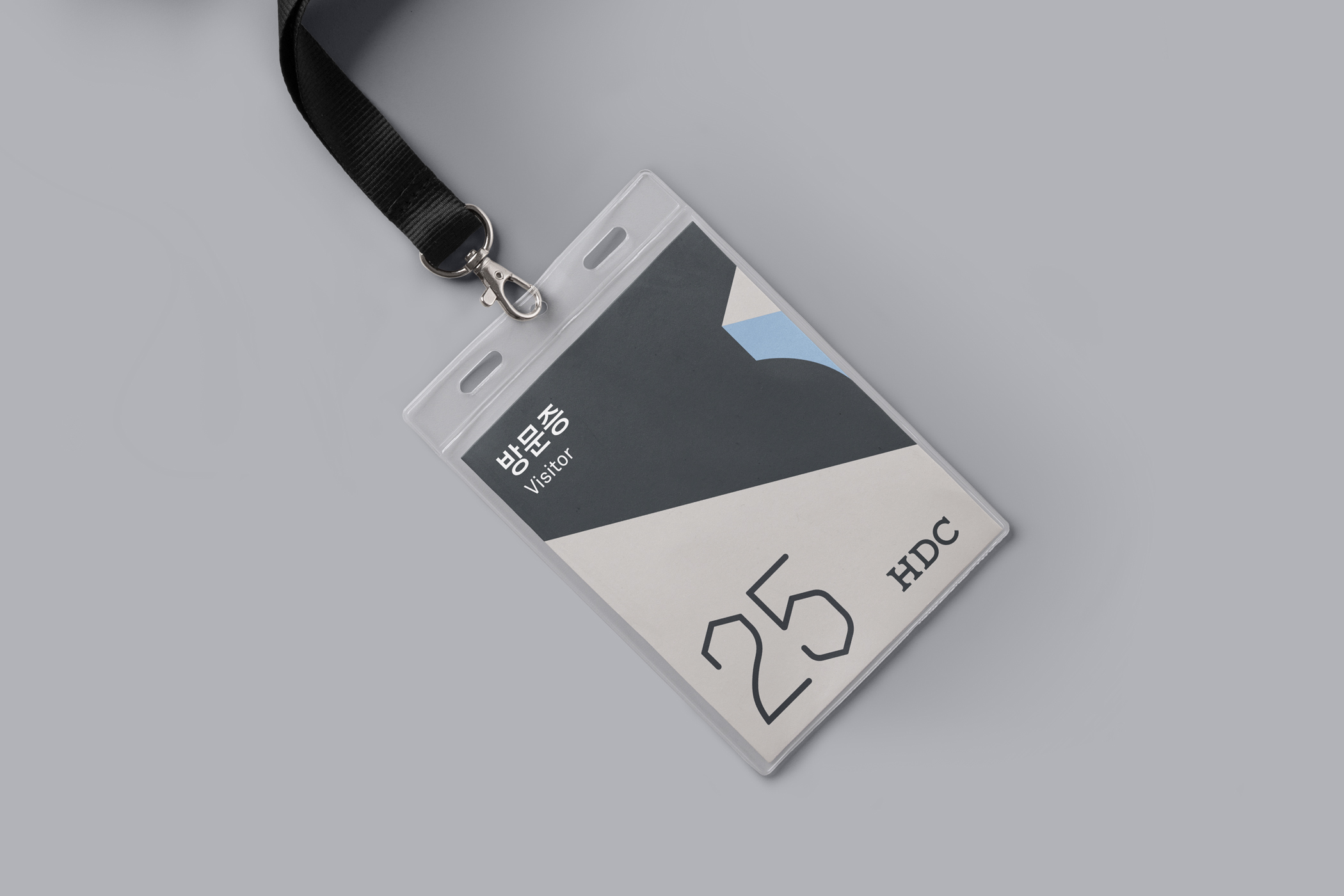
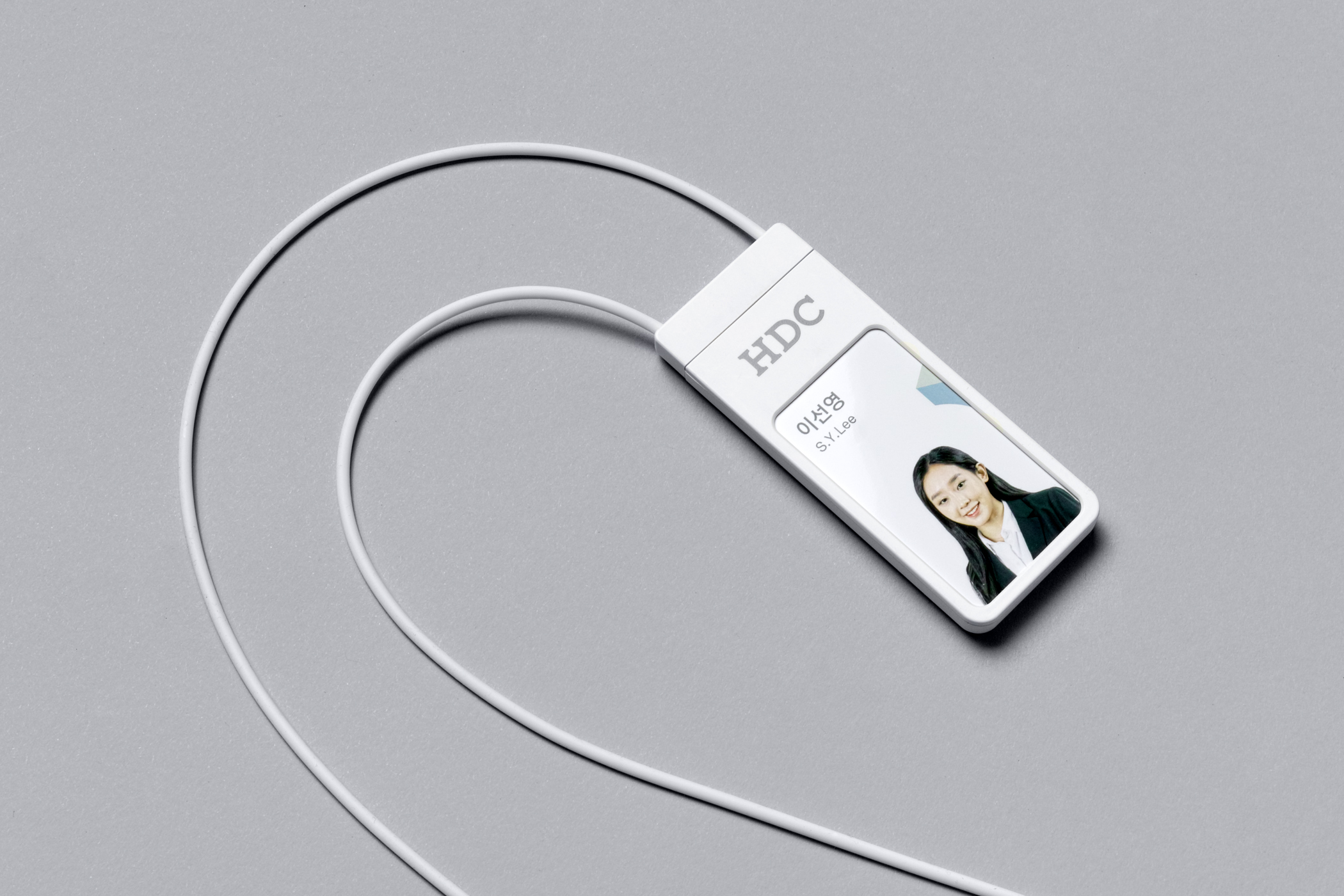
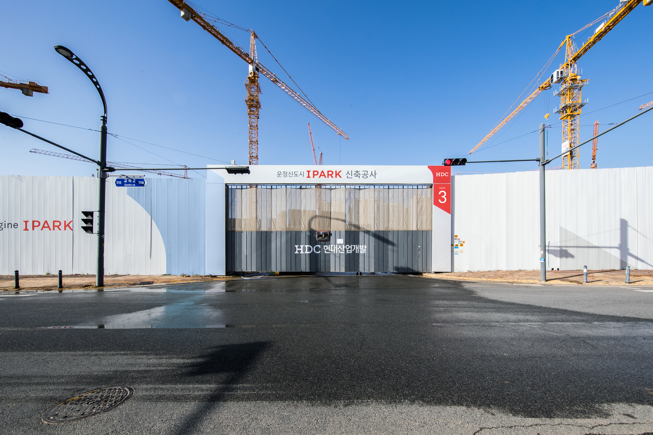
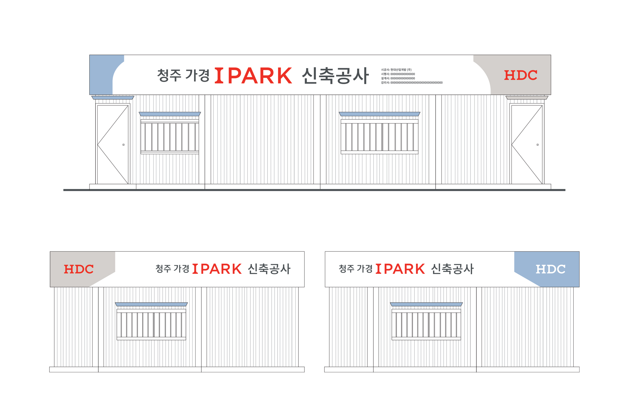
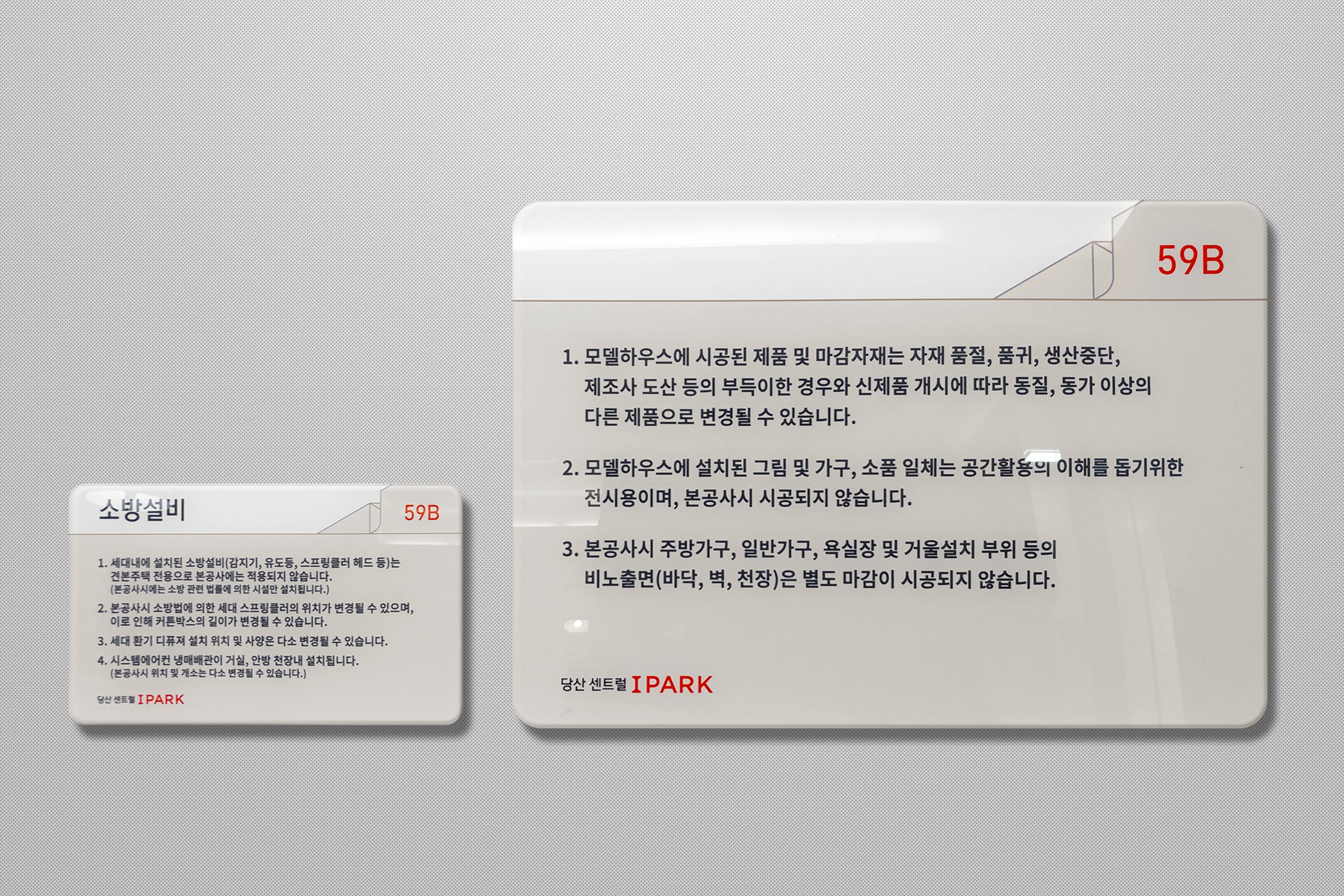
IPARK and HDC share the same starting point and graphic devices, but utilize them in a different way that suits them individually. These graphics were applied to various physical spaces, such as inside and outside of apartment homes, construction sites, model houses, and office spaces.


- Creative direction, strategy: Heesun Kim
- Art direction: Jaemin Lee
- Graphic design: Ahju Kwon, Dawoon Jeon, Dayoung Jeong and Jaemin Lee
- Art direction: Jaemin Lee
- Graphic design: Ahju Kwon, Dawoon Jeon, Dayoung Jeong and Jaemin Lee
- Slogan: BB&TT(Heejung Kim and Hana Kim)
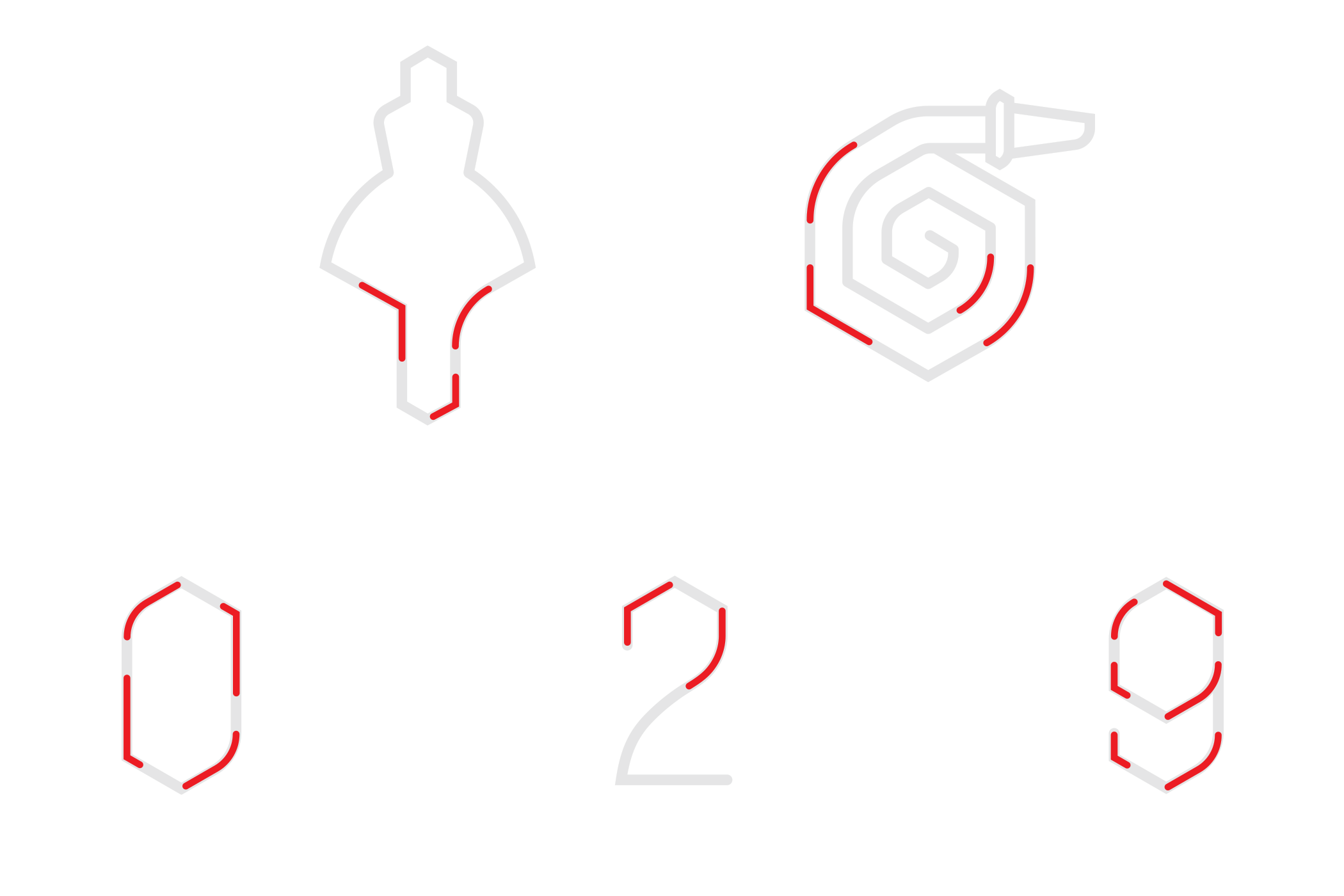
- Illustration (Pictogram): Hyekyung Shin
- Illustration (Pictogram): Hyekyung Shin
© 2023 studio fnt. All rights reserved.