Juno Hair
Juno Hair, Korea’s largest hair salon brand, is entering a phase of active global expansion and needed to redefine its brand awareness and positioning. Studio fnt redesigned the visual system from the ground up—from the logo and typography to the colour palette and graphic motifs—building an integrated identity that works consistently across a wide range of touchpoints.
The new design language begins with the core of the service experience: the rich, layered texture of hair and the directional flow shaped by the stylist’s hands. At the same time, it brings together Juno Hair’s commitment to “endless innovation” through education at Juno Academy, the strengthening of professional expertise, and ongoing collaborations with partners in and outside Korea. A gently flowing curve that also suggests a concentrated inner energy becomes the key graphic motif, structured so it can be extended and varied across different media and formats.
The wordmark was designed to move away from the familiar beauty-industry formula of looking simply “pretty” and “luxurious.” It is built on a declarative, robust sans serif, while details such as the mirrored relationship between J and r and the curved junction of u and n introduce a sense of flexibility and refinement. Together, these elements create a durable framework that can sustain the brand’s character and momentum over time.
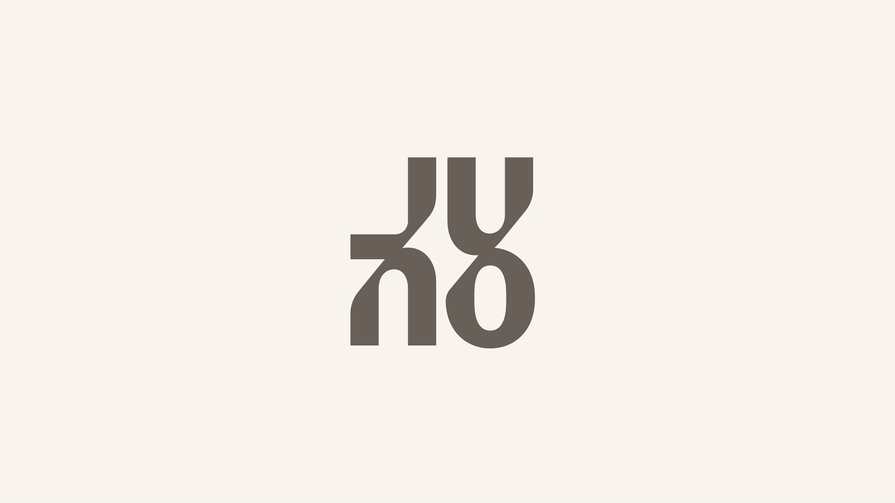
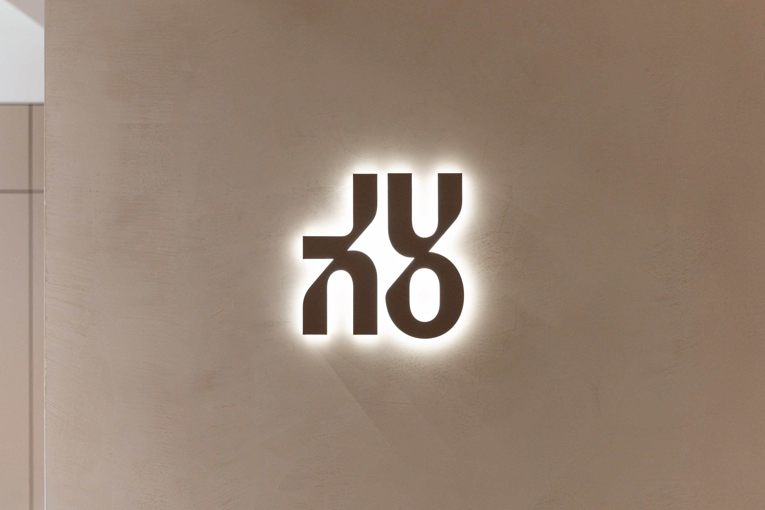
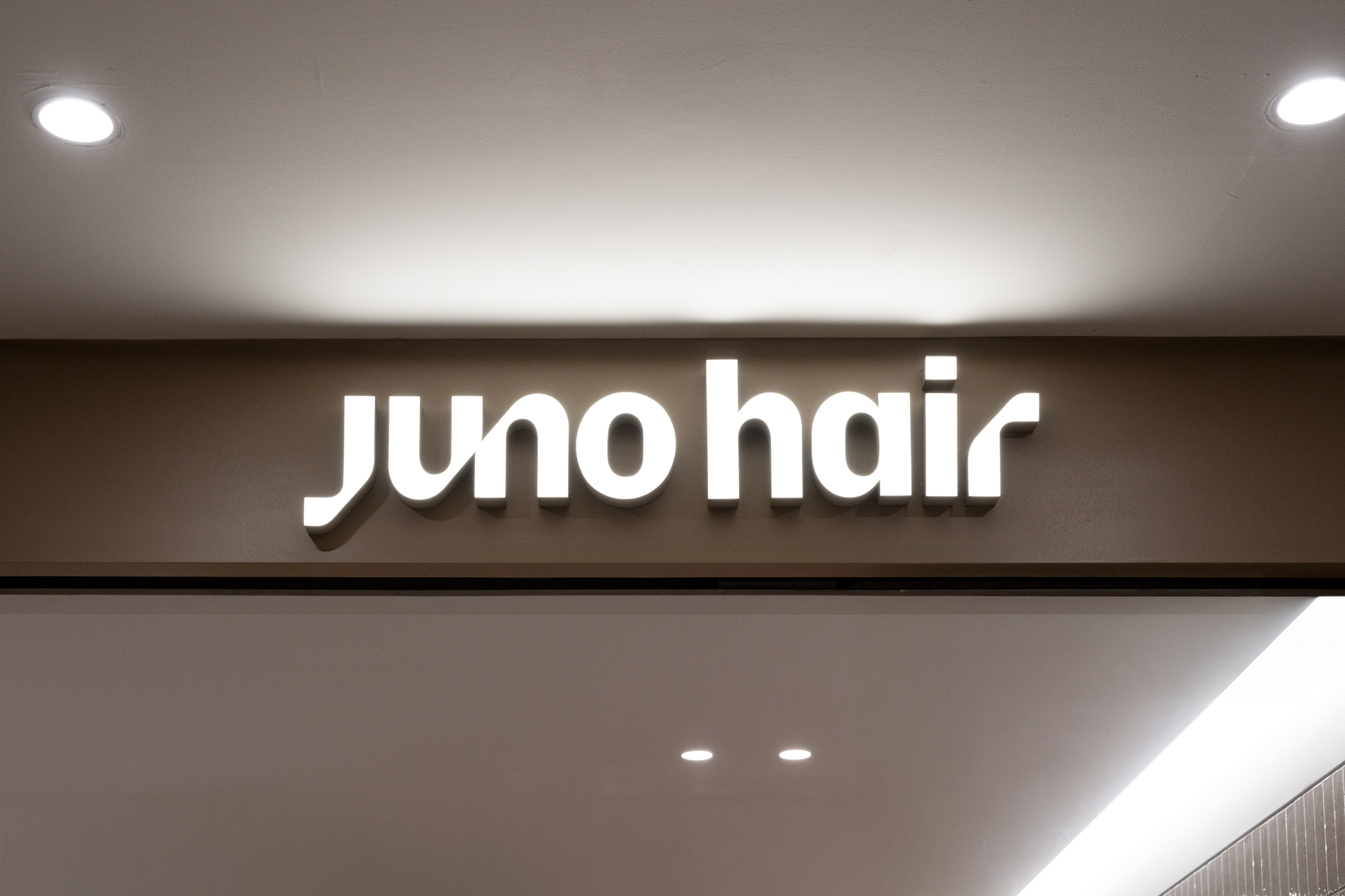
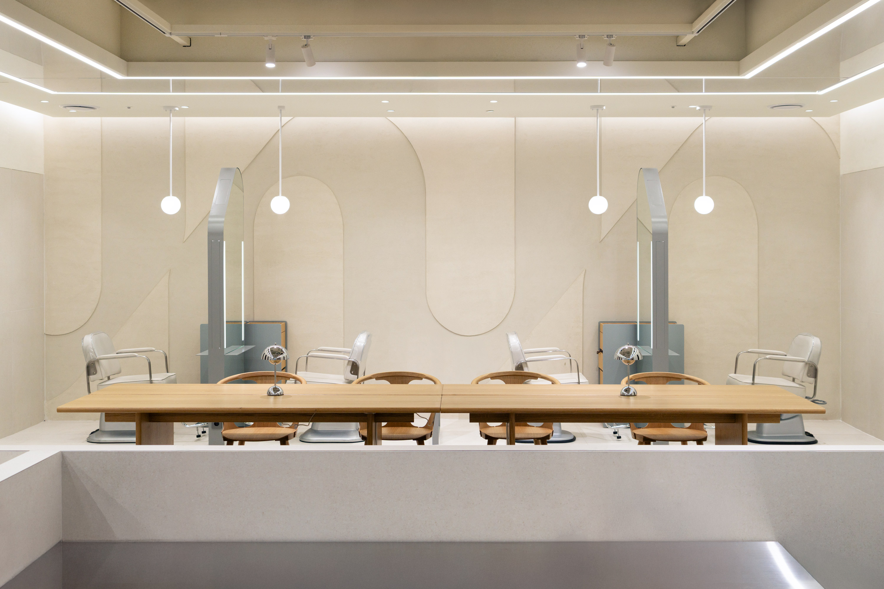
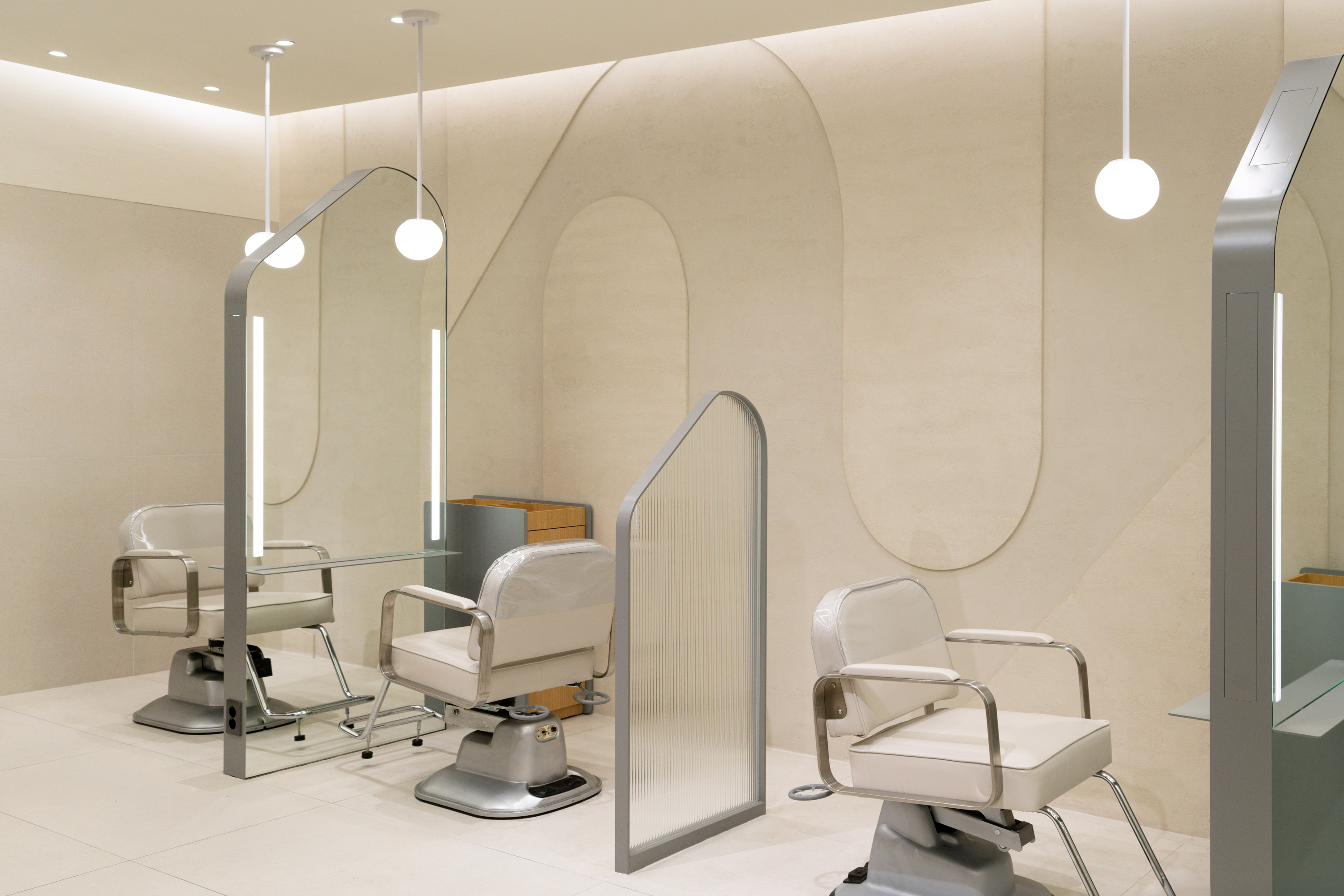
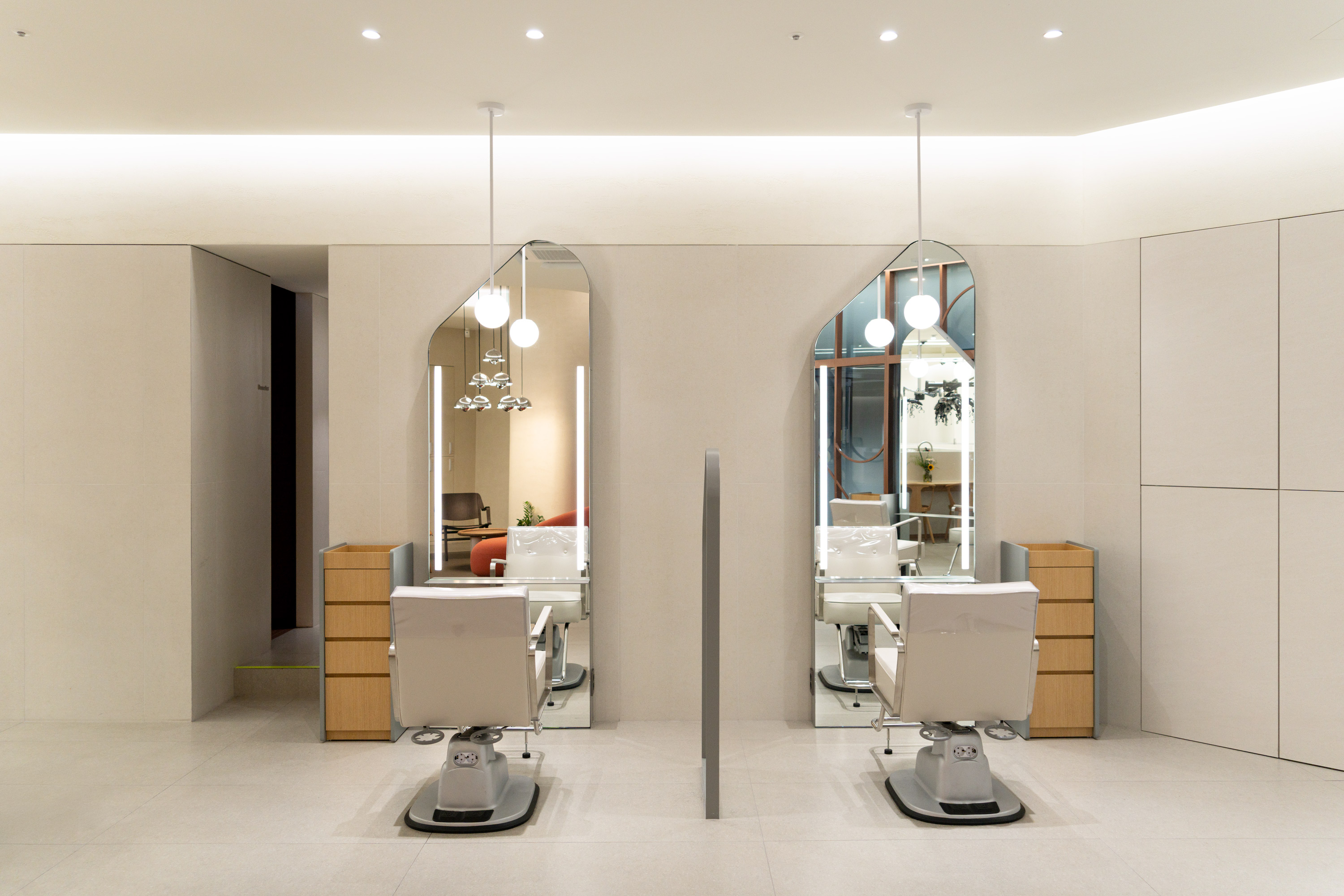
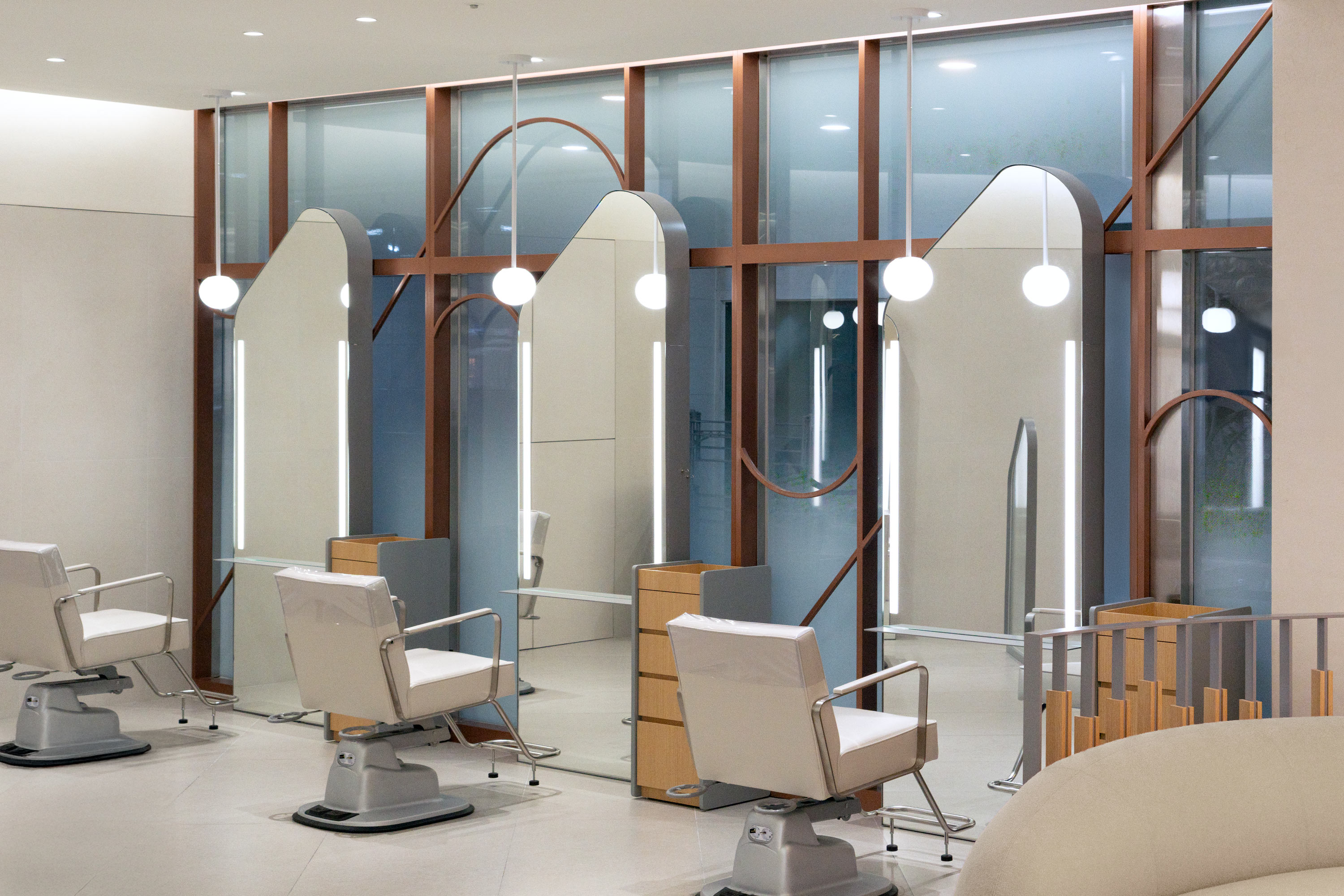
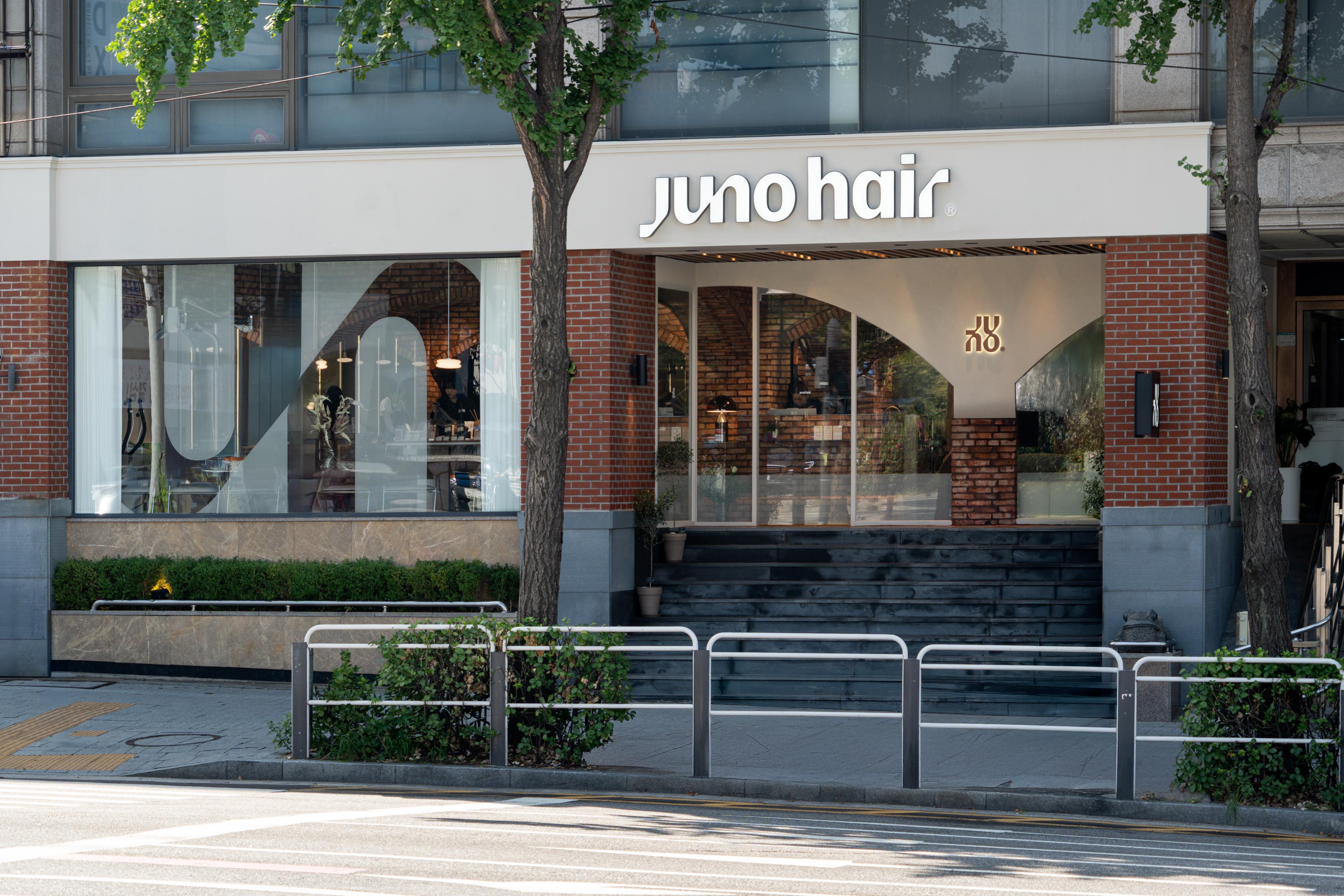
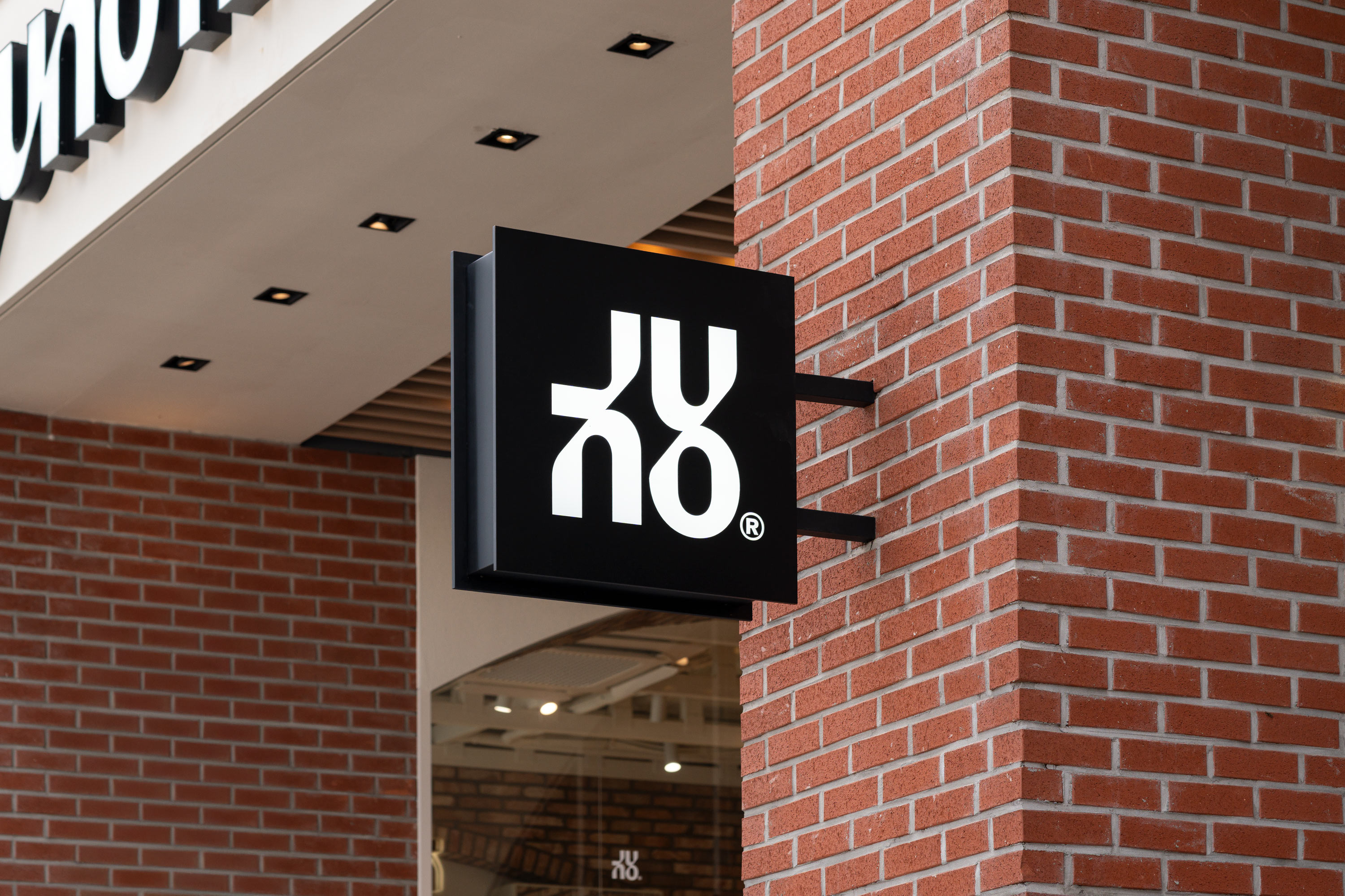
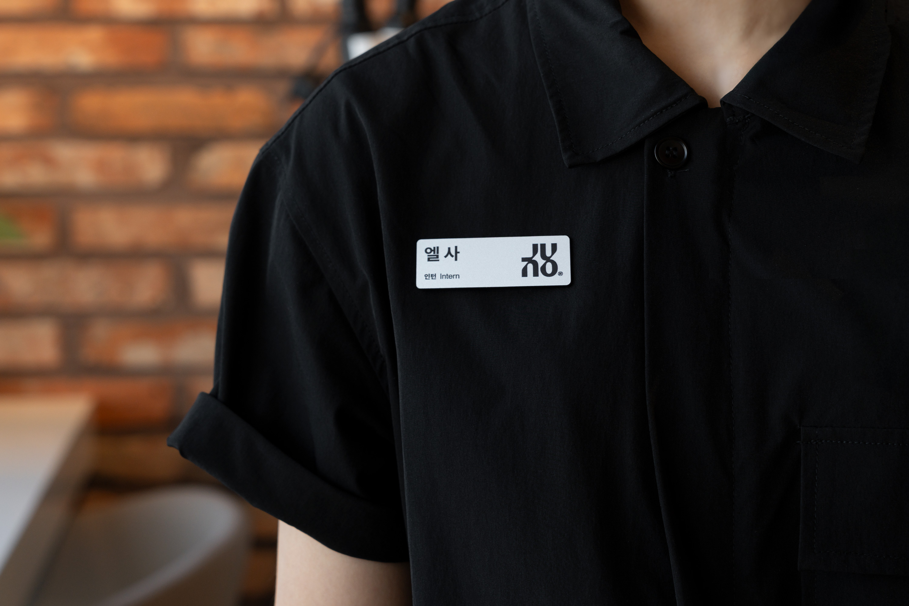
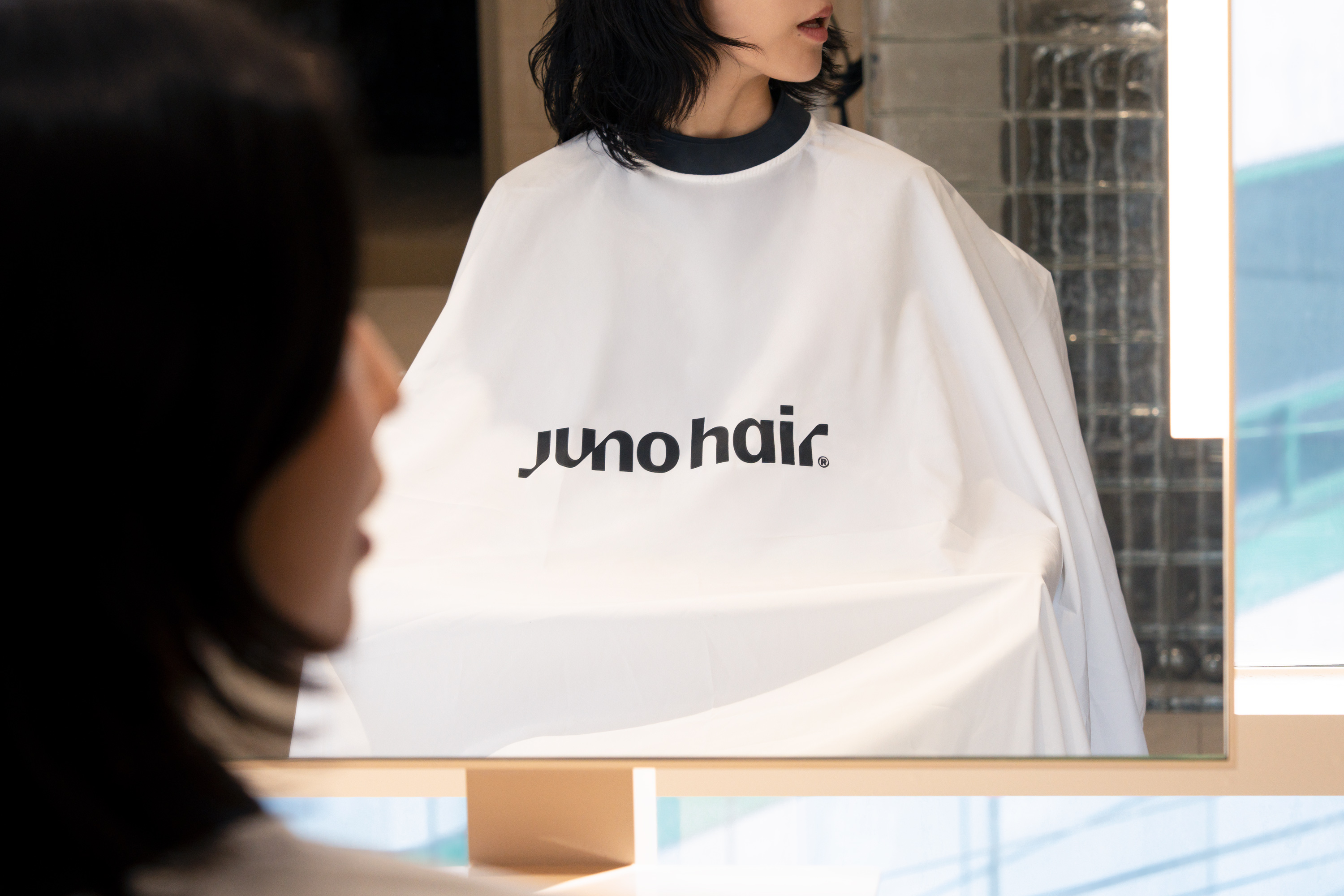
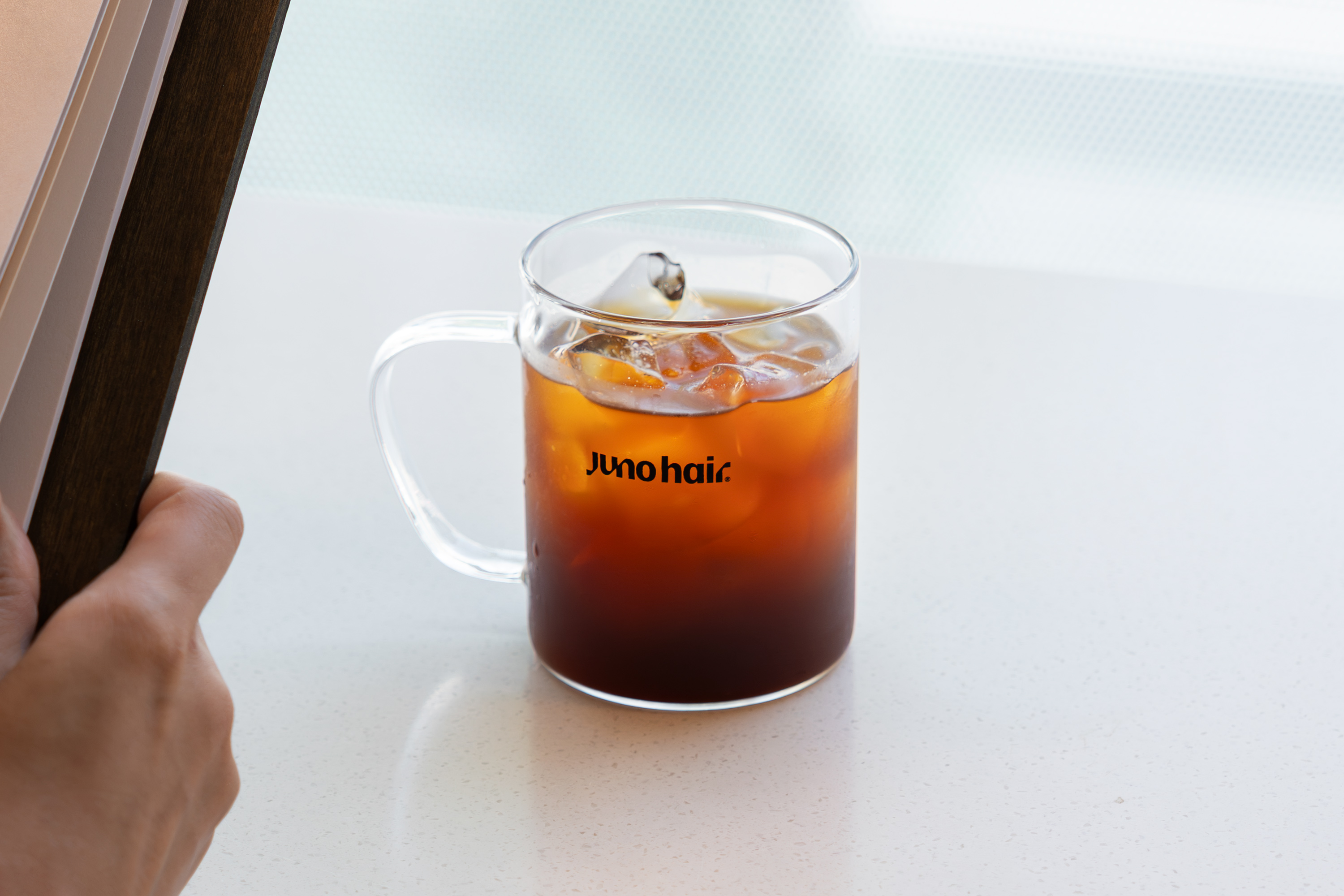
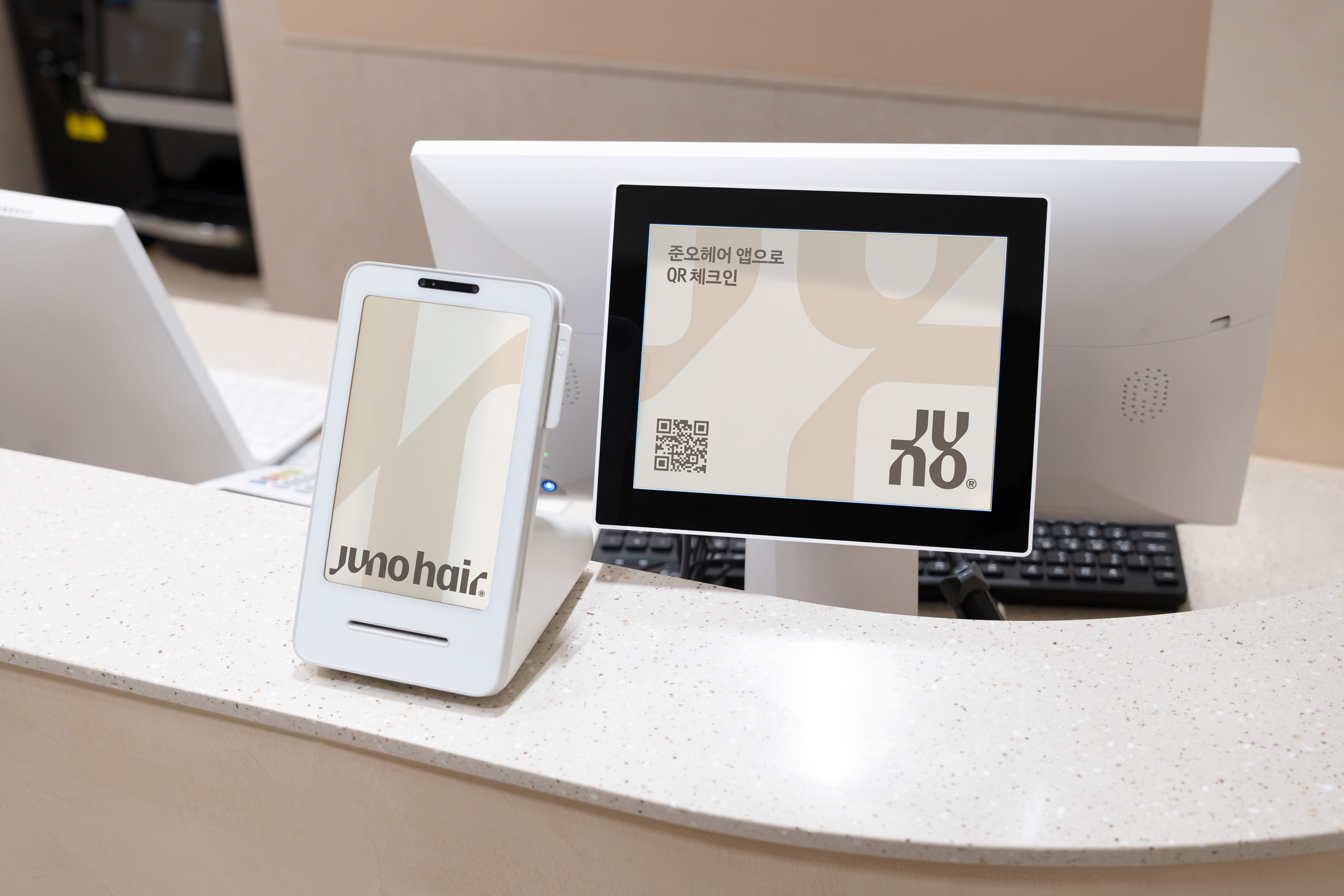
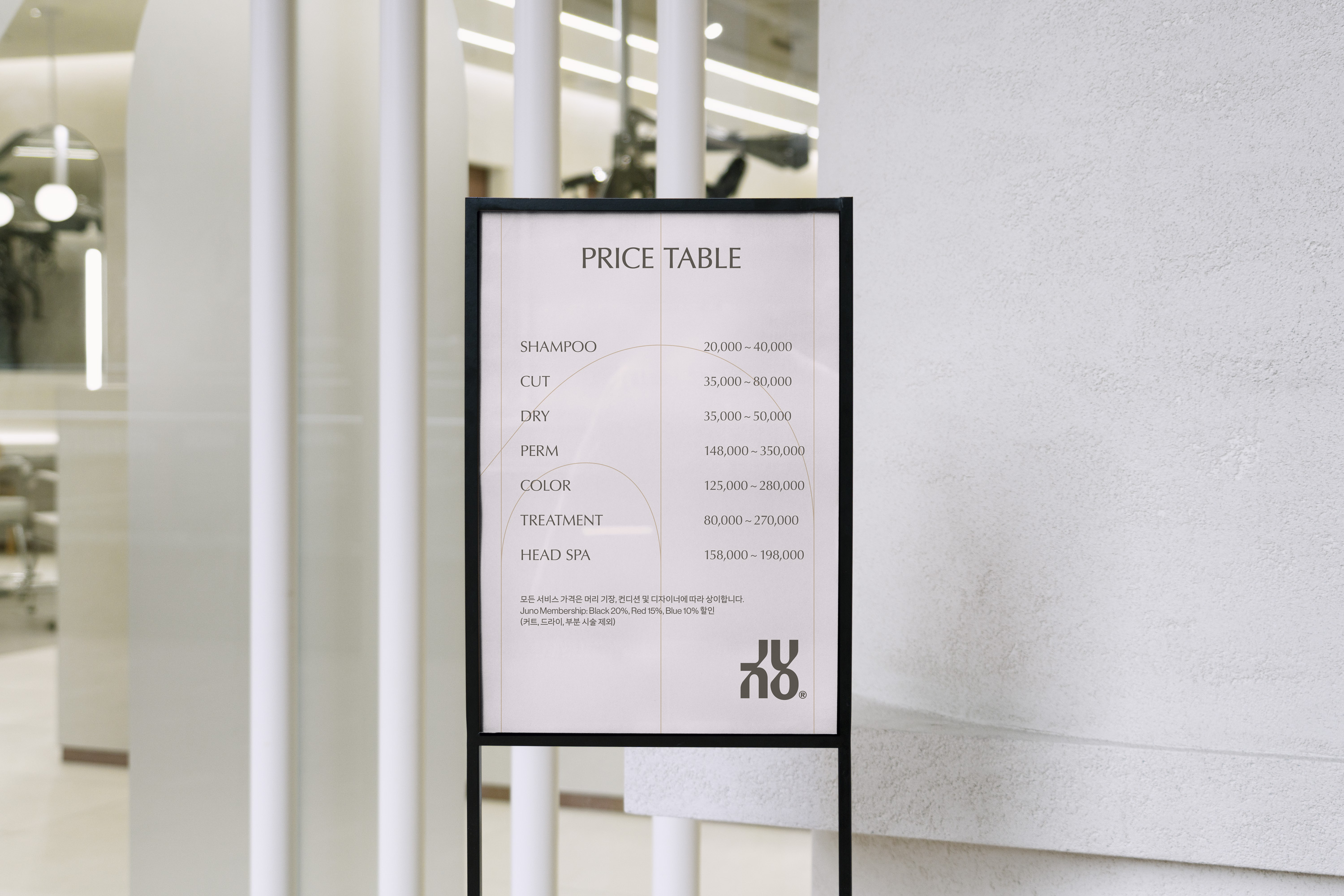
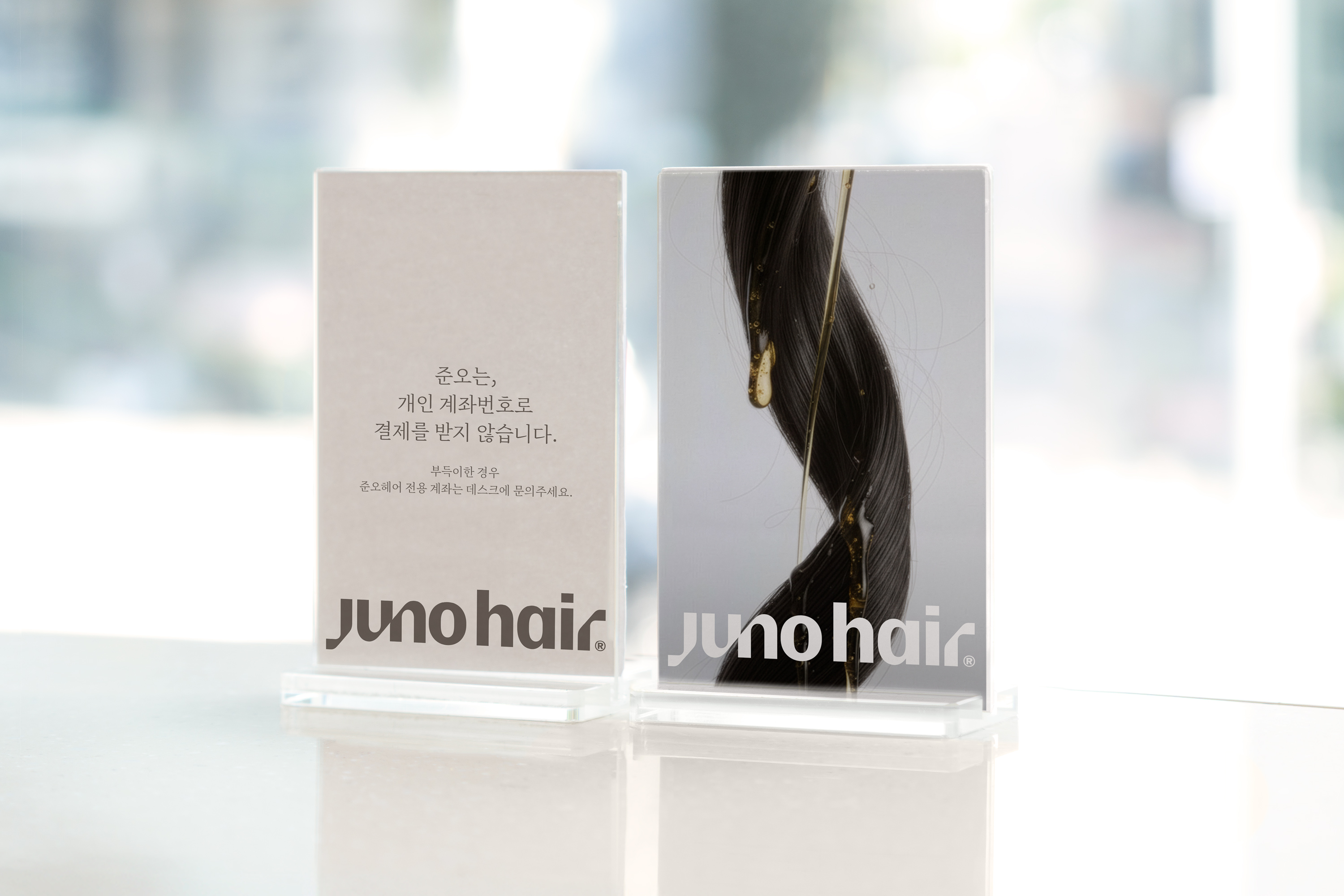
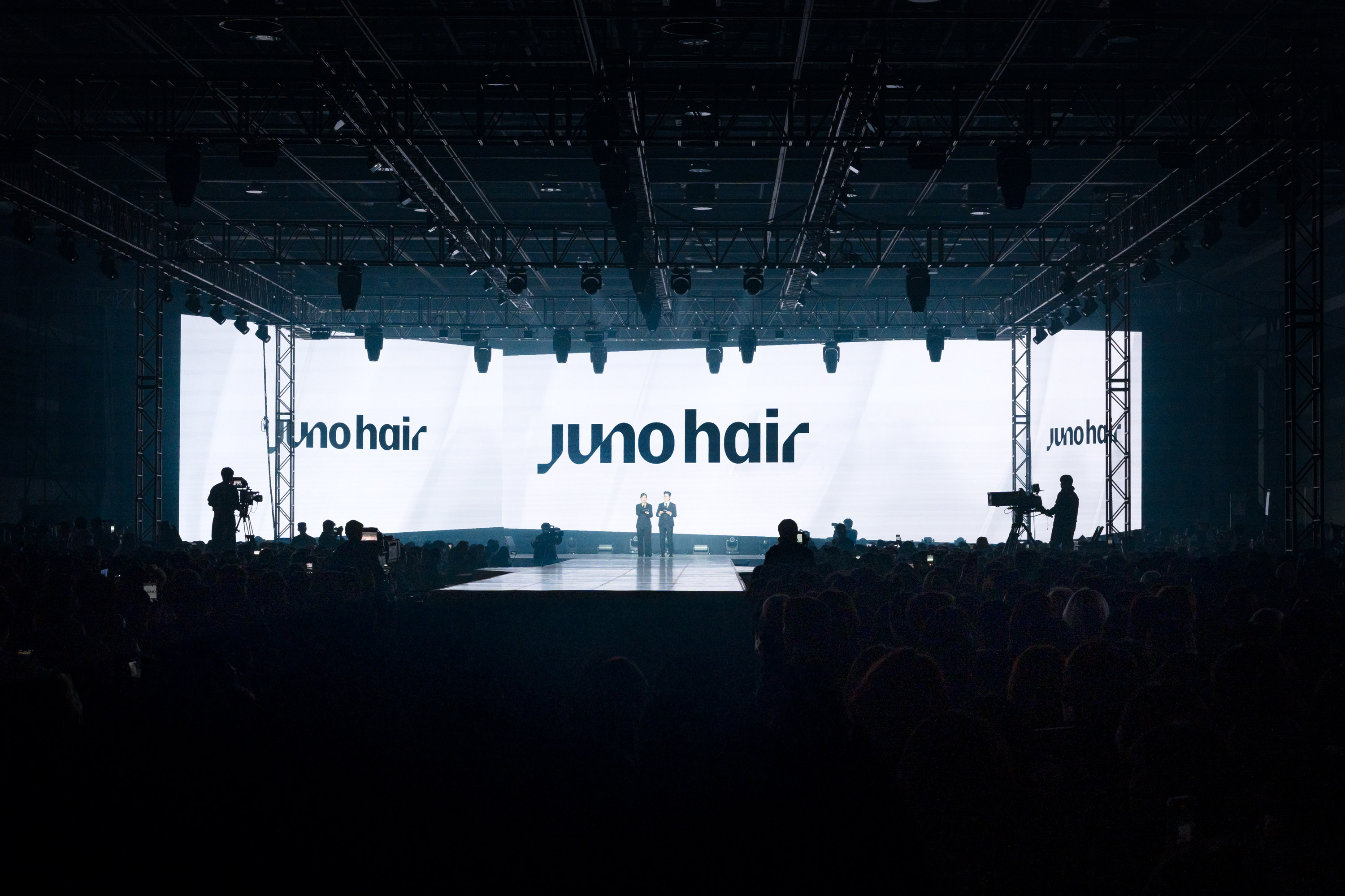
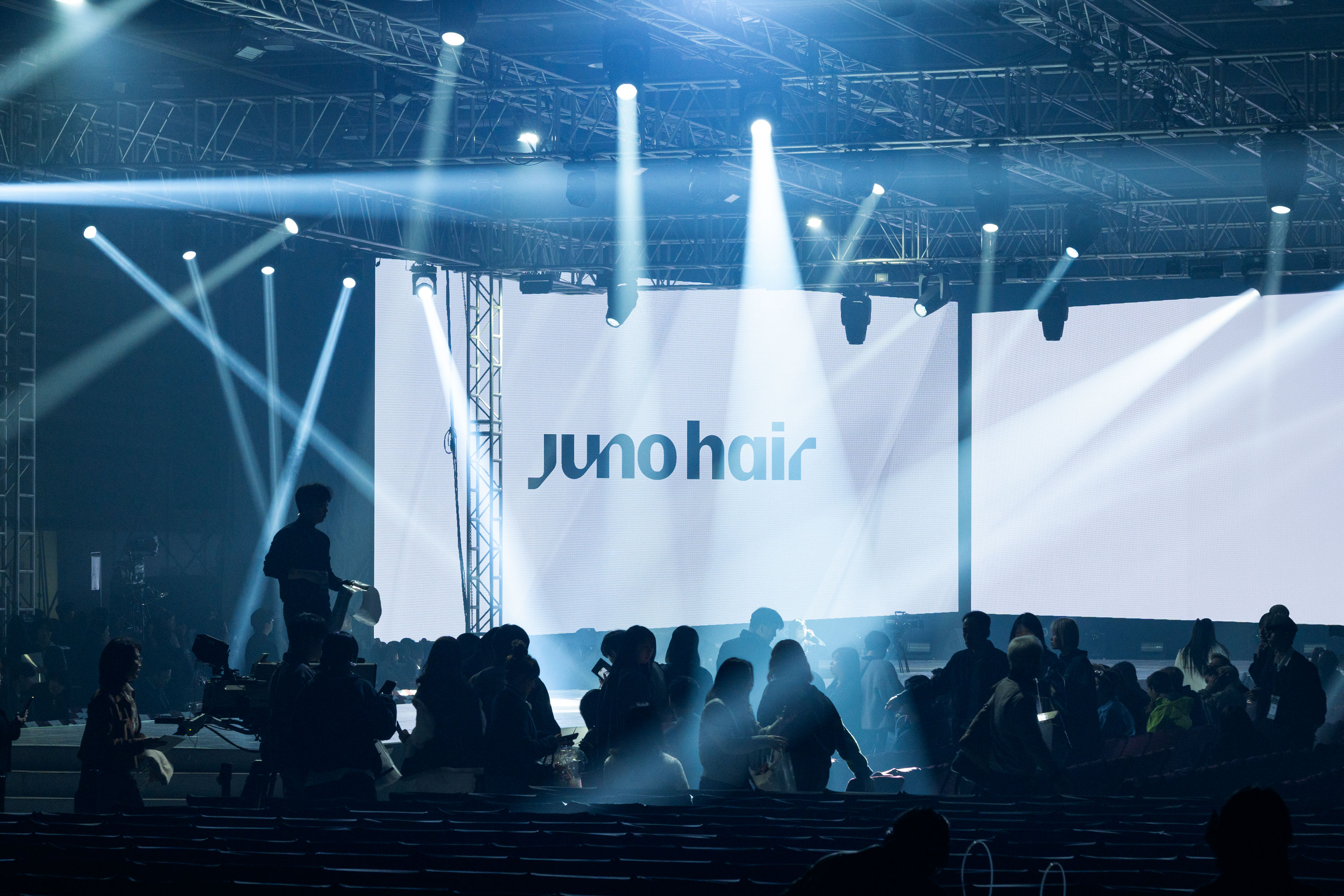
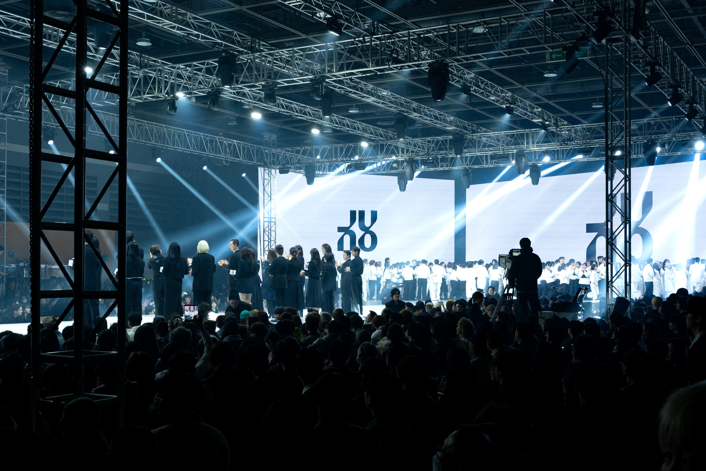

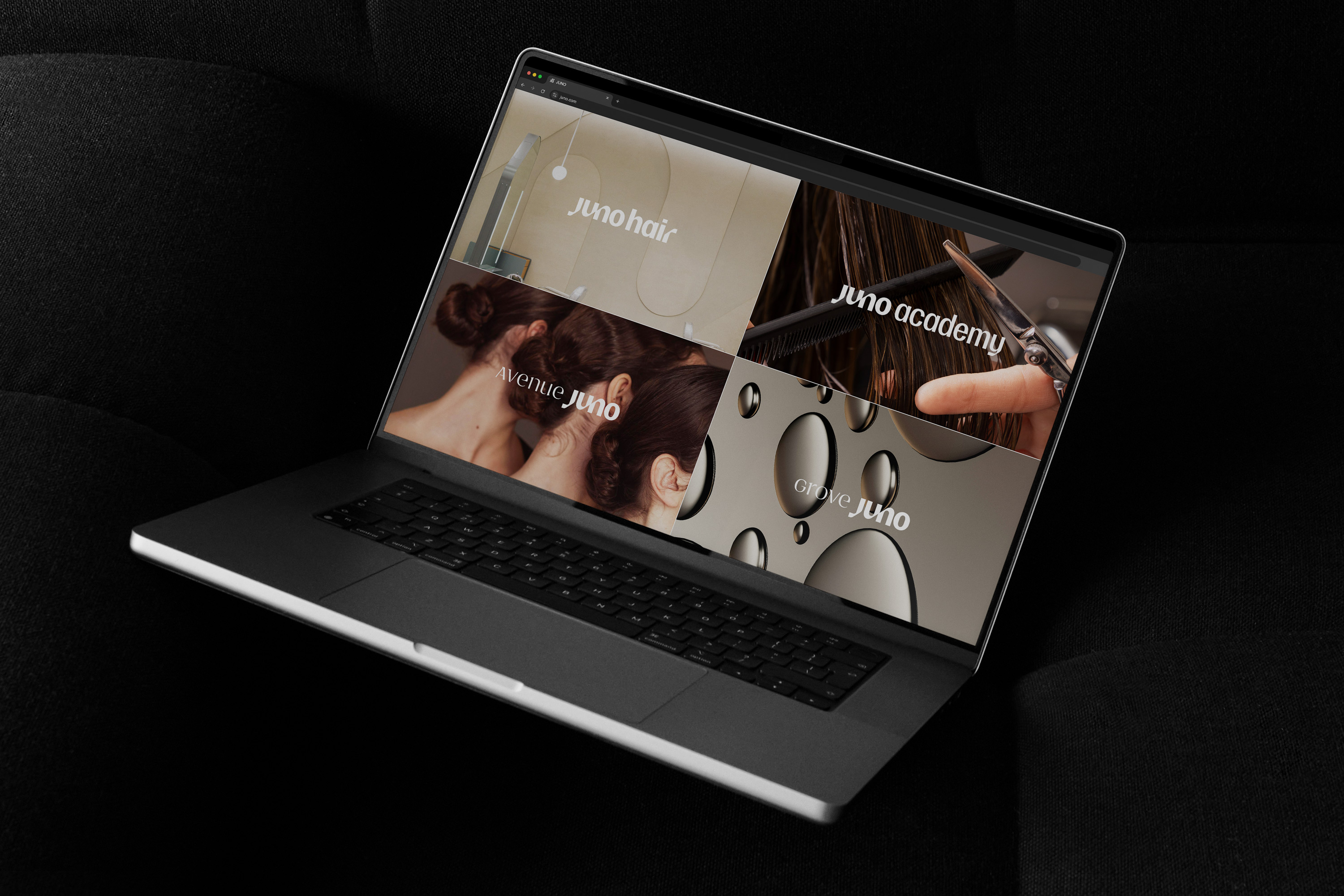
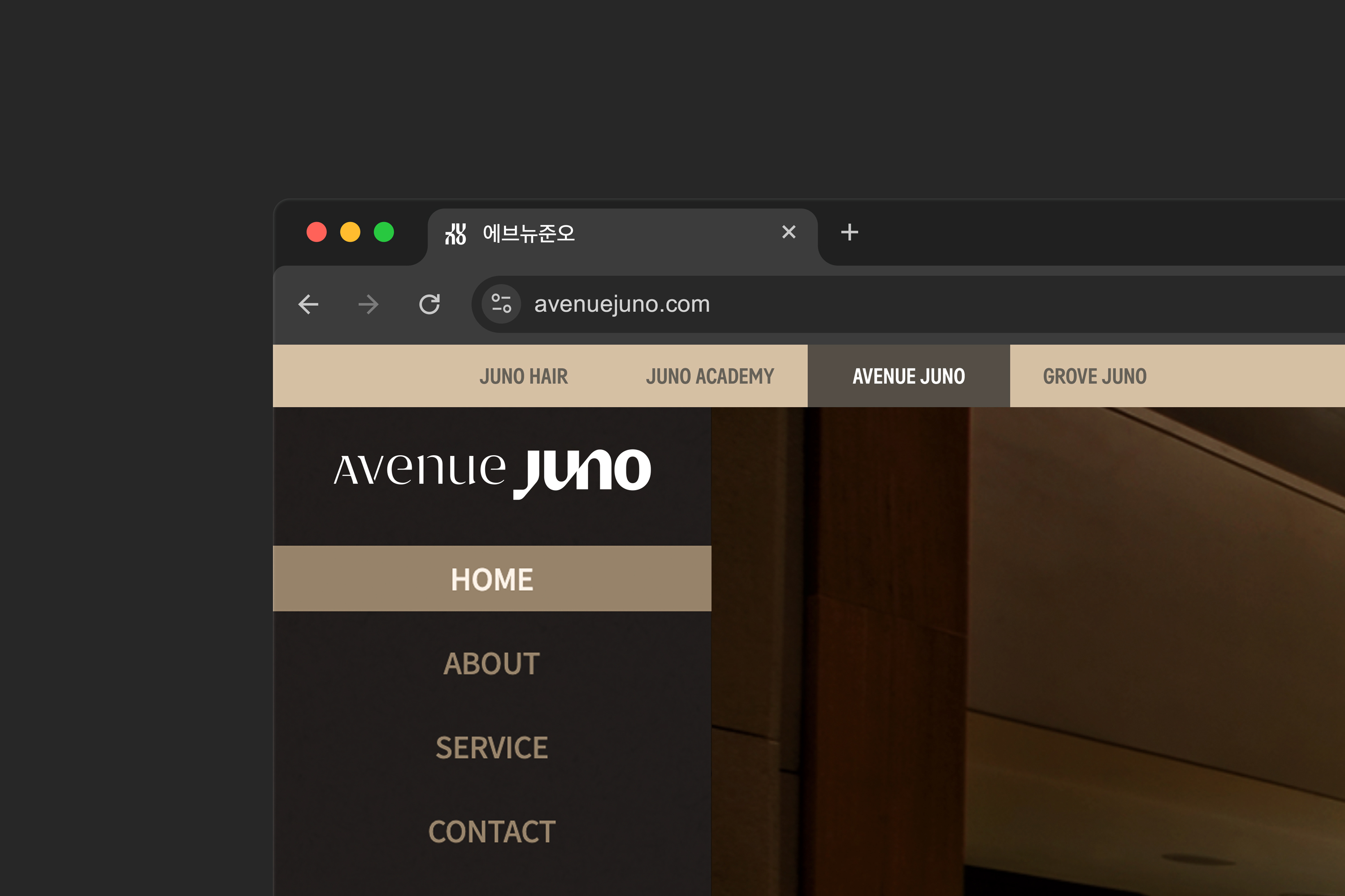
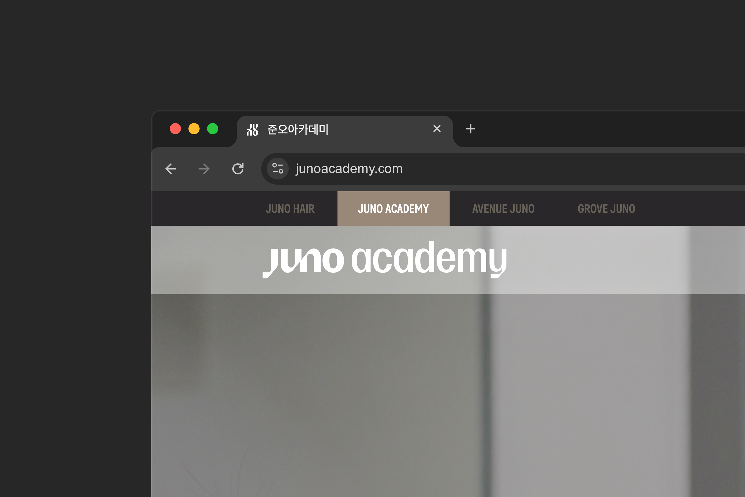
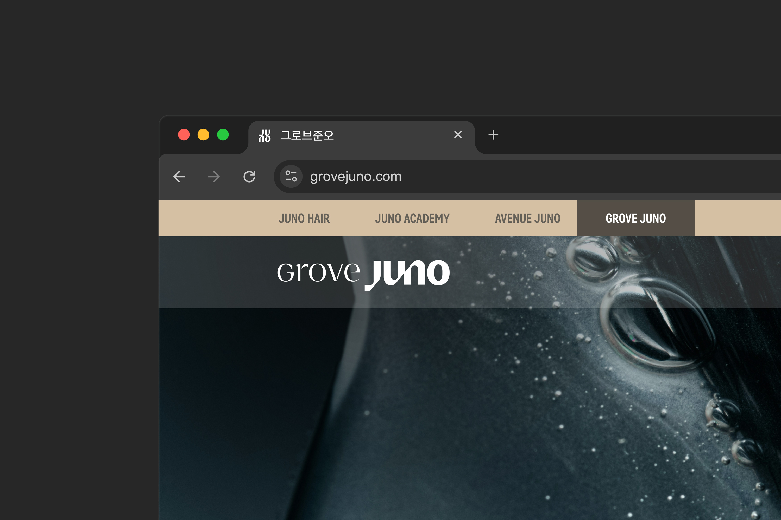
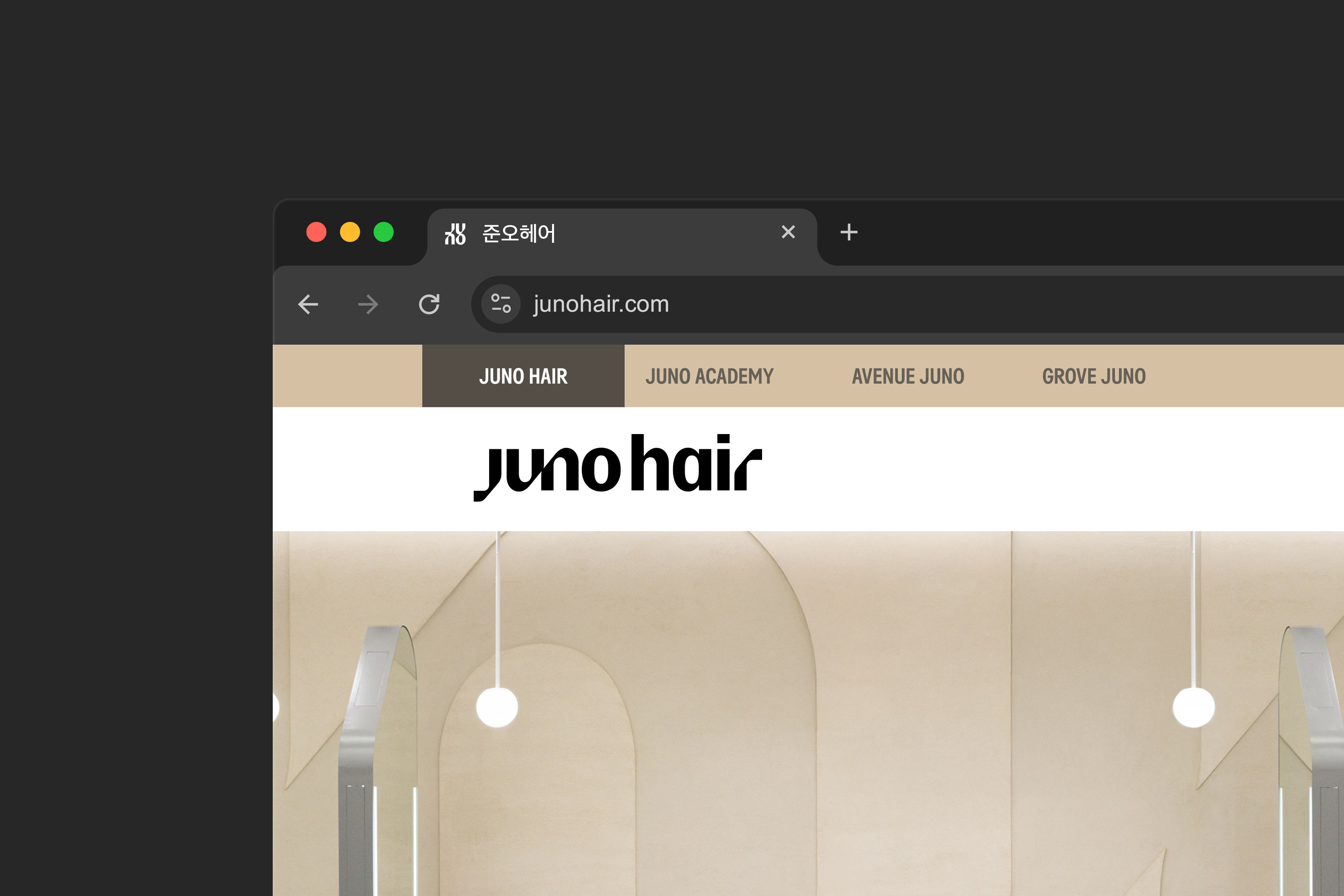
Photo: Sujeong Park and Jaemin Lee, courtesy of studio fnt
- Creative direction: Heesun Kim
- Art direction: Jaemin Lee
- Design lead: Younghyun Song
- Design: Seoyoung Jang and Jaemin Lee
- Motion design: Sojeong Park
- Art direction: Jaemin Lee
- Design lead: Younghyun Song
- Design: Seoyoung Jang and Jaemin Lee
- Motion design: Sojeong Park
- Client: Juno Hair
- Year: September 2025
- Year: September 2025
© 2023 studio fnt. All rights reserved.