Ki-One Whisky
Ki-One is Korea’s first and foremost single malt whisky, representing the nation on a global stage. Born from a collaborative intersection of three cultures—a Korean-American founder, a Scottish master distiller, and Korean staff—the whisky has introduced three signature lines: ‘Tiger,’ ‘Eagle,’ and ‘Unicorn,’ with studio fnt spearheading its new branding and package design.
At the core of the new design lies a cultural fusion between tradition and modernity, and between Scotland and Korea. The Korean emblem is crafted intentionally to command presence in bars across diverse cultures. The logo’s vertical orientation—possible in Korean, Chinese, and Japanese writing systems—is inspired by the organic form of malt, whisky’s essential ingredient. It visually embodies the dual meanings behind the brand name ‘Ki-One’: ‘Origin (起源)’ and ‘Wish (祈願),’ capturing powerful imagery of roots deeply embedded and branches growing upward. Additionally, the auxiliary English labels ‘Ki’ and ‘One’ flank the Korean logo to ensure accurate pronunciation internationally and clearly communicate the brand name.
At the core of the new design lies a cultural fusion between tradition and modernity, and between Scotland and Korea. The Korean emblem is crafted intentionally to command presence in bars across diverse cultures. The logo’s vertical orientation—possible in Korean, Chinese, and Japanese writing systems—is inspired by the organic form of malt, whisky’s essential ingredient. It visually embodies the dual meanings behind the brand name ‘Ki-One’: ‘Origin (起源)’ and ‘Wish (祈願),’ capturing powerful imagery of roots deeply embedded and branches growing upward. Additionally, the auxiliary English labels ‘Ki’ and ‘One’ flank the Korean logo to ensure accurate pronunciation internationally and clearly communicate the brand name.
Ki-One Whisky’s distinctiveness arises from Korea’s extreme and unique climate conditions. The dramatic seasonal contrasts between humid, hot summers and dry, cold winters accelerate maturation, imparting a deeper, more complex flavor profile that surpasses traditional Scotch whisky in potential. Ki-One symbolically conveys Korea’s unique aging environment, shaped by nature and time, using sun, moon, and star motifs inspired by the traditional Korean tri-colored swirl, called “samtaegeuk (三太極),” symbolizing the harmony of heaven, earth, and humanity.
The bottle design also emphasizes artisanal craftsmanship through a contemporary reinterpretation of traditional still shapes. The three signature lines—Yellow, Pink, and Celadon—draw from Korea’s distinctive colors. Labels printed on textured Korean hanji paper introduce a freshness rarely seen in the existing whisky market. Ki-One aspires beyond being merely a Korean single malt whisky, striving to establish a unique whisky culture characterized by distinct charm and confidence.
The bottle design also emphasizes artisanal craftsmanship through a contemporary reinterpretation of traditional still shapes. The three signature lines—Yellow, Pink, and Celadon—draw from Korea’s distinctive colors. Labels printed on textured Korean hanji paper introduce a freshness rarely seen in the existing whisky market. Ki-One aspires beyond being merely a Korean single malt whisky, striving to establish a unique whisky culture characterized by distinct charm and confidence.


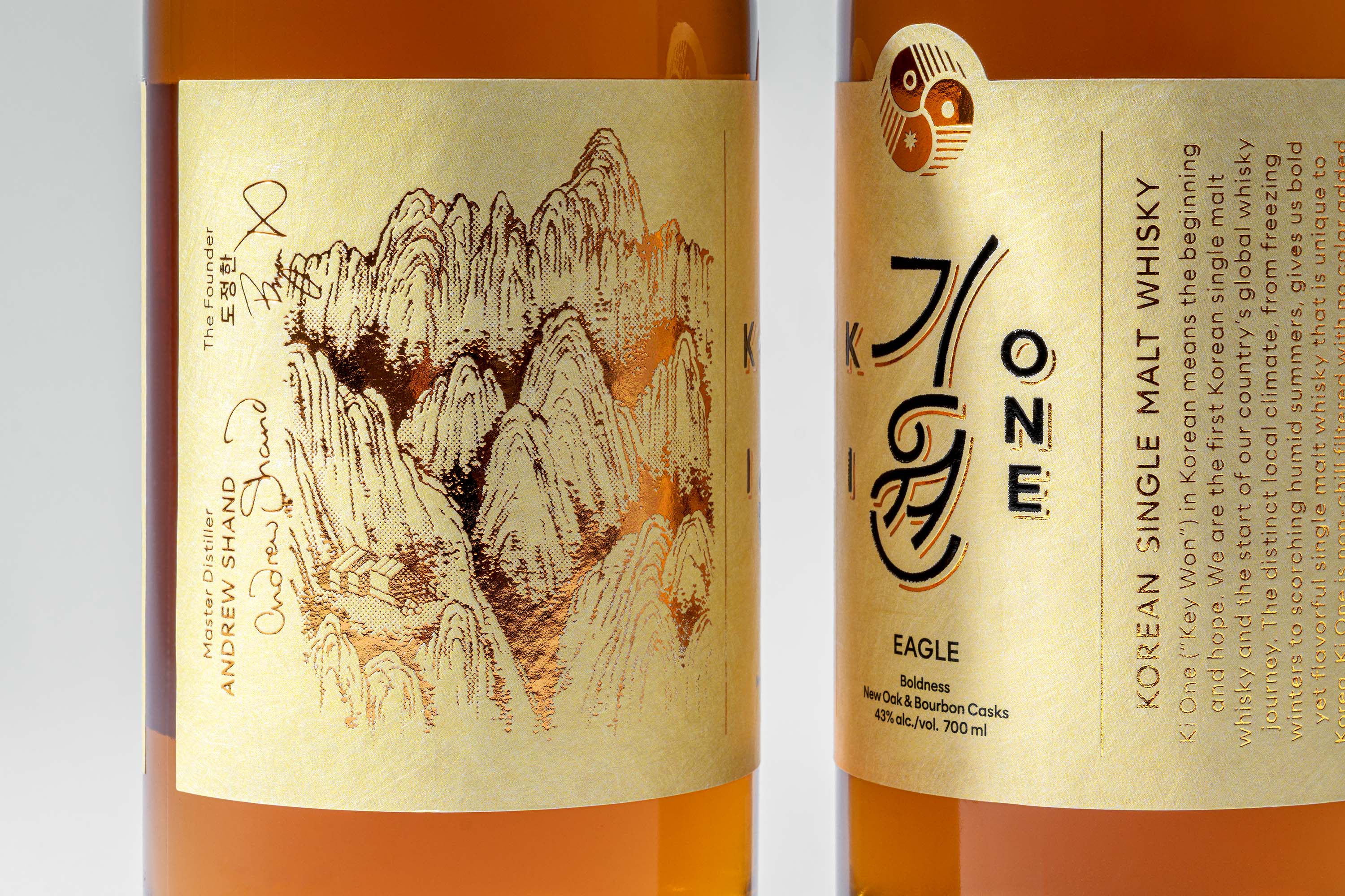
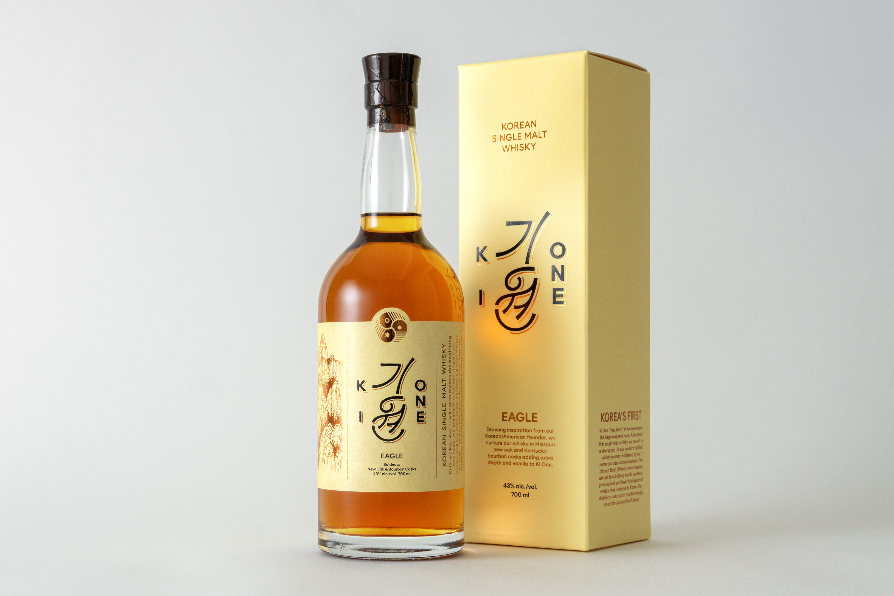

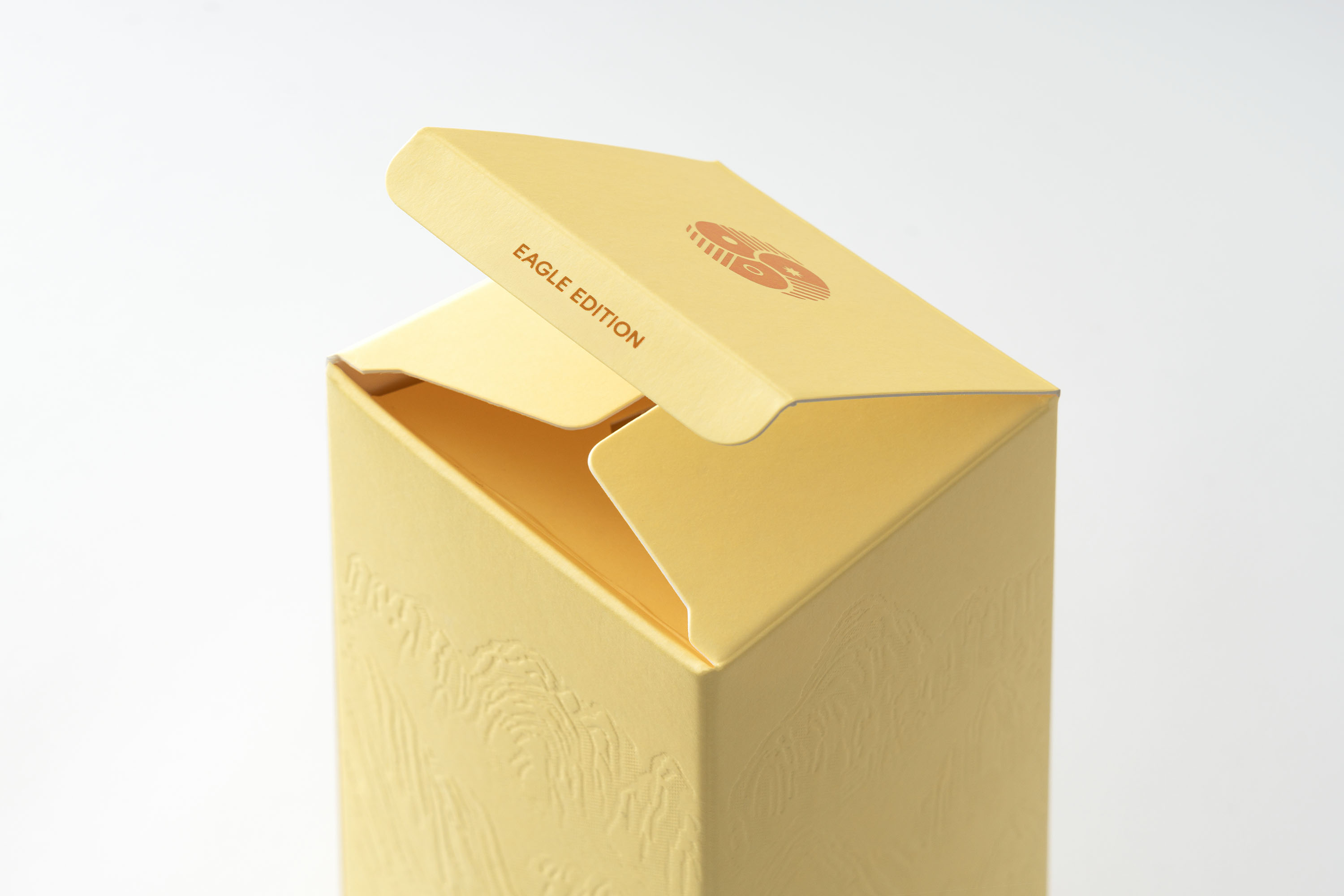
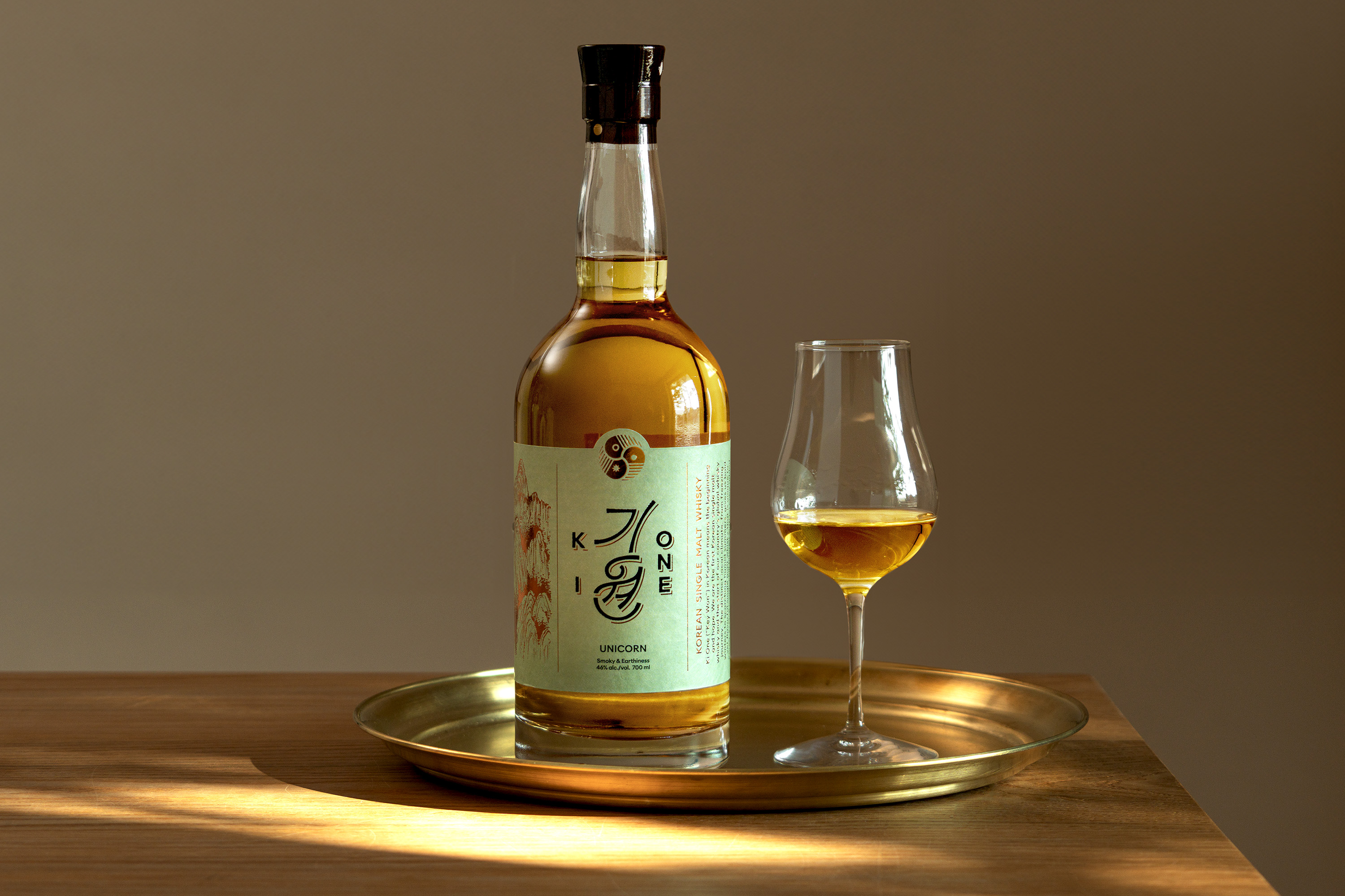


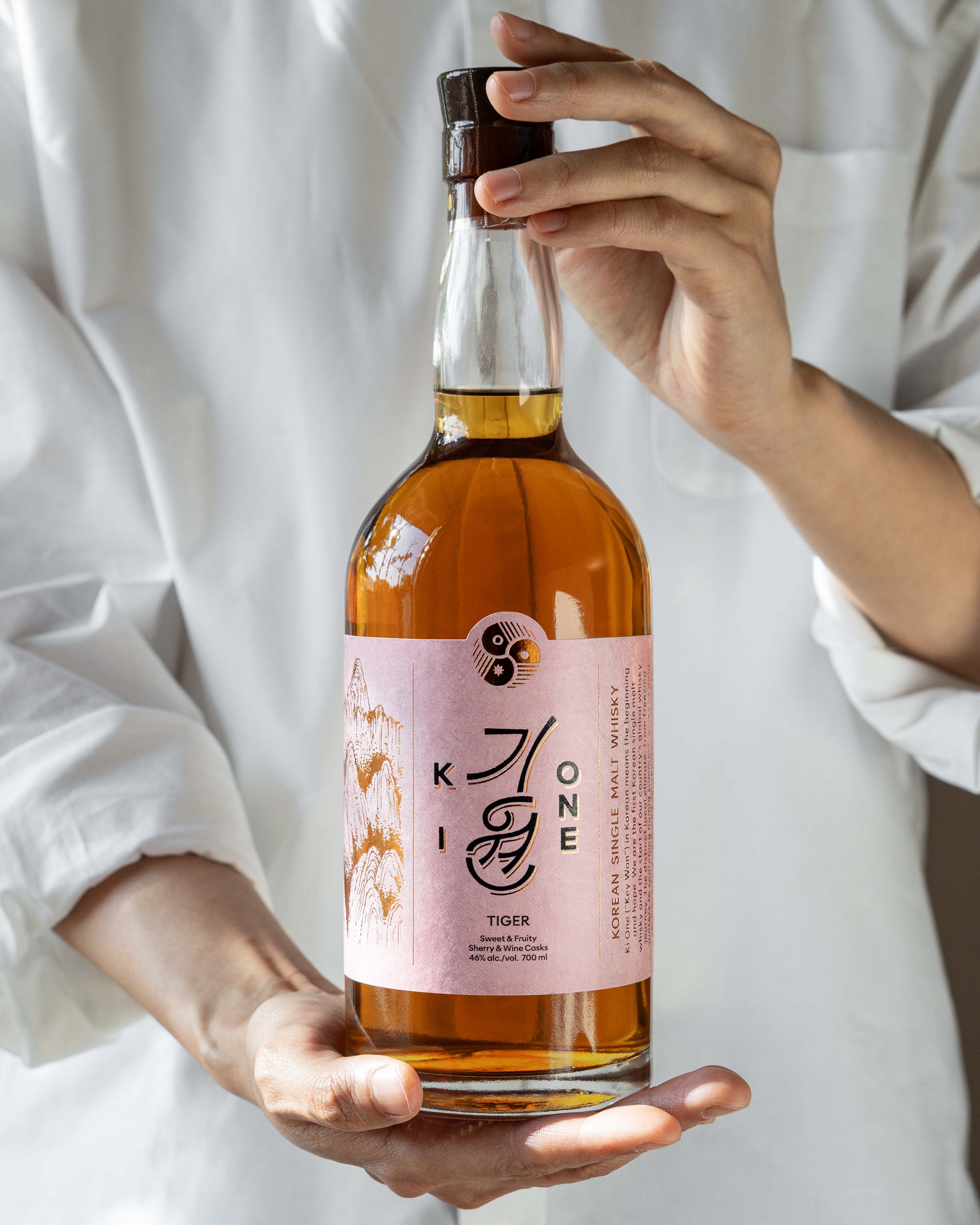

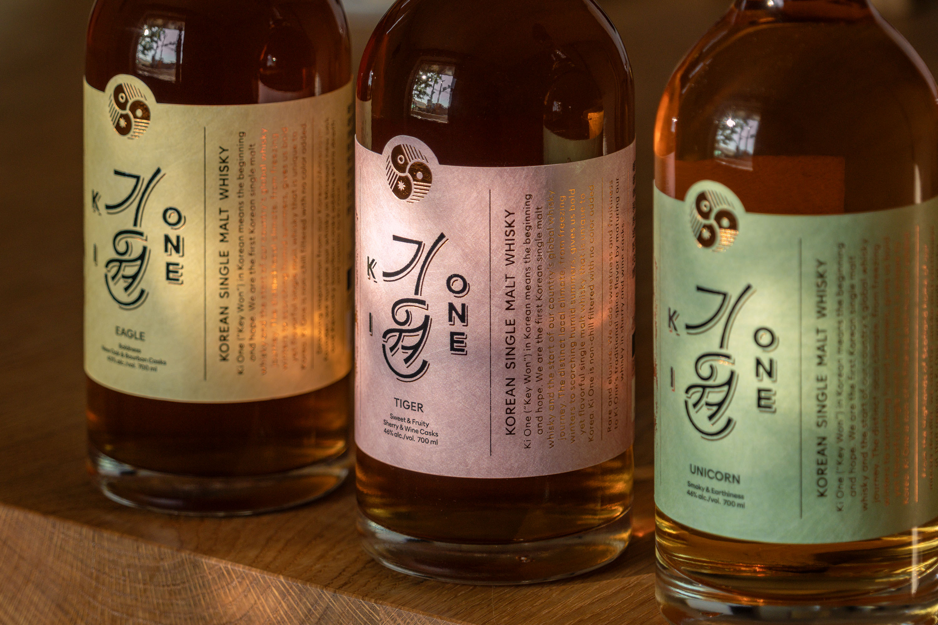
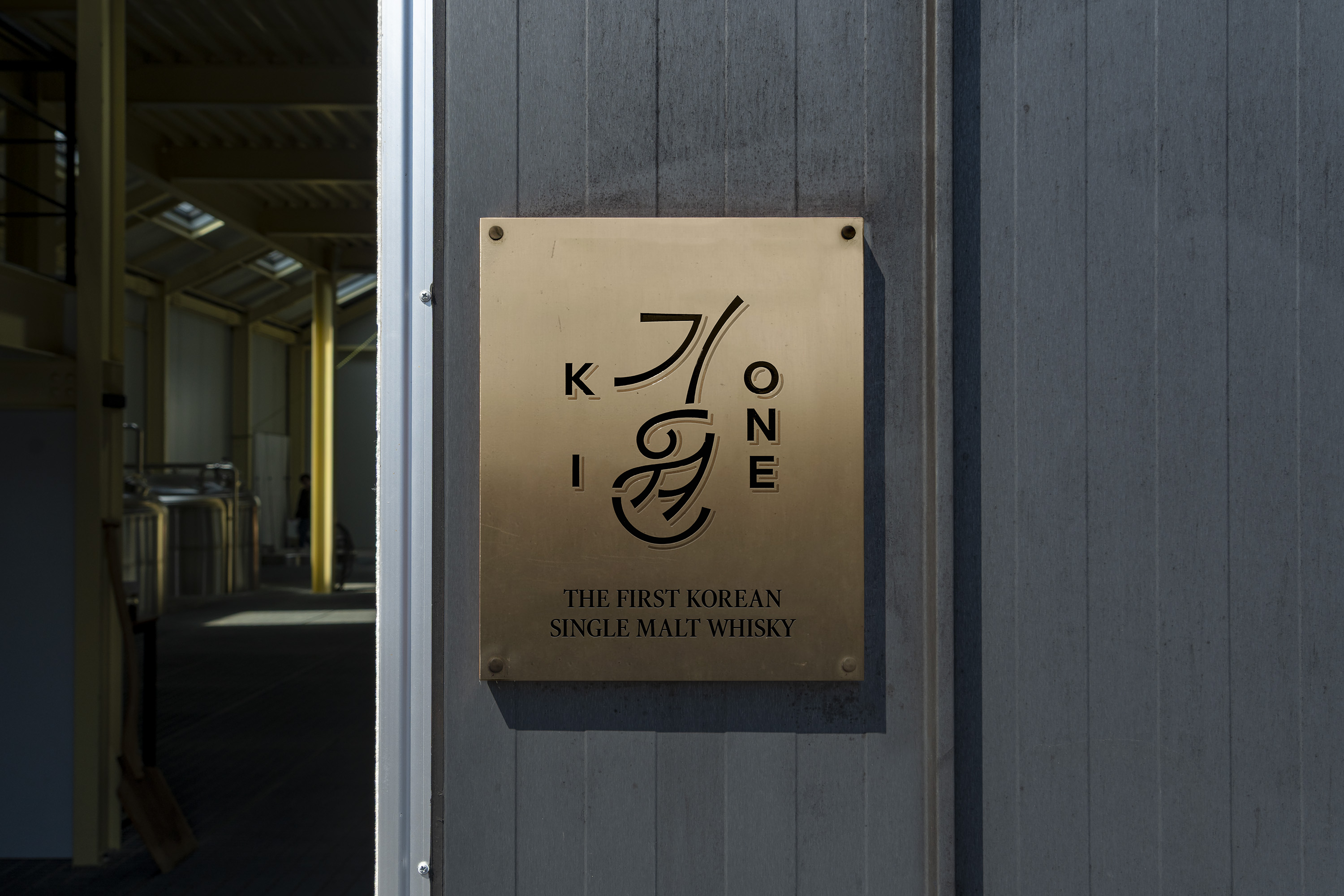
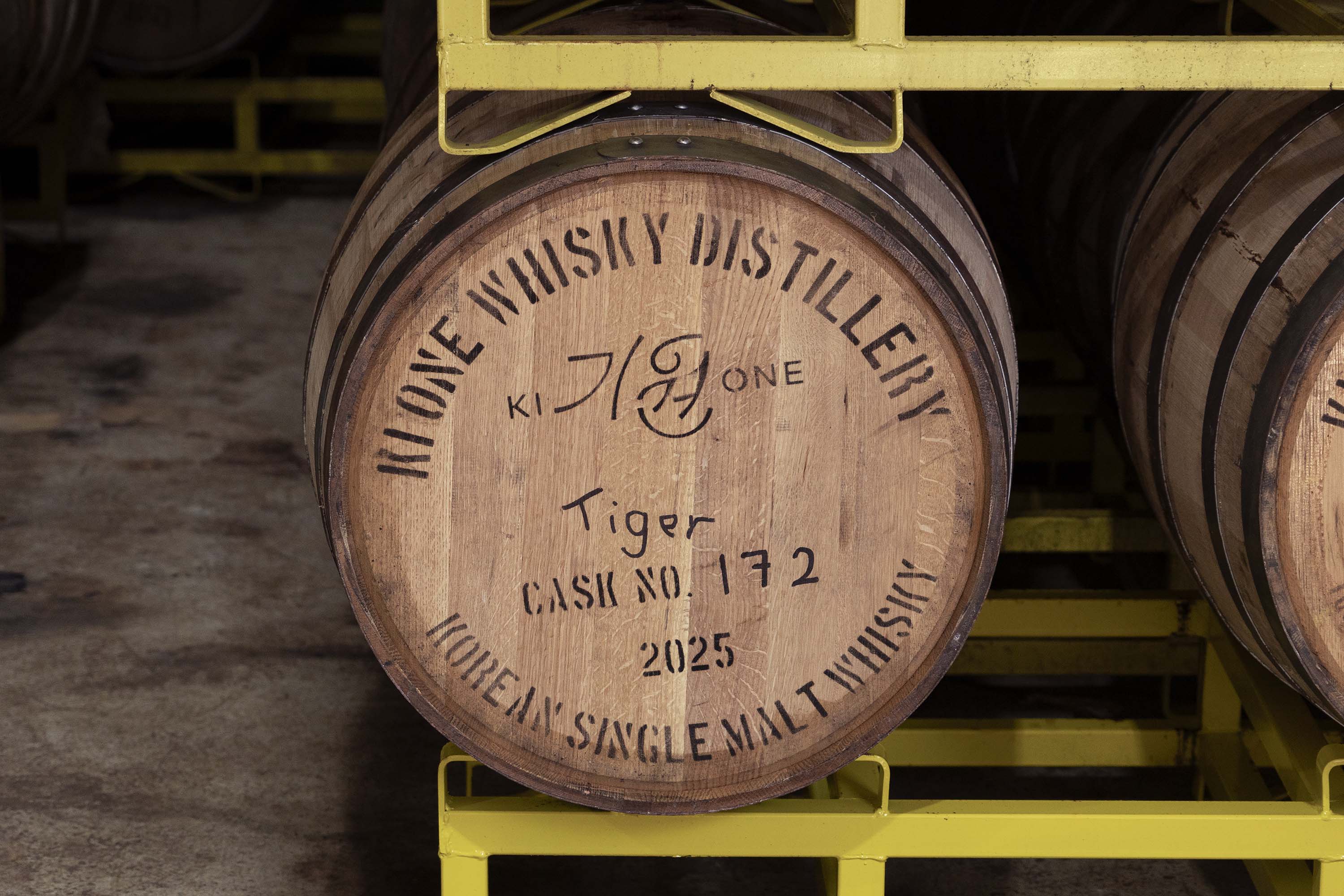


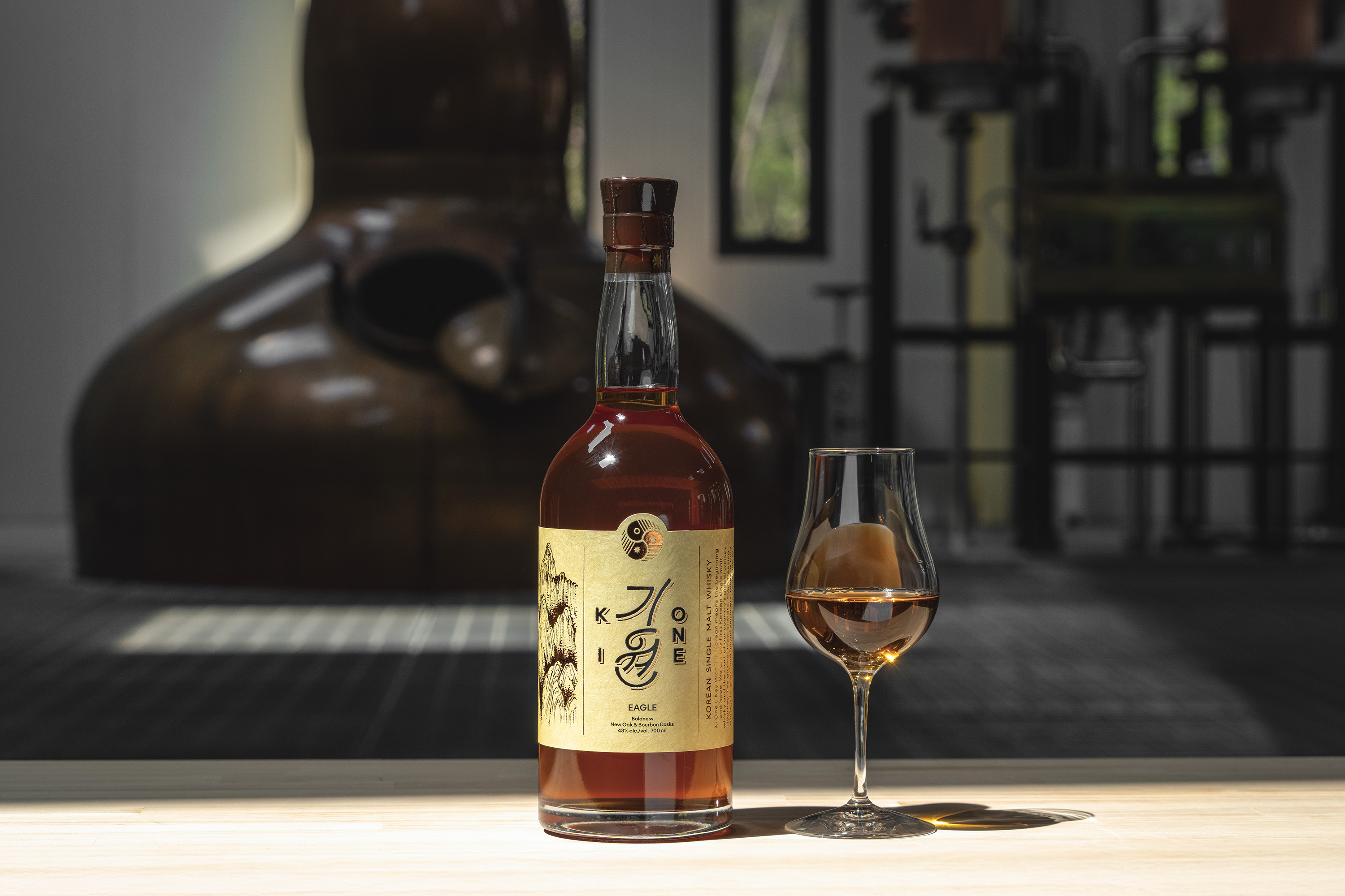


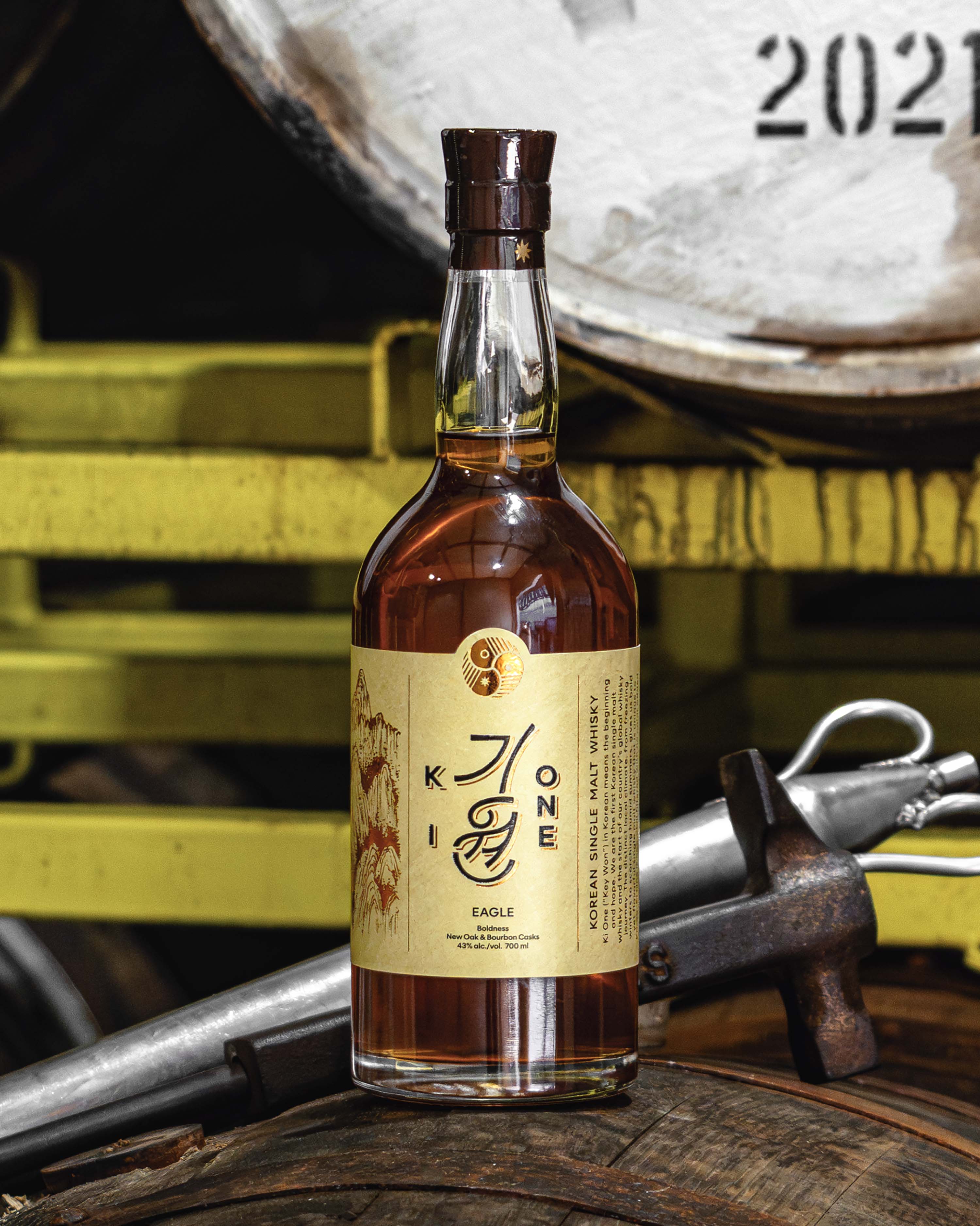
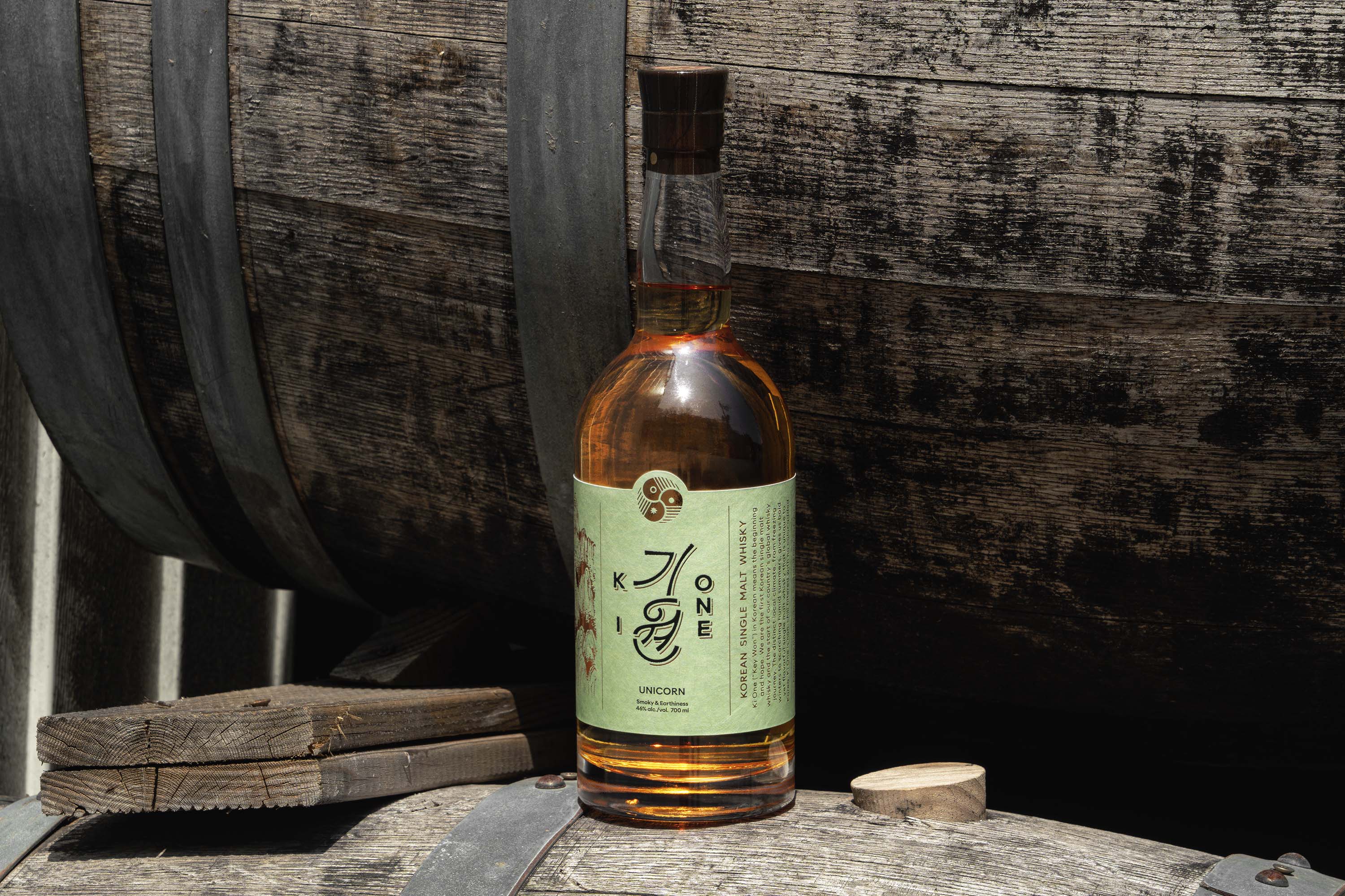


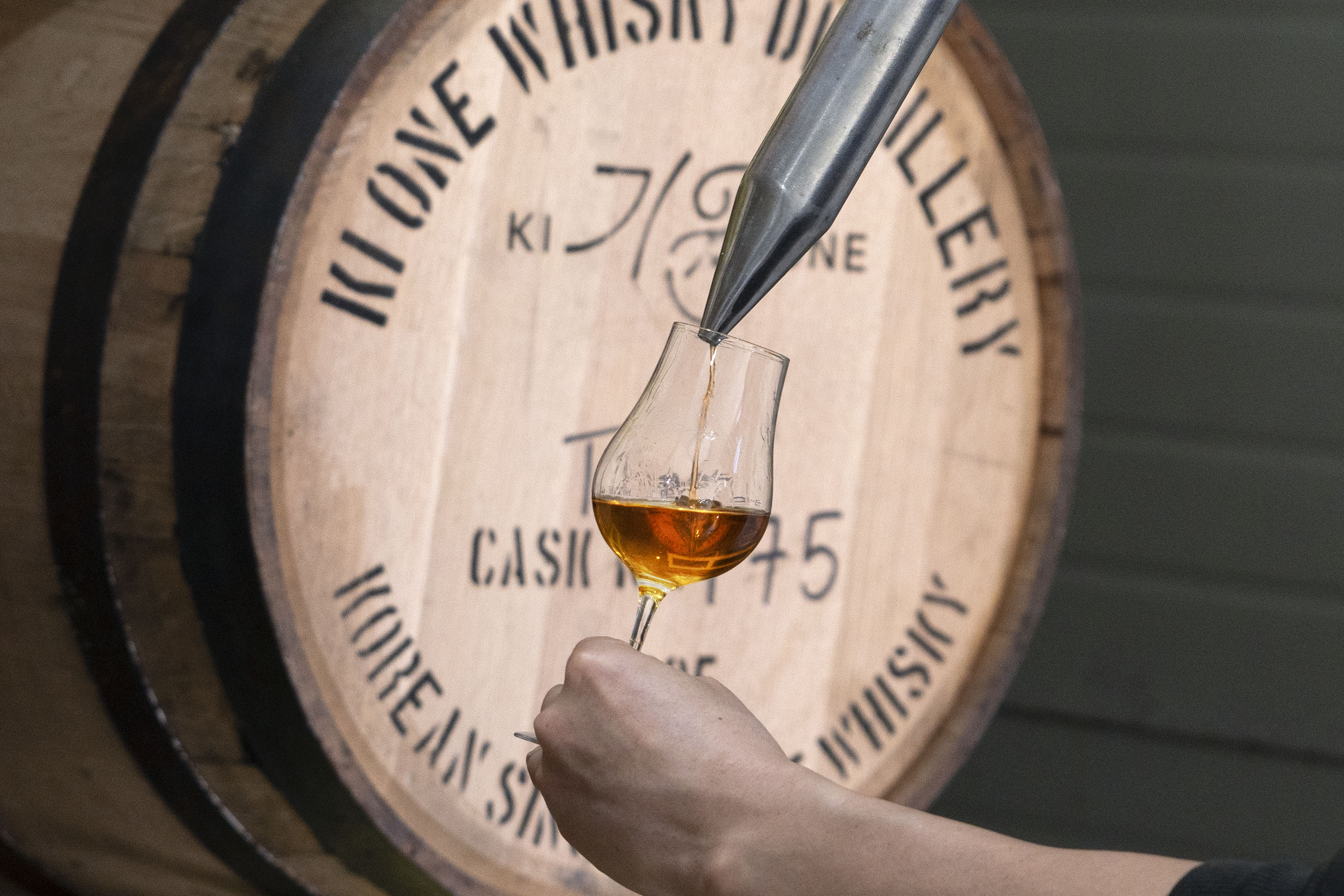


Photo: Sujeong Park and Jaemin Lee, courtesy of studio fnt
- Art direction: Jaemin Lee
- Design: Jaemin Lee and Ajeong Kim
- Illustration: Jaemin Lee
- Design: Jaemin Lee and Ajeong Kim
- Illustration: Jaemin Lee
- Client: Ki-One Distillery
- Year: April 2025
- Year: April 2025
© 2023 studio fnt. All rights reserved.