Mill and Bean
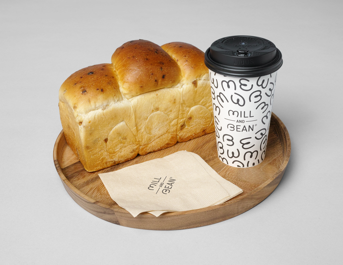
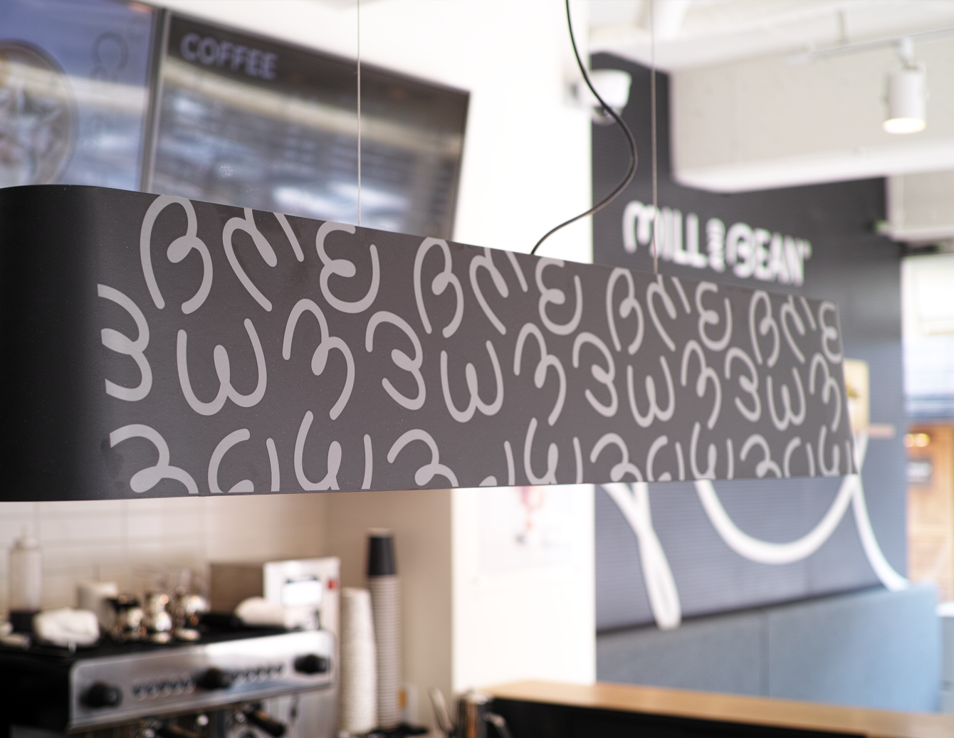
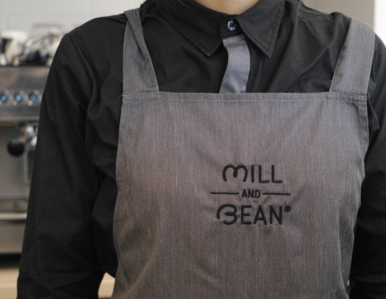
Brand identity work for a bakery cafe located in Seoul, Mill and Bean. The work covers naming, packaging for bread and cups, signage and stationary design. Mill and Bean is different to the other typical cafes in that they serve warm & fresh bread just baked out in the store.
The letters M & B are designed into a symbol as the forms of bread and coffee implying the equal importance of them. This simple and direct approach was based on the possibility of this cafe to extend into a franchise.


- Creative direction: Heesun Kim
- Art direction: Jaemin Lee
- Naming: Heesun Kim and Gunjung Lee
- Graphic design: Jaemin Lee, Hyehyun Yi, Seungtae Kim and Jihye Lee
- Editorial work: Hyehyun Yi
- Client: Mill and Bean
- Year: February 2015
- Art direction: Jaemin Lee
- Naming: Heesun Kim and Gunjung Lee
- Graphic design: Jaemin Lee, Hyehyun Yi, Seungtae Kim and Jihye Lee
- Editorial work: Hyehyun Yi
- Client: Mill and Bean
- Year: February 2015
© 2023 studio fnt. All rights reserved.