NAVER Blog
Naver Blog has been Korea’s leading UGC platform for more than two decades, serving as a central space for documentation and accumulation. As video-driven and short-form content increasingly shape contemporary consumption patterns, the platform is now challenged to preserve its core strength—trusted records—while moving beyond static information to offer more dynamic modes of exploration and relational engagement. Within this broader service renewal, studio fnt led the identity design.
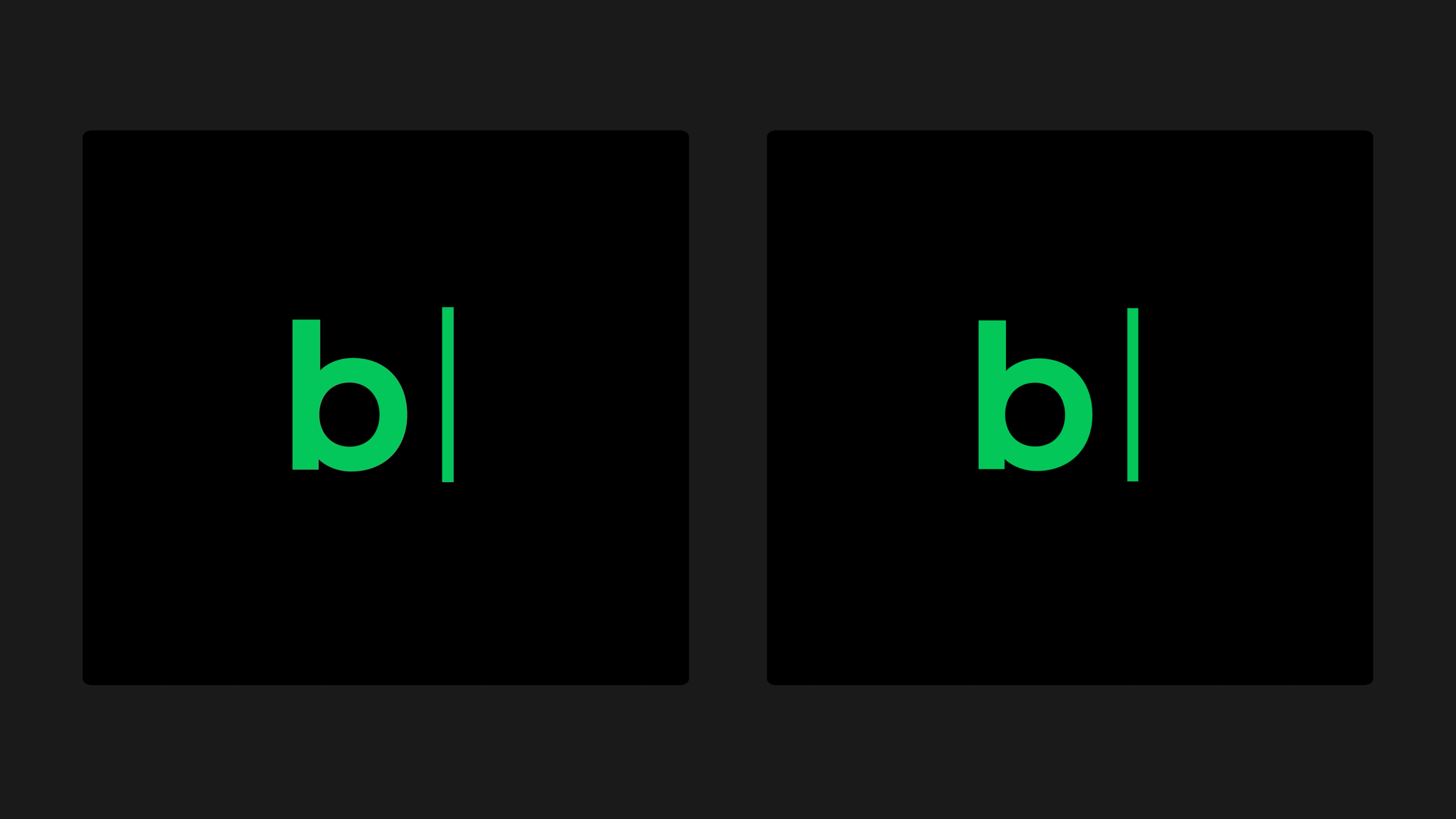
The identity renewal begins with the cursor—the point where every digital record comes into being. Its initiating quality and generative potential were reinterpreted by combining it with the first letter “b” of “blog,” resulting in a new symbol. This symbol marks the starting point of diverse narratives and signals the platform’s capacity for future expansion.
The identity renewal begins with the cursor—the point where every digital record comes into being. Its initiating quality and generative potential were reinterpreted by combining it with the first letter “b” of “blog,” resulting in a new symbol. This symbol marks the starting point of diverse narratives and signals the platform’s capacity for future expansion.
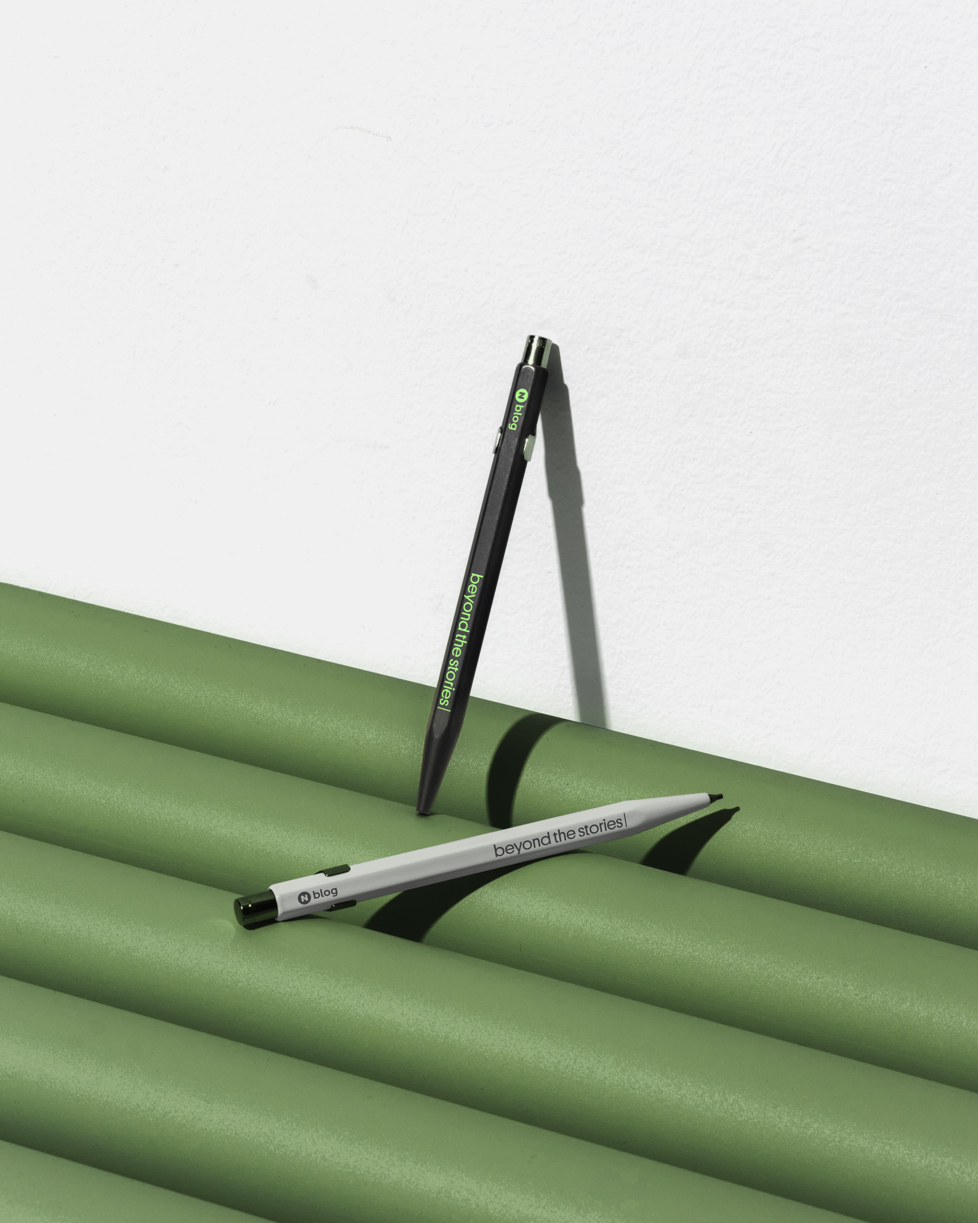
The space that follows the cursor was regarded as a field of possibility—an area yet to be written—and became the basis for a flexible graphic module. This modular system adapts to evolving content types and varied communication contexts. The key visuals were developed from the same structural logic: lines derived from the cursor express the flow and direction of writing, while solids inspired by text selection visualize moments of emphasis and expansion. Together, these elements form a graphic language that maintains consistency across touchpoints while enabling broad scalability.
This renewed identity preserves the long-held value of Naver Blog’s accumulated records, while equipping the platform with the vision and flexibility needed to open a new chapter within an ever-changing content environment.
This renewed identity preserves the long-held value of Naver Blog’s accumulated records, while equipping the platform with the vision and flexibility needed to open a new chapter within an ever-changing content environment.


- Creative direction: Heesun Kim
- Art direction: Jaemin Lee
- Design: Hyerin Ji and Whajin Shin
- Motion design: Hyerin Ji
- Project lead (Client): Junsu Kim and Jinkyu Kim (Naver)
- Art direction: Jaemin Lee
- Design: Hyerin Ji and Whajin Shin
- Motion design: Hyerin Ji
- Project lead (Client): Junsu Kim and Jinkyu Kim (Naver)
- Client: Naver
- Year: September 2025
- Year: September 2025
© 2023 studio fnt. All rights reserved.