ONHARU
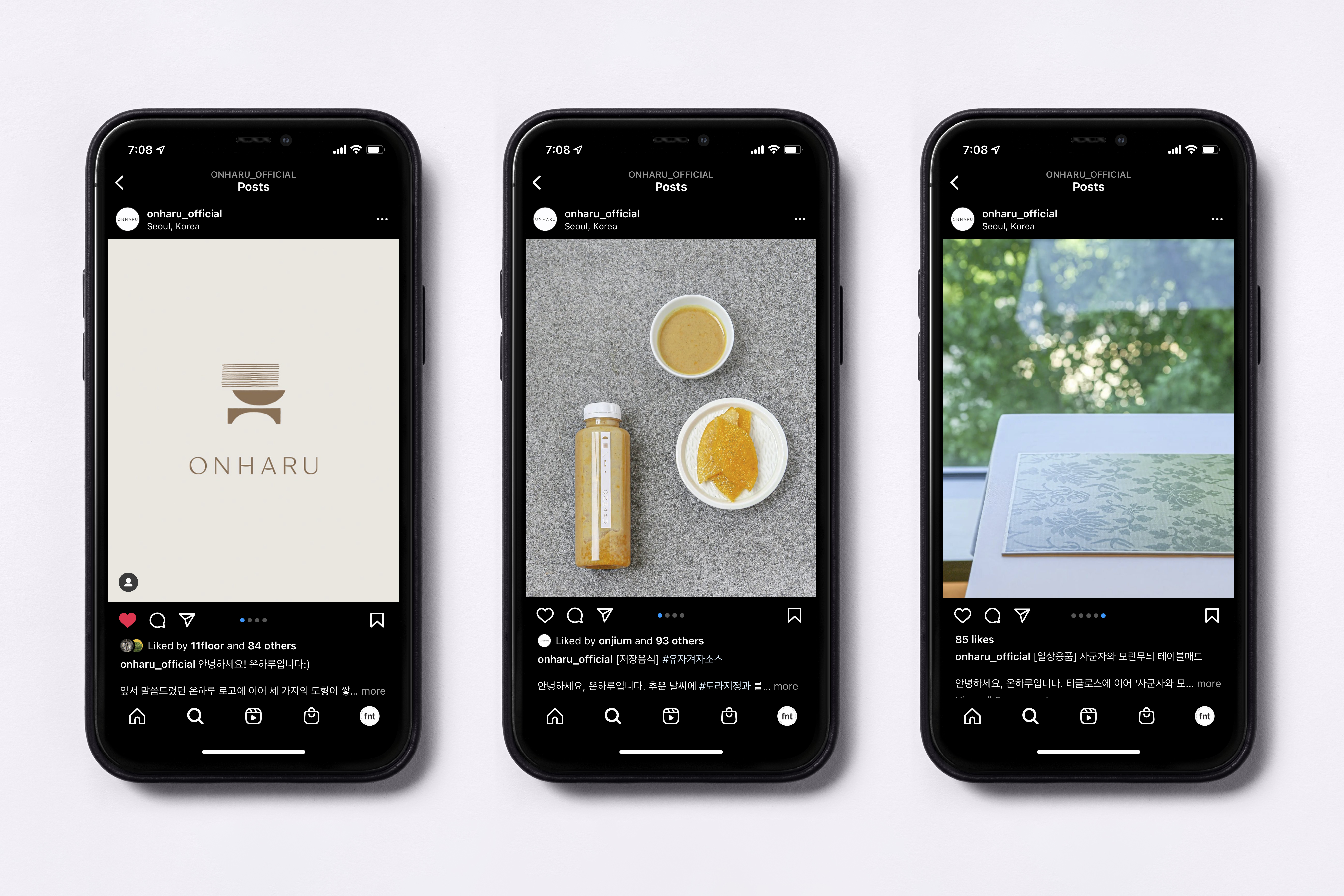
Studio fnt was responsible for building a new identity design system for ONHARU. ONHARU is an online-based lifestyle brand launched by ONJIUM, an institute for research into traditional Korean culture. ONHARU aims to be a brand that makes it easier to experience the value of traditional culture in everyday life. Such brand vision is embedded in their brand name, where ON means ‘a whole’ and HARU means ‘day’ in Korean.
The design concept for ONHARU uses the keyword ‘ripe’ to convey the taste and style of the older generations in a friendly and comfortable way. The horizontal strokes of the logo are in a puffy shape to express a well-ripe state (like rice or fruit), and the symbol consists of three different shapes that symbolize clothing, food, and housing. In the overall design, including color and graphic devices, we tried to capture ONHARU’s brand value, using the simple yet elegant harmony of the older generation’s aesthetics with contemporary finishes. The project ranged from stationery design for the brand operation to original packaging products and the development of online channels.

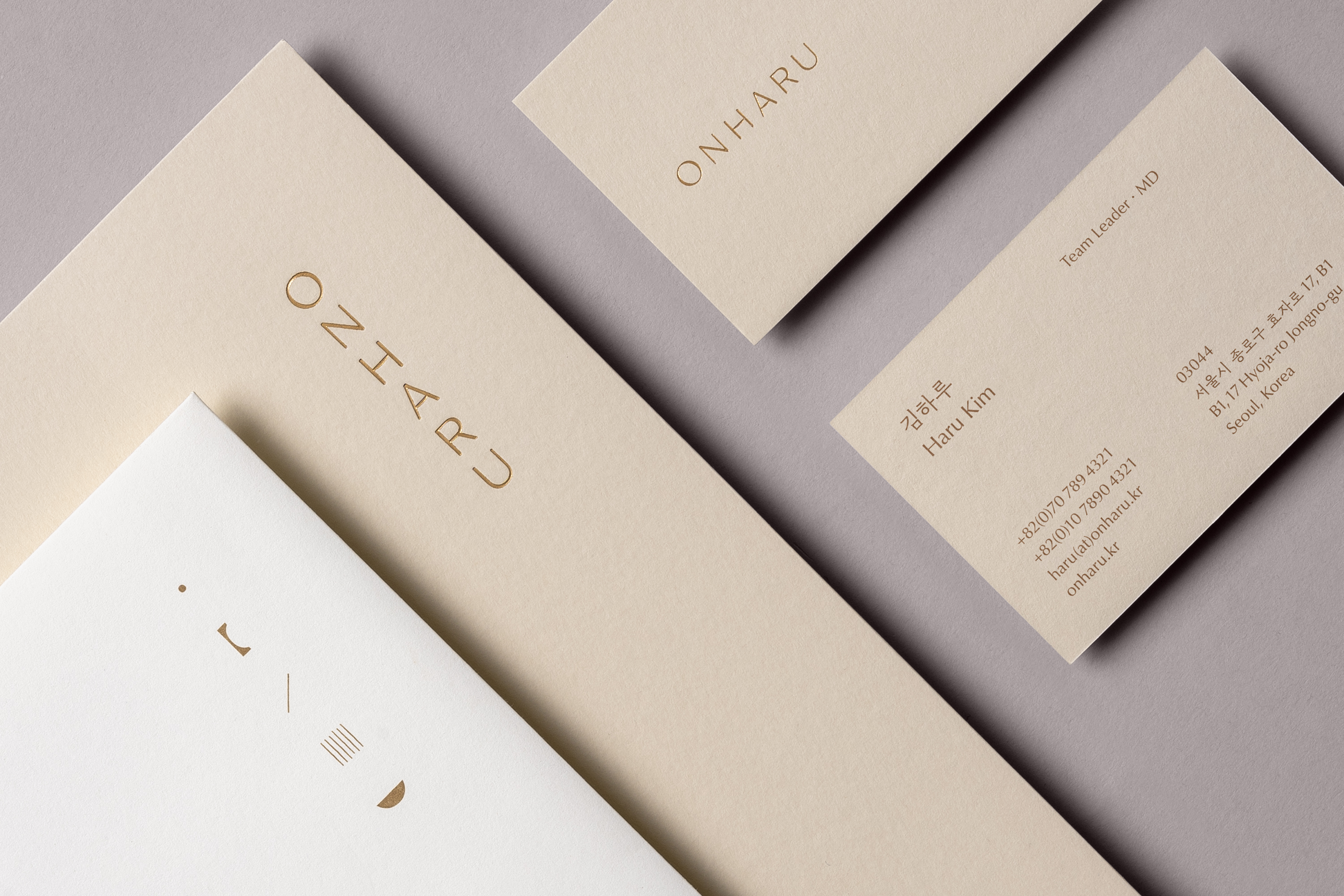

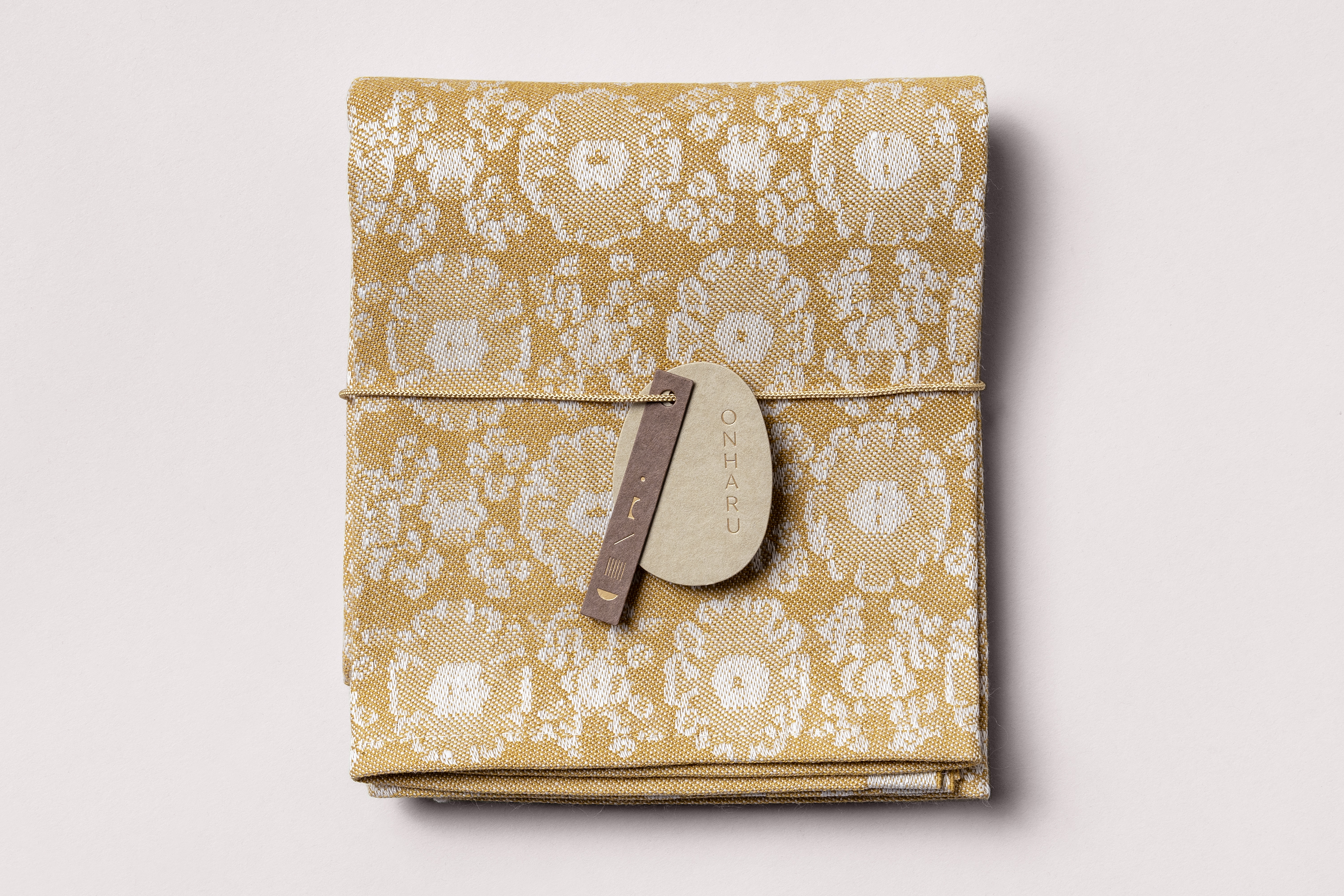

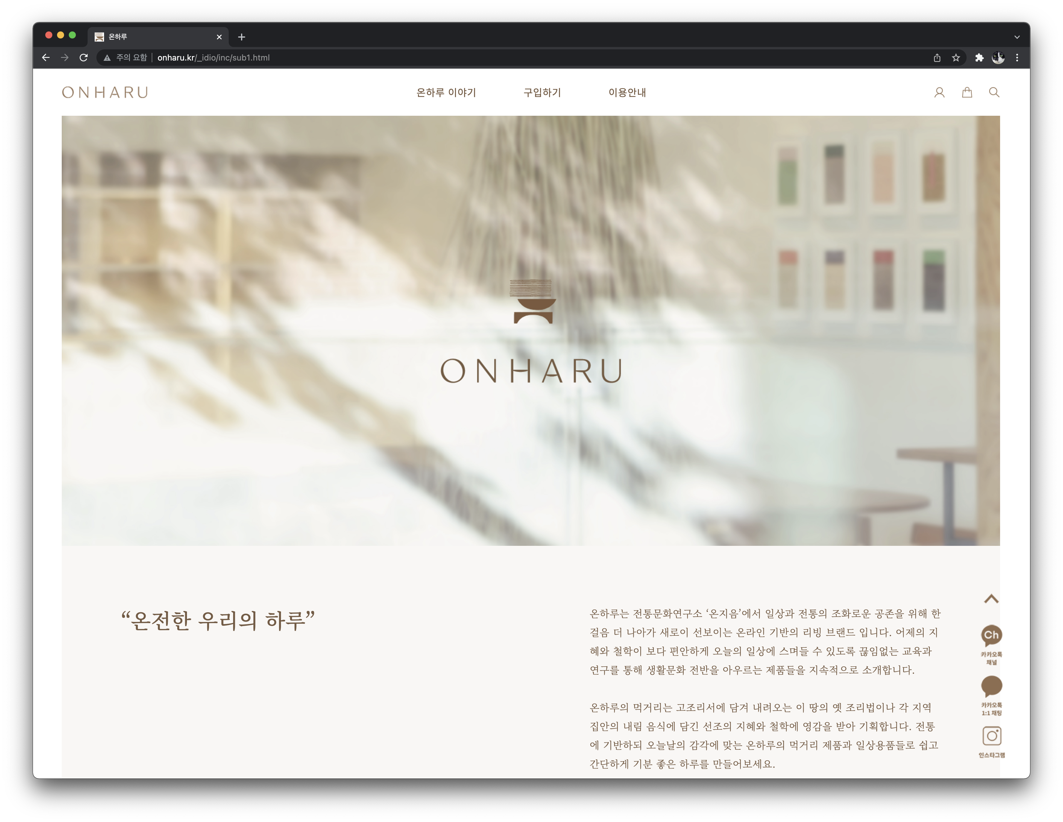


Photo: Jandee Kim, courtesy of ONJIUM
 Photo: Jandee Kim, courtesy of ONJIUM
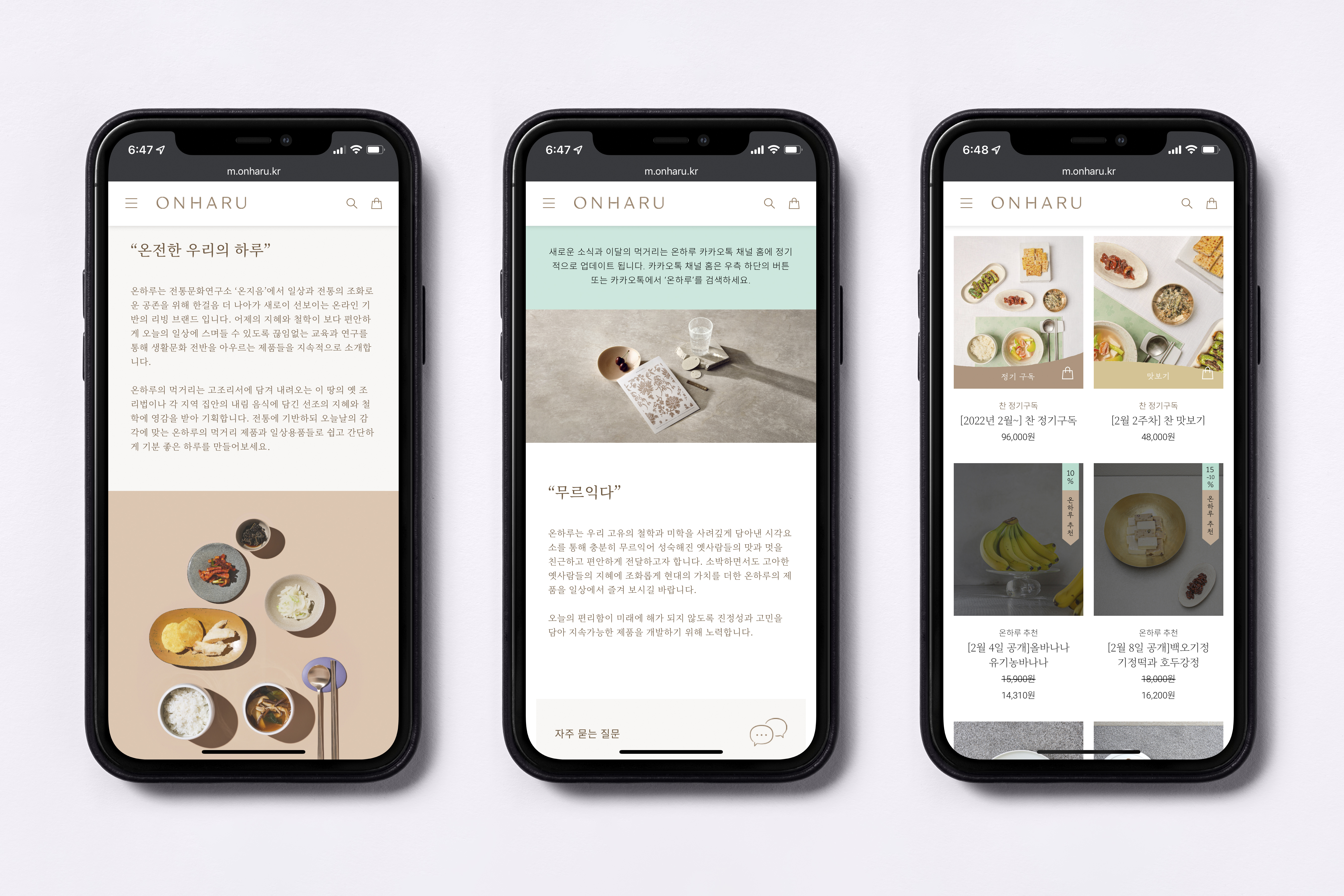
- Creative direction: Heesun Kim
- Art direction: Woogyung Geel
- Design: Youjeong Lee
- Website design: Youjeong Lee
- Art direction: Woogyung Geel
- Design: Youjeong Lee
- Website design: Youjeong Lee
- Client: ONJIUM
- Year: September 2021
- Year: September 2021
© 2023 studio fnt. All rights reserved.