Olive Young
BI Application Renewal
Olive Young, a pioneering brand in the domestic health and beauty (H&B) market, offers a diverse range of domestic and international cosmetics alongside imported confectionery. It boasts the most significant number of stores in Korea. Studio fnt undertook a task to redefine the brand identity’s application system, encompassing graphics, and colors to be progressively implemented across major branches while designing in-store applications and gift packages.
The new graphic motif centers around the symbol’s tilted olive-shaped oval shape. By employing consistent angular multiples, such as 13, 26, and 39 degrees, alongside various size variations, the brand’s ethos of ‘healthy beauty’ is visually expressed intuitively and dynamically. Olive Young’s updated color system subdivides their usage beyond the existing green and coral colors, enabling enhanced contrast and vibrant imagery with rich hues. This hierarchical design system, structured by importance and frequency, is adaptable across diverse mediums, including video and print.
The new gift packaging enhances the experience of giving and receiving, adding fun and excitement. Again, we’ve added more choices, such as ultra-compact sizes, while improving structural stability. We’ve also introduced an easy-to-fold and stackable box design for ease of use.

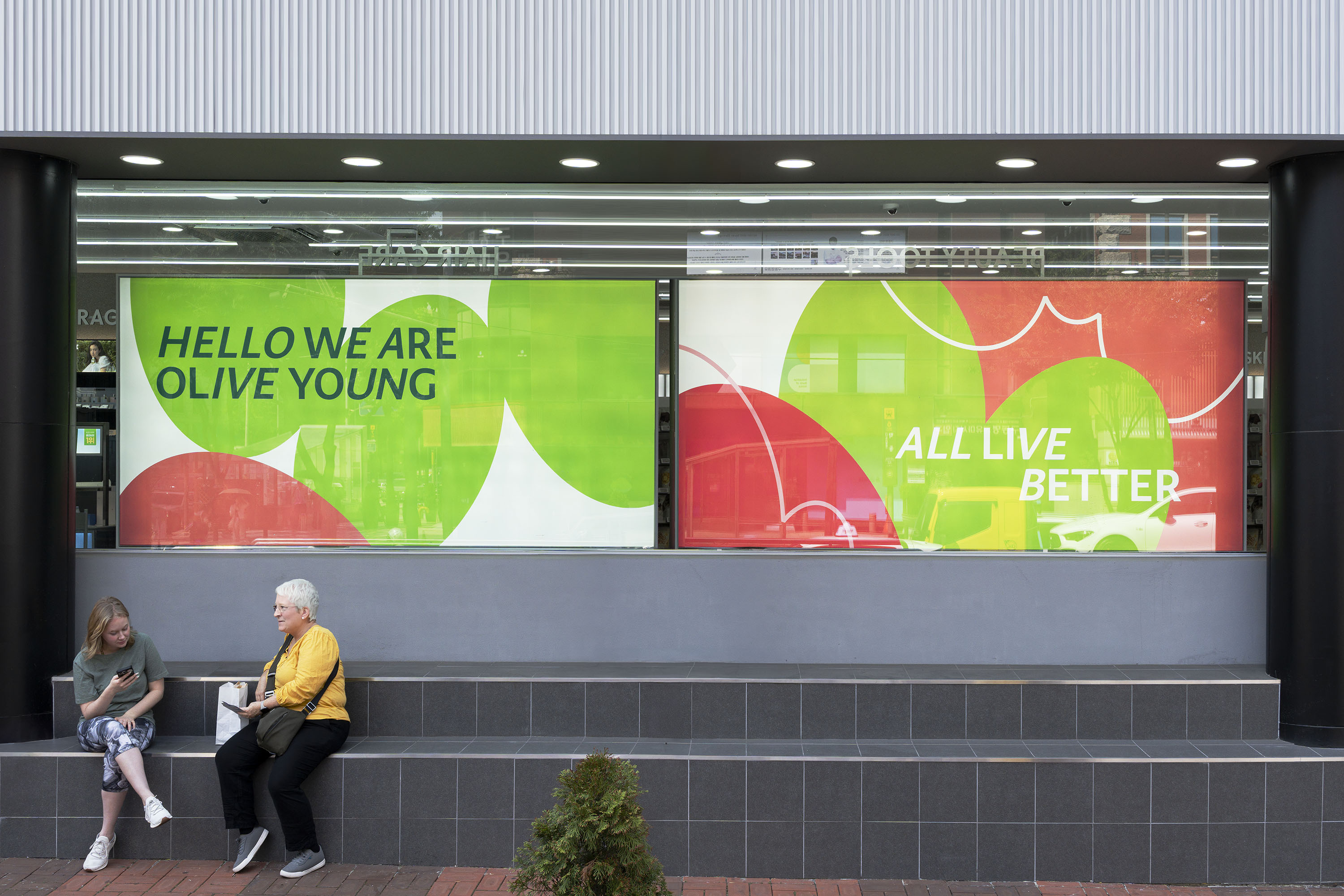

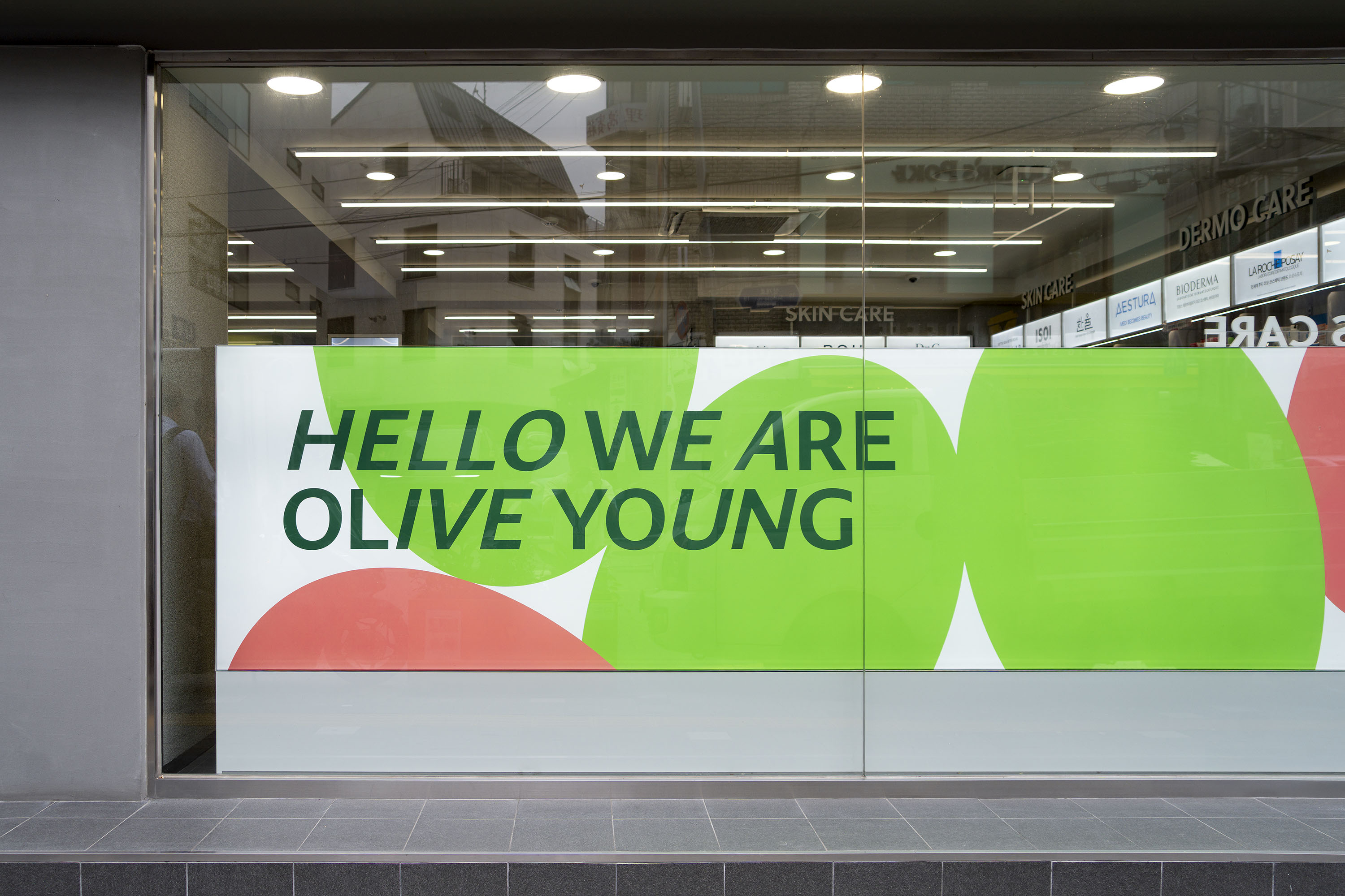
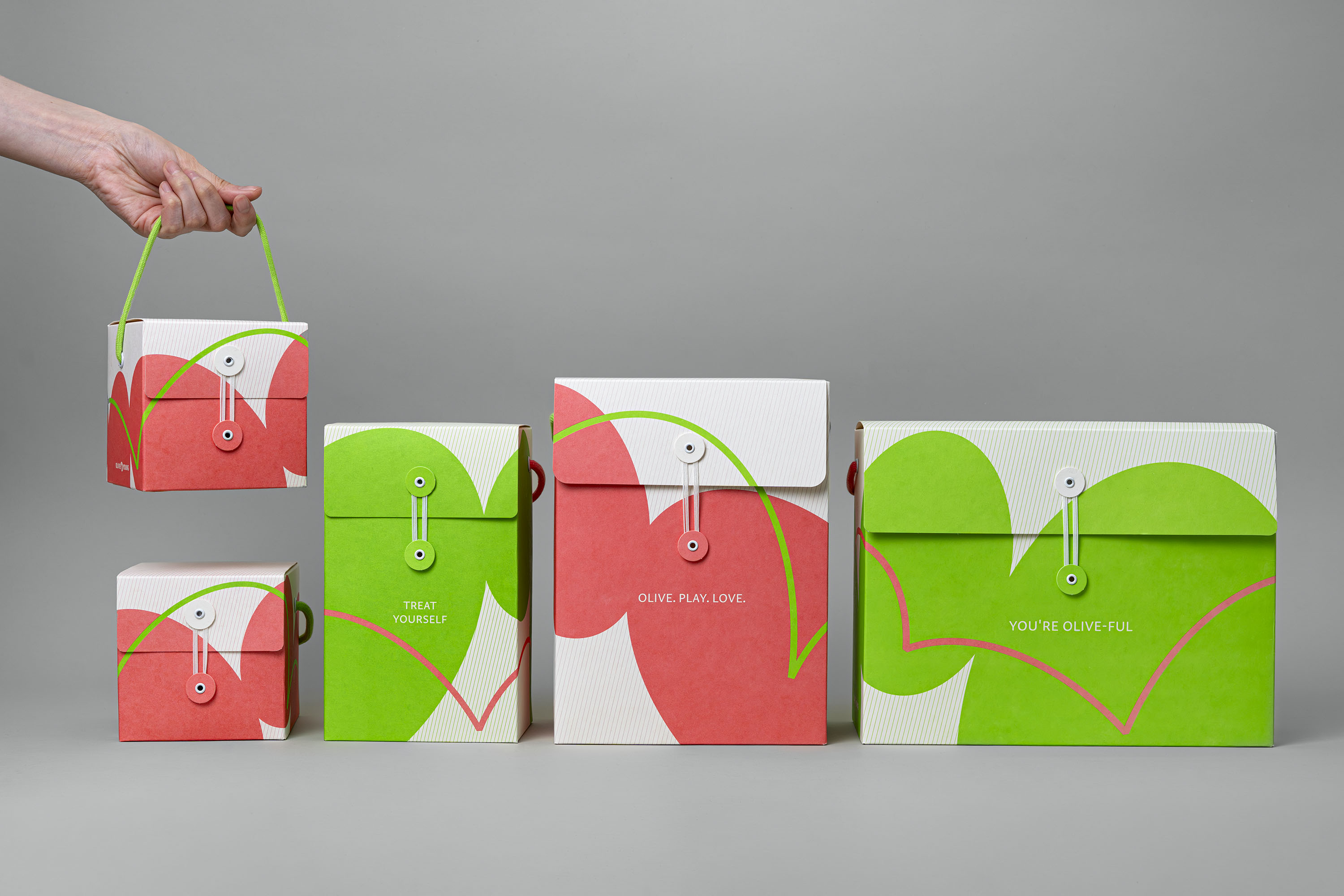
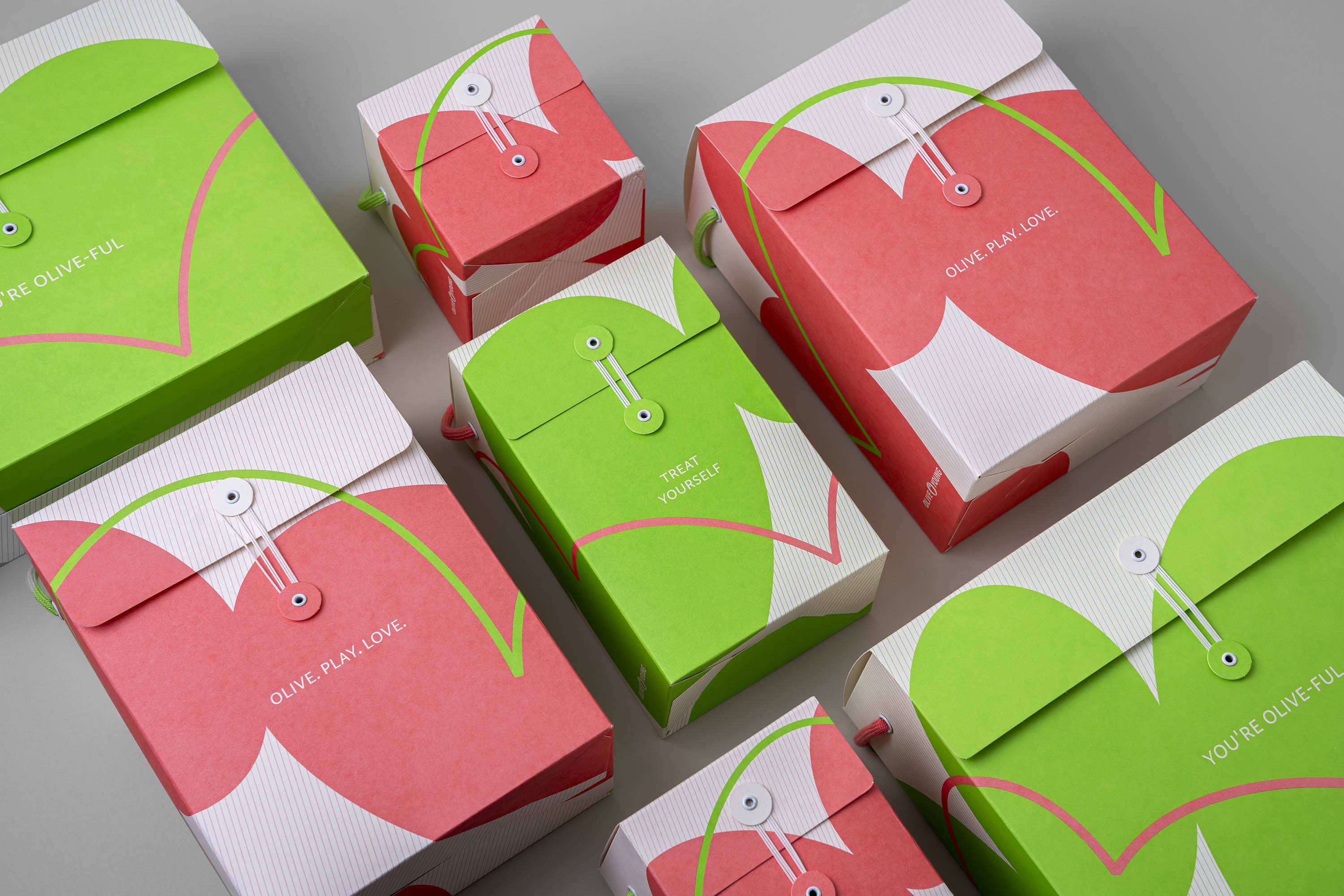
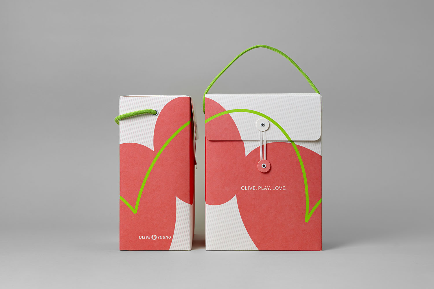
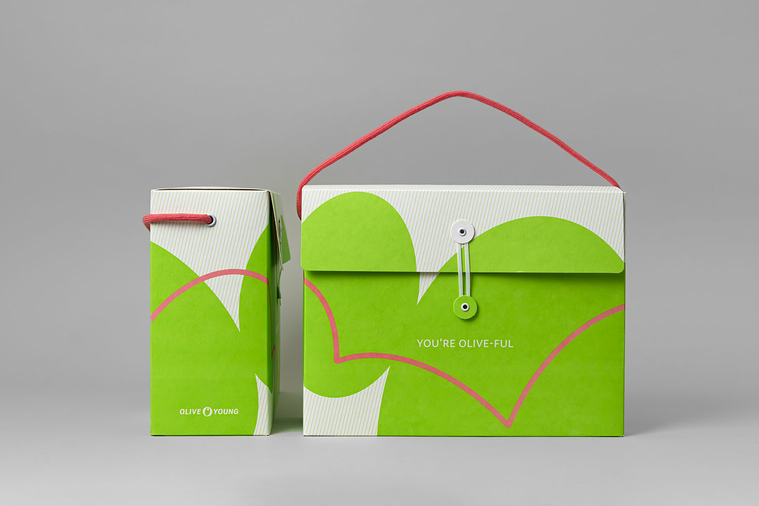
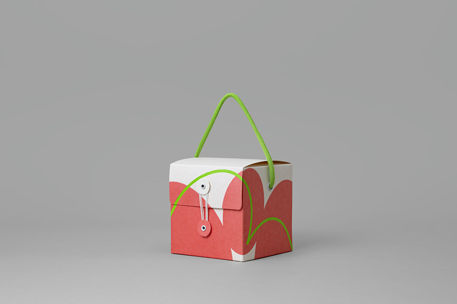
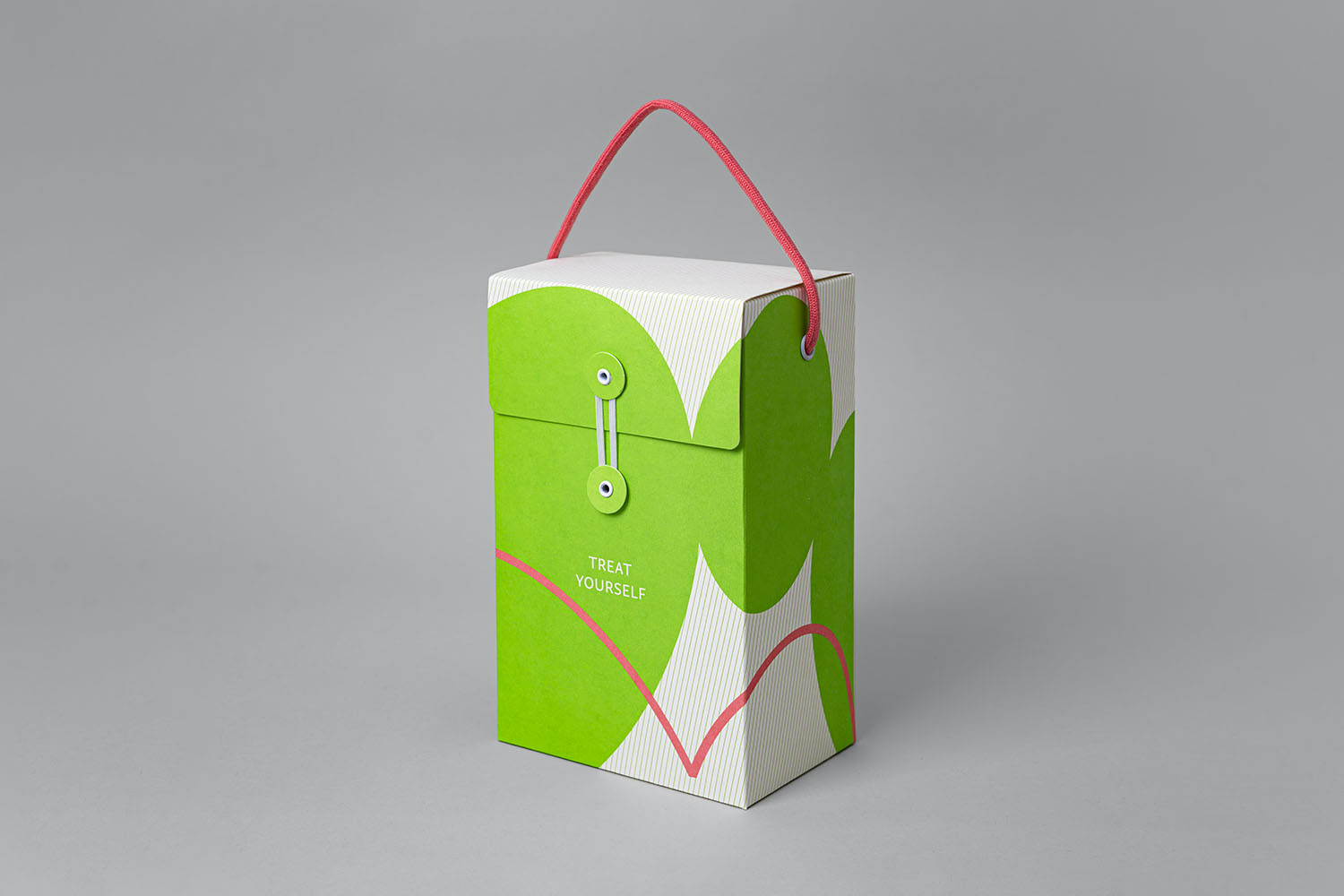
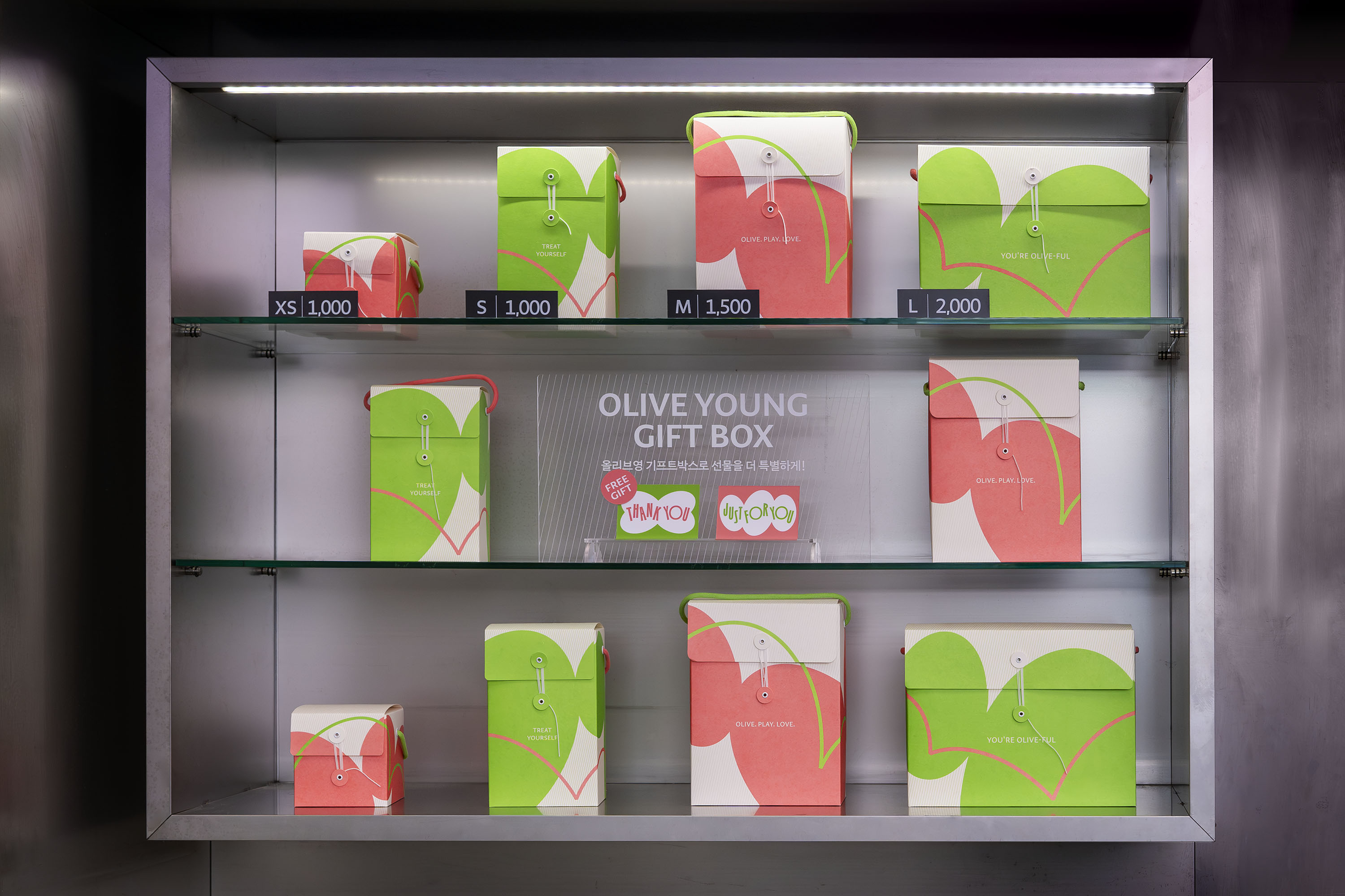
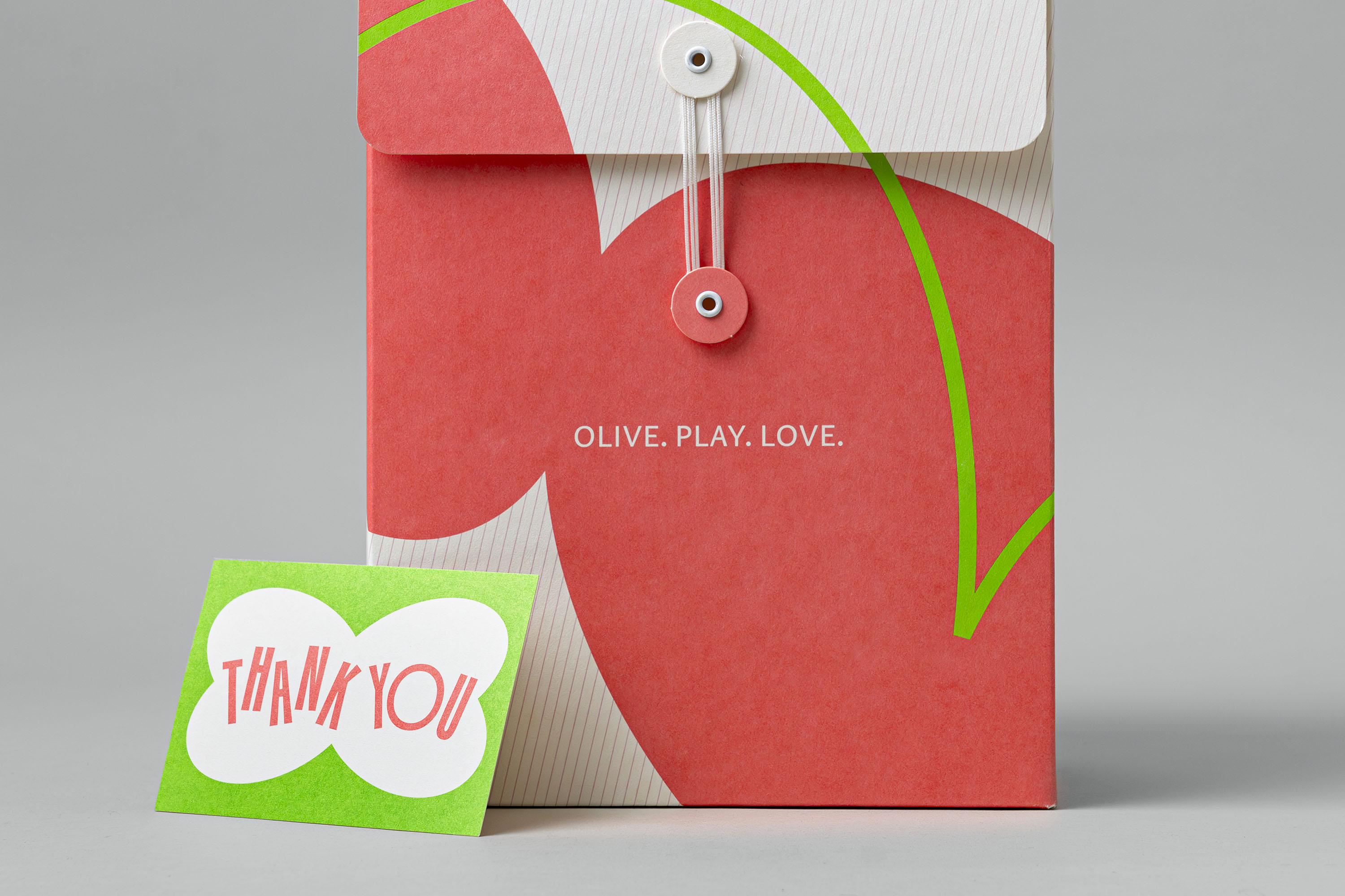
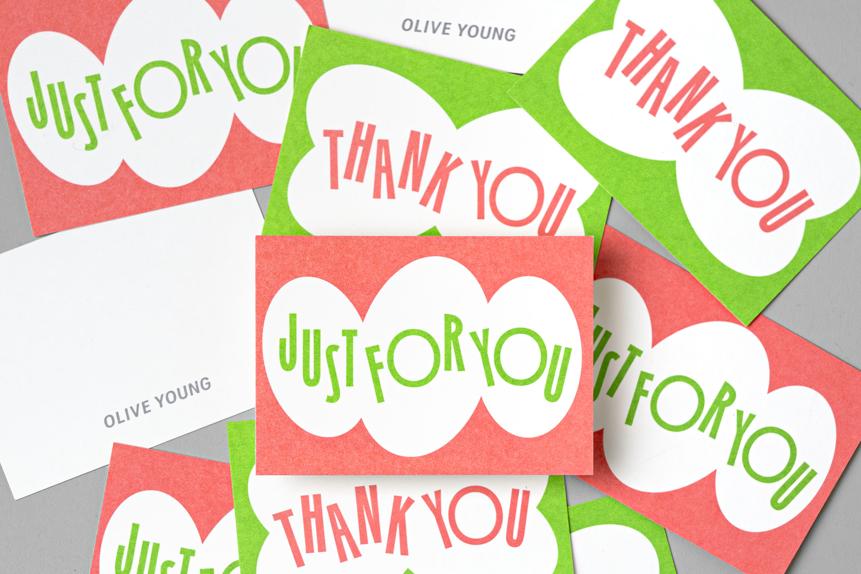
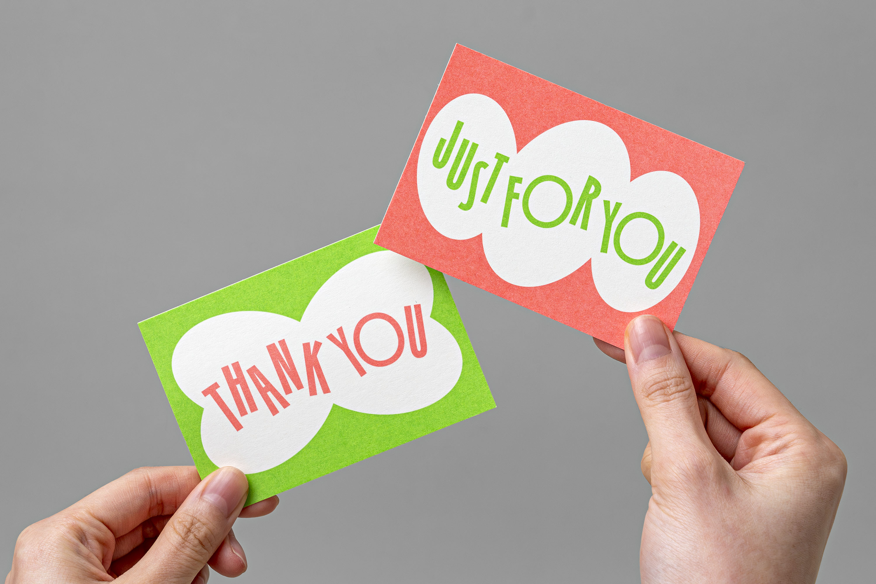
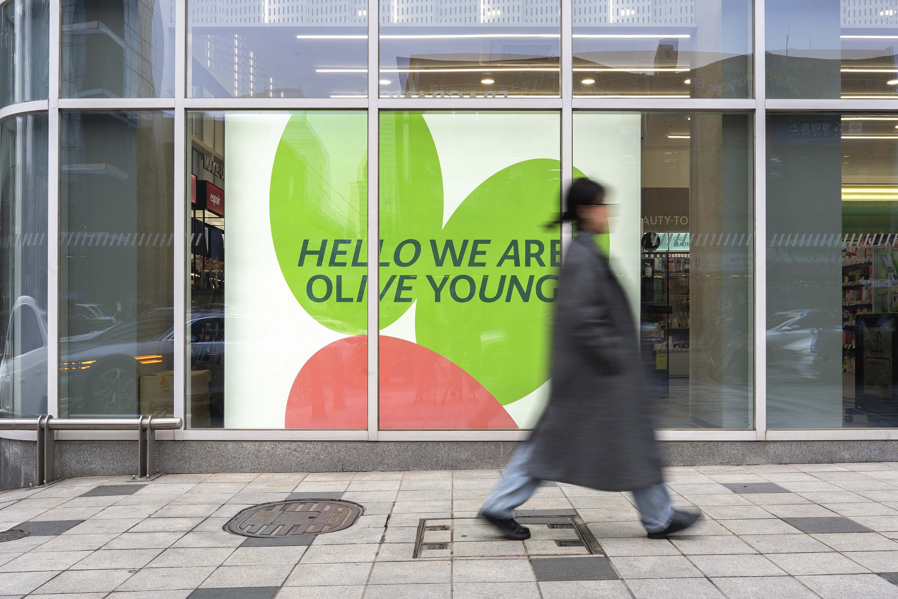
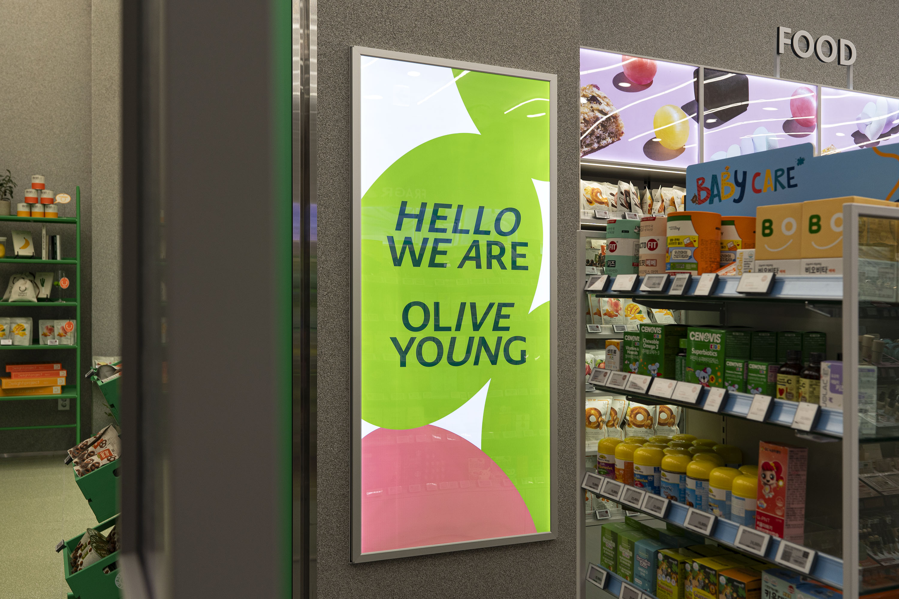
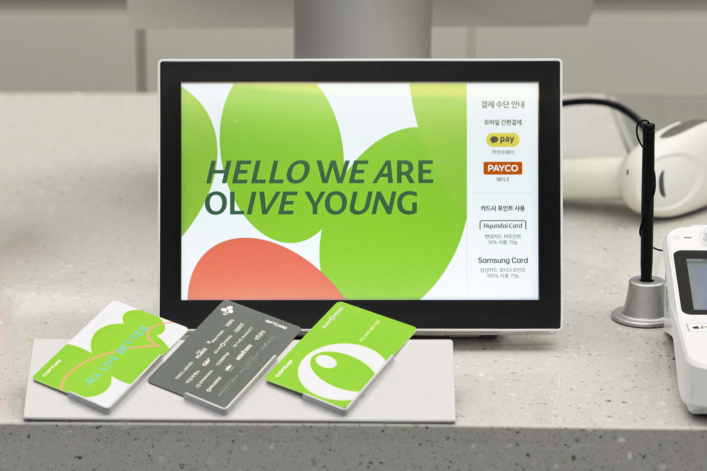
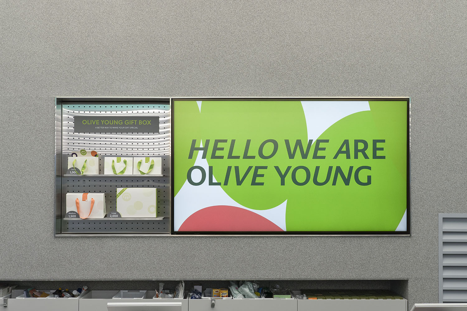
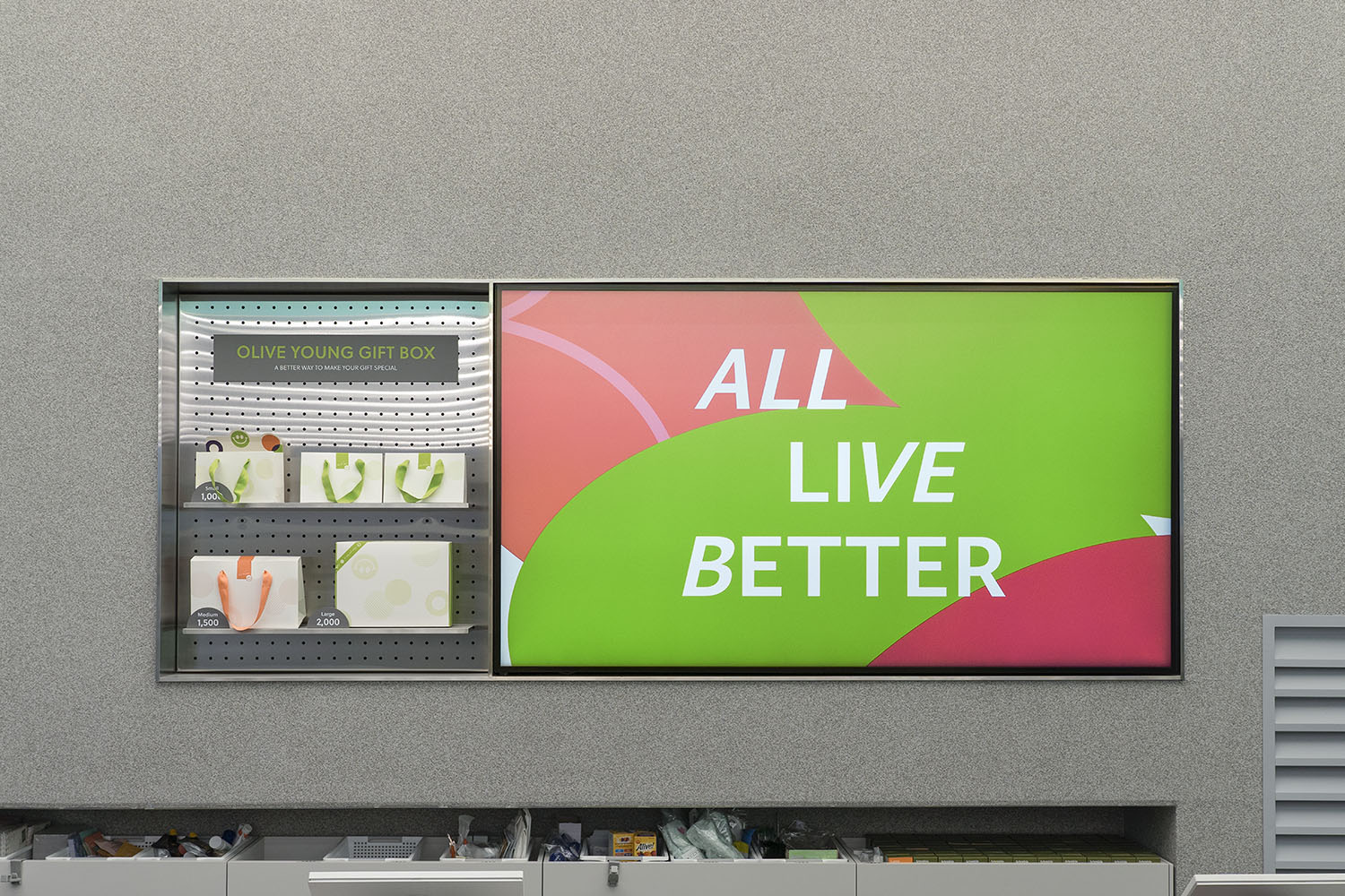
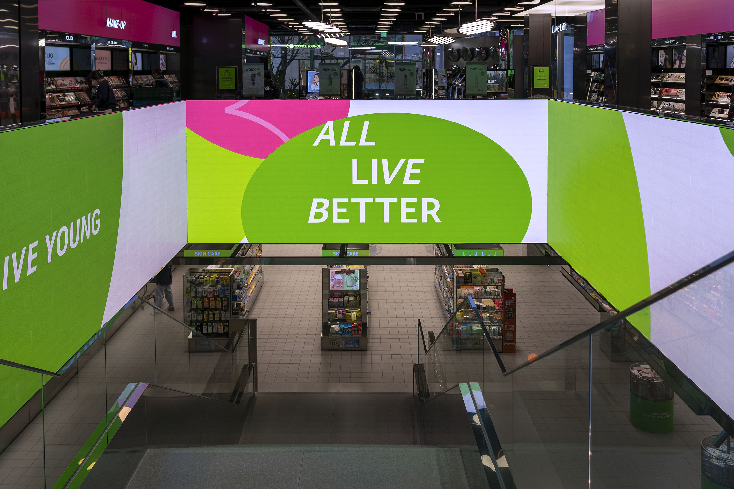
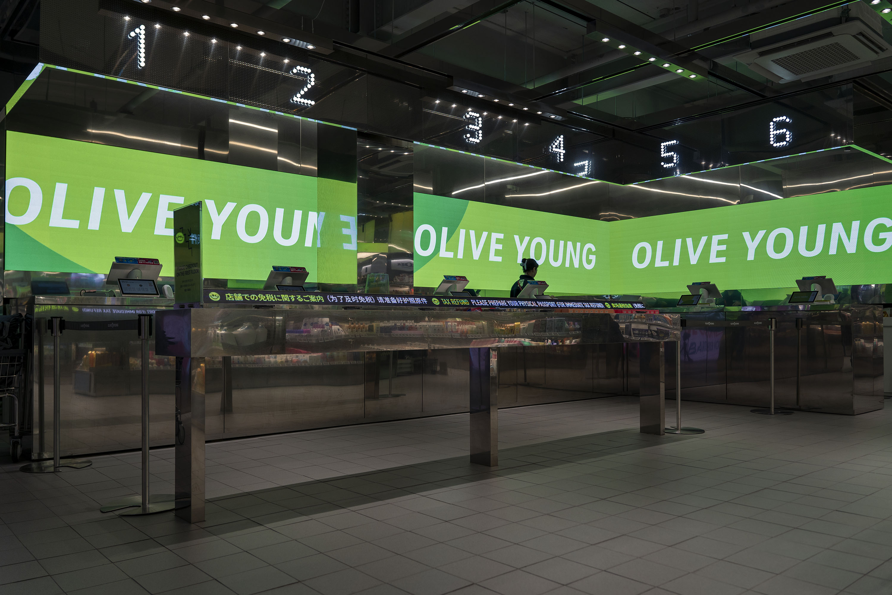
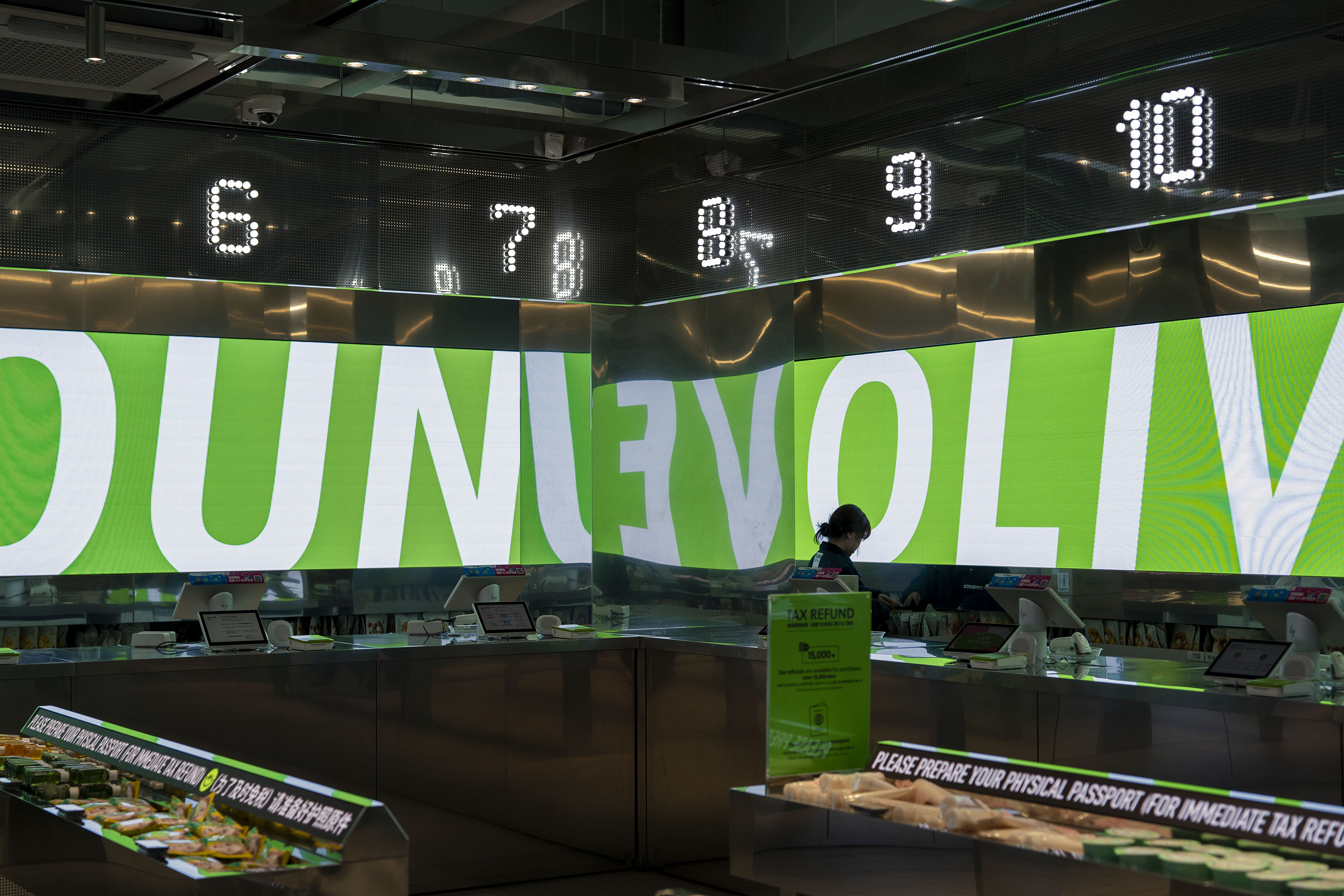
Photo: Sujeong Park, courtesy of studio fnt
- Creative direction: Heesun Kim
- Art direction: Woogyung Geel
- Design: Whajin Shin, Jieun Kang
- Motion design: Sojeong Park
- Art direction: Woogyung Geel
- Design: Whajin Shin, Jieun Kang
- Motion design: Sojeong Park
- Client: Olive Young
- Year: October 2023
- Year: October 2023
© 2023 studio fnt. All rights reserved.