OSULLOC
Teafood & Bakery Packaging Design
Osulloc is Korea's representative green tea brand, which uses tea leaves grown in Jeju Island as raw ingredients. Aspiring to set an attractive daily tea culture, Osulloc introduced tea-derived foods such as snacks and chocolate to be paired with tea, as well as spreads and bakery products. Studio fnt re-established the hierarchy and context of the existing Osulloc tea-food products, and developed a packaging system that reflects the brand's vision.
The new package designs utilize the shapes of Osulloc tea-foods, express its products as a genuine premium dessert, and emphasize the connection between Osulloc and Jeju Island. We picked out the four natural objects to represent Jeju Island to be tea farm, rock, wind, and sand. These were translated into graphic patterns to symbolize Osulloc's four product categories to communicate their starting points or raw materials, and also to embed the brand's vision. In the individual package design, the front, side, and cross-section of the contained food products were photographed and arranged in a rhythmic manner, to intuitively convey what the consumer will find inside while adding visual interest.
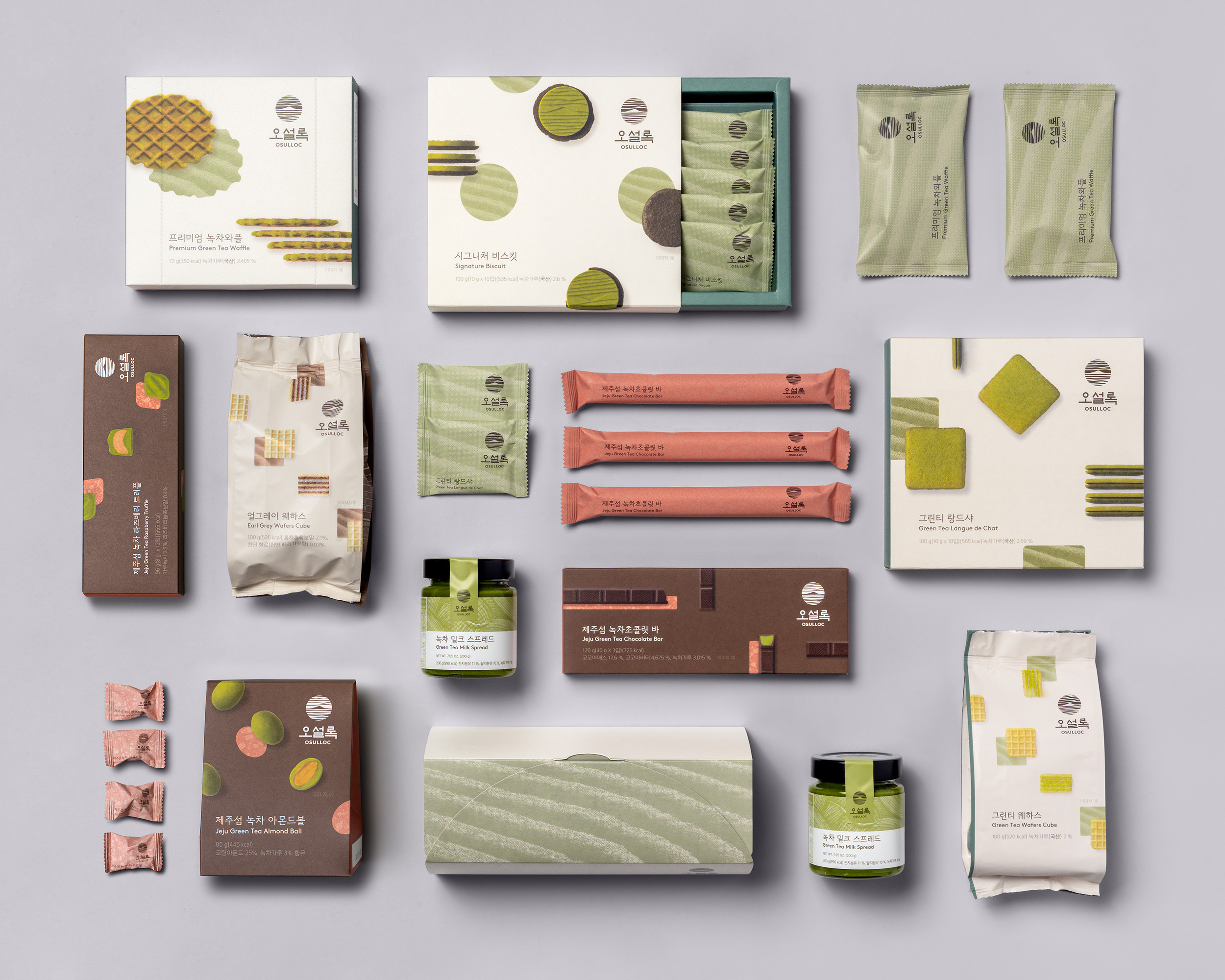
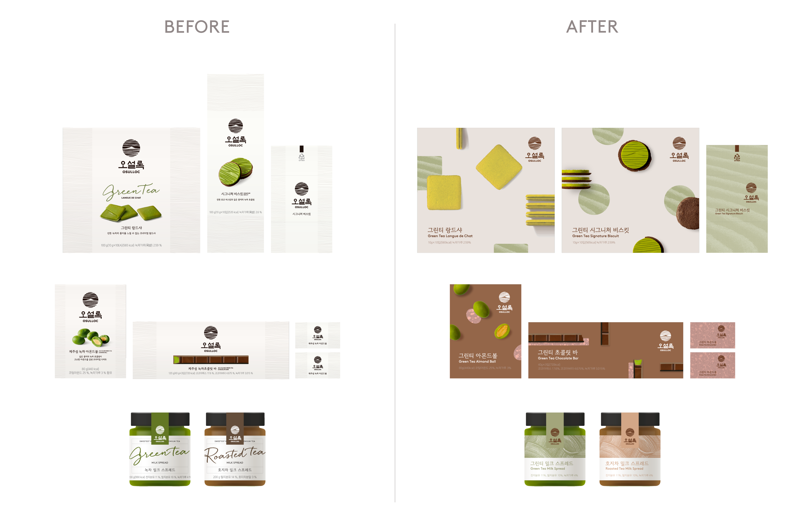


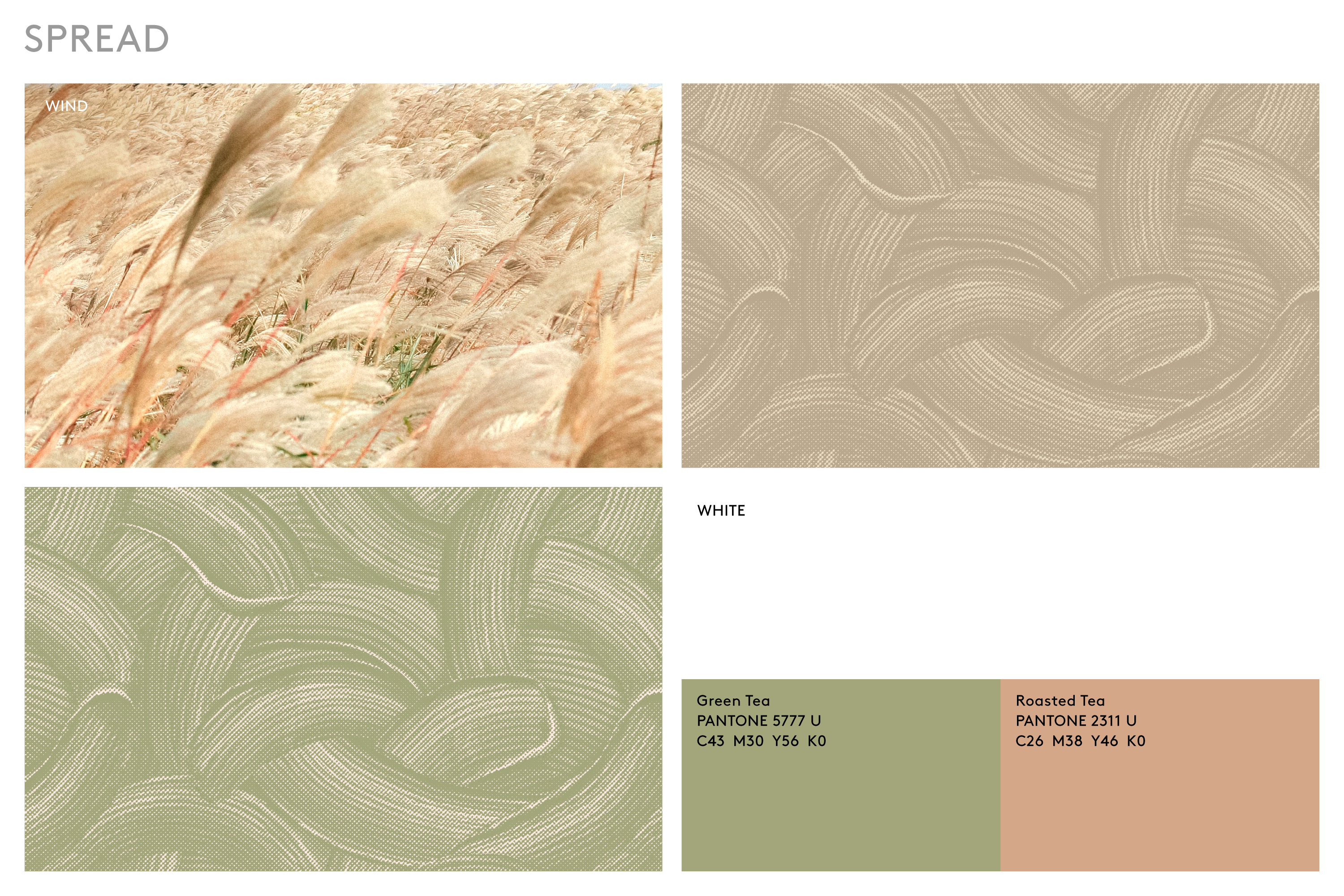


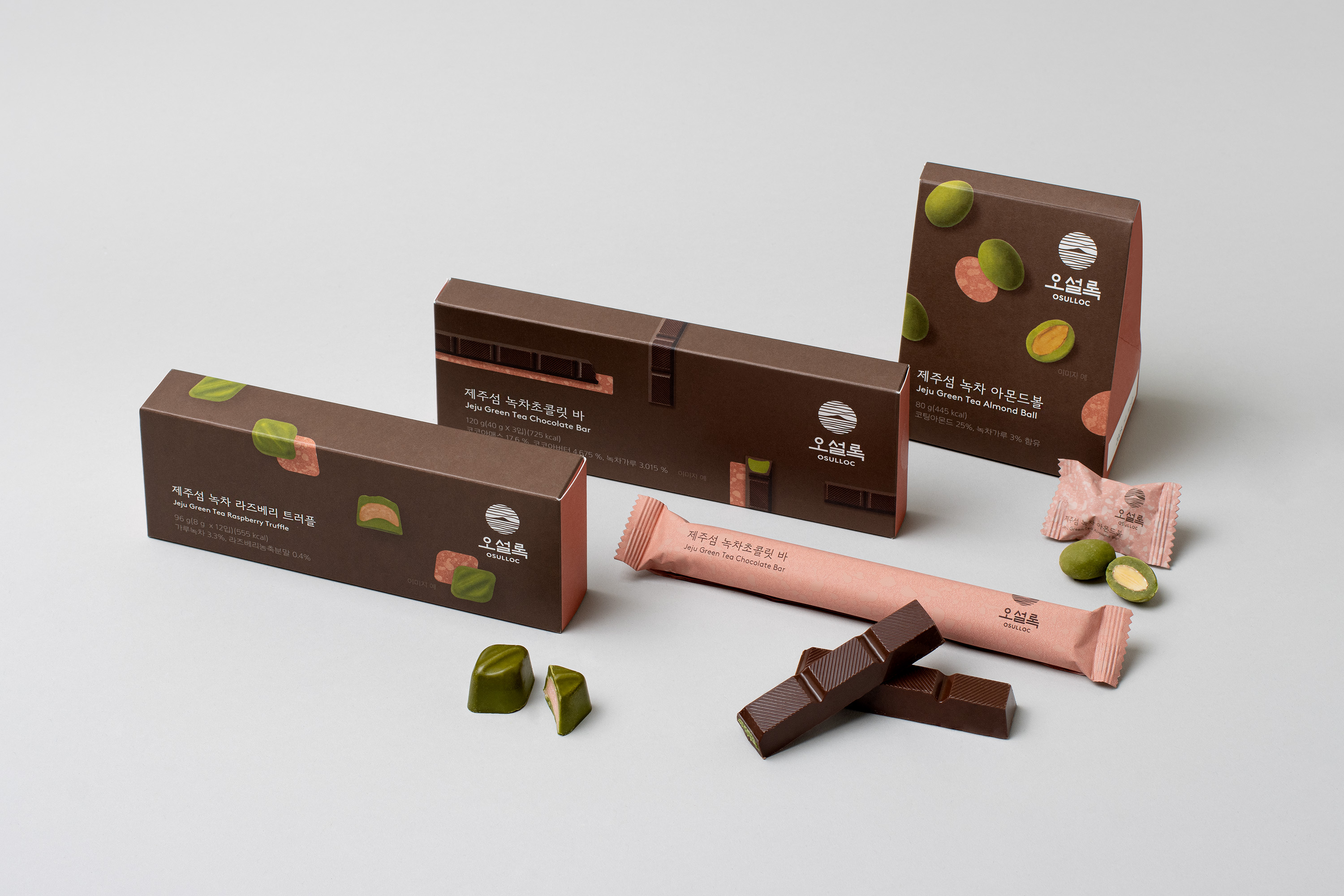
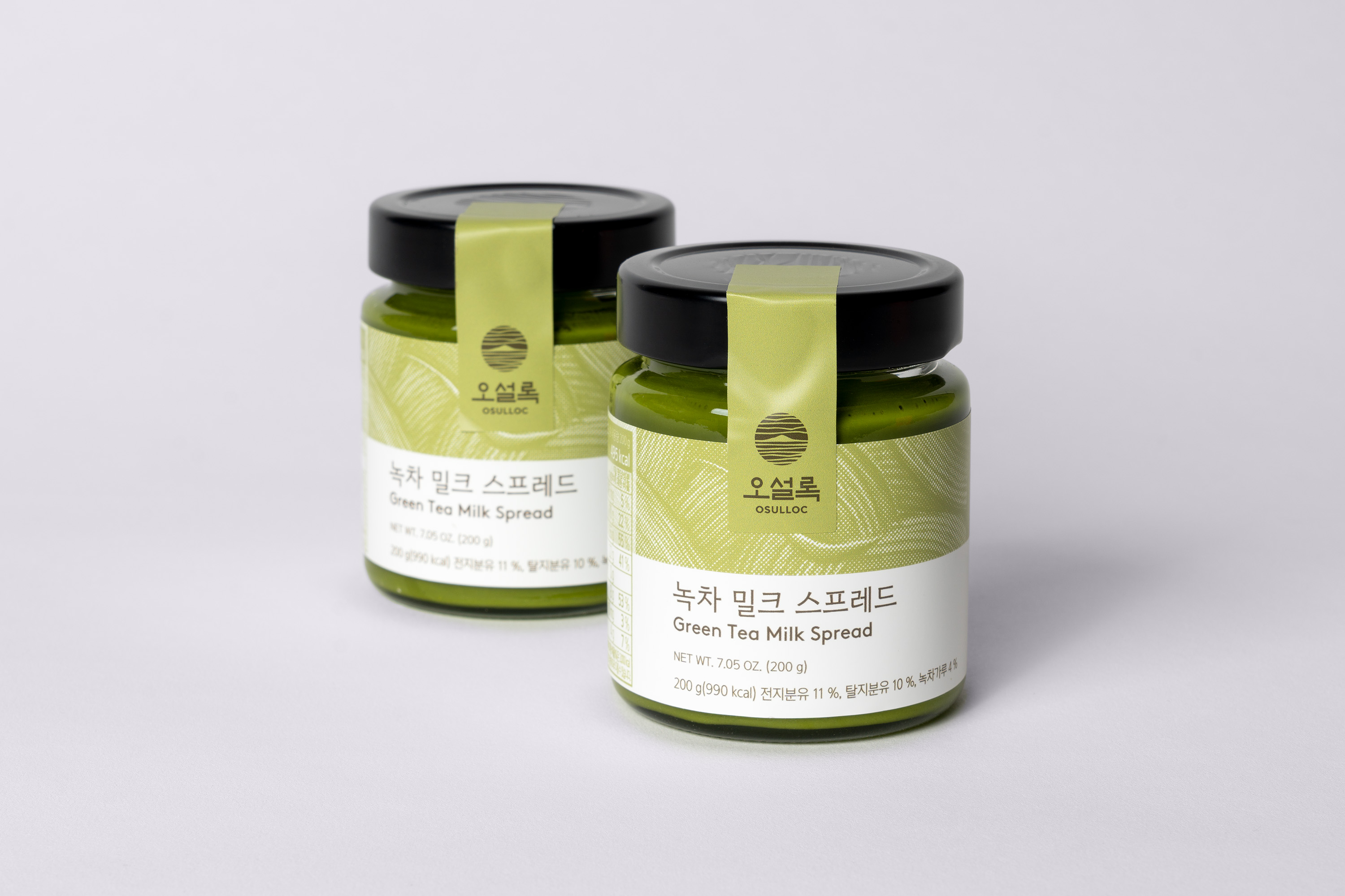
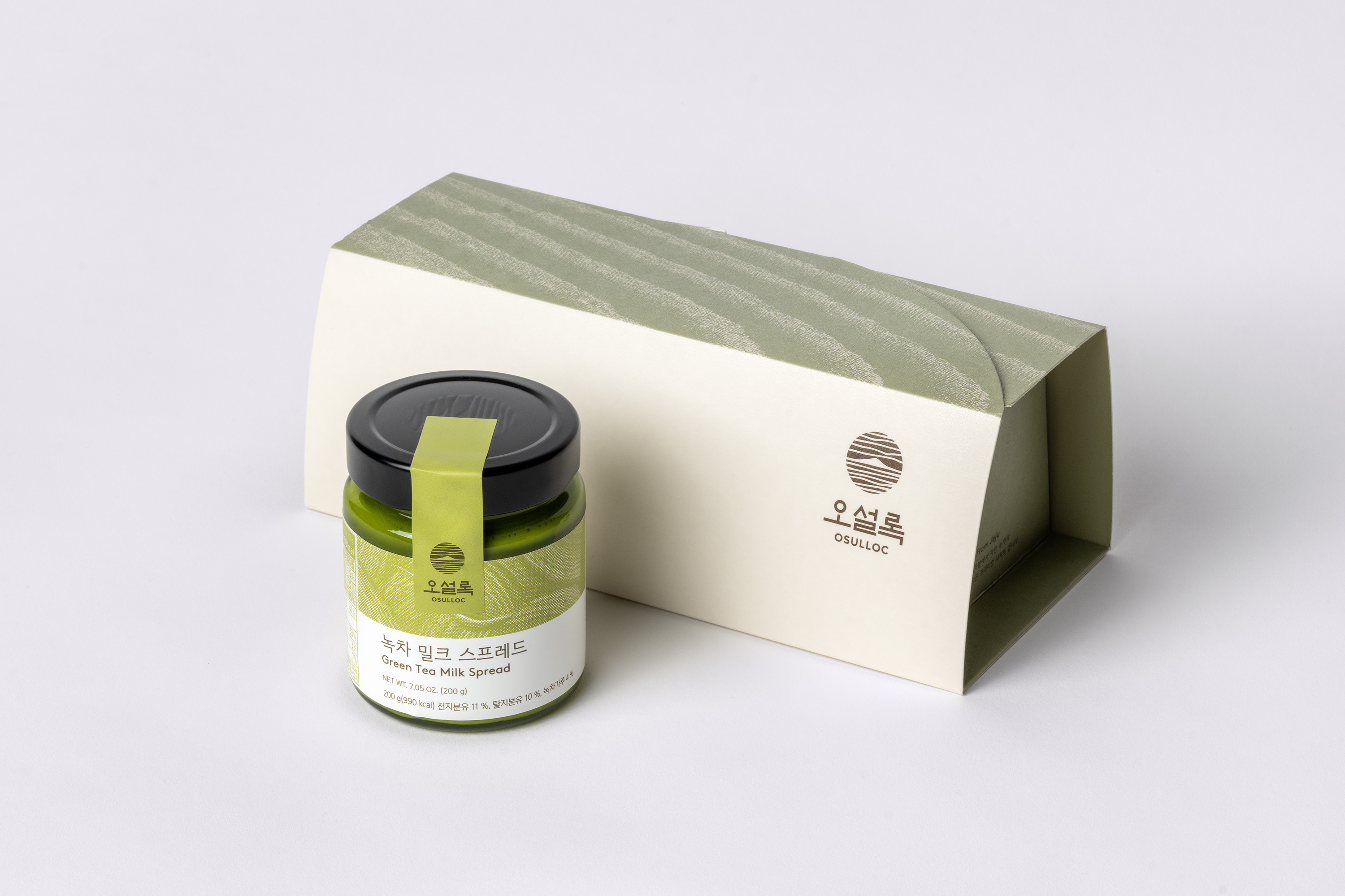

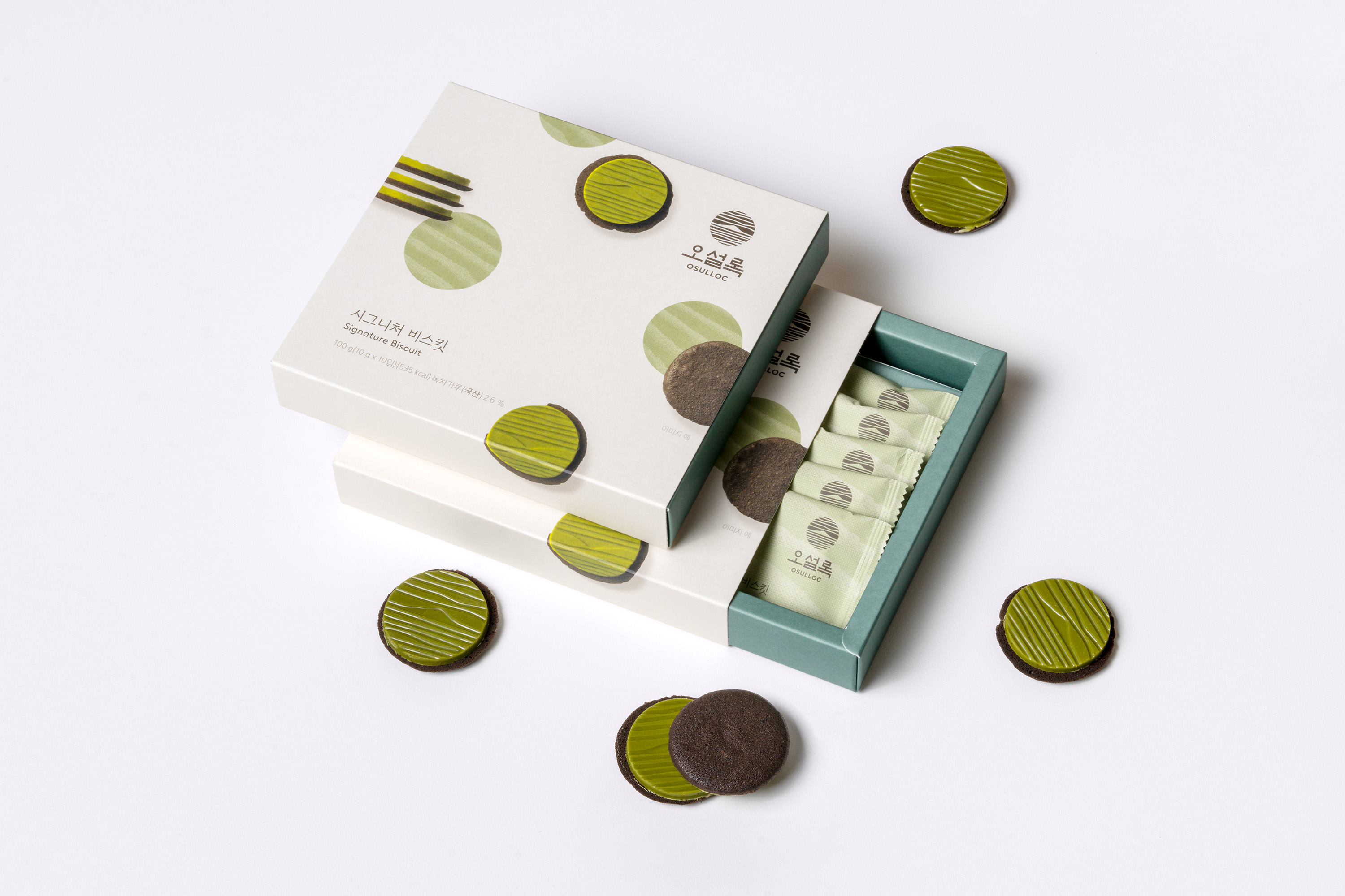


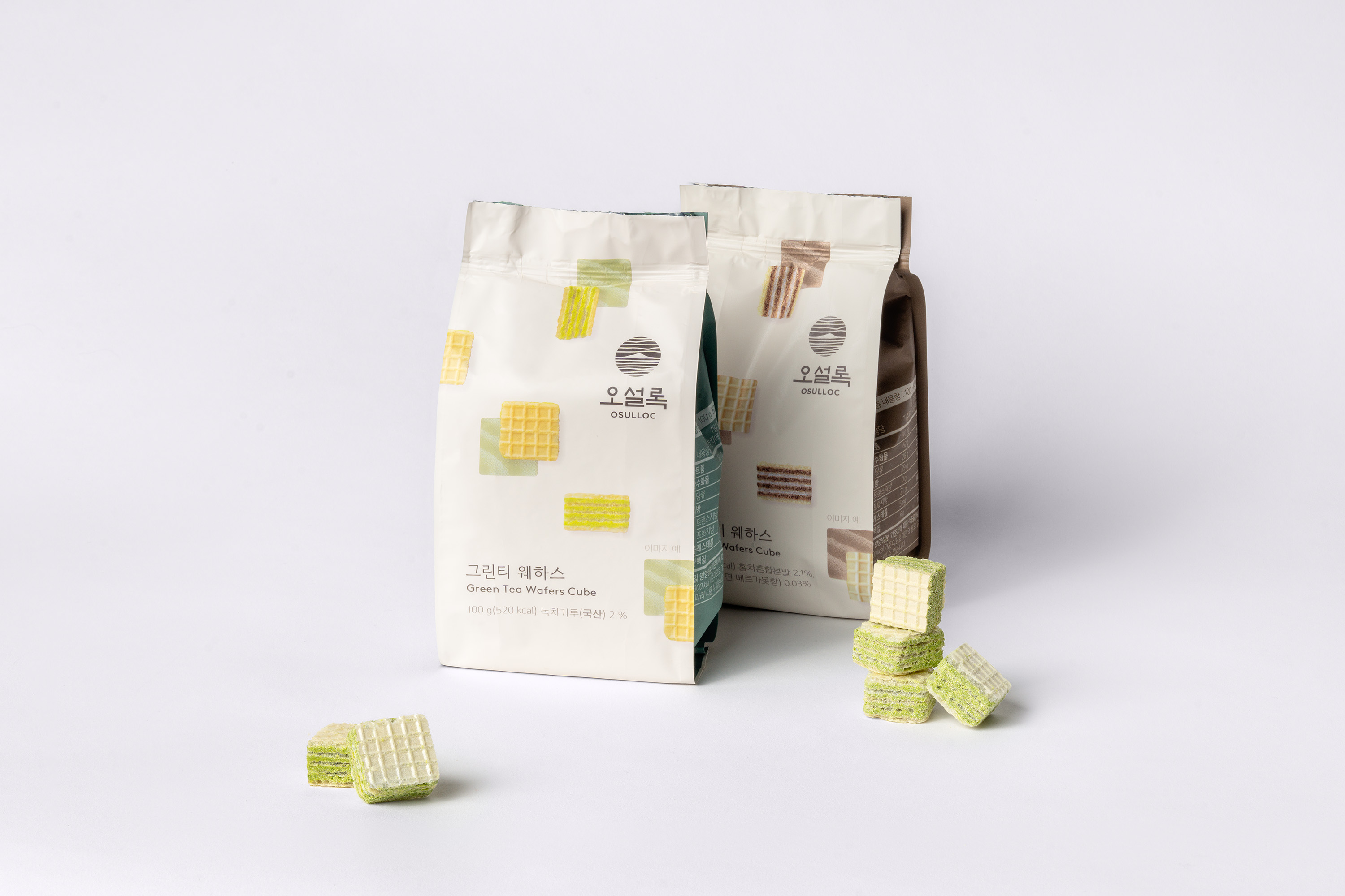
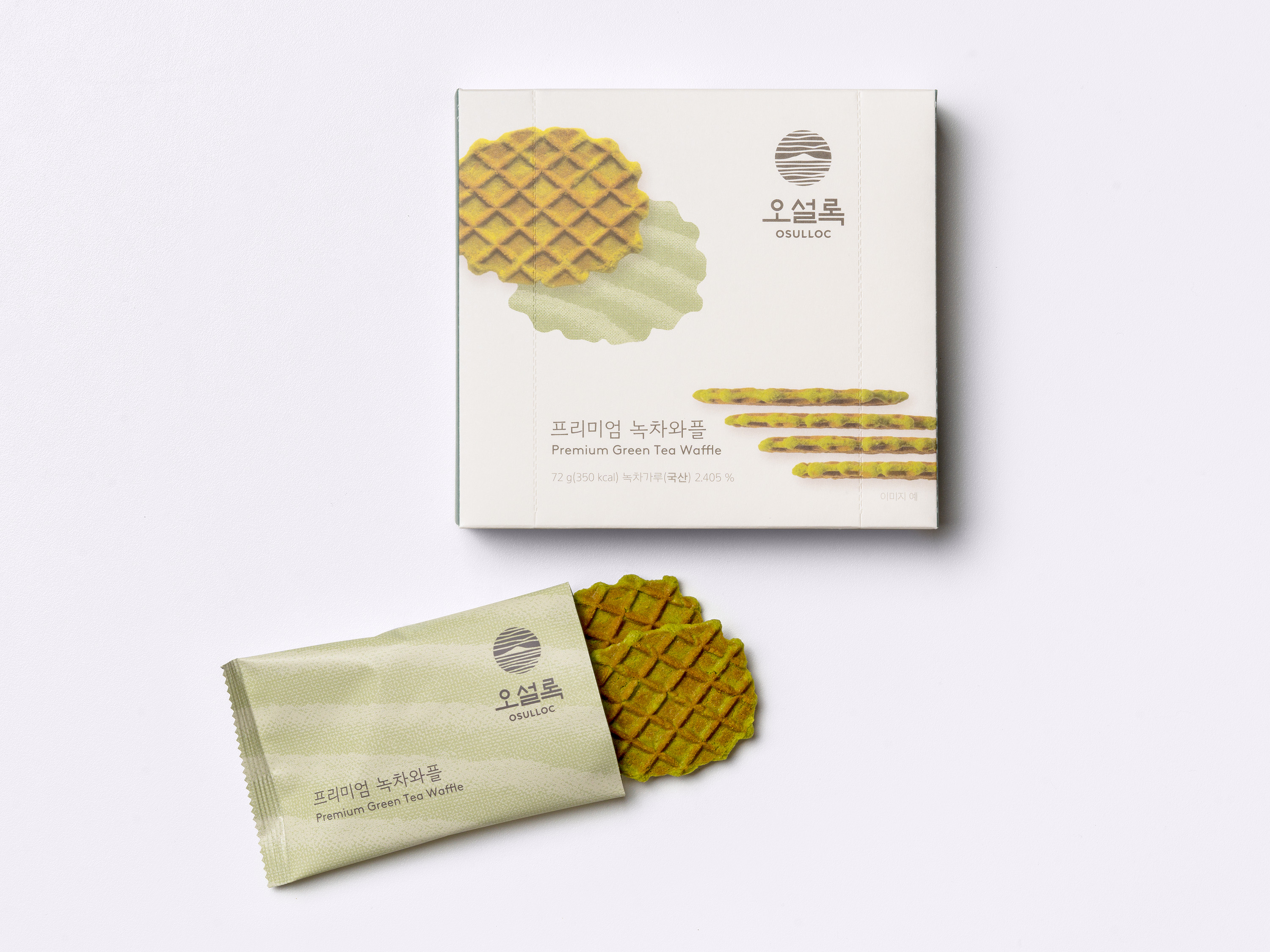
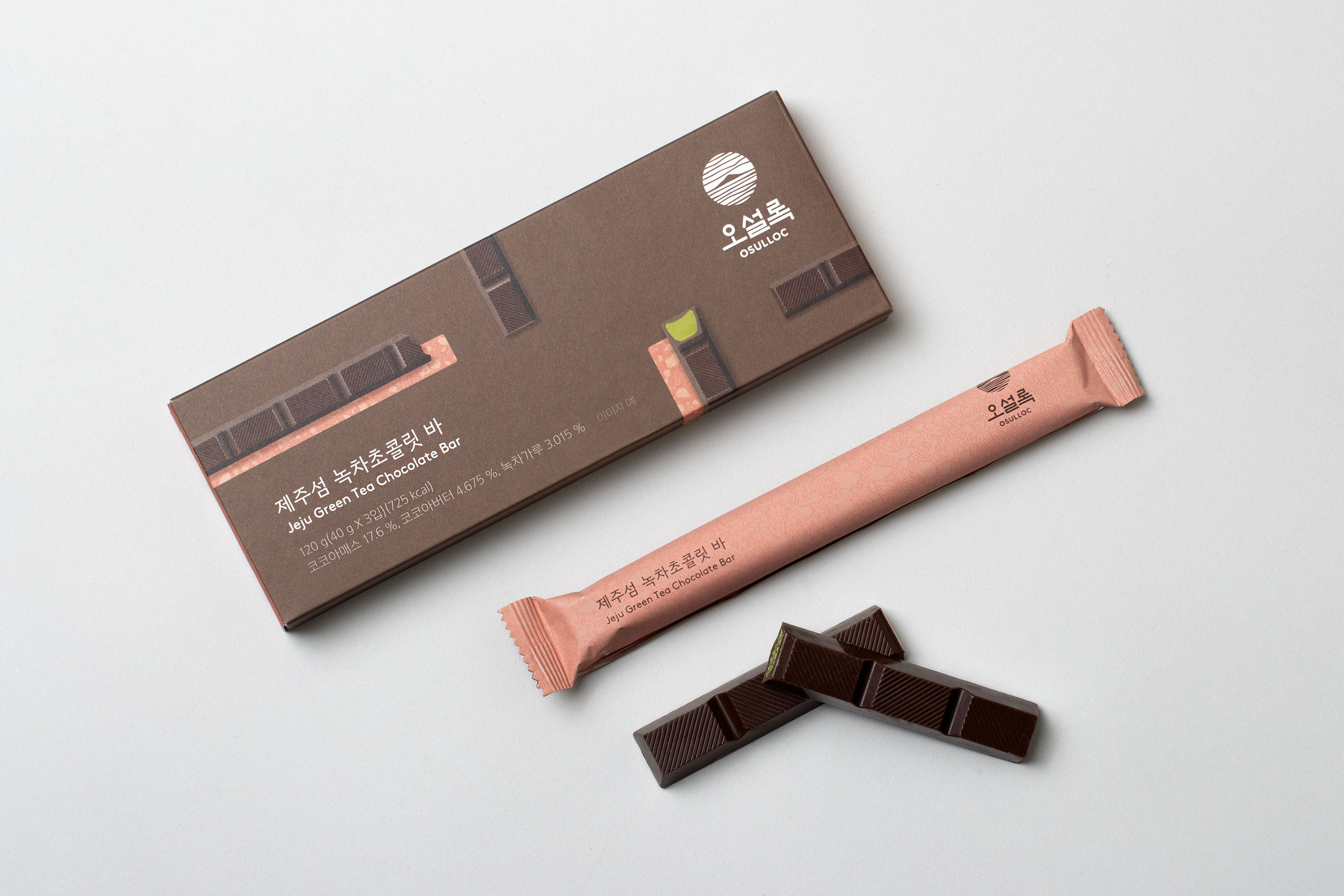
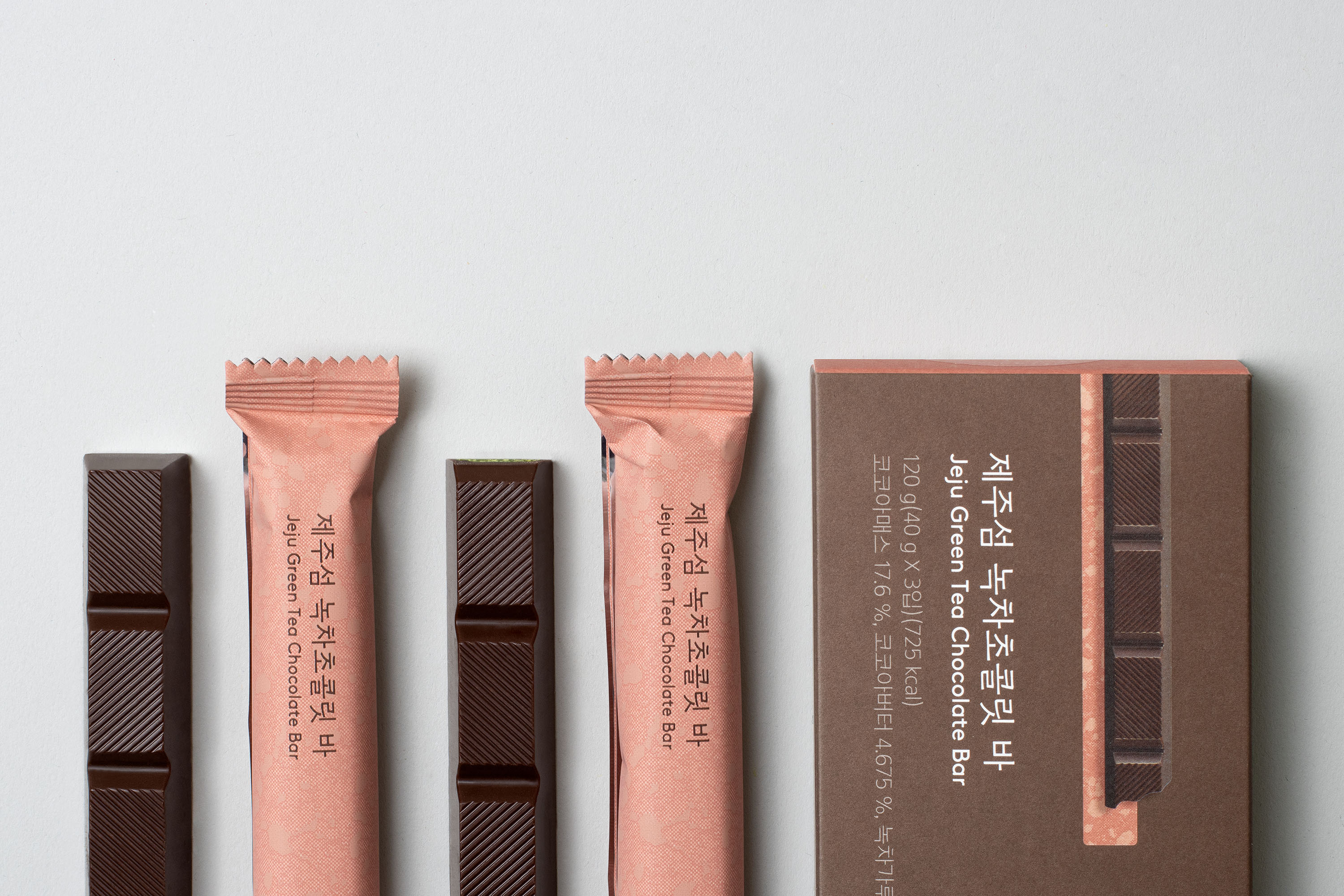
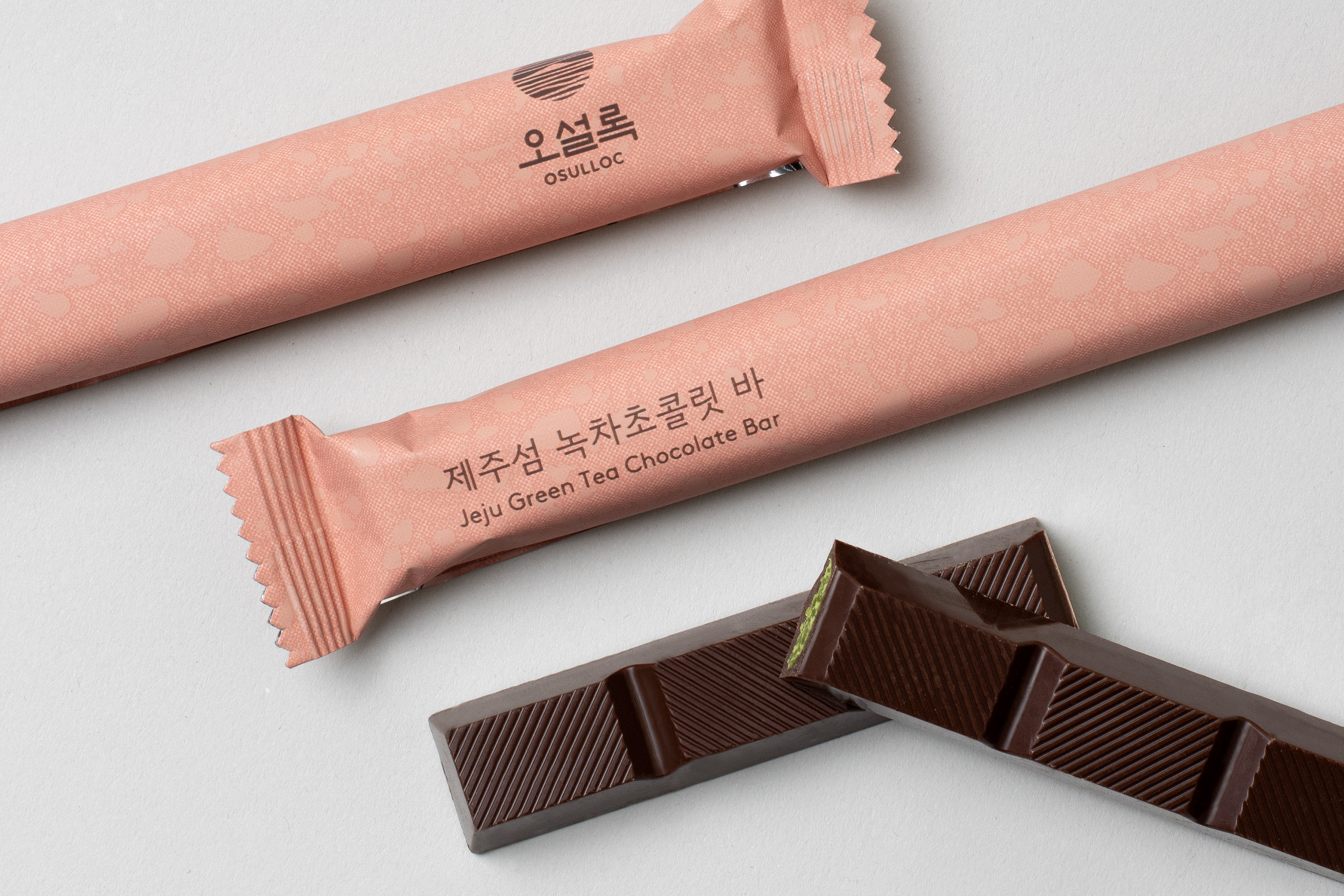
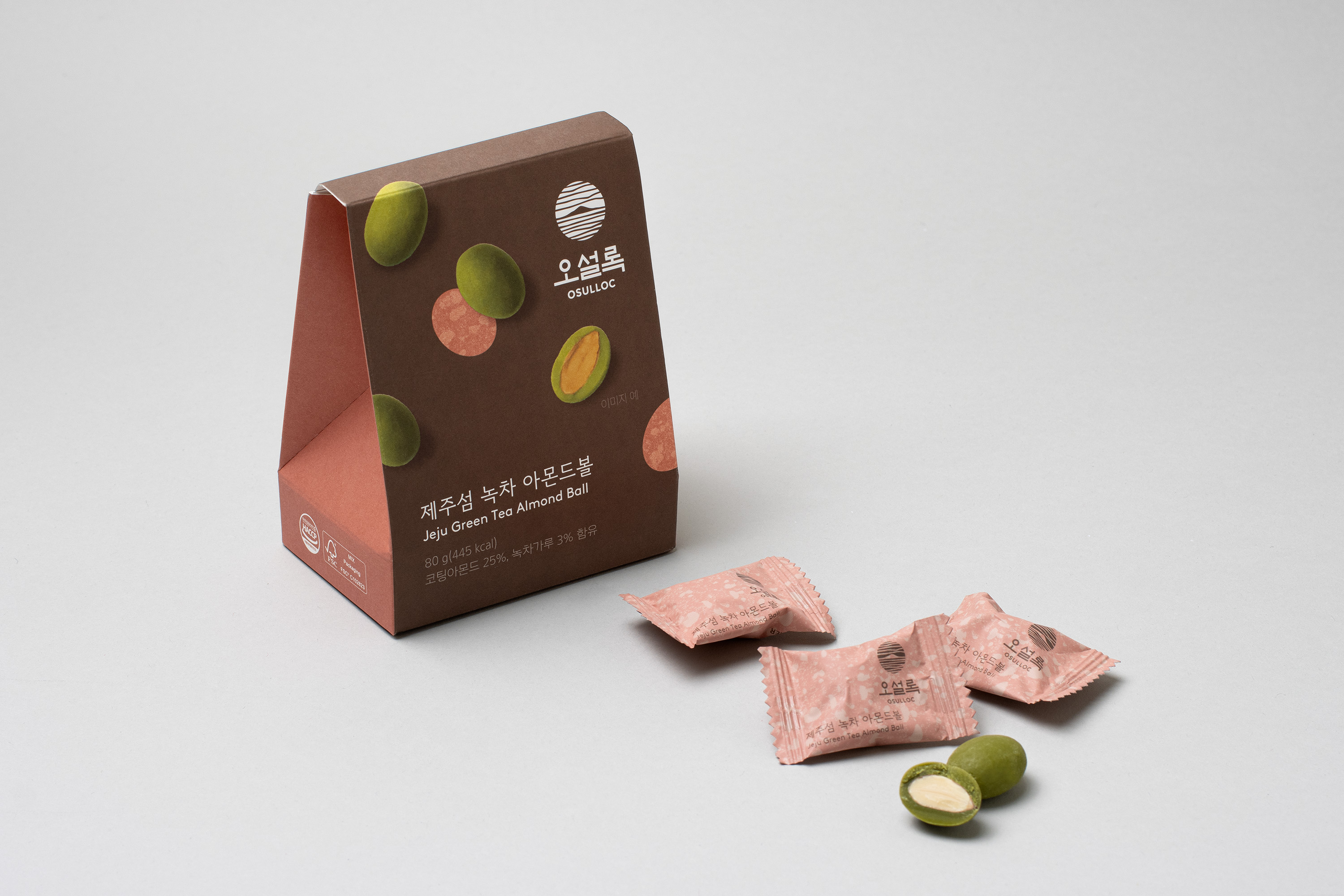

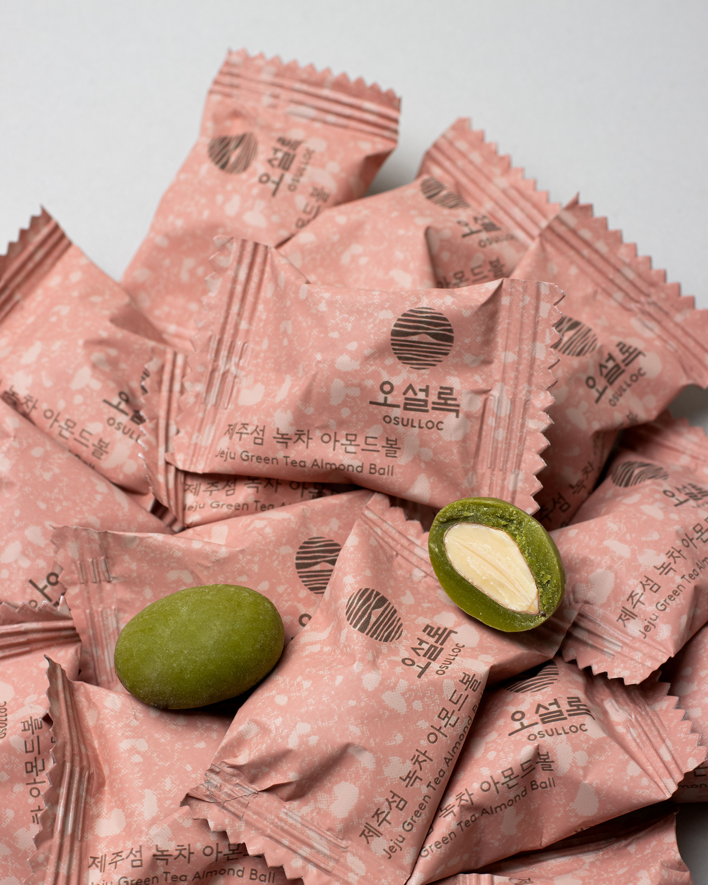
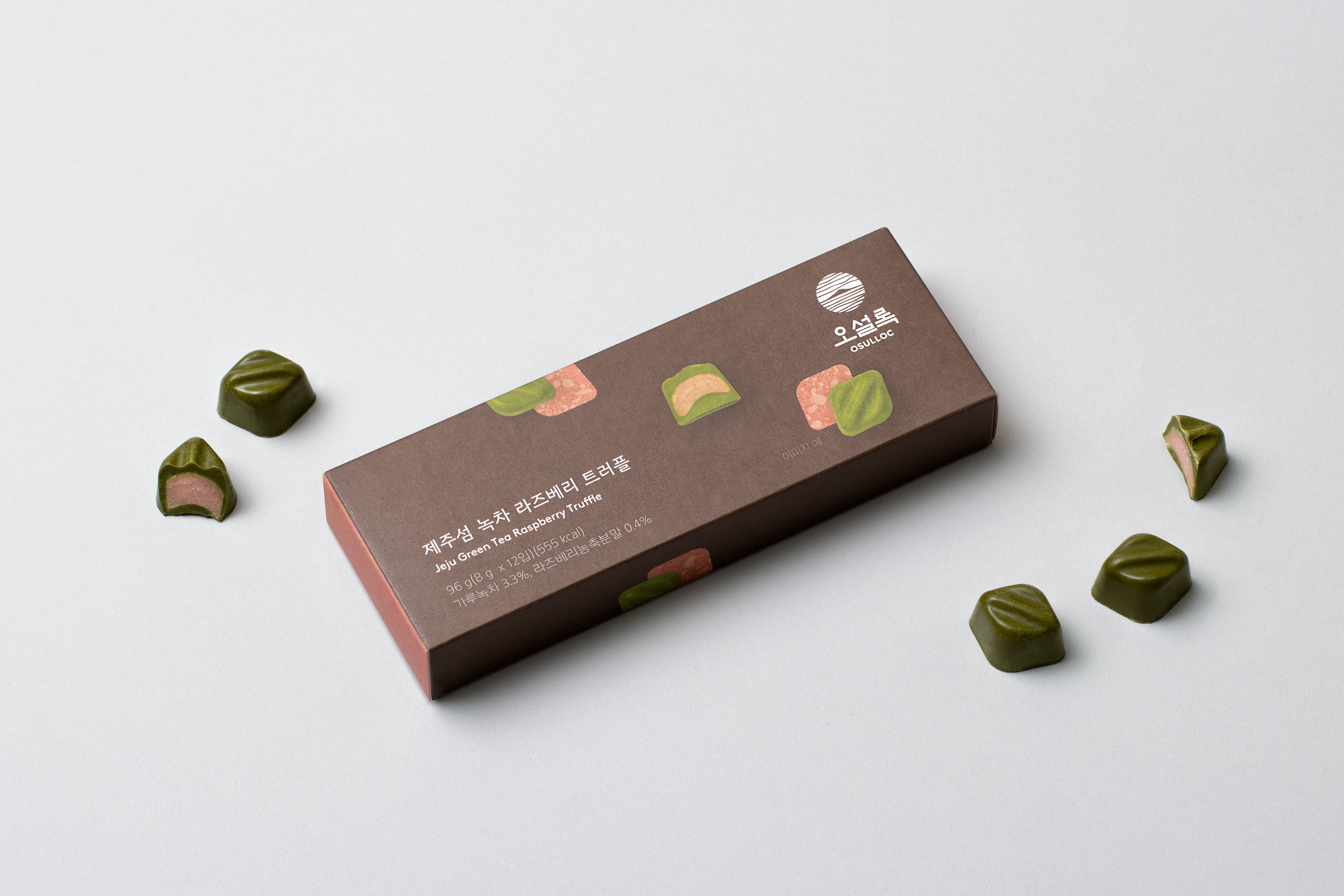
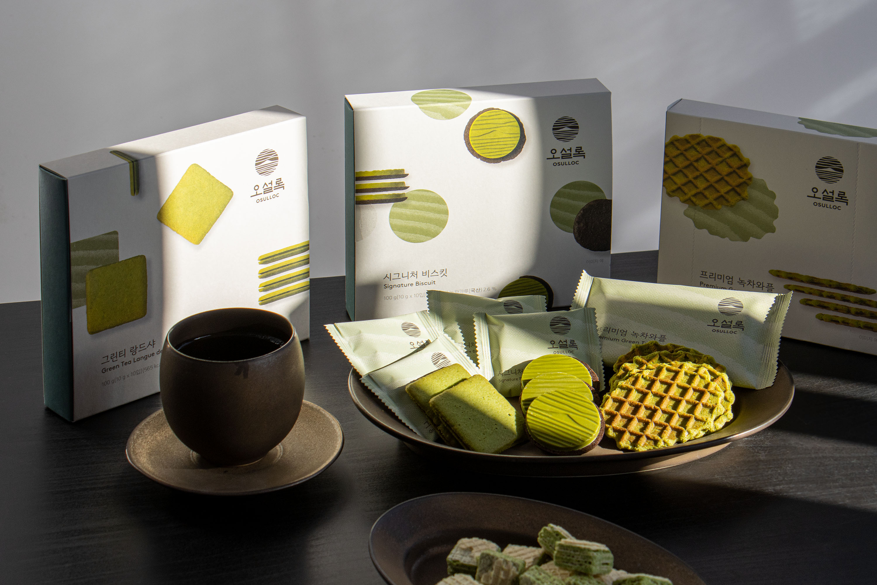
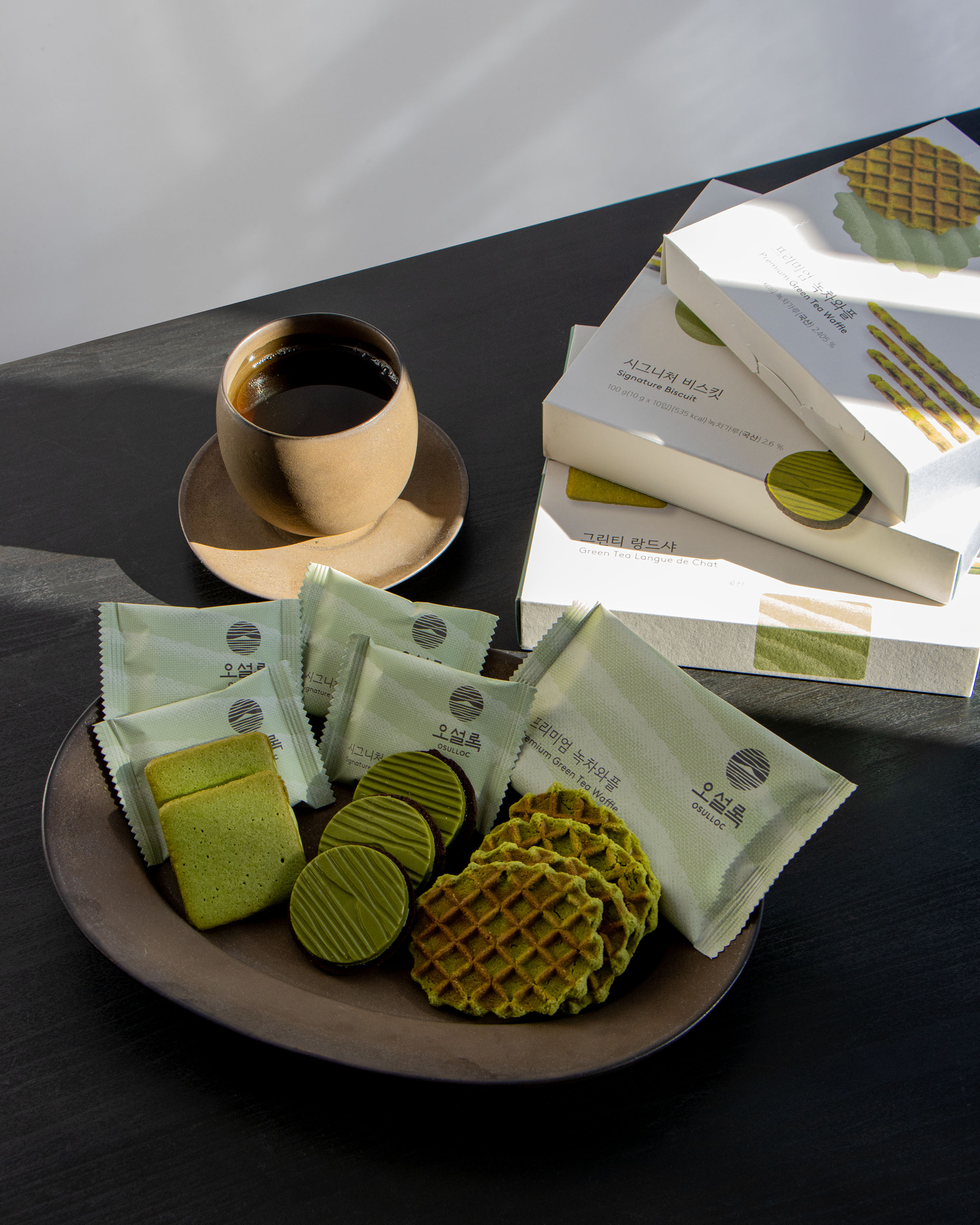
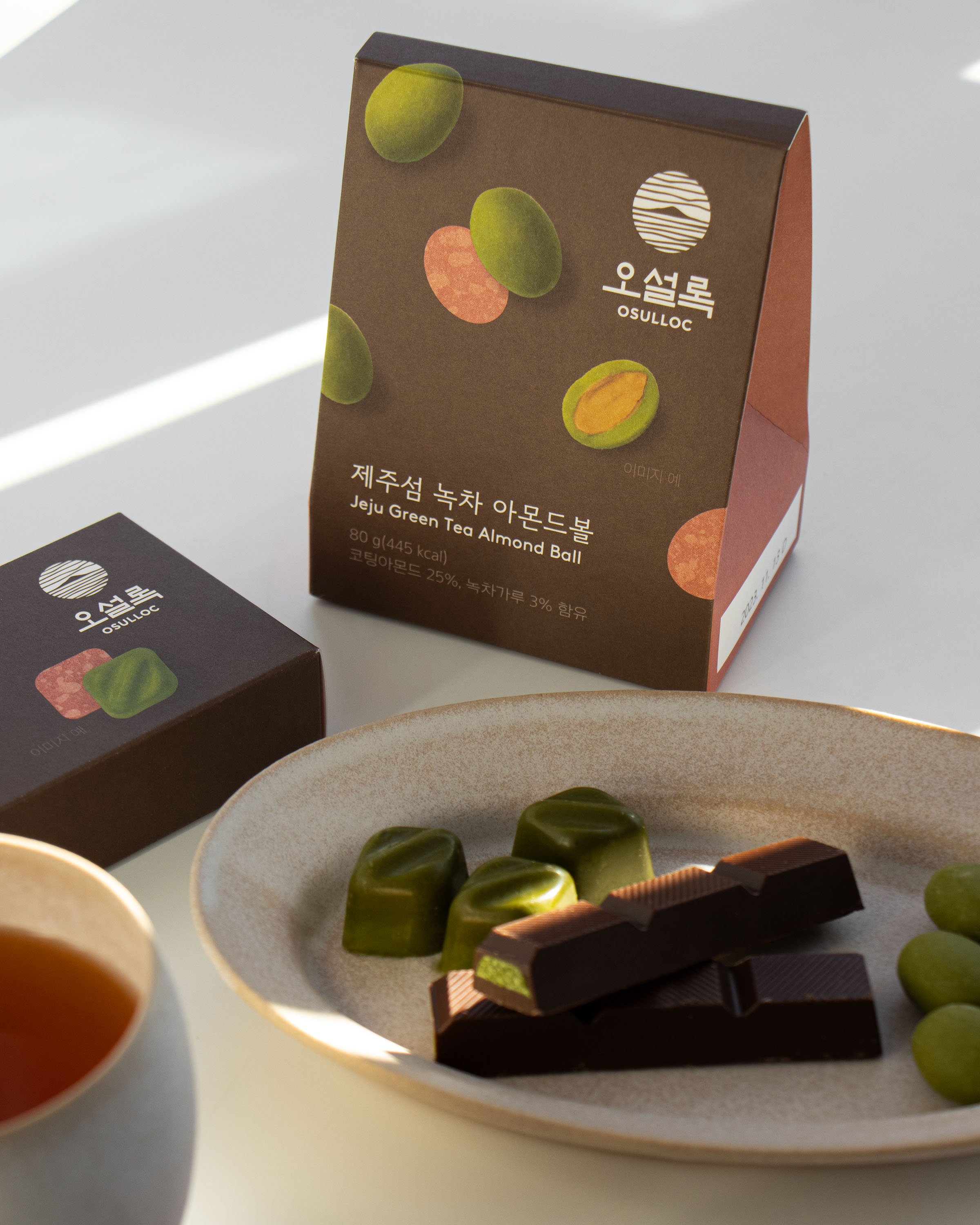

Photo: Sujeong Park and Jaemin Lee, courtesy of studio fnt
- Art direction: Woogyung Geel
- Design: Youjeong Lee, Younghyun Song, Hyungwon Cho
- Design: Youjeong Lee, Younghyun Song, Hyungwon Cho
- Client: Osulloc
- Year: October 2022
- Year: October 2022
© 2023 studio fnt. All rights reserved.