Sorot
Sorot, derived from the Korean term meaning ‘preserved in its original state,’ embodies its essence as a natural-fermented vinegar brand. Studio FNT took the lead in crafting the design for Sorot’s entire product line, capturing the vibrant microorganisms and promoting healthy dietary choices through modern fermentation techniques.
Departing from the conventional portrayal of fermented vinegar, we aimed to cultivate a contemporary image associated with daily wellness. We ensured intuitive ingredient recognition by using vivid fruit imagery while visually narrating the fermentation journey through sequentially diminishing grid systems and evolving patterns. The logo, elegantly presented in vertical script, echoes the symmetrical allure of the brand name, incorporating the distinctive Korean characters ㅅ, ㅗ, ㄹ, ㅗ, ㅅ. Drawing inspiration from the natural palette of raw ingredients, we infused subtle neon yellow, evoking the invigorating essence of Sorot’s distinctive flavor profile.

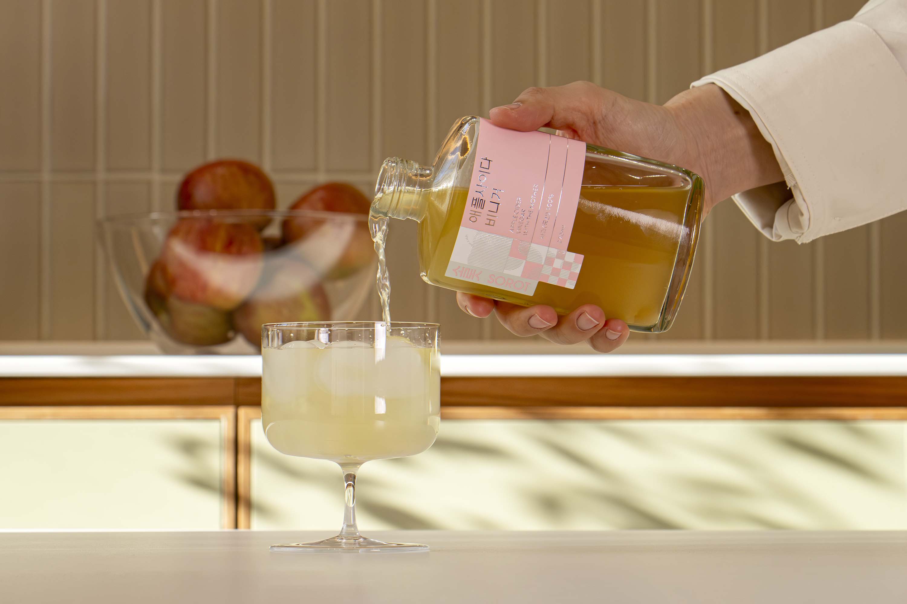
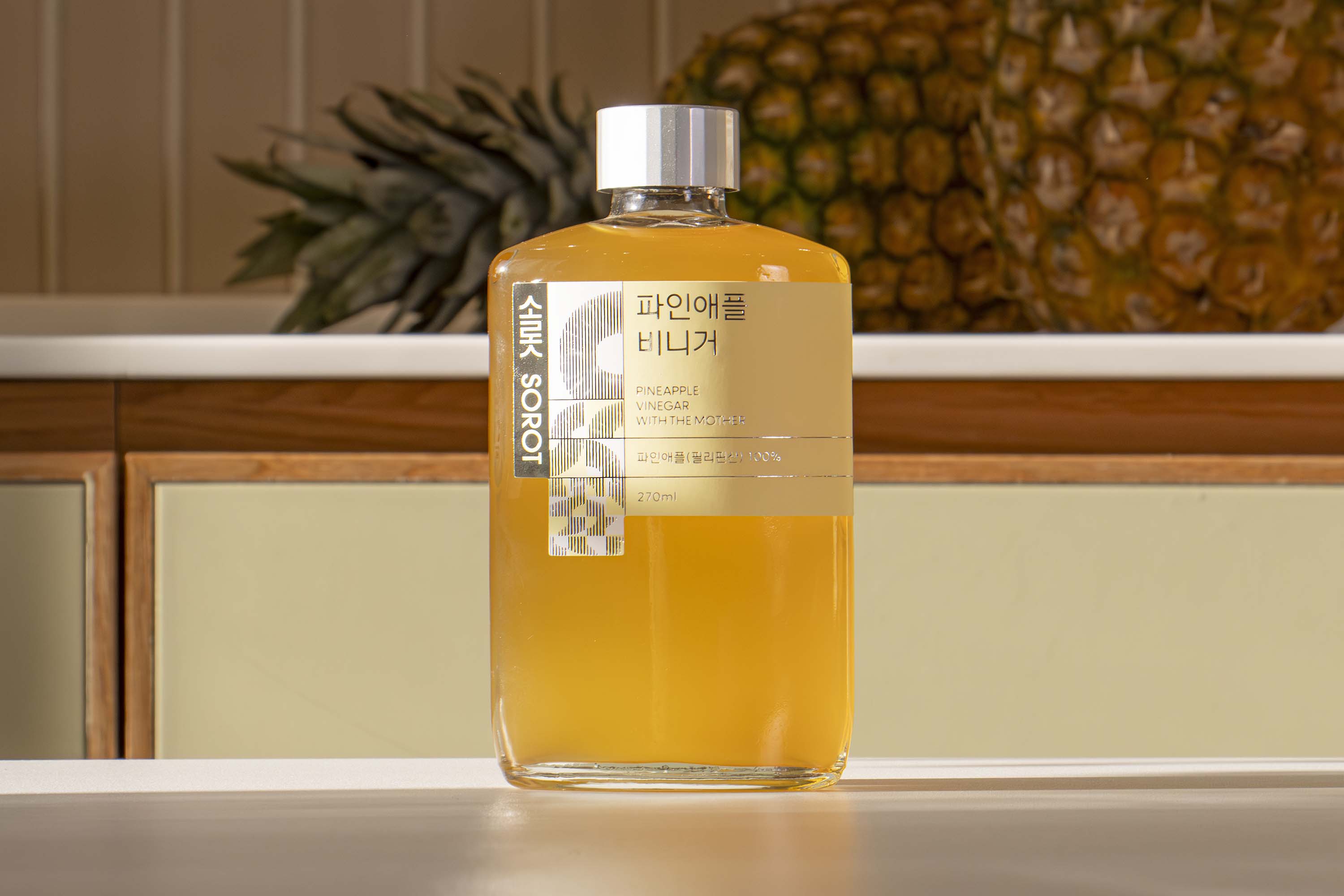
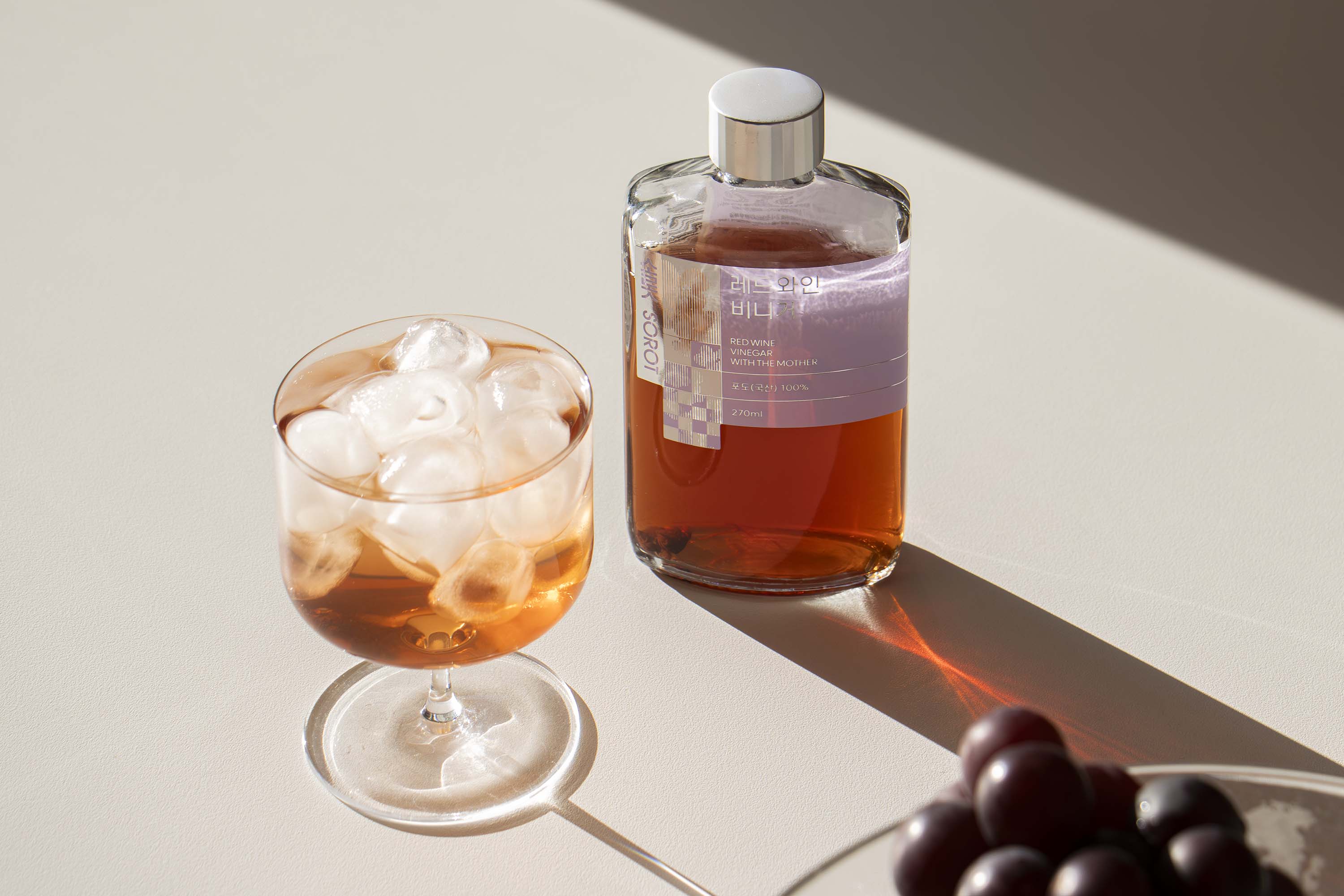
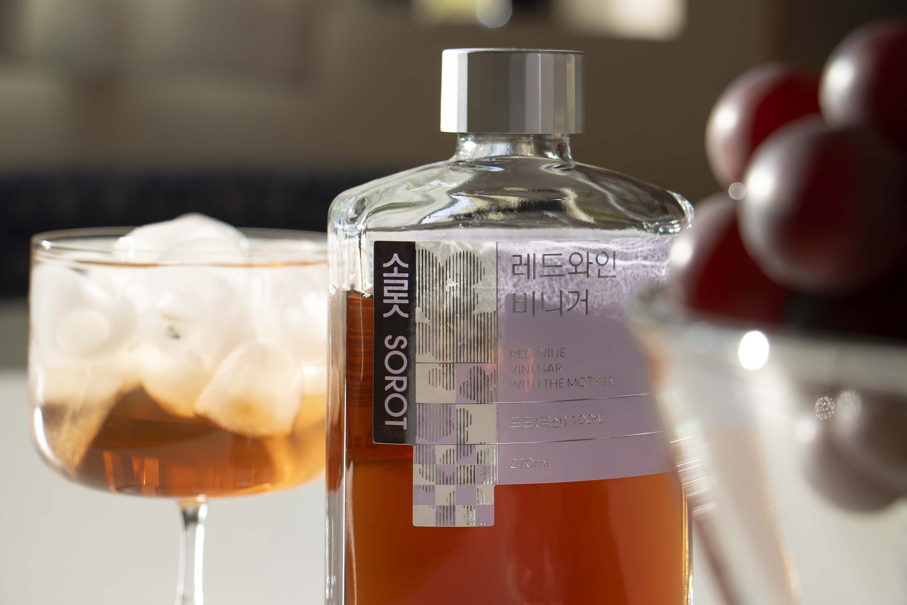


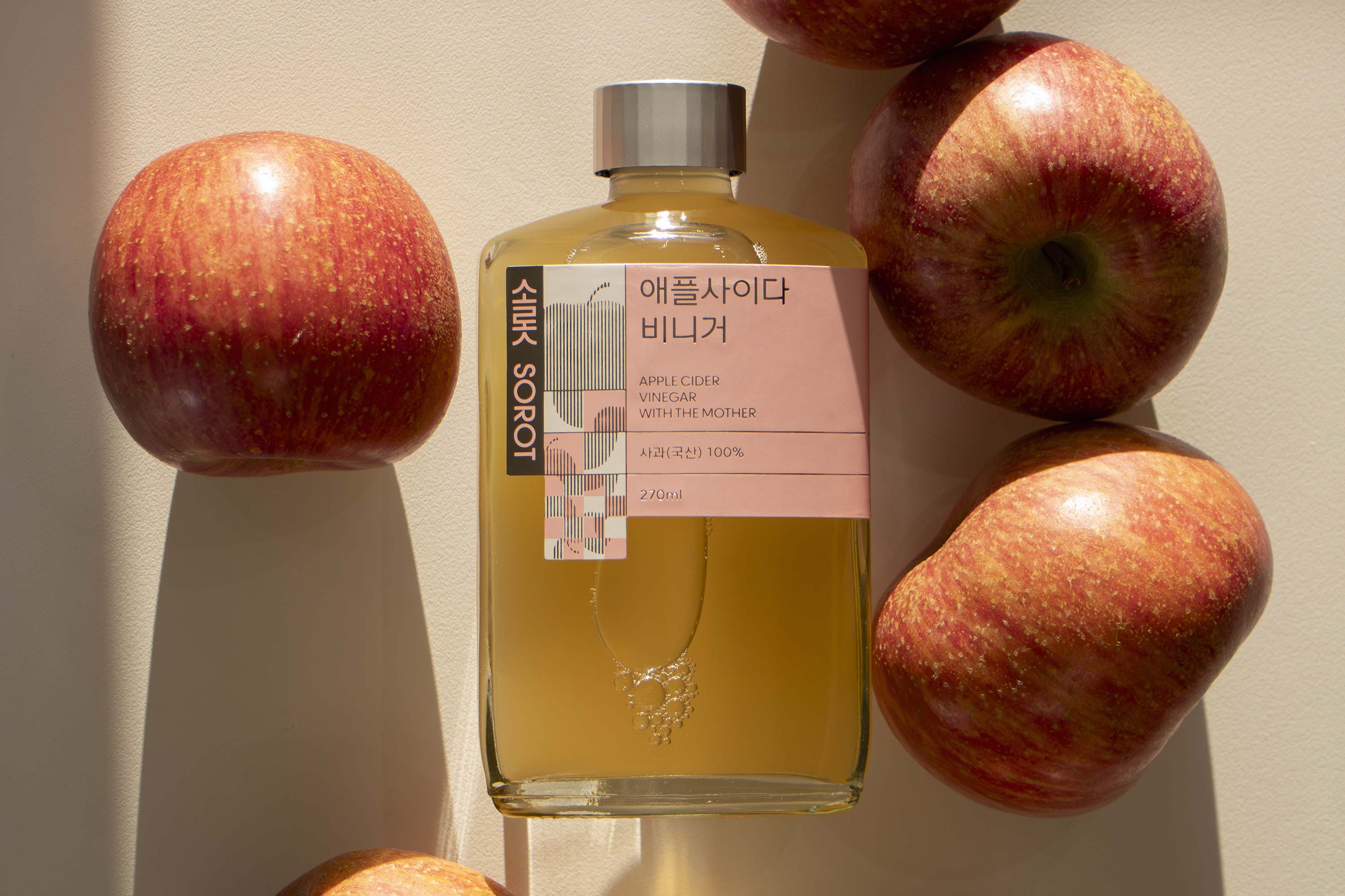
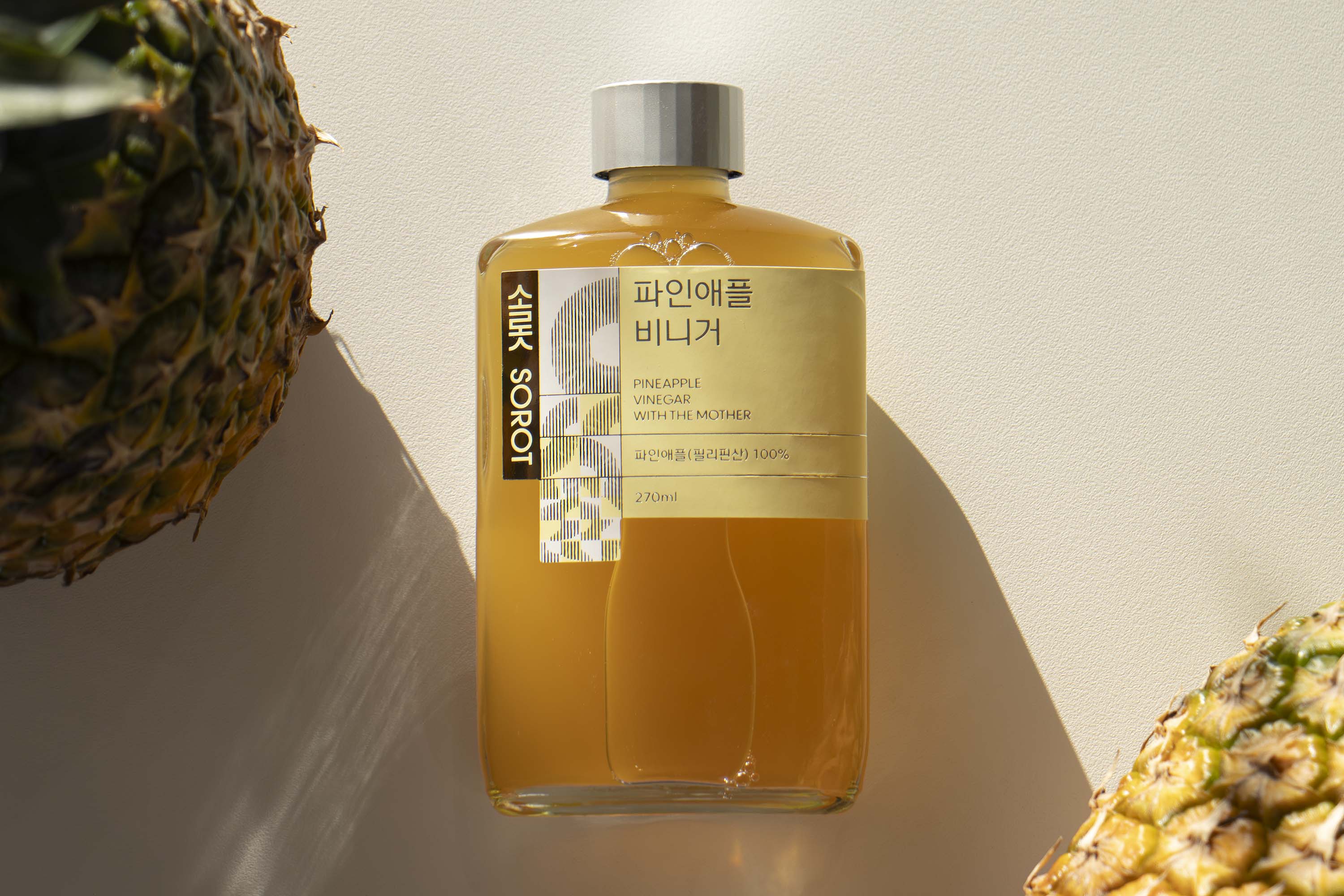


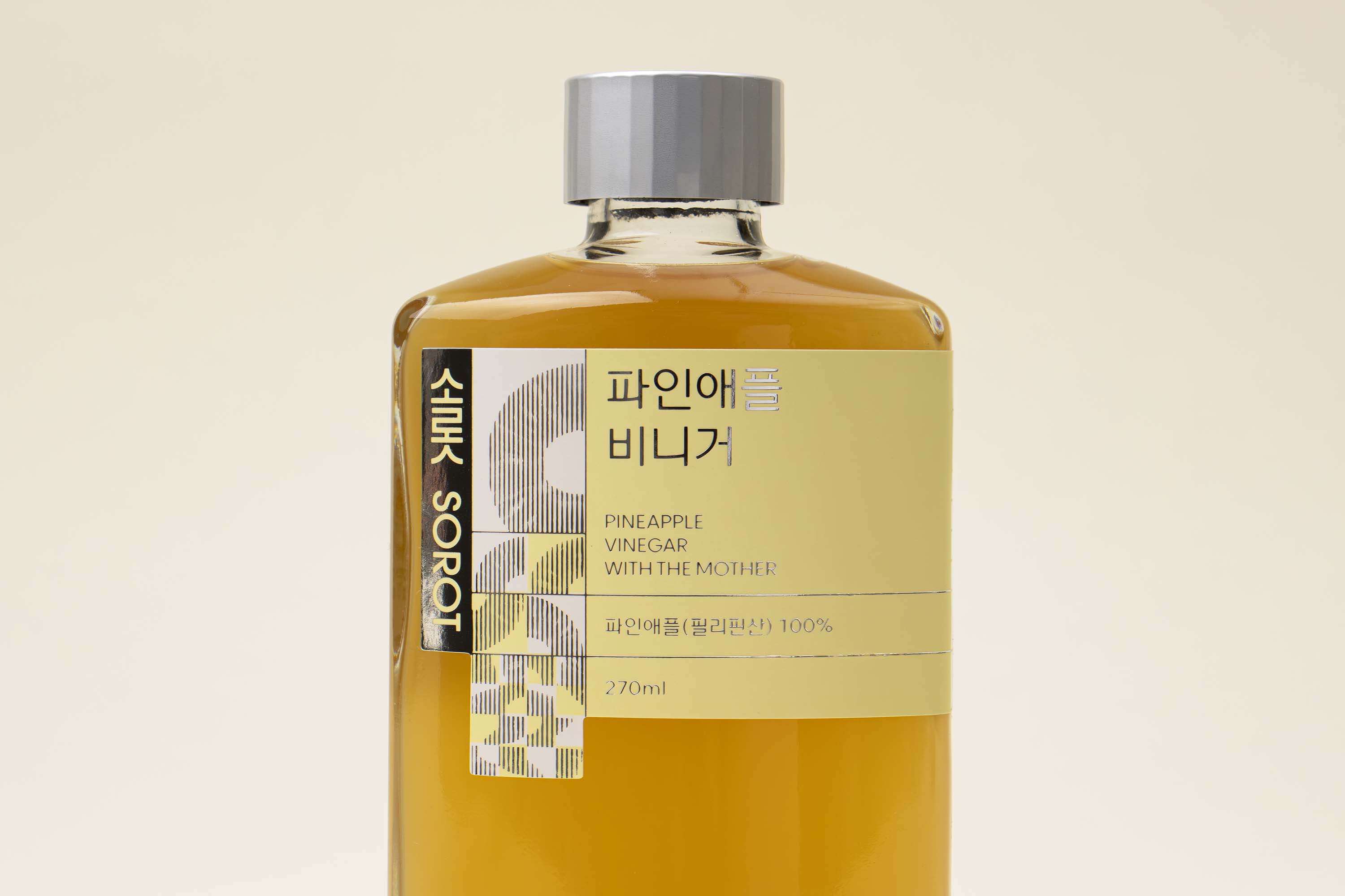

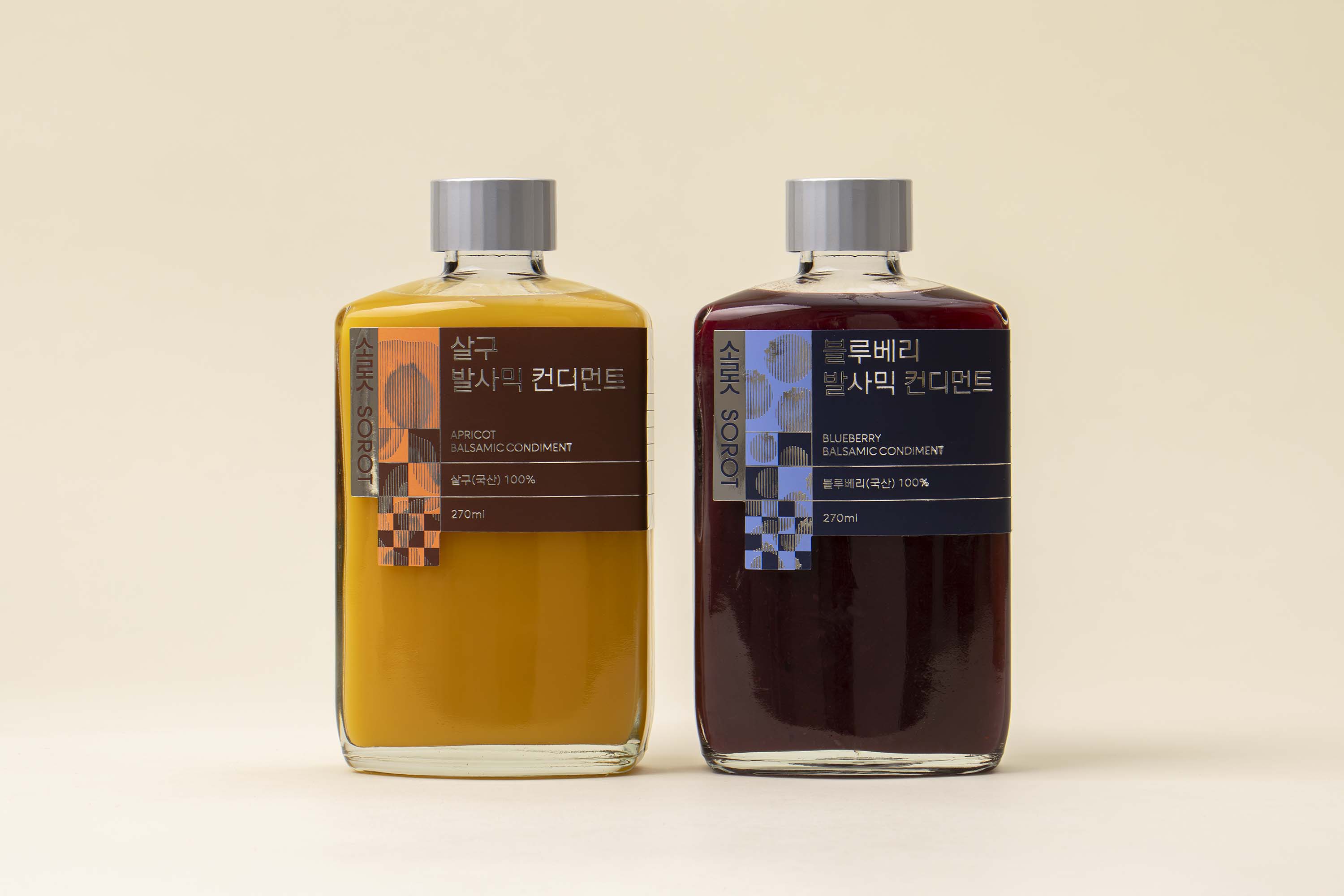

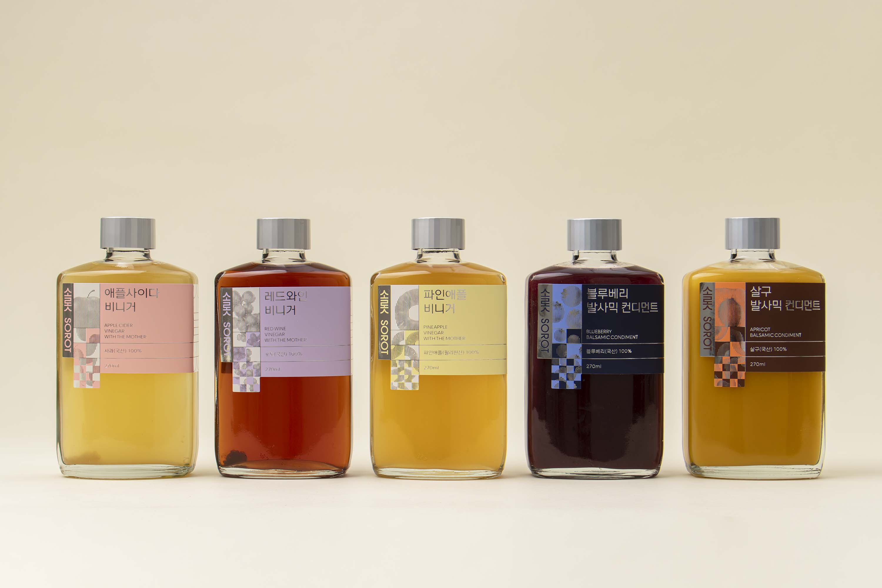
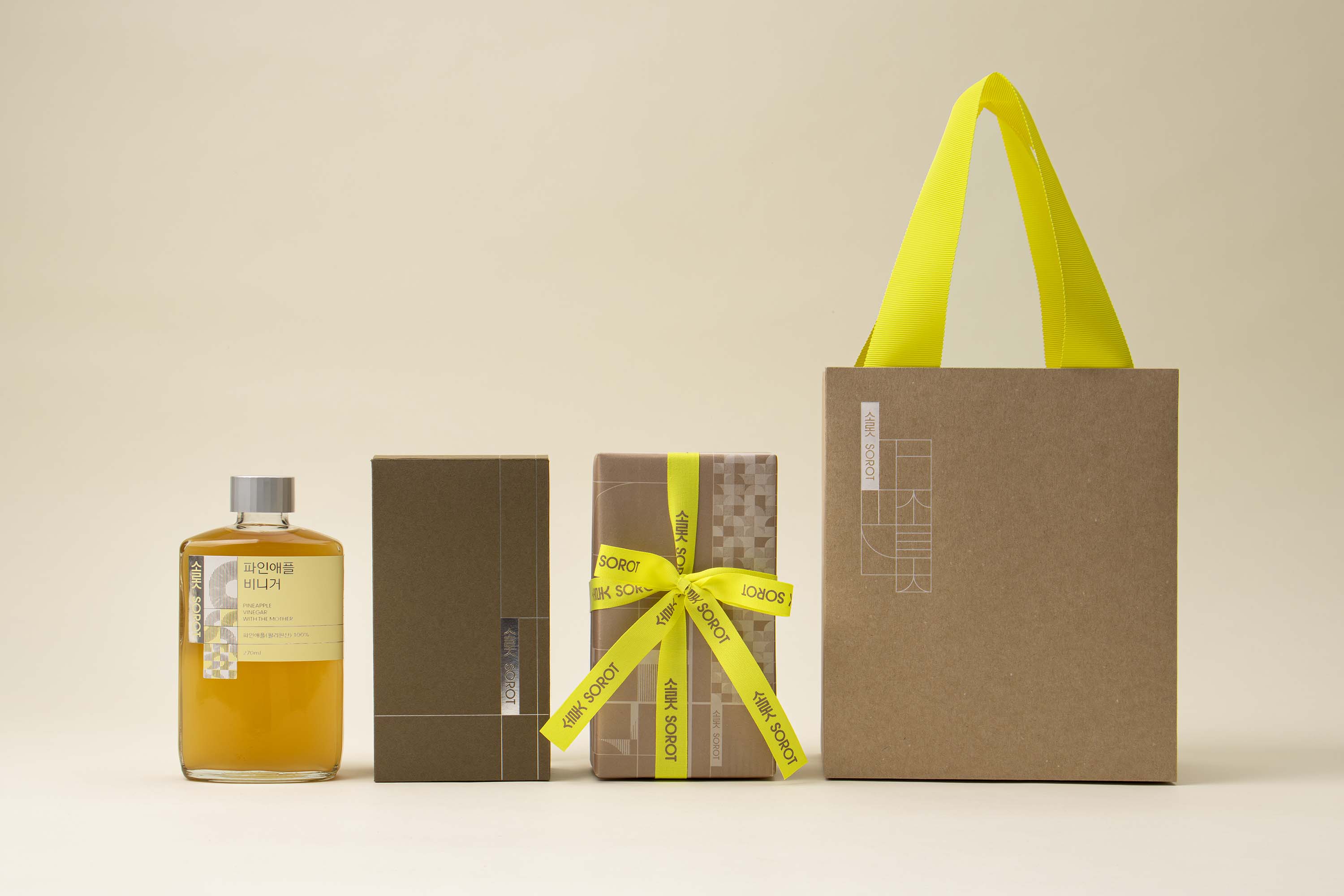
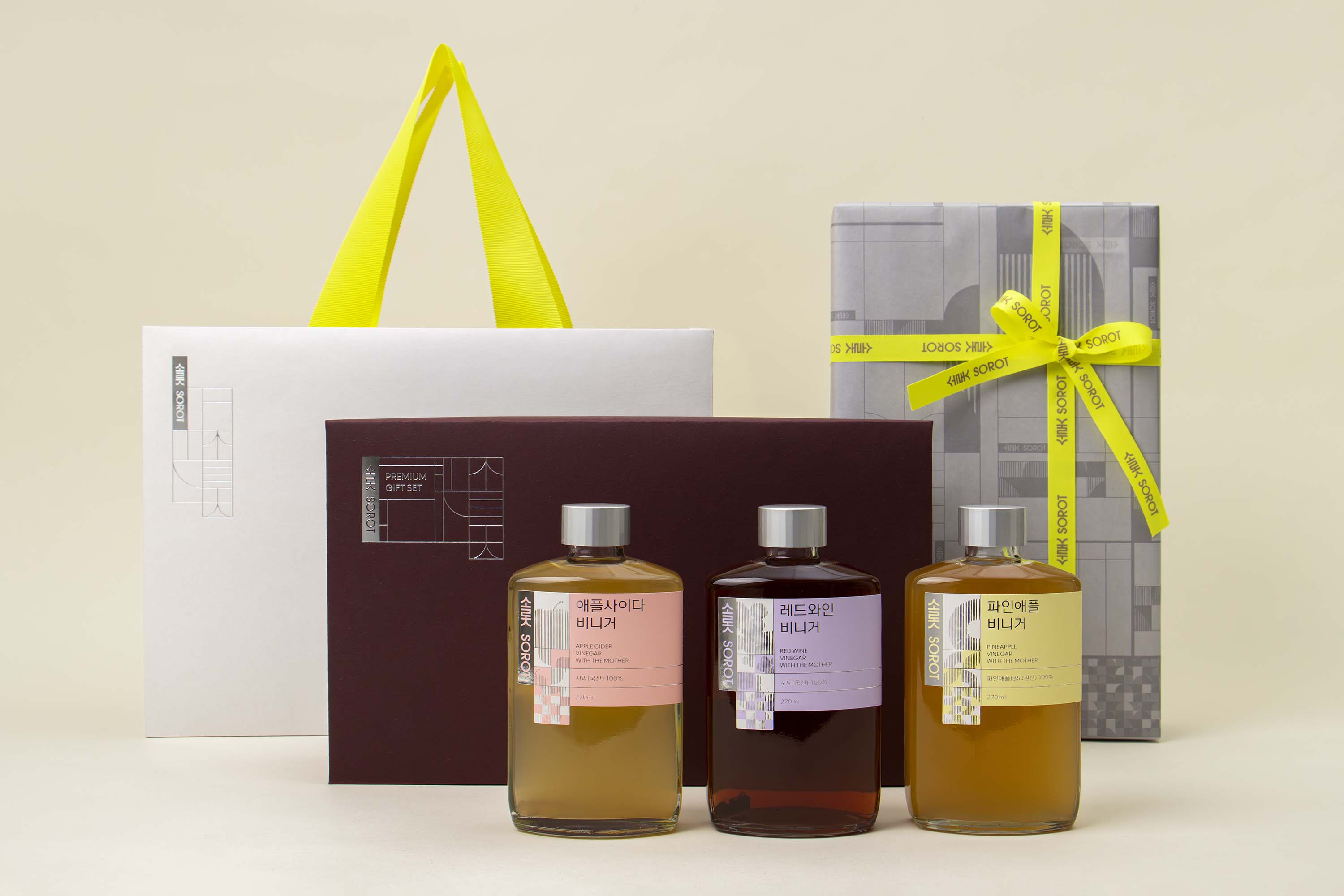
Photo: Sujeong Park, courtesy of studio fnt
- Art direction: Woogyung Geel
- Graphic design: Hyungwon Cho, Giho Choi, and Younghyun Song
- Graphic design: Hyungwon Cho, Giho Choi, and Younghyun Song
- Client: wholesome kitchen @wholesome_kitchen
- Year: May 2023
- Year: May 2023
© 2023 studio fnt. All rights reserved.