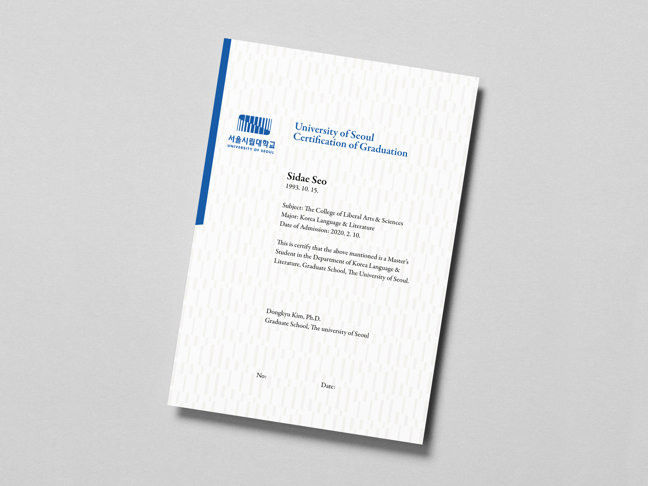
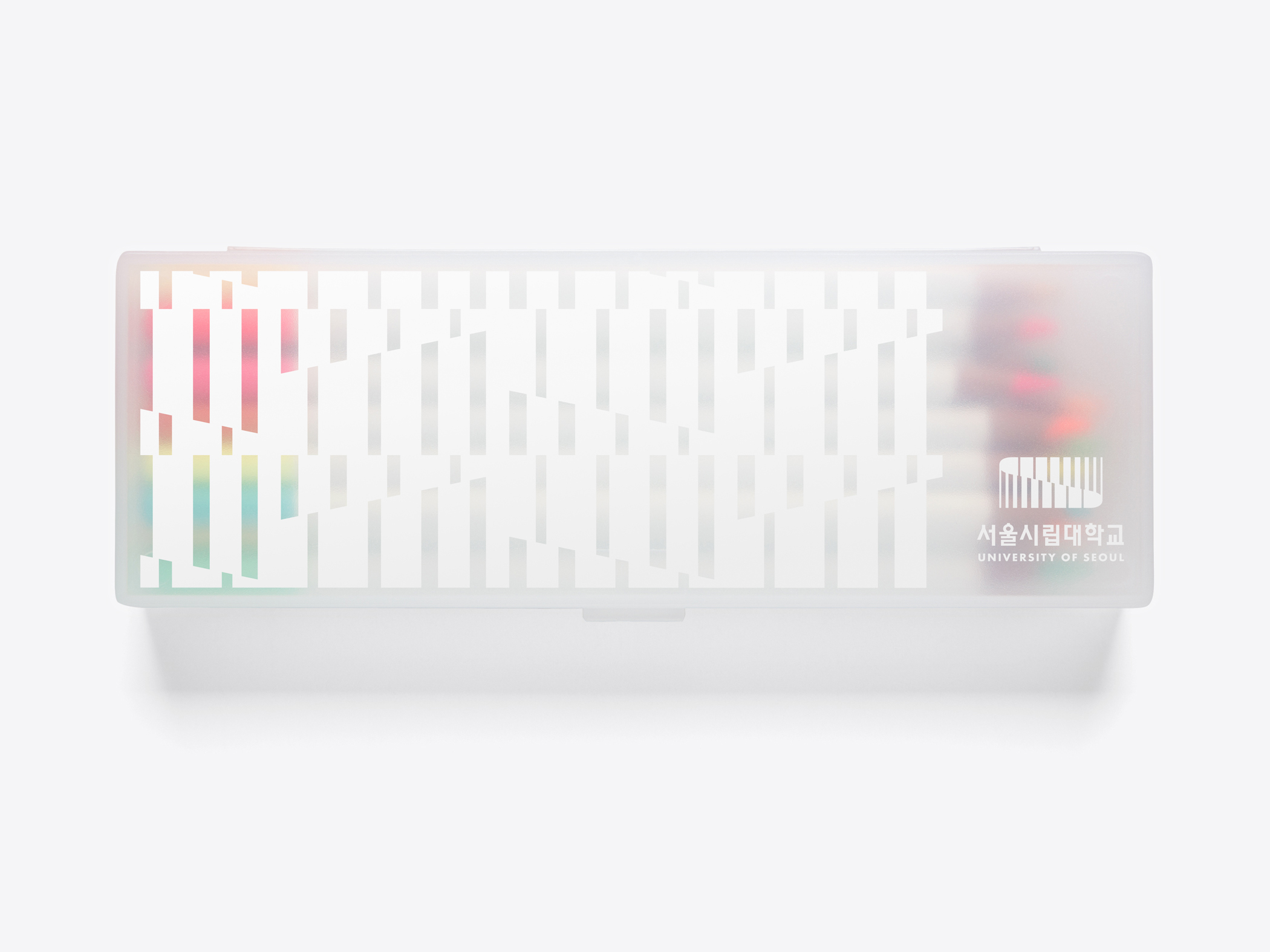
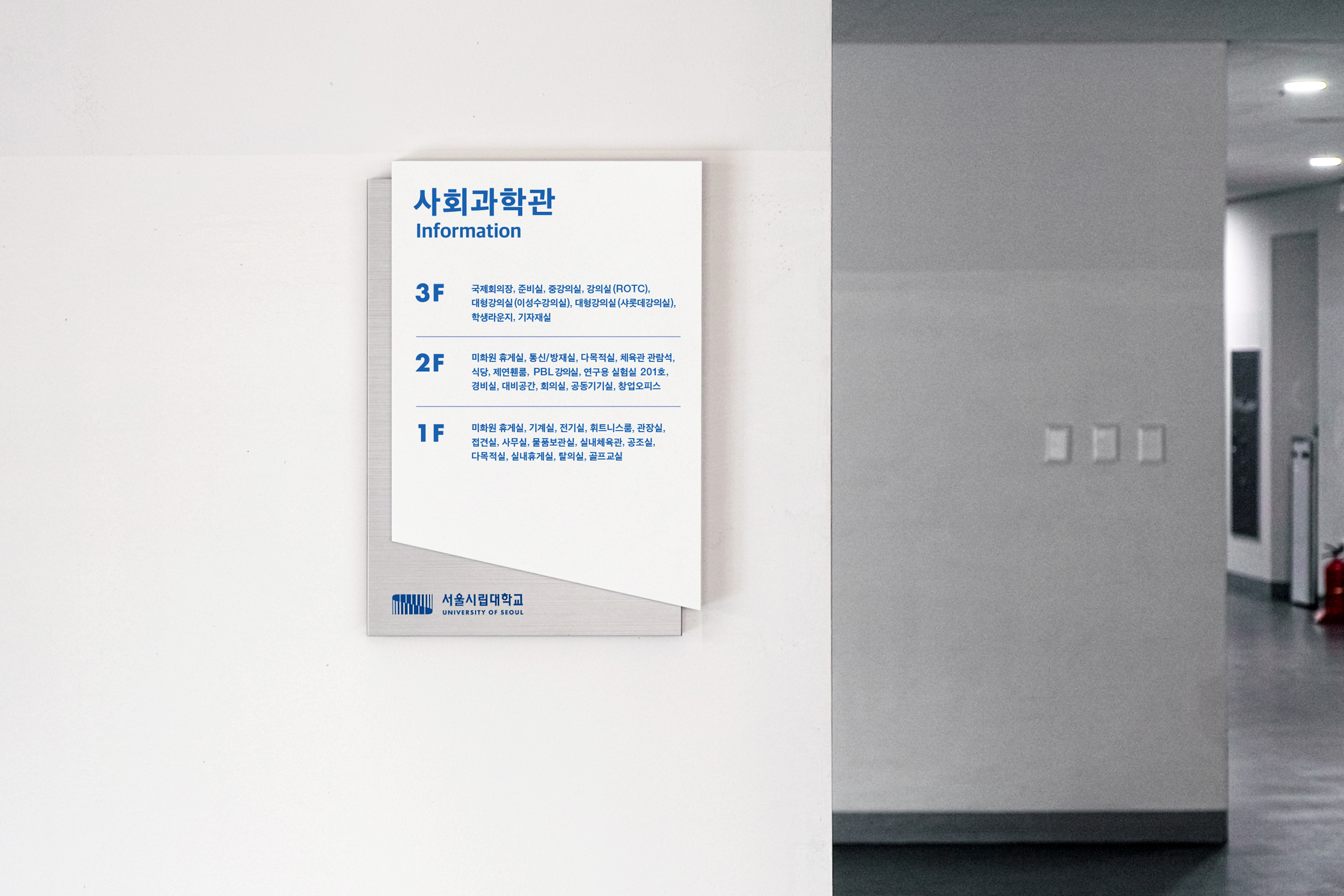
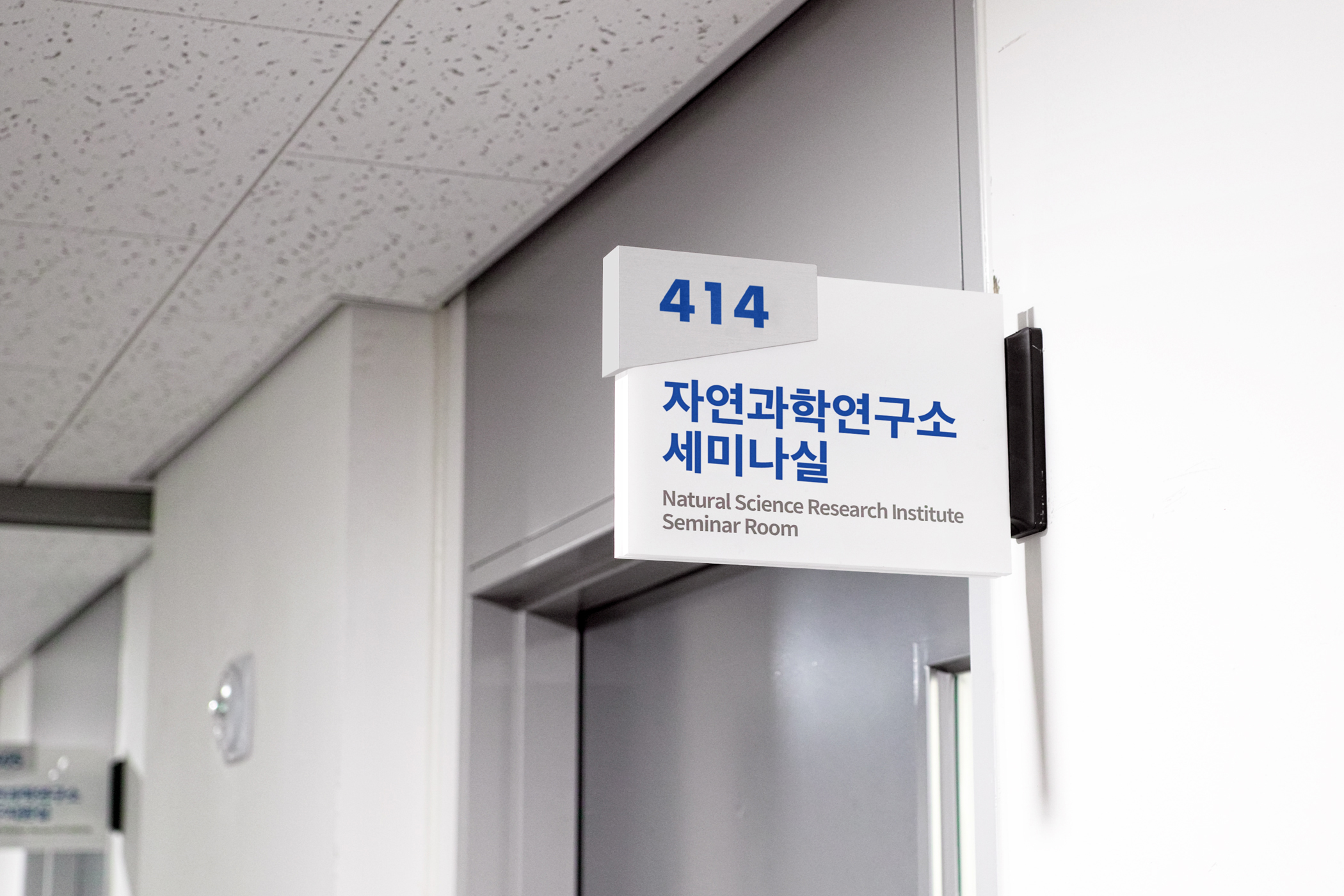
University of Seoul
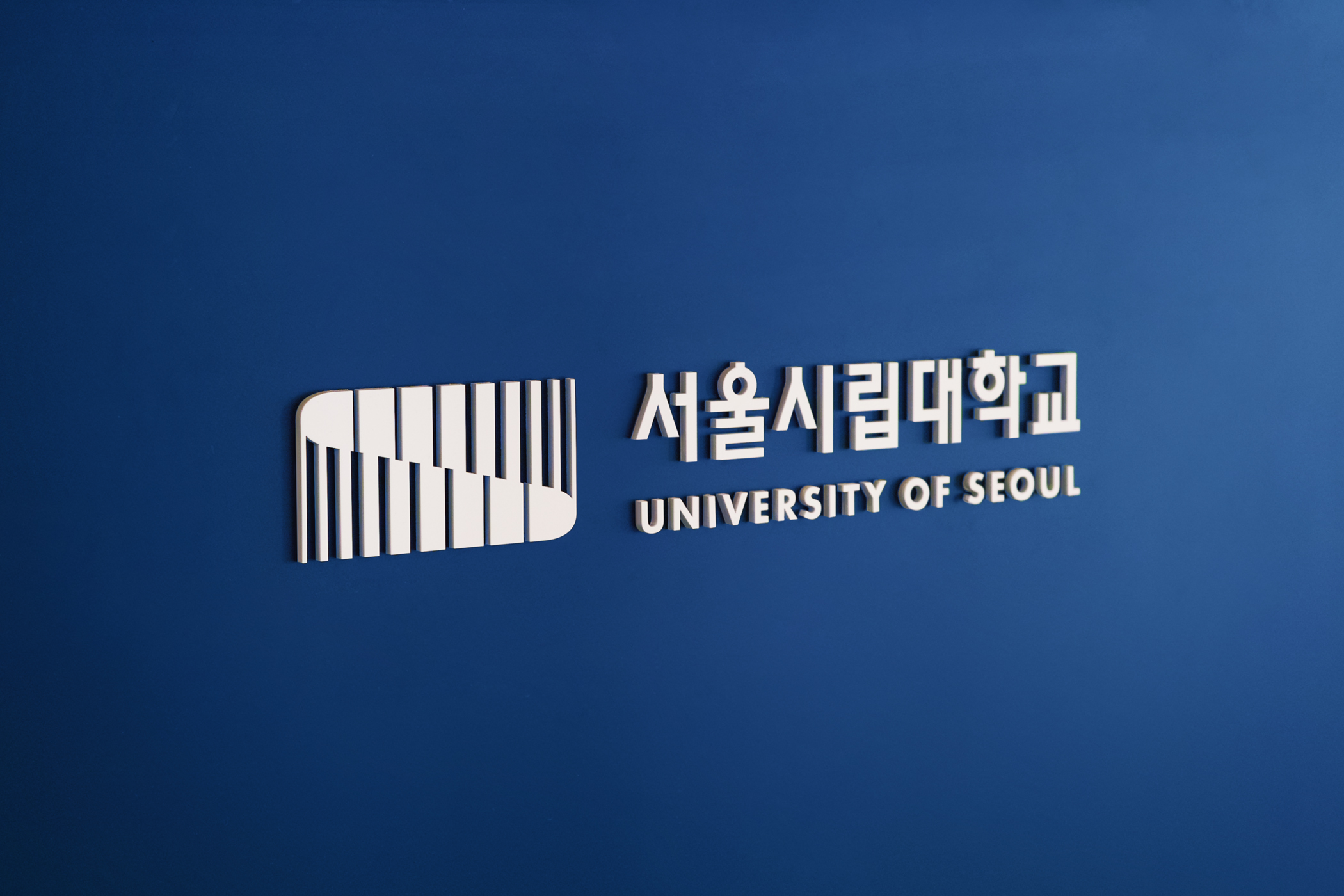
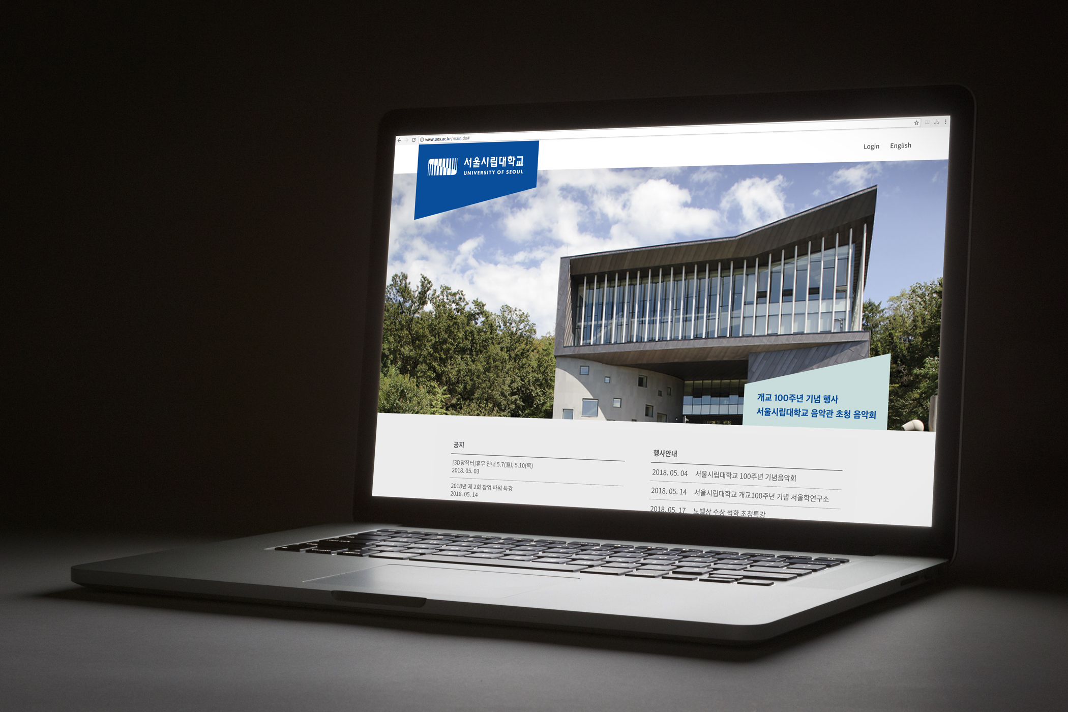
To celebrate the 100th anniversary, The University of Seoul reached out to studio fnt to help them improve the University’s symbol system, including a new logo. We utilized the ‘S’ shape that has been used since it was first designed in 1998, to expresses the meaning and spirit of ‘infinite space’. The symbol ‘S’ is attractive, because it has a unique and contemporary look with wide proportions, which is unlike the traditional emblems used by most universities.
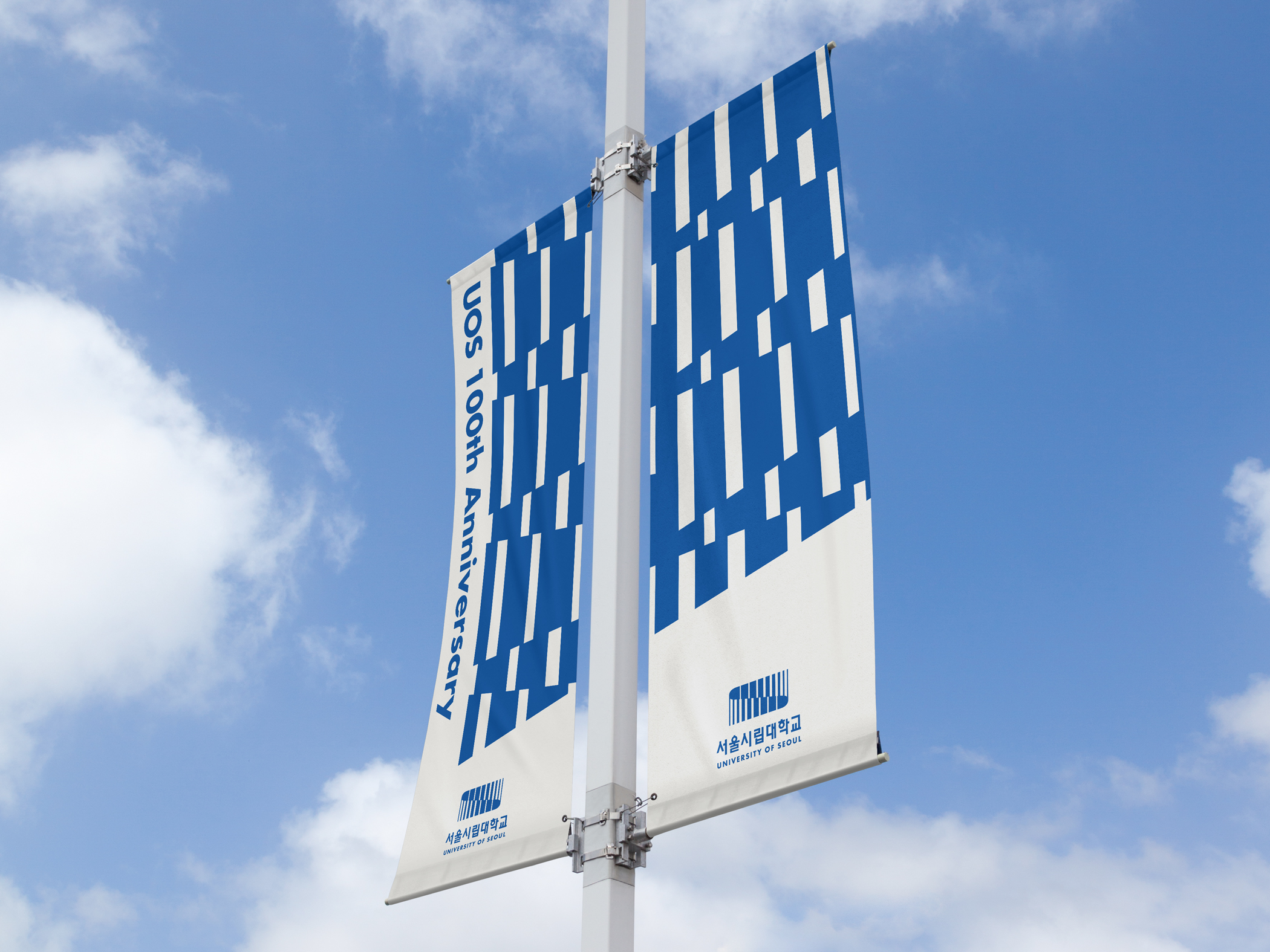
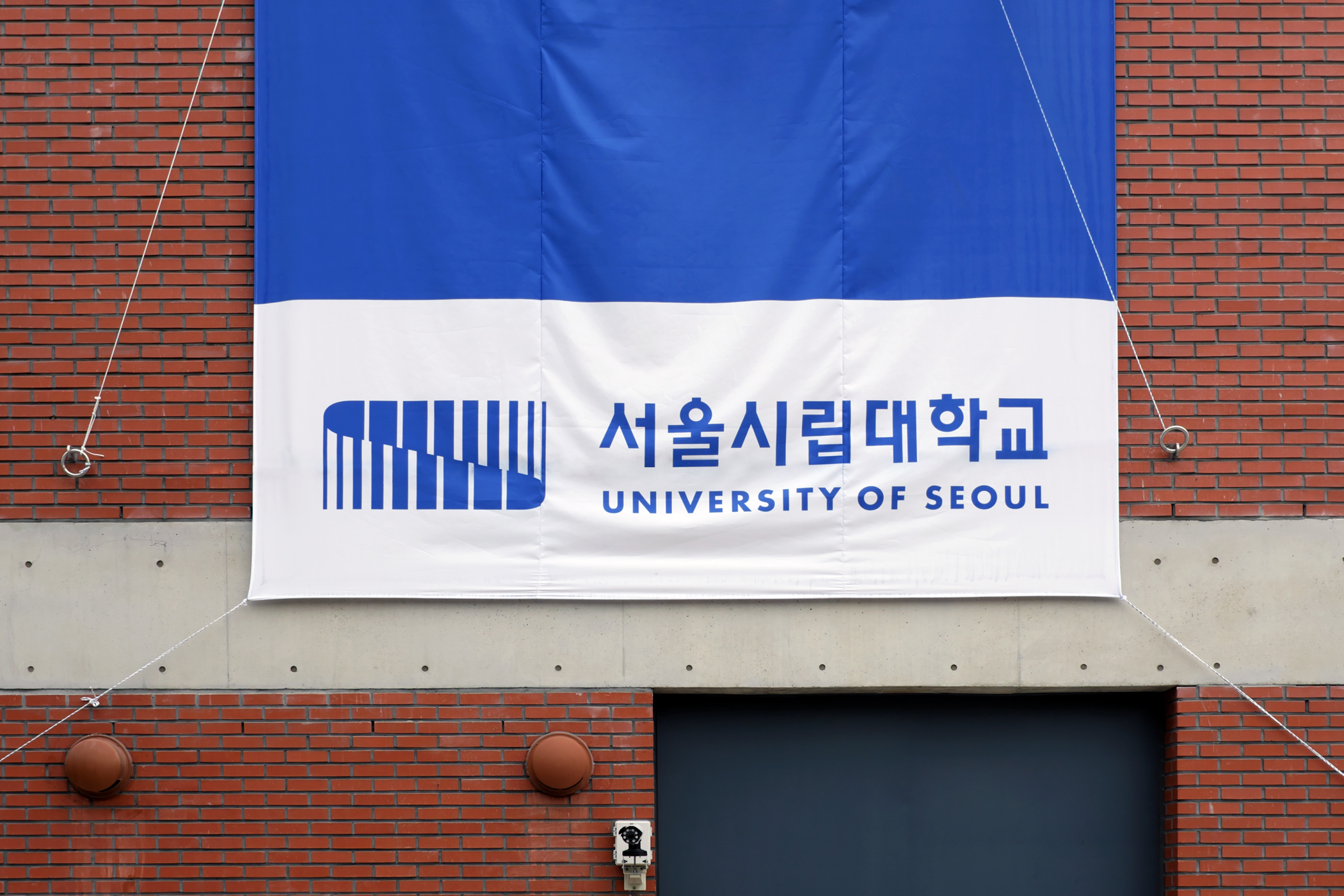
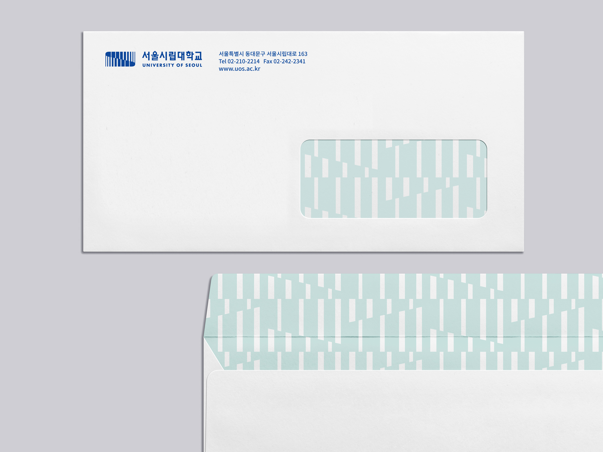
On the other hand, we had to carefully examine the current restrictions as well as the cases of false usage of the logo, caused by its color gradient. Based on this, we redesigned the symbol and emblem so that they can be used safely and precisely just as they were designed, and also developed a color scheme and graphic elements that can be applied to various applications.


- Creative direction: Heesun Kim
- Art direction: Jaemin Lee
- Graphic design: Solah Koh, Hyungwon Cho
- Client: University of Seoul
- Year: October 2018
© 2023 studio fnt. All rights reserved.