VIPS Premier
VIPS is Korea’s casual dining restaurant franchise, established in 1997. Since the 2000s, for over a decade, it maintained great popularity thanks to a booming trend in casual dining in Korea. However, as consumers’ tastes and consumption patterns changed, the demand for casual dining restaurants is not the same as before, and so the VIPS brand needed a time for change.
We knew that it won’t be easy to renew the entire VIPS brand because of the extensive number of existing VIPS branches across the country. Also, there is still a stable and constant demand for casual dining restaurants today, for family outings and group gatherings.
The strategy then, that VIPS came up with, was to develop a high-end brand named VIPS Premier, and apply the new branding to some of the major cities in Korea with a flagship store concept. This project was carried out with the goal that the new brand would take the lead of the entire VIPS brand.
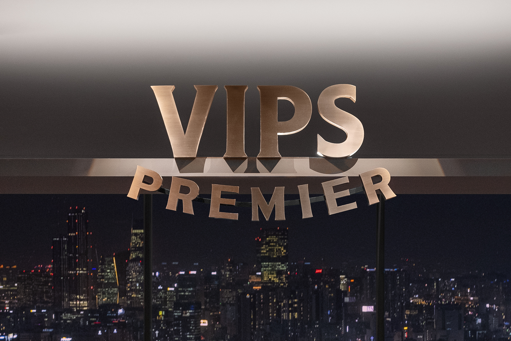
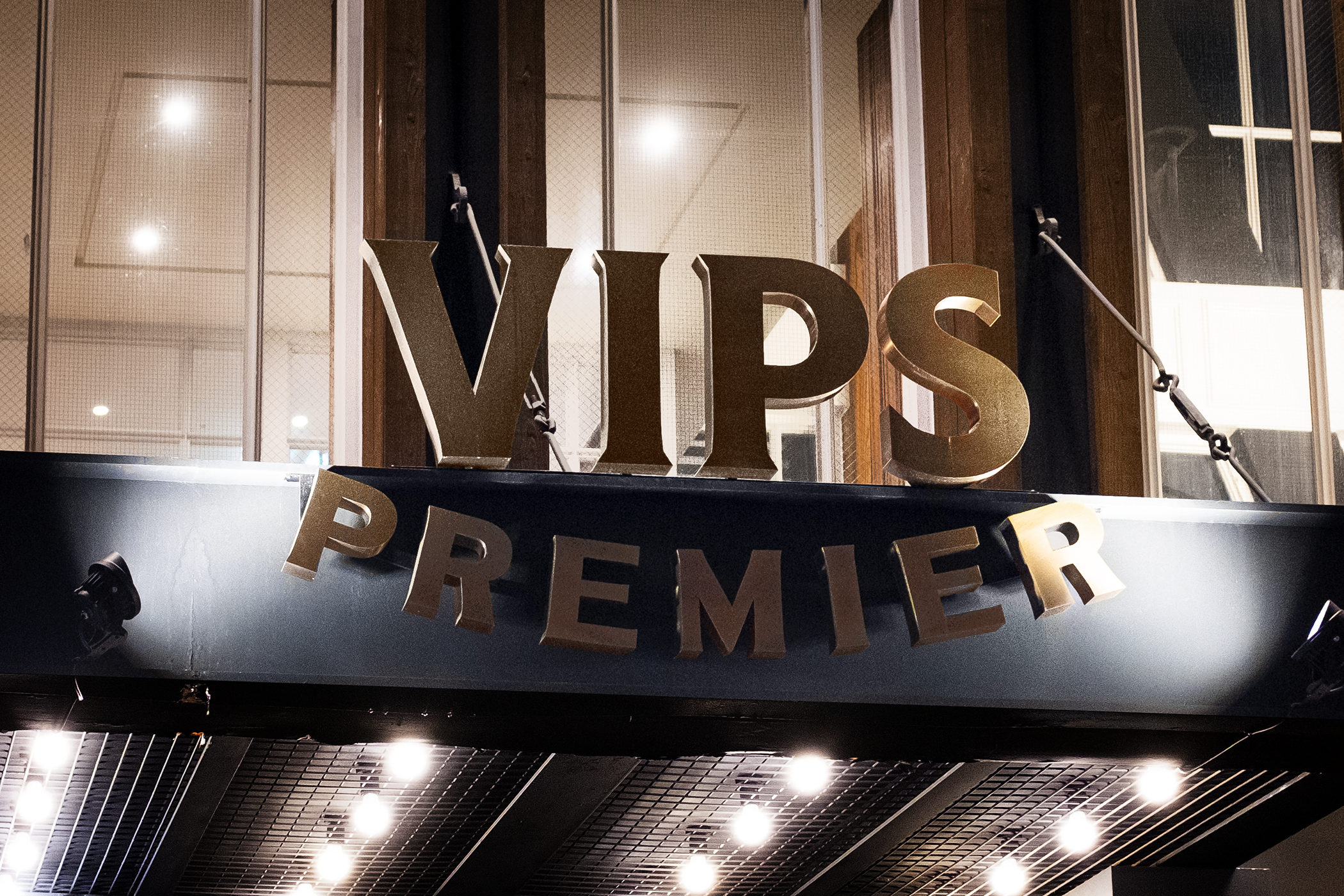

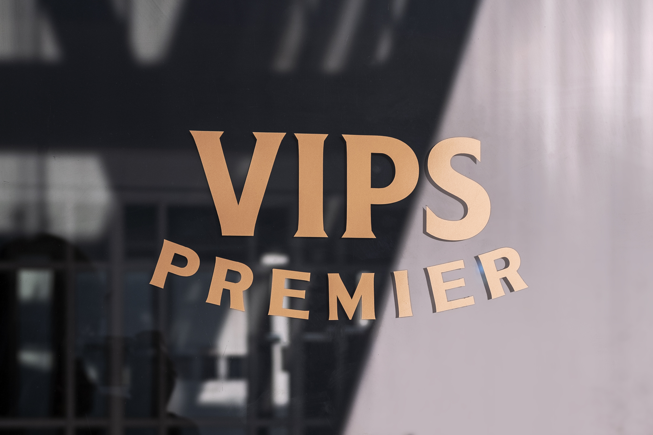
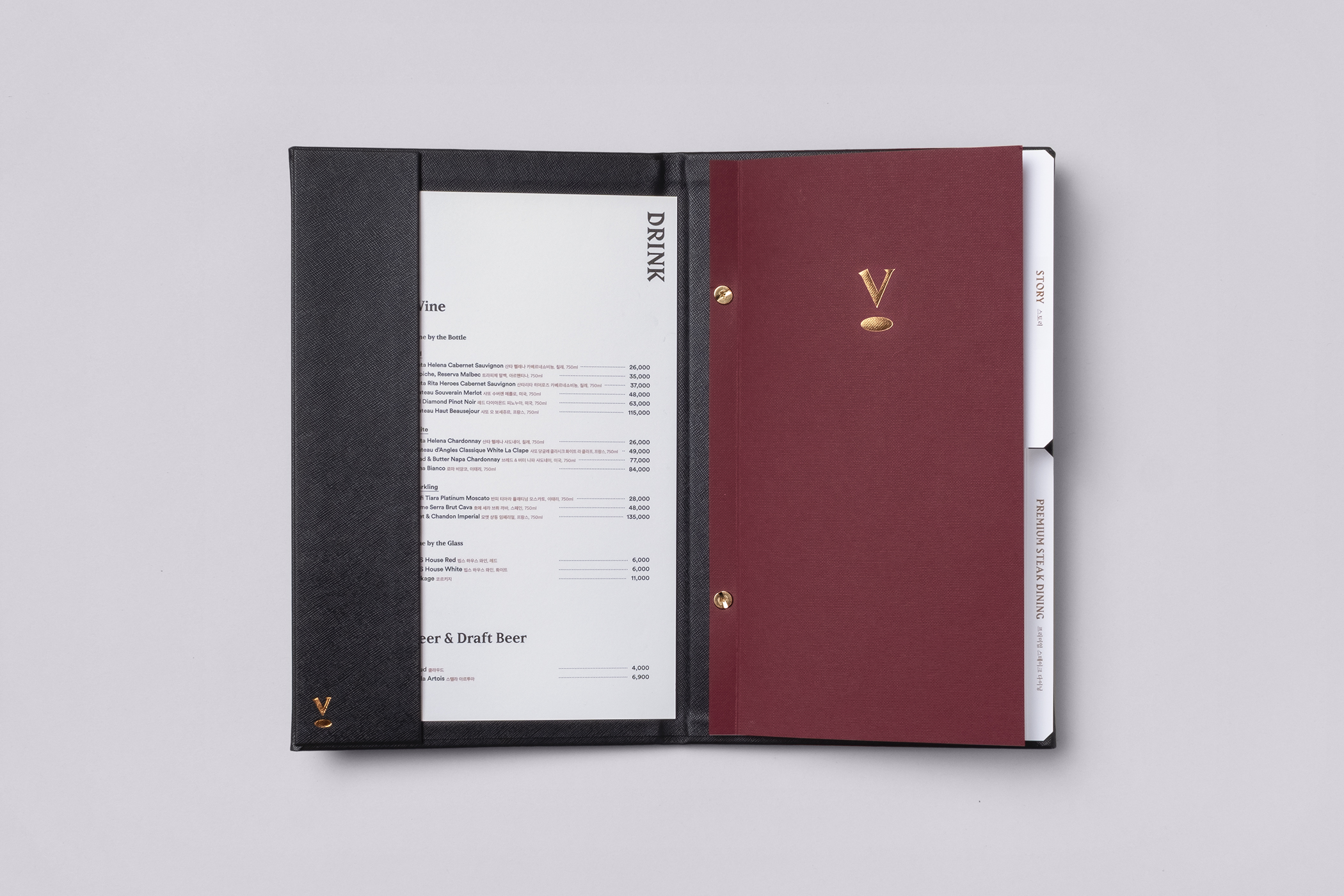
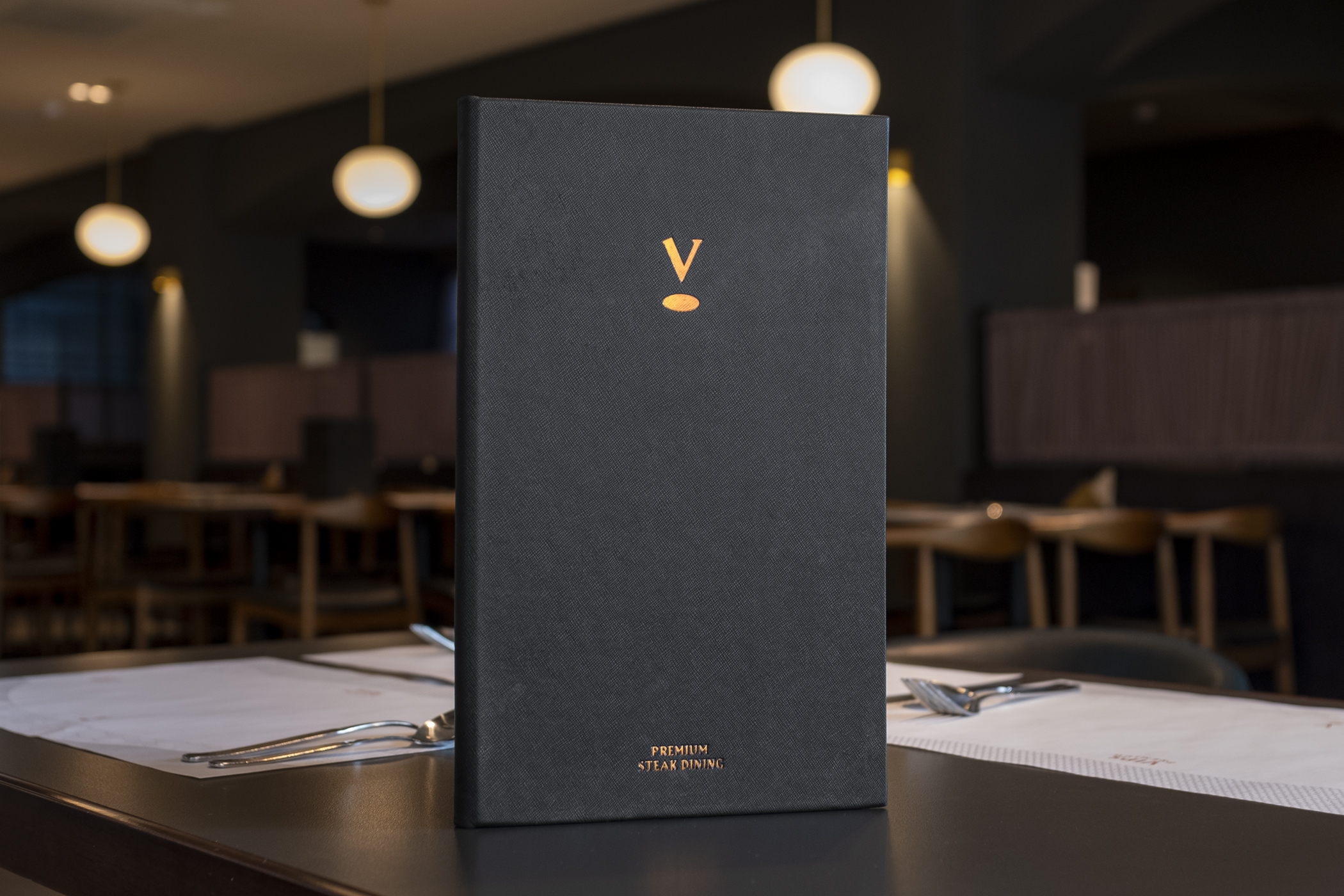
We added and revised various design elements to contribute to the progress of the overall brand image of VIPS, while maintaining the core context of its BI design so that VIPS Premier could still be recognized as part of VIPS. After dissecting the logo into the oval-shape, the red color, and the word mark, we added delicate serifs to the word mark. After that, the word PREMIER was applied with a soft curve, reminiscent of the trajectory of the oval-shape.
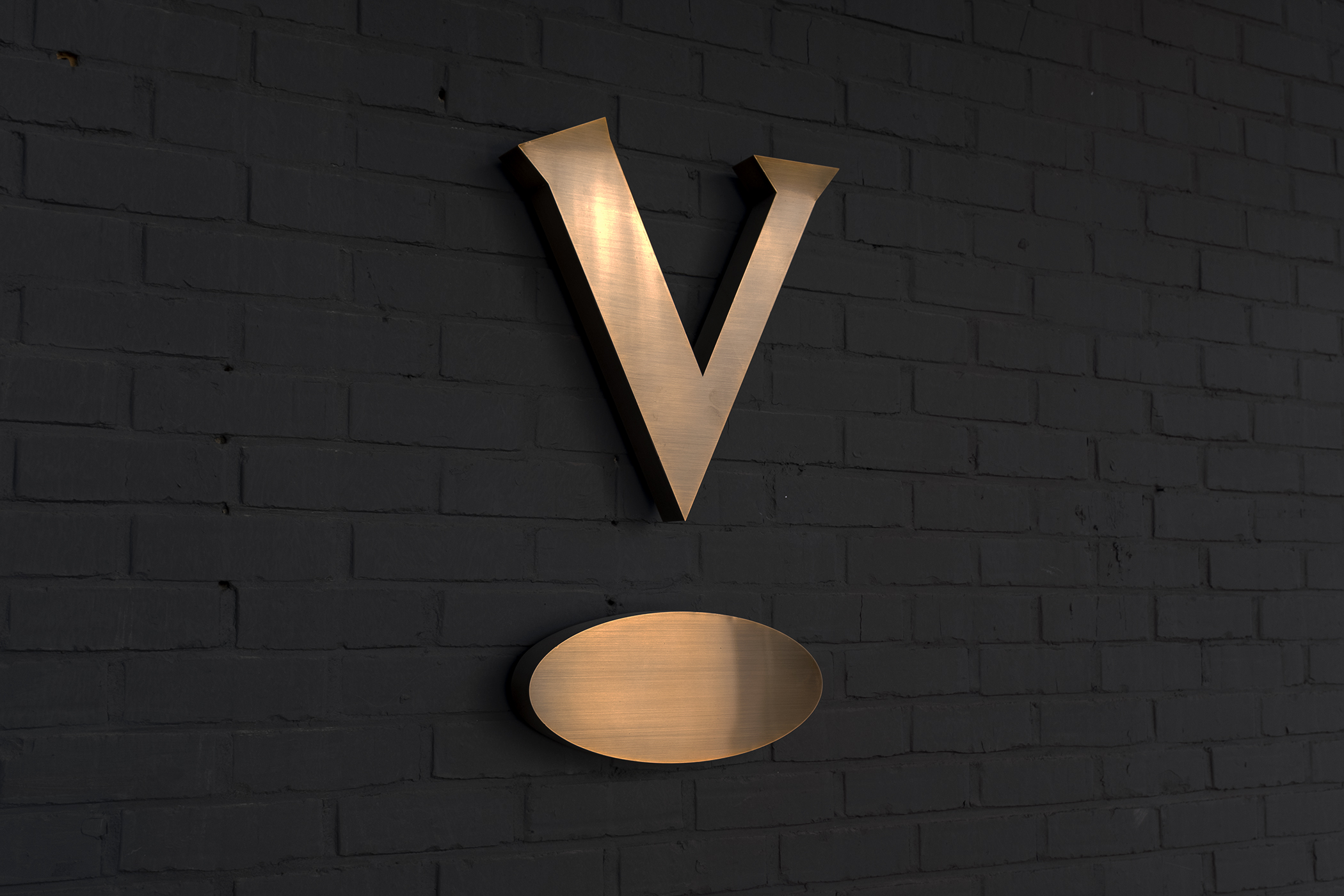
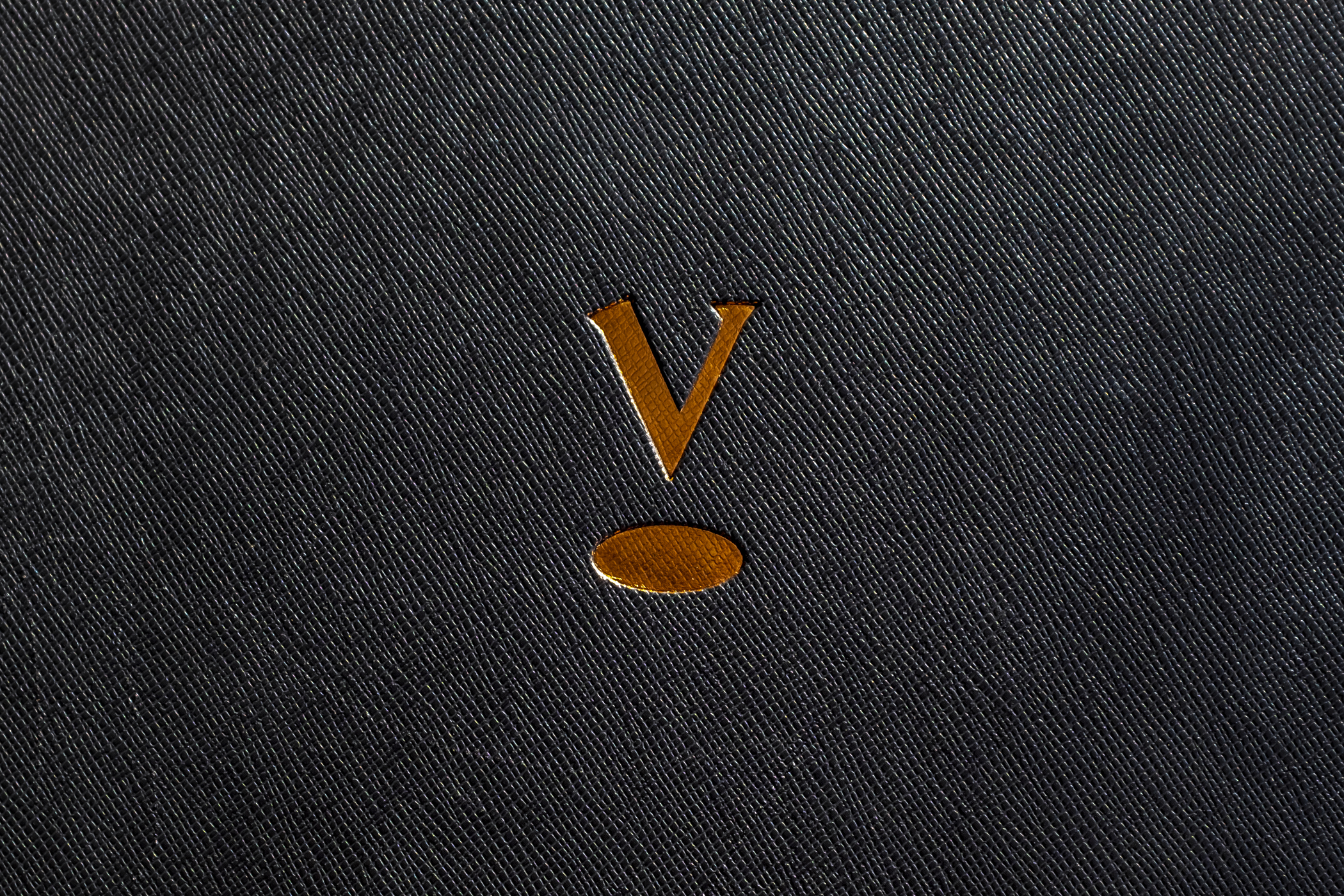
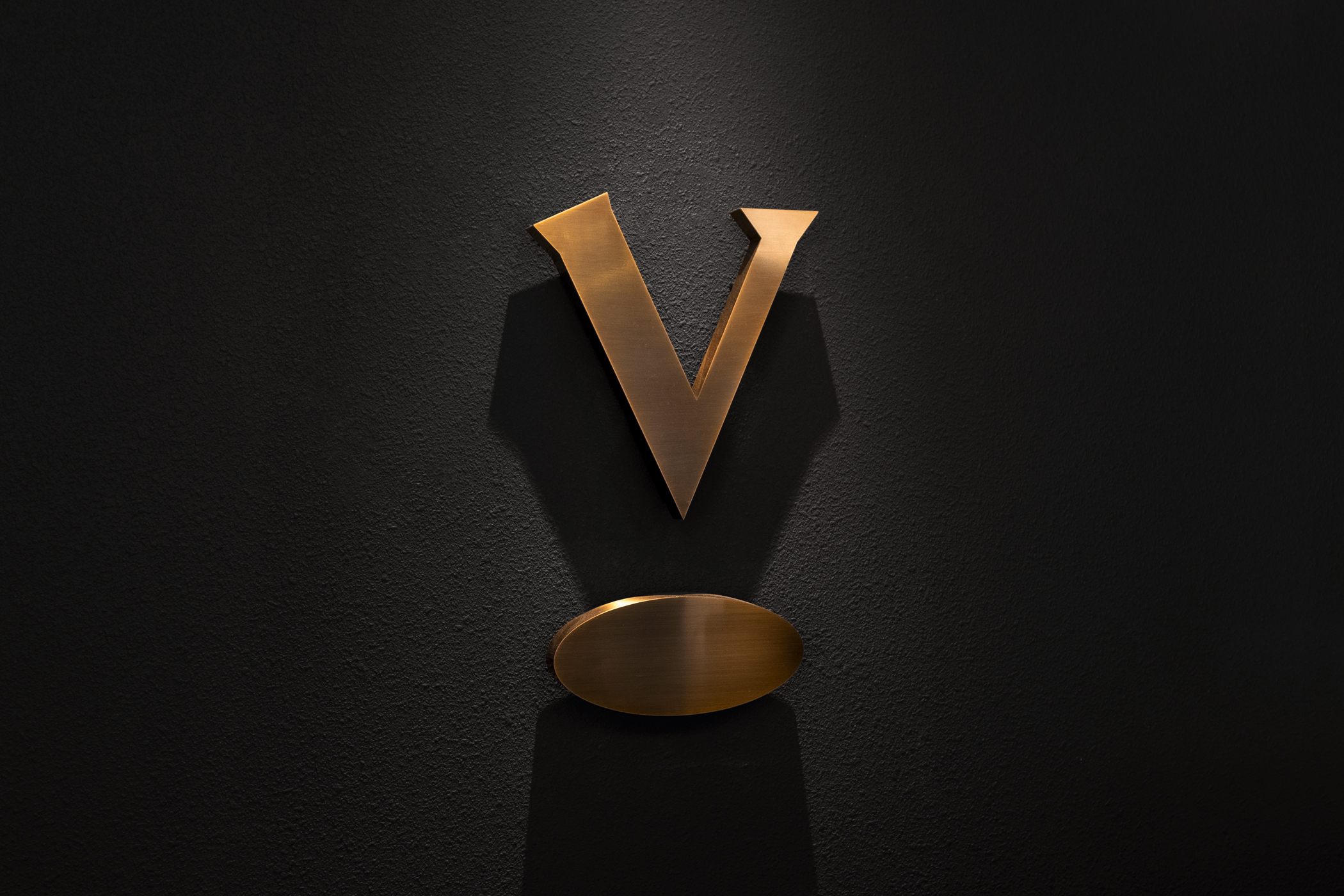
As a key element of the new identity, a new symbol was designed to condense the premium aim and direction of the new brand. The first letter of the brand, the letter V, and an oval-shape frame from the original logo; these two elements are vertically combined to make the V float in the air, to look like the prominent protagonist. This new symbol symbolizes VIPS Premier’s selection of premium products, meticulous service and exceptional experience.


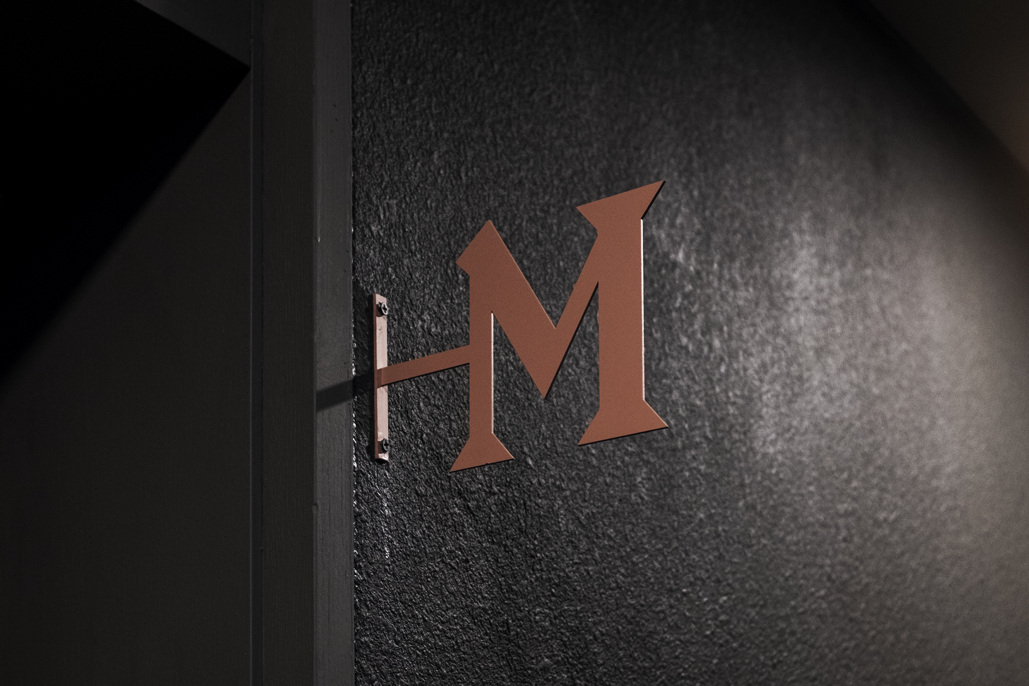


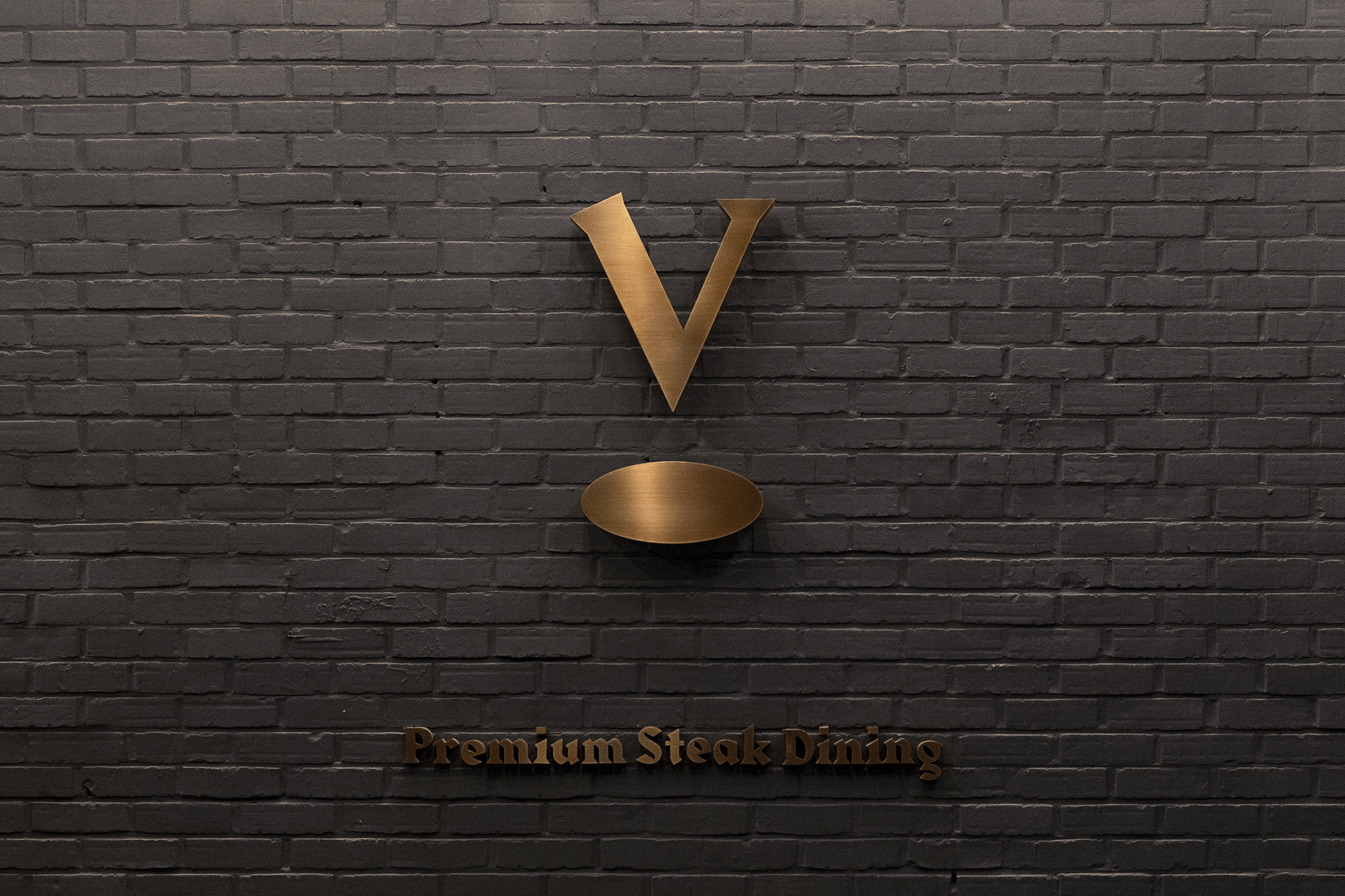
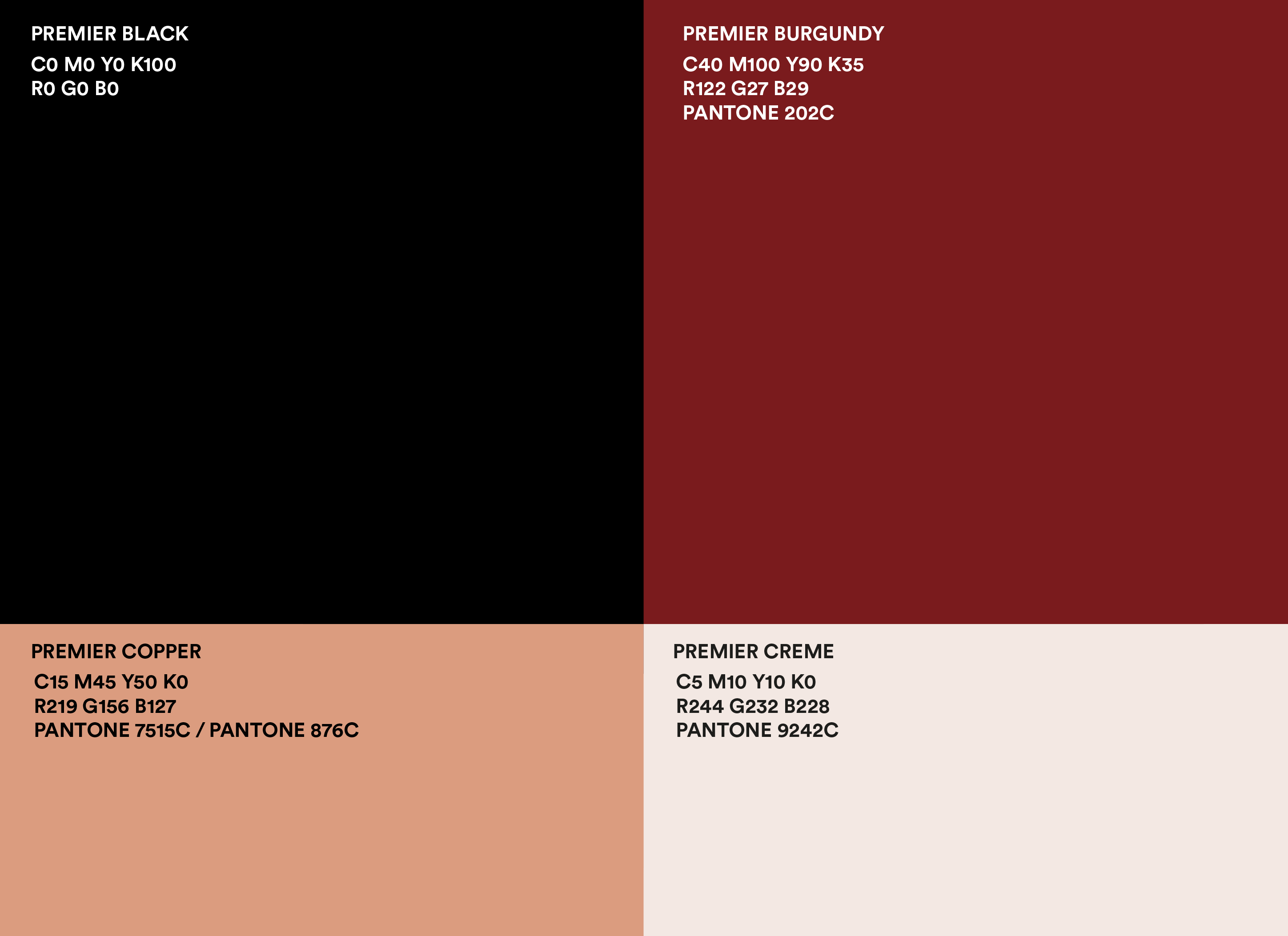
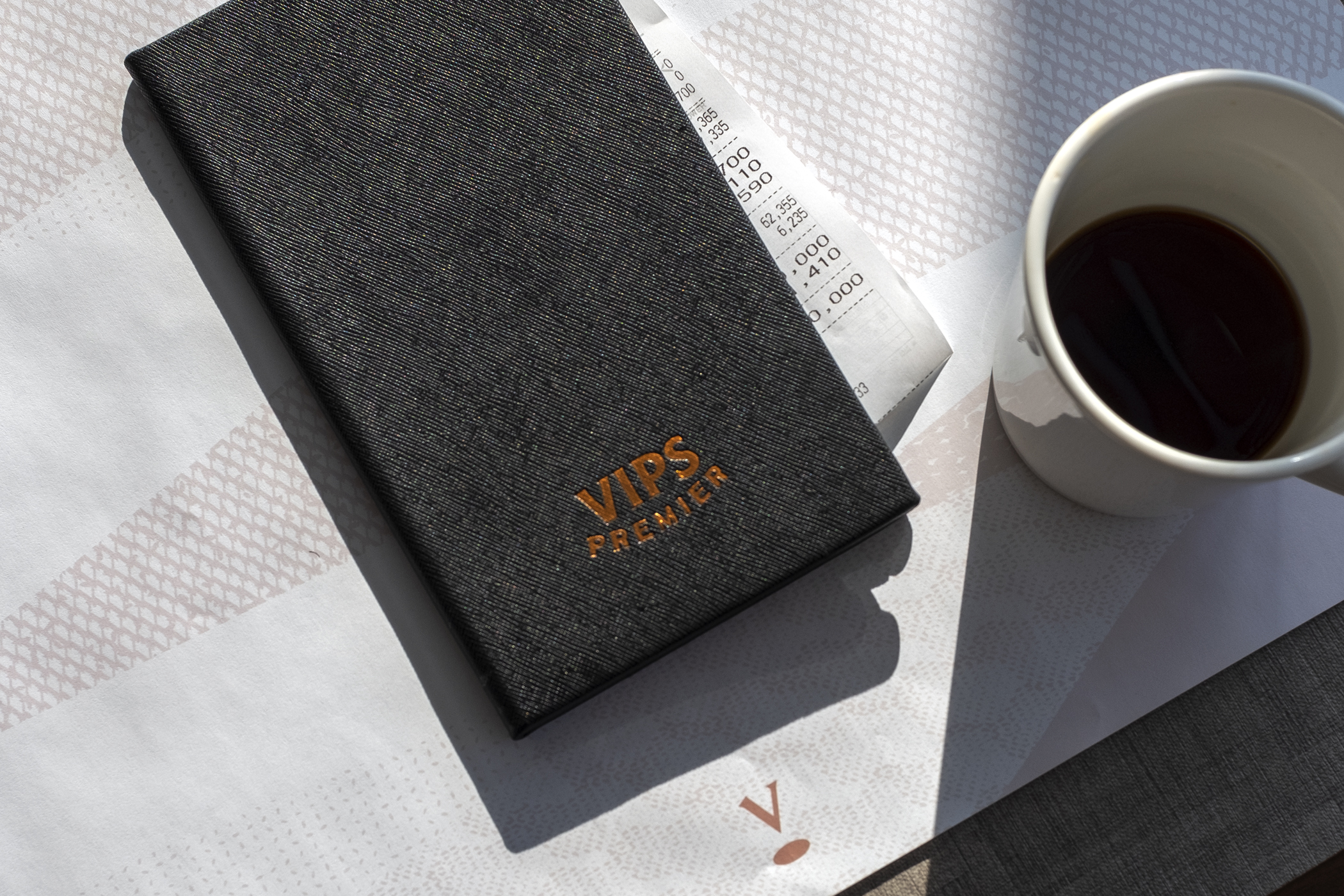
The vivid red color was modified to a more mature burgundy color, with the addition of classic and rich black as the main color. We also regulated the visual communications system. For instance, many of the physical materials such as signages, are to be made using copper as a secondary color and material.
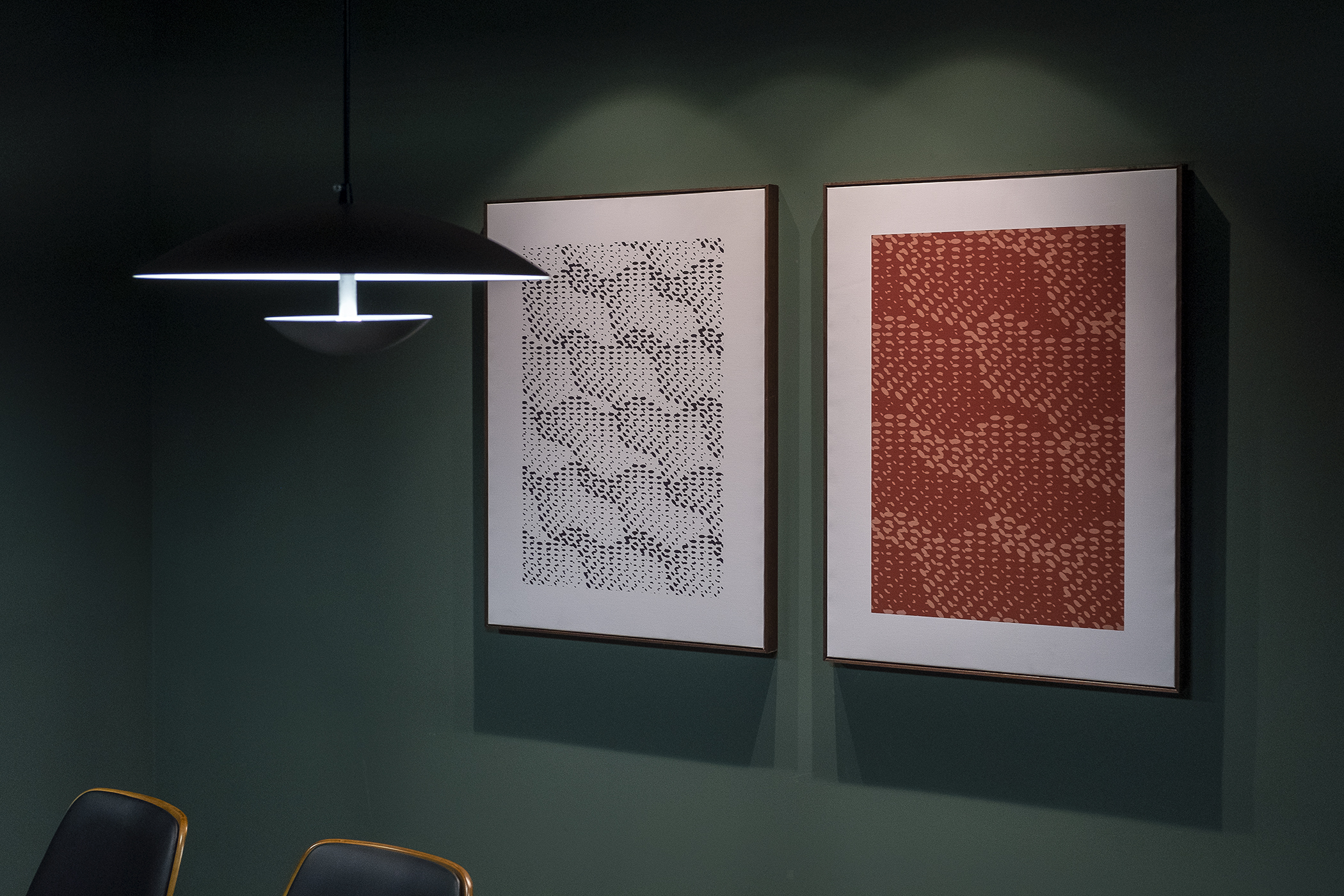
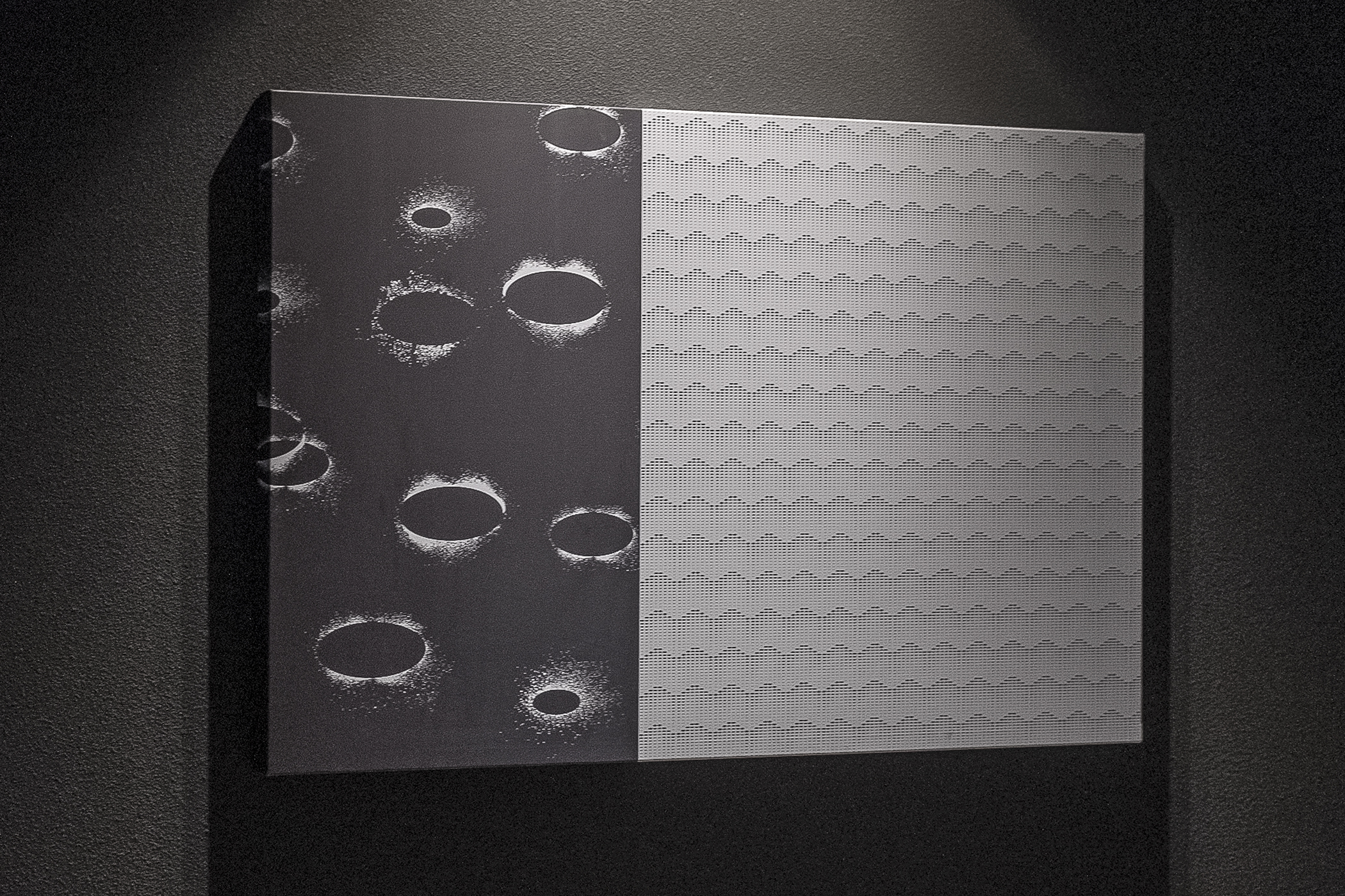
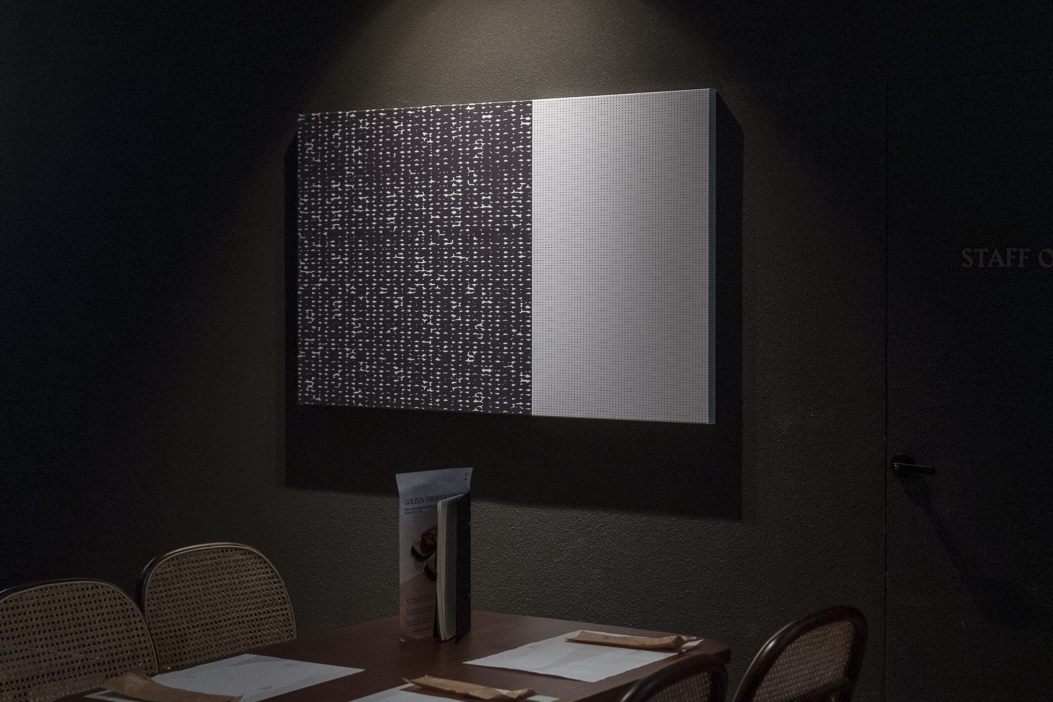
Patterns used throughout brand applications derive from the formative features of the newly developed symbol, and suggest the rich texture and taste of their dishes.
Patterns used throughout brand applications derive from the formative features of the newly developed symbol, and suggest the rich texture and taste of their dishes.
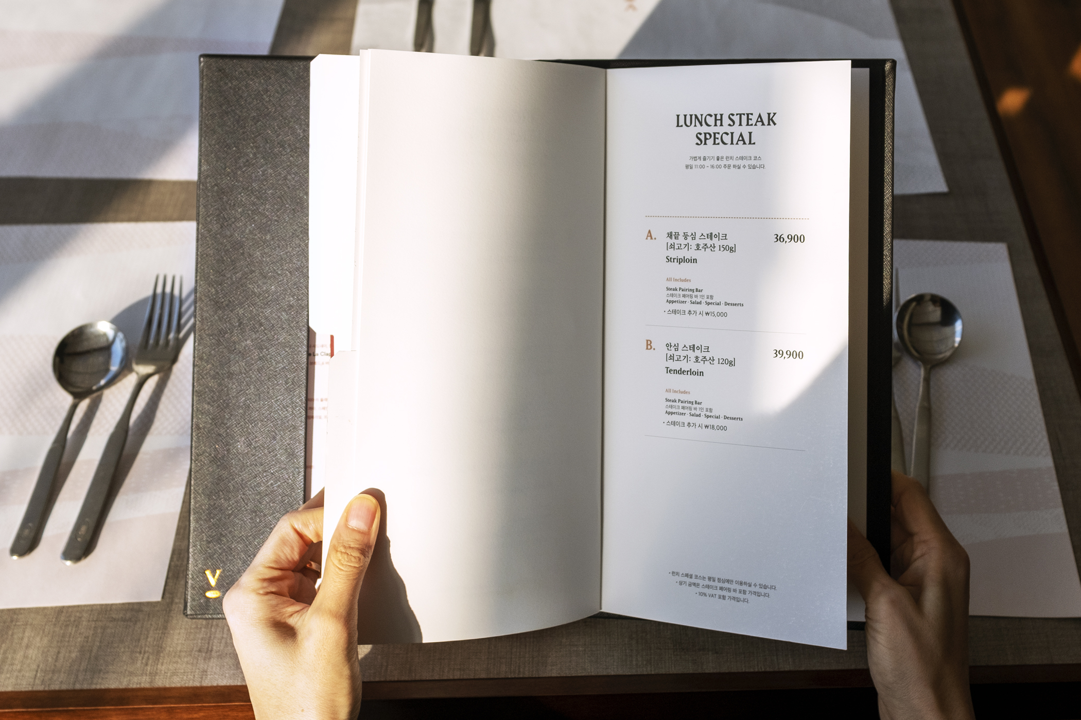
We also designed a wide range of applications, including the menu, in-store communication items such as a POP, signage designs inside and outside of every store, various types of uniforms, and packaging. In addition to graphics, we gave detailed recommendations regarding production specifications of branding applications, resulting in high-degree of completion.

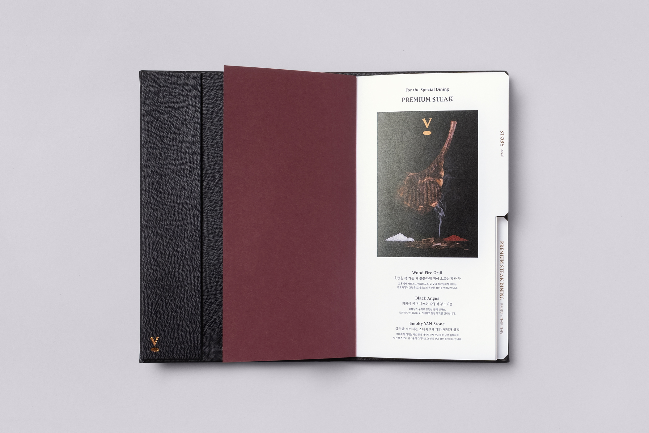


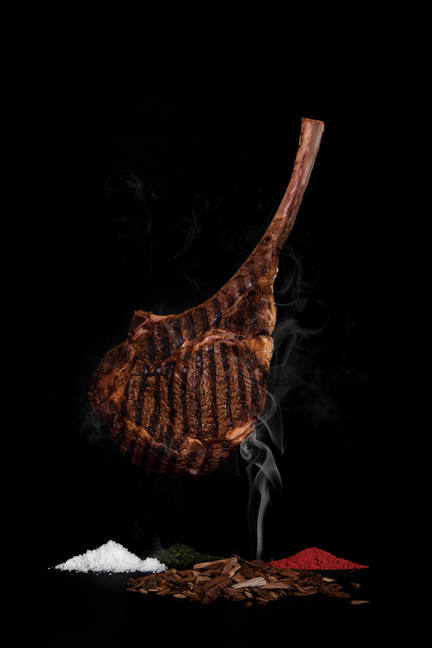
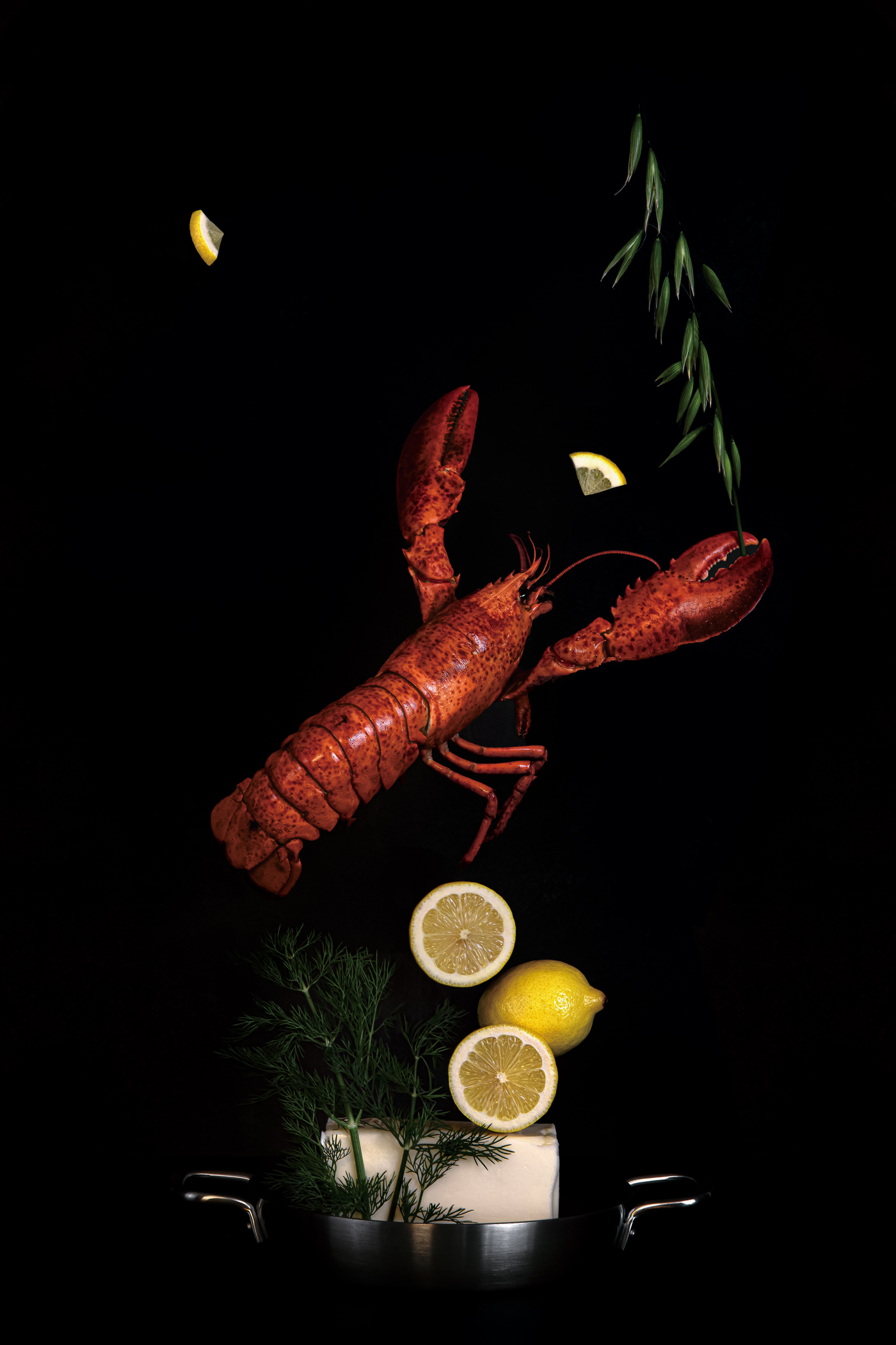
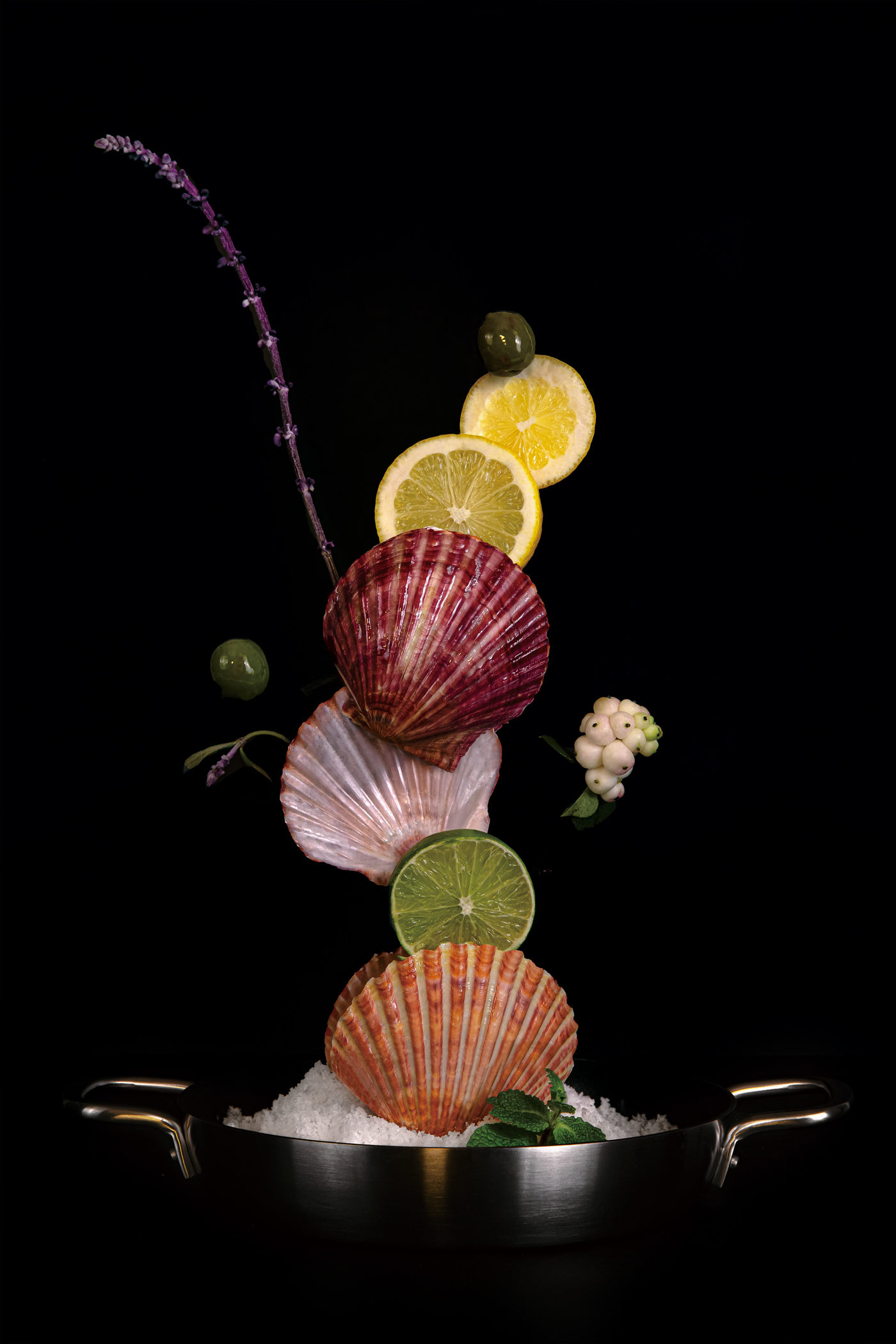
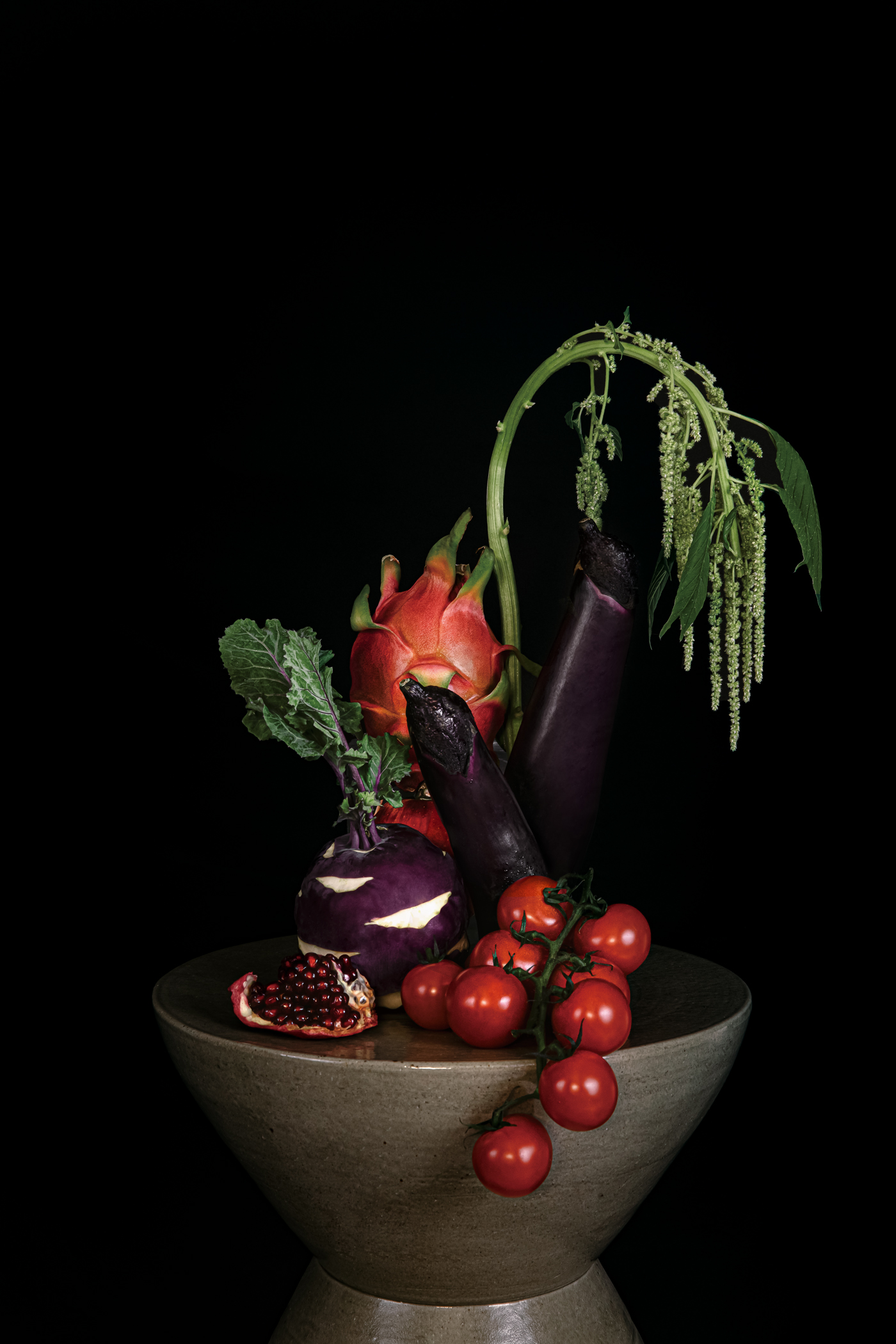
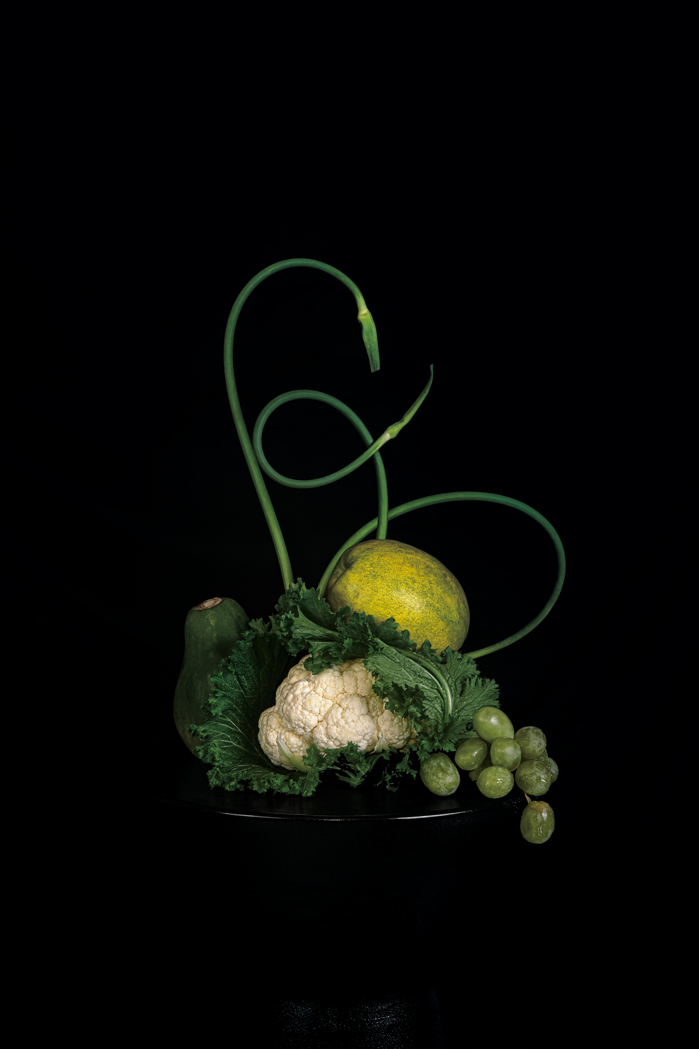
We organized a series of photographs that implicitly demonstrate the new direction that VIPS Premier seeks to drive toward. A typical casual dining restaurant mainly uses a plated food imagery, with an emphasis on the sense of ‘sizzle’. In order to give a distinctly different impression, we carefully selected food ingredients and focused on them instead, in a minimal and artistic manner.
The unique arrangement of the ingredients followed the same vertical composition as the VIPS Premier’s new symbol. Food styling was done by the food designer Homeground, and photography was by Texture on Texture.
VIPS Premier opened in Seoul in 2020 and is currently receiving much love by many customers. It will be introduced one after another, in other major cities in Korea as well.
VIPS Premier opened in Seoul in 2020 and is currently receiving much love by many customers. It will be introduced one after another, in other major cities in Korea as well.

- Creative direction: Heesun Kim
- Art direction: Jaemin Lee
- Graphic design, signage design, editorial design and uniform cordination: Youjeong Lee, Solah Koh, Hyungwon Cho, Jaemin Lee, Heesun Kim
- Art direction: Jaemin Lee
- Graphic design, signage design, editorial design and uniform cordination: Youjeong Lee, Solah Koh, Hyungwon Cho, Jaemin Lee, Heesun Kim
- Verbal identity: Heejung Kim
- Photography: Texture on Texture, Homeground(Styling), Heesun Kim(Concept Direction)
- Photography: Texture on Texture, Homeground(Styling), Heesun Kim(Concept Direction)
- Client: CJ Foodville
- Year: January 2020
- Year: January 2020
© 2023 studio fnt. All rights reserved.