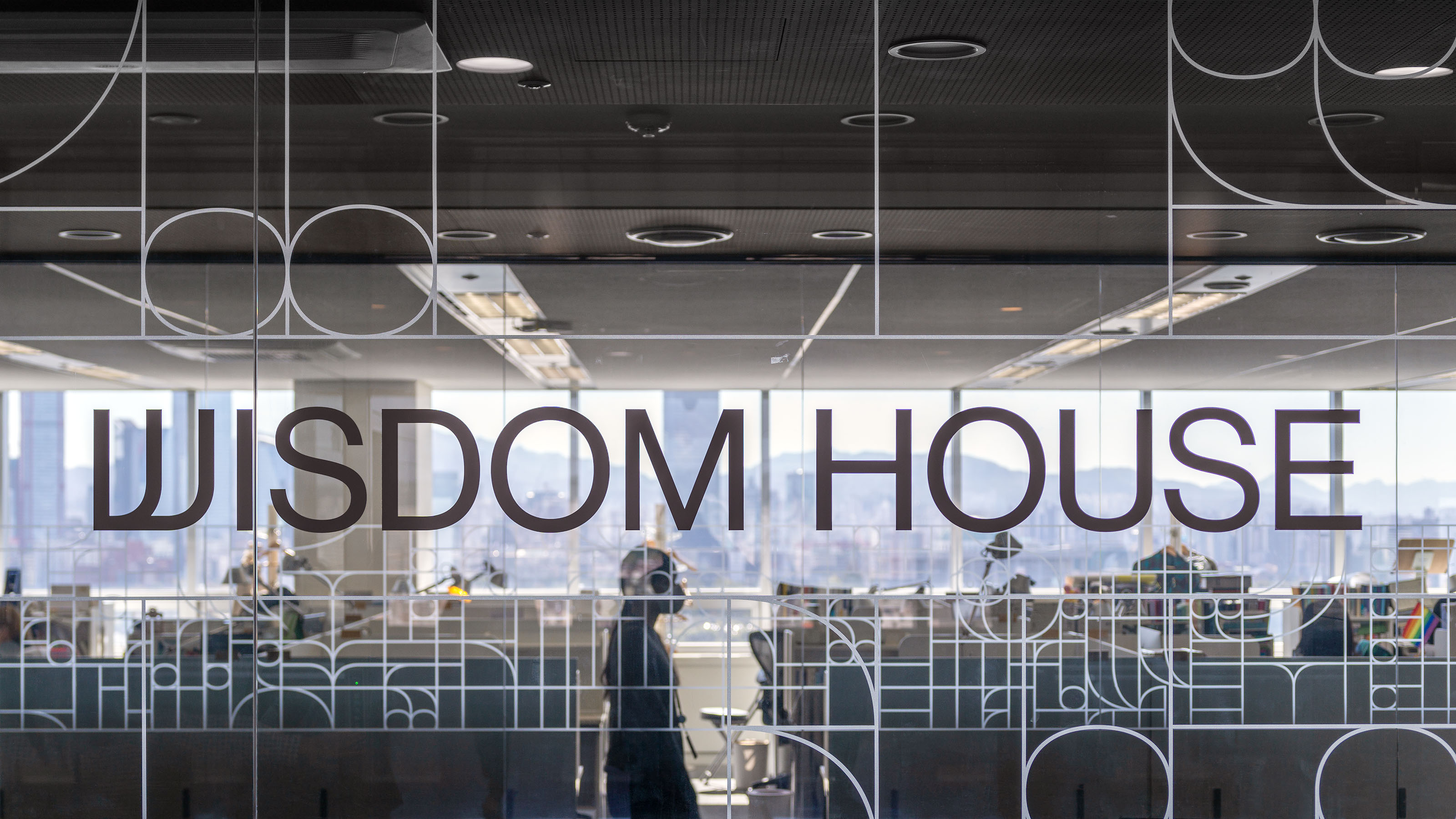
WISDOM HOUSE
WISDOM HOUSE is a Korean publishing company that has been producing high-quality books. Recently, it has expanded its business to webcomics and web novels. Based on all of these contents, we started to create more enjoyable values within the company by connecting their content with other various media such as dramas, movies, broadcasting, and animation. Along with their expansion into these new fields, it was necessary for them to re-establish the brand identity, which studio fnt was in charge of.
From now on, the contents that WISDOM HOUSE will be creating include practical books dealing with contemporary knowledge and discourse, literature and essays that illuminate various aspects of life, fun pop-up textbooks for growing children and adolescents, Webcomics with rich wit and sensitivity, and also web novels. As such, it will have a broad spectrum of content offerings. The new identity design then has the task of being able to embrace them all.
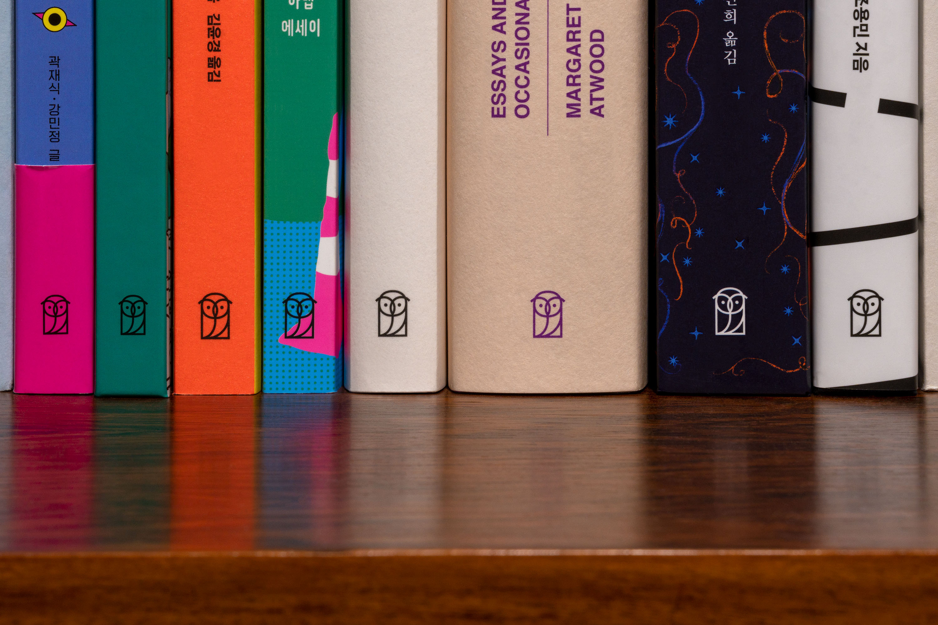
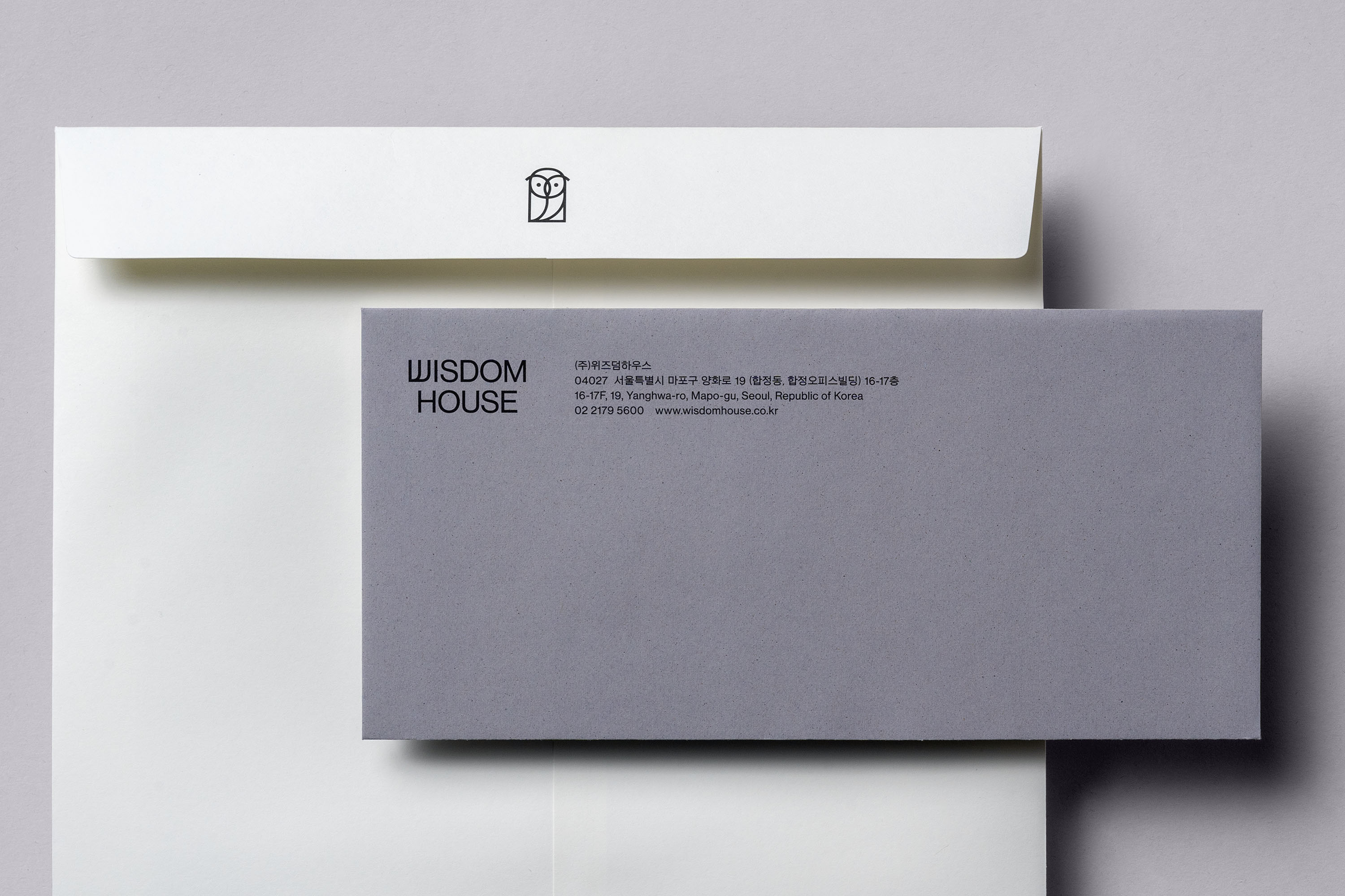
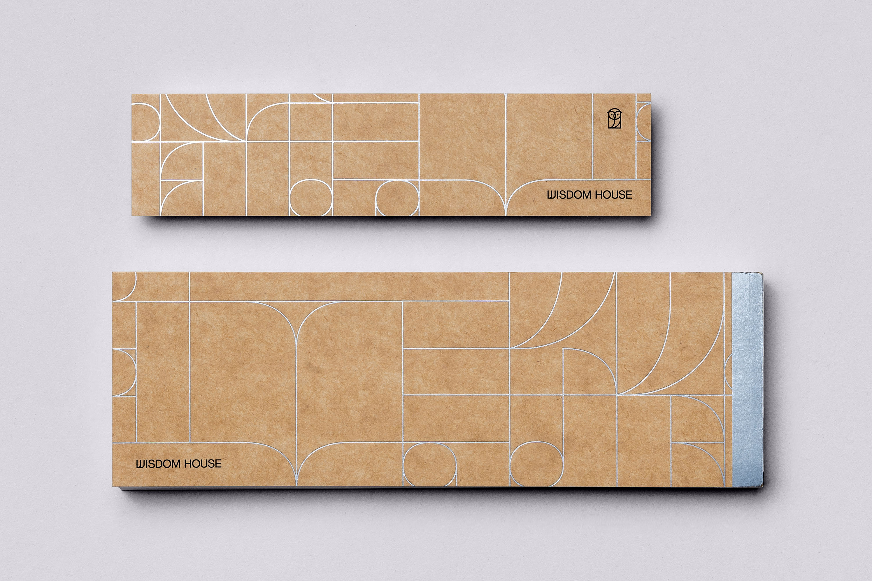
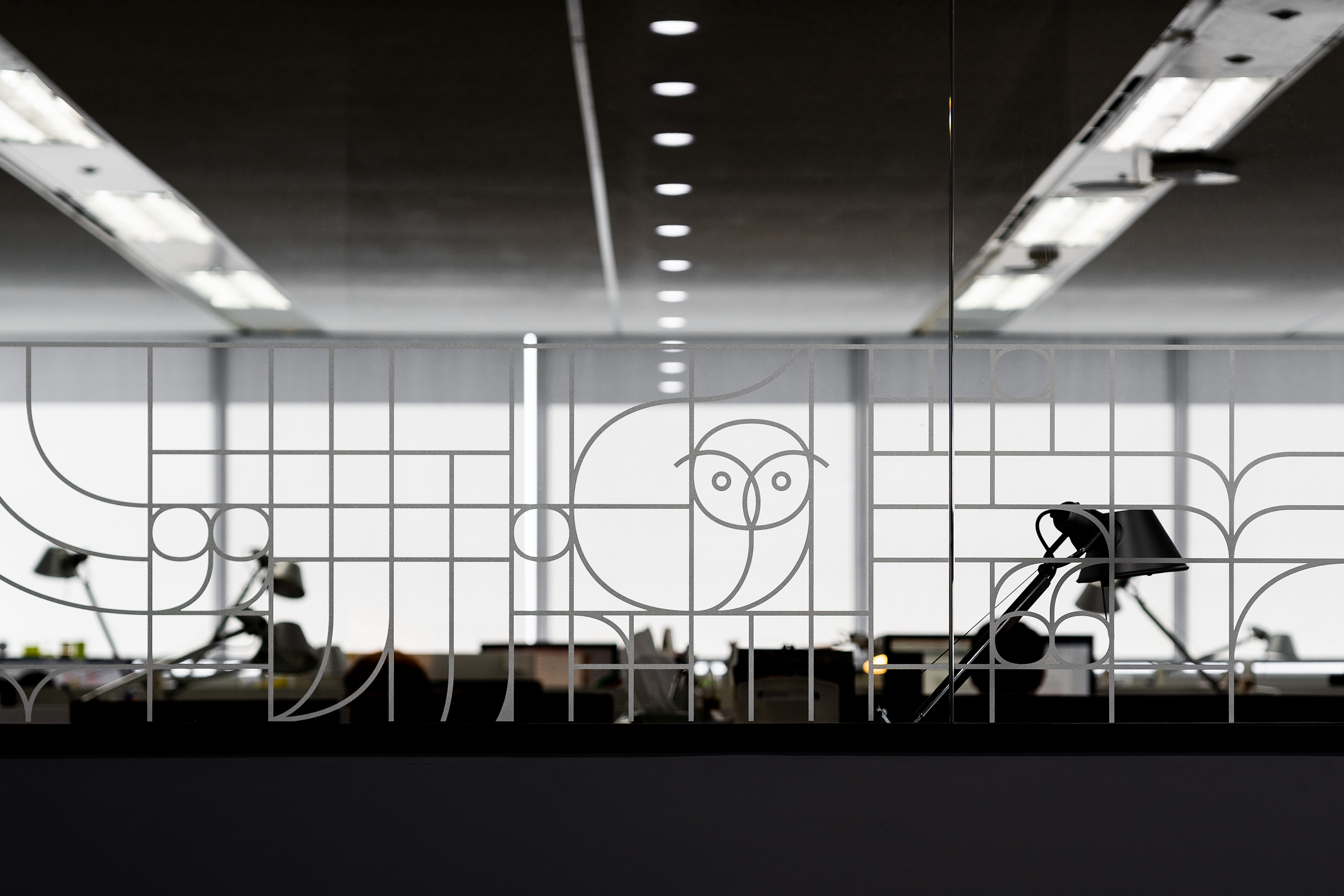
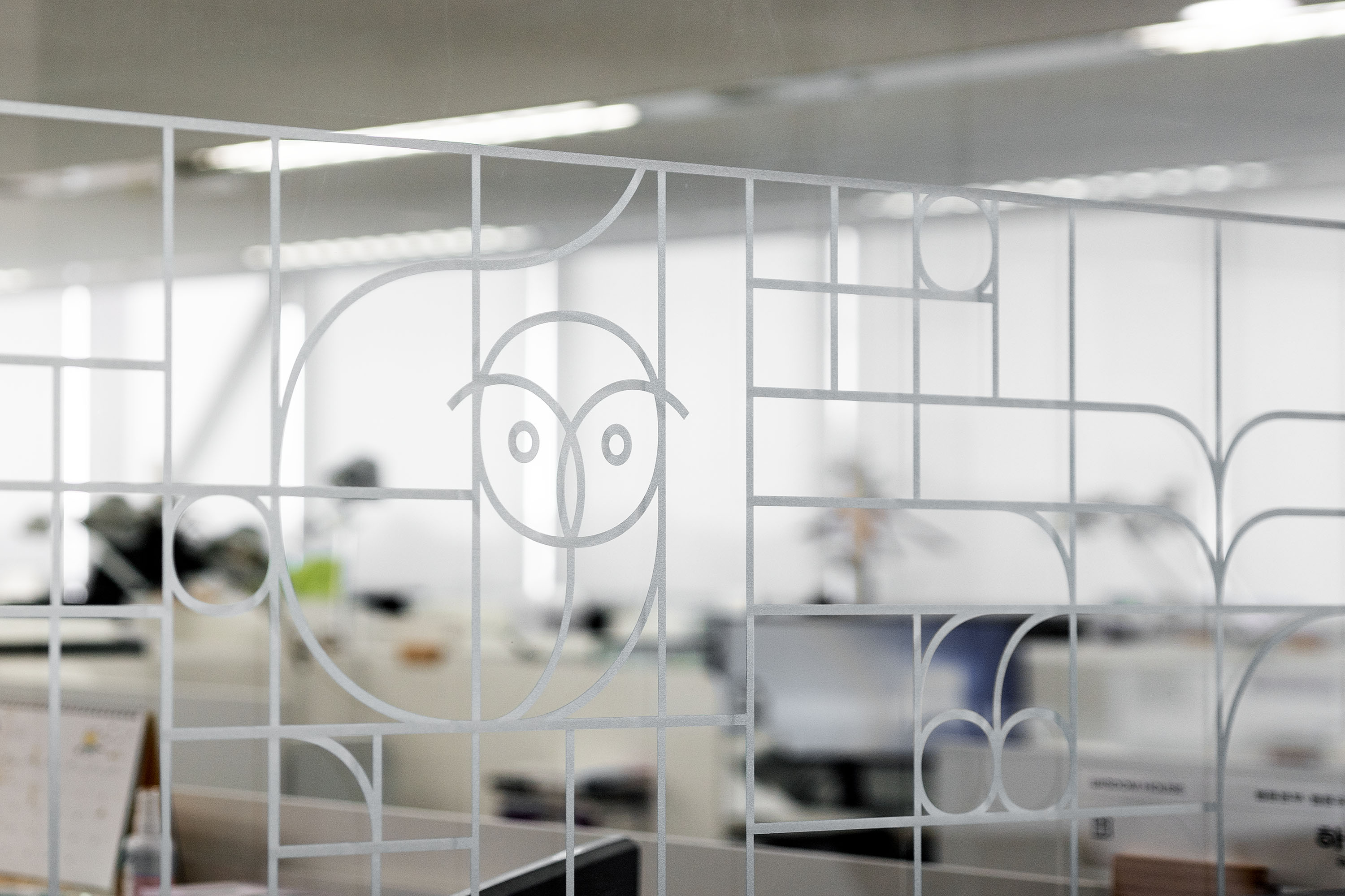
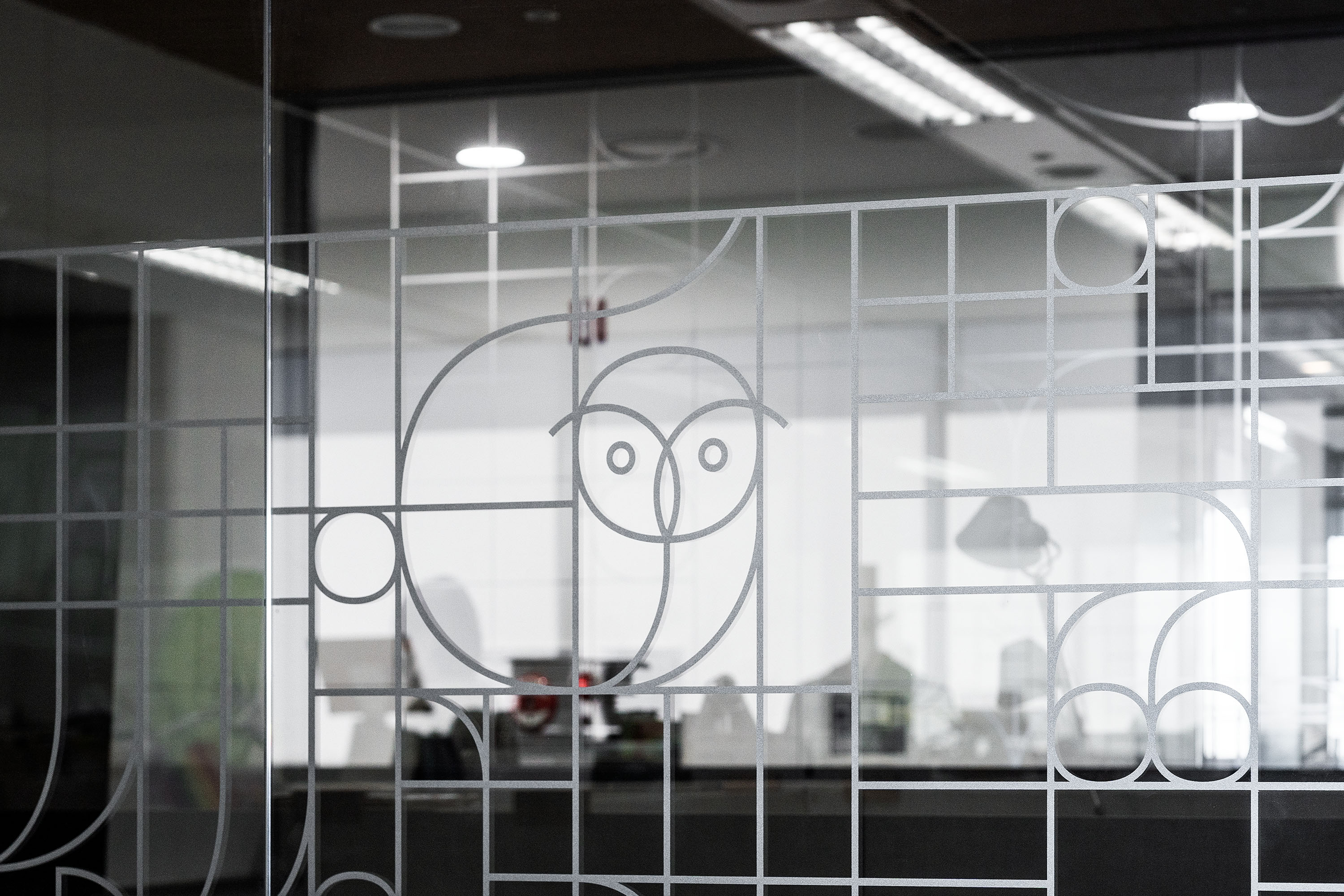
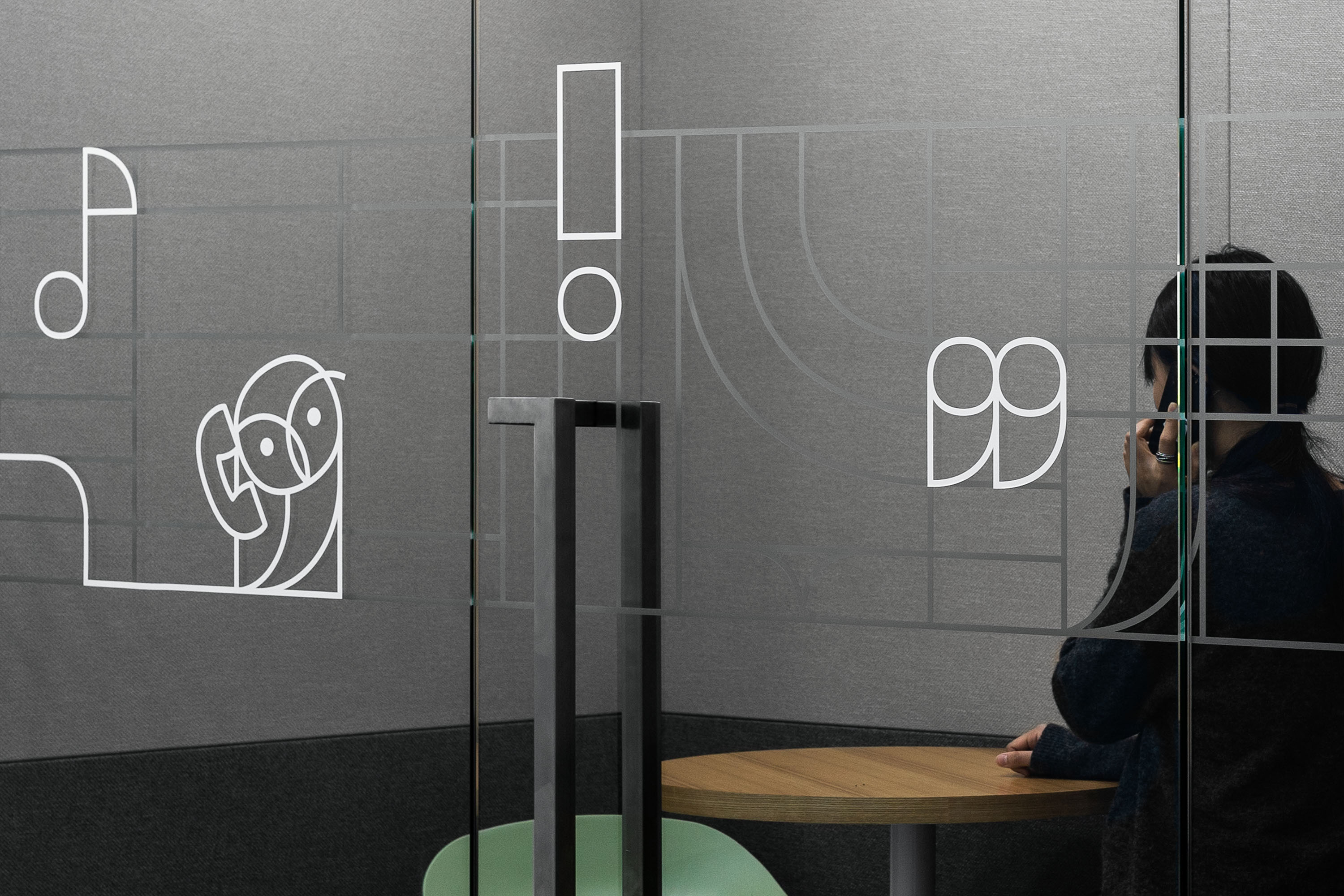
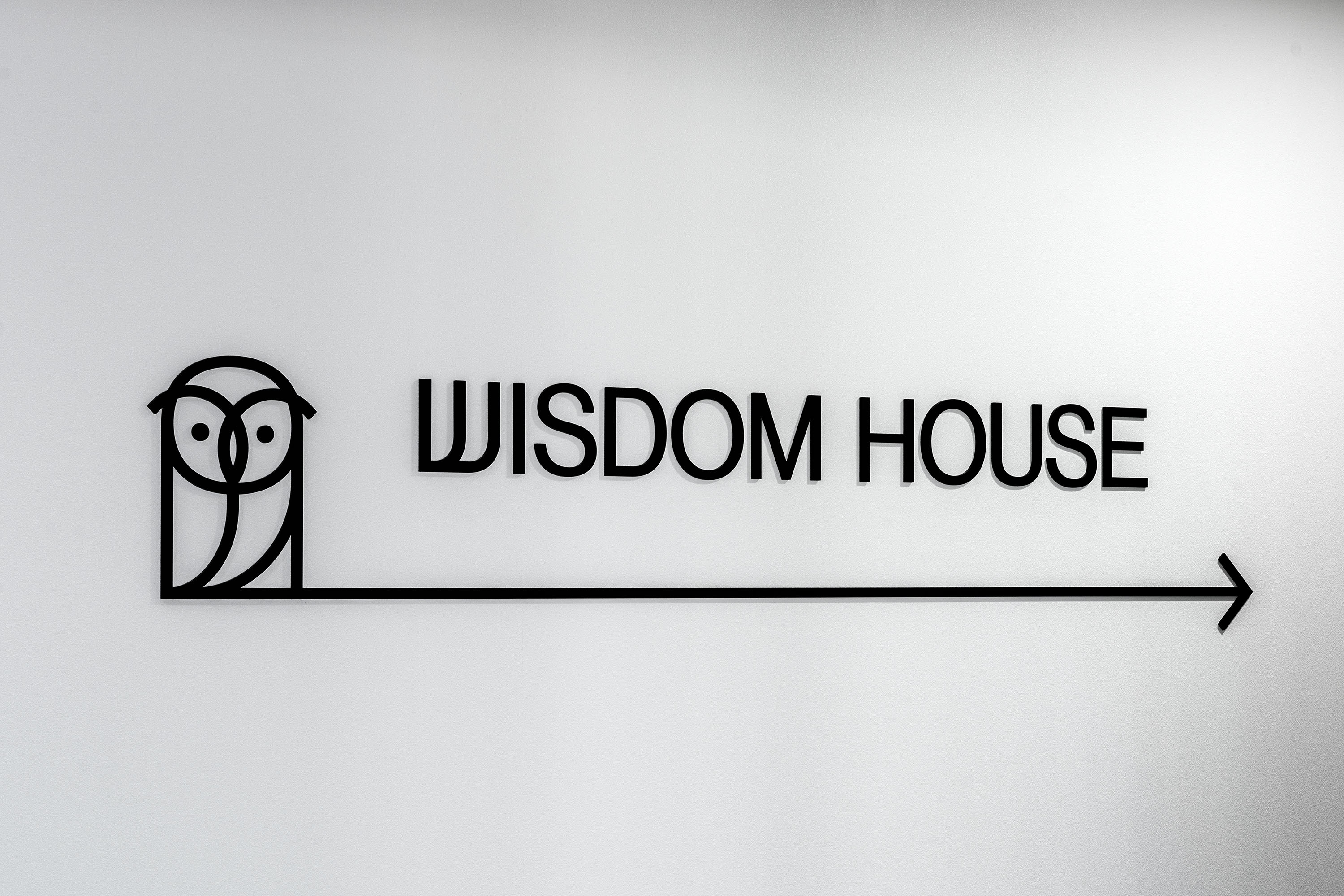
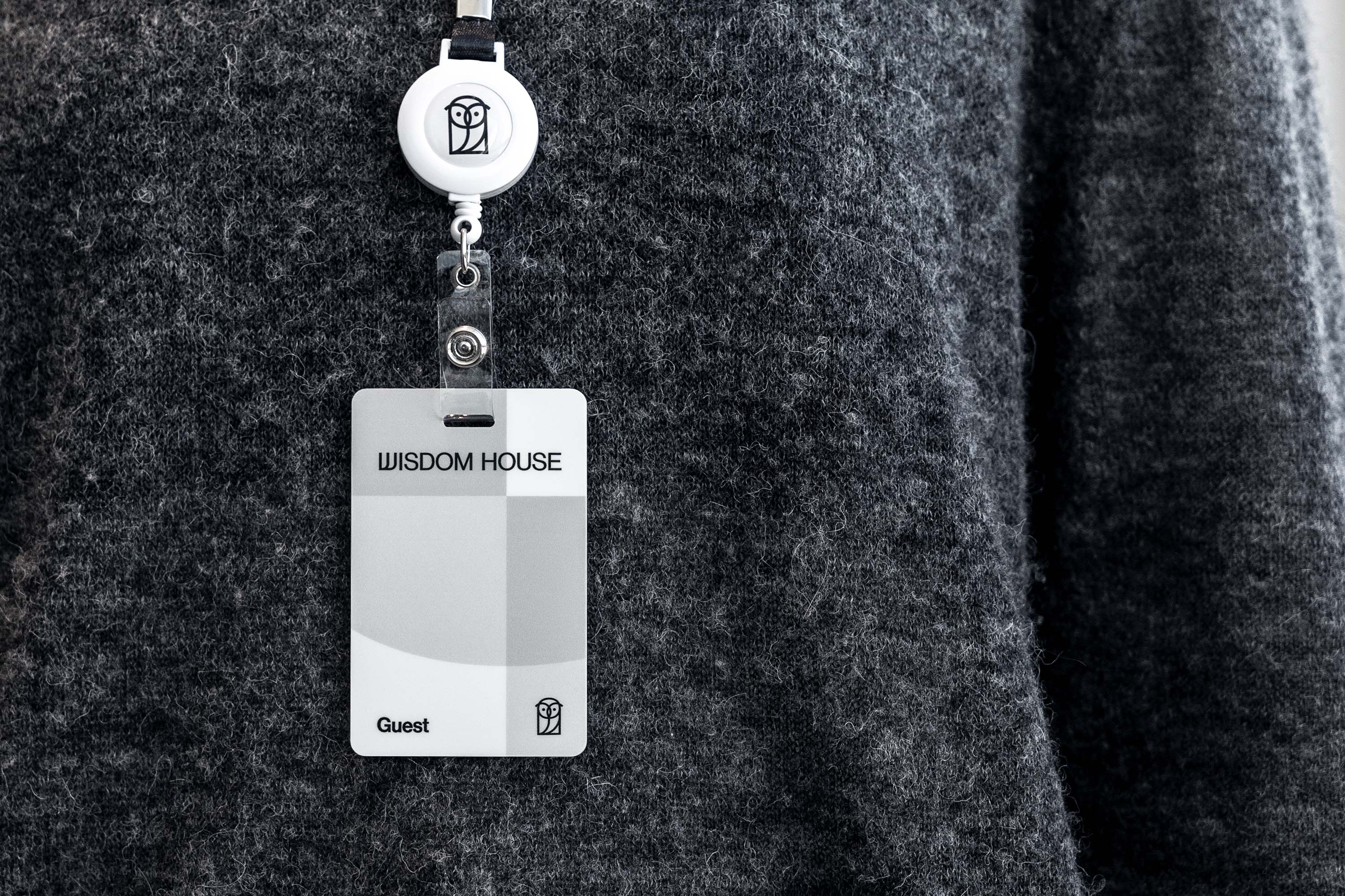
We thought of an owl as the main visual icon for the new identity of WISDOM HOUSE. The owl was often depicted in ancient Greece alongside Athena, the goddess of wisdom. Also, in ancient Rome, the owl appeared as a symbol of Minerva, the Latin version of the goddess Athena. As such, the owl icon that represents and symbolizes wisdom is intuitively connected to the brand name WISDOM HOUSE. In addition, it is a friendly animal that will live and breathe with contents that are outside the traditional category of ‘books’ such as Webcomics and Web novels. We were also able to imagine book readers staying up through long nights in search of new knowledge or entertainment alongside with the owl.
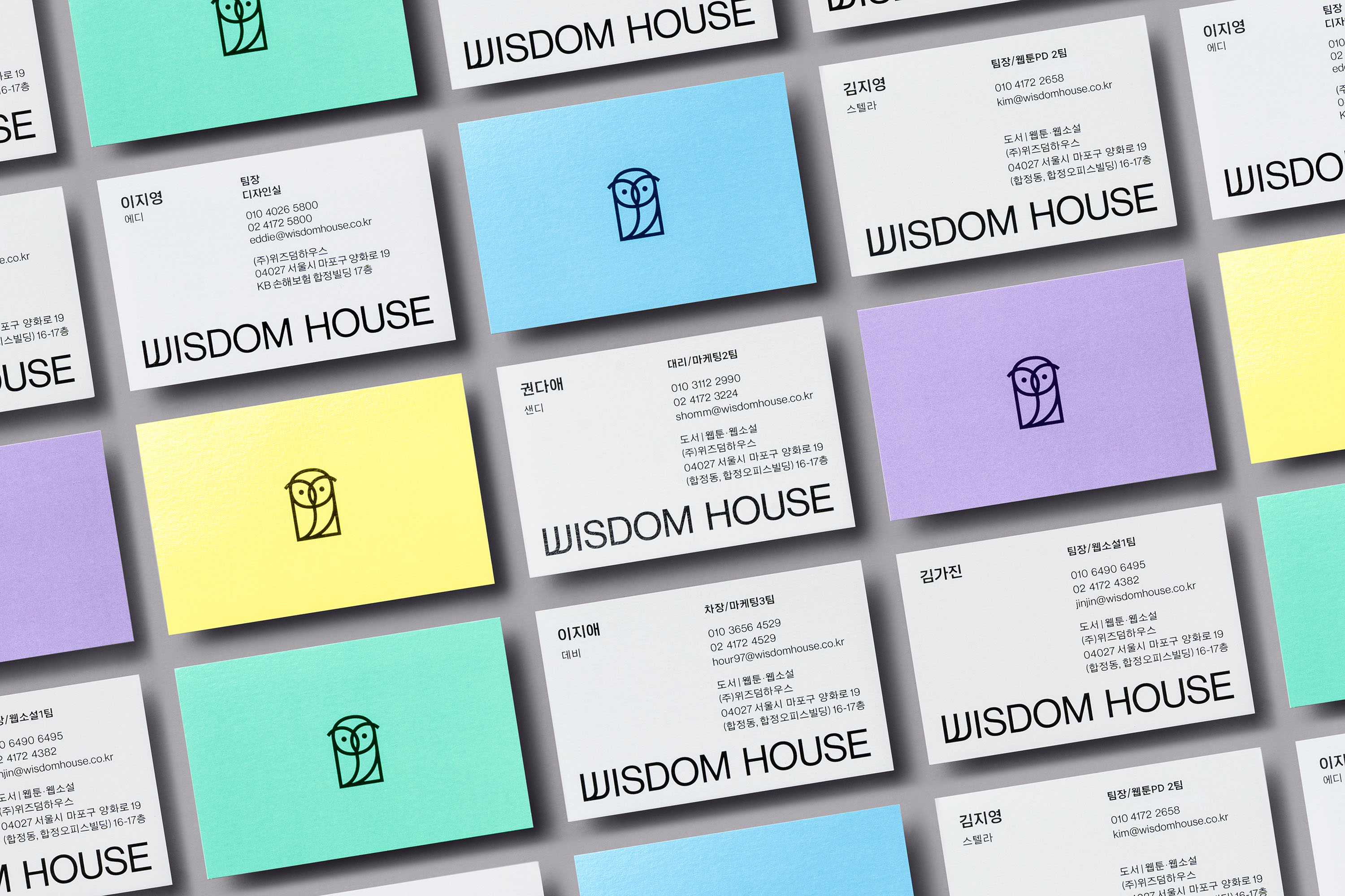
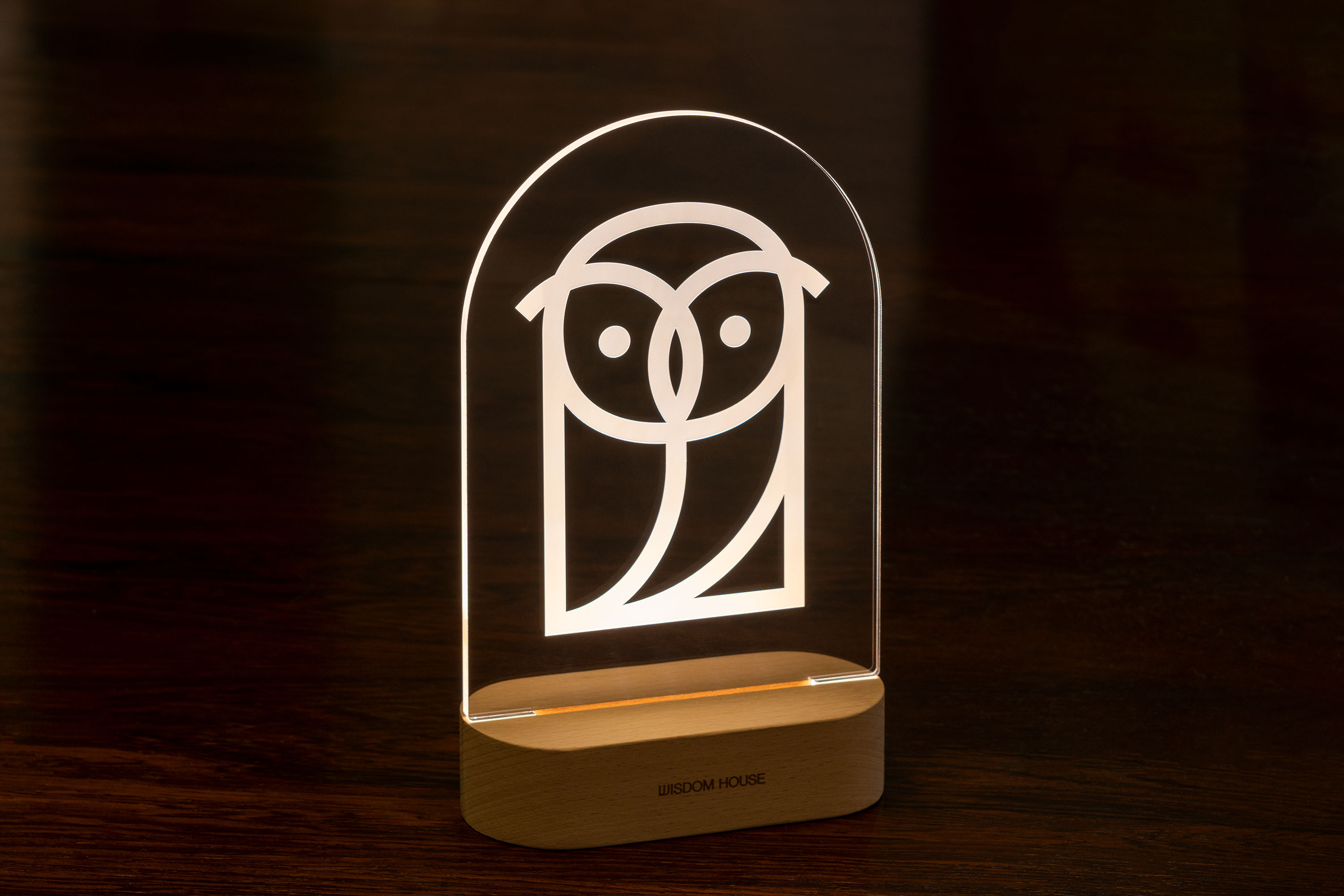
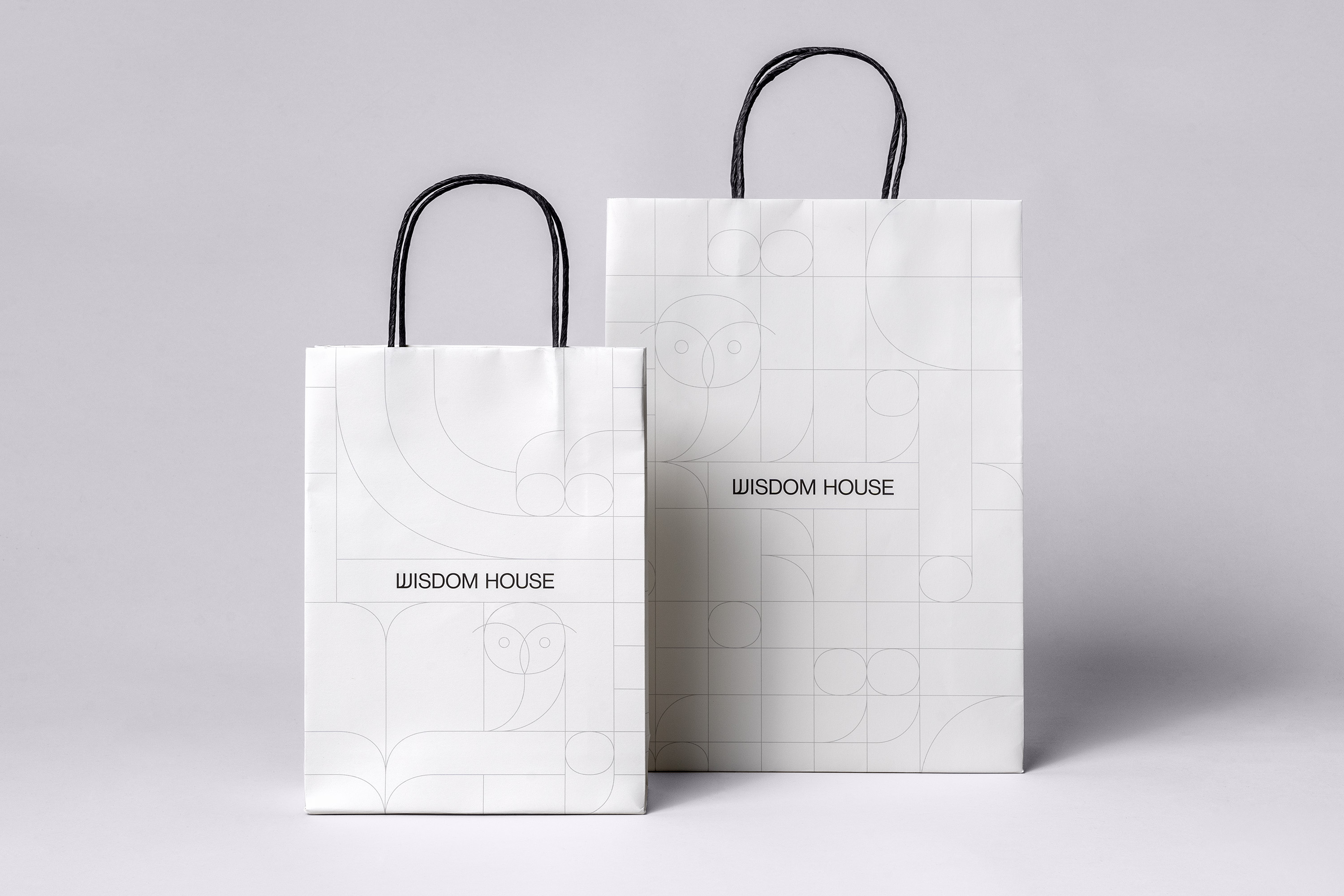
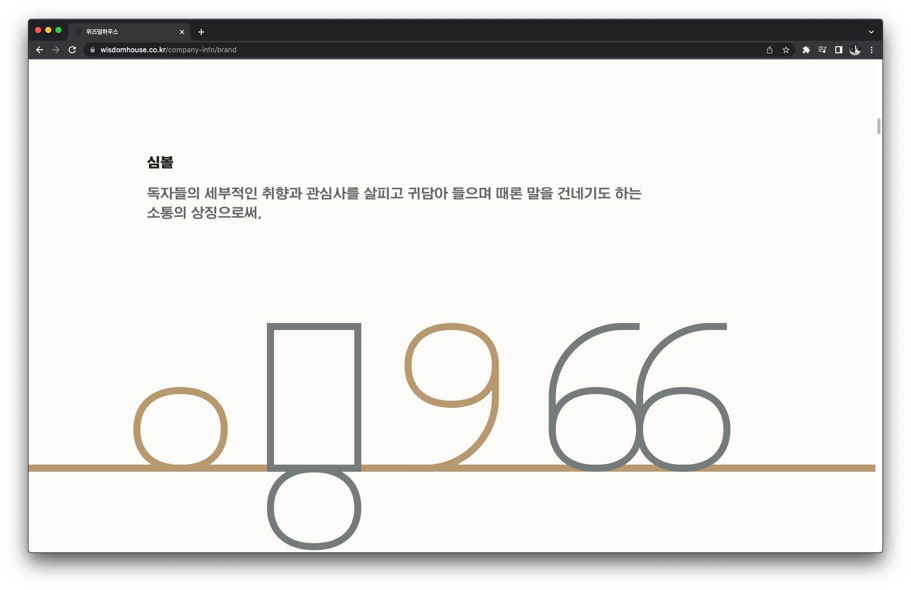
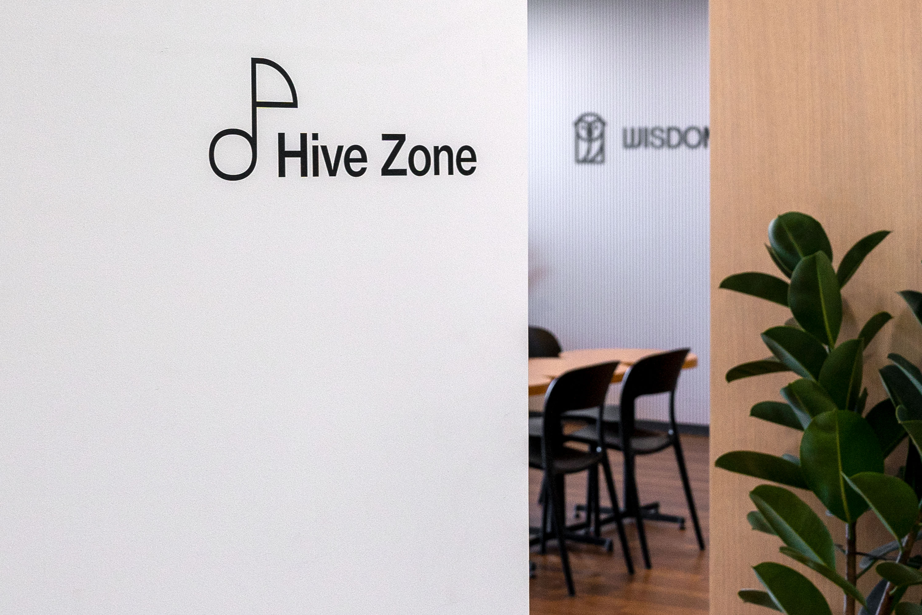
The owl icon serves as a symbol of communication by examining the specific tastes and interests of every reader, listening to them, and sometimes talking to them. It contains the mission of WISDOM HOUSE, which is ‘the most reader-oriented publishing group in Korea’. On the other hand, if you decompose the formative elements of the owl icon, you can find punctuation marks such as commas, quotation marks, periods, and exclamation points. These graphic elements allow you to imagine the rich story that WISDOM HOUSE tells its readers. ‘The combination of the most intuitive symbol and the graphic device with endless possibilities for interpretation and use’ is what we were aiming for in this project. The concise and flexible logotype was also created by transferring the visual characteristics of the owl icon to the alphabet and Hangul letters.
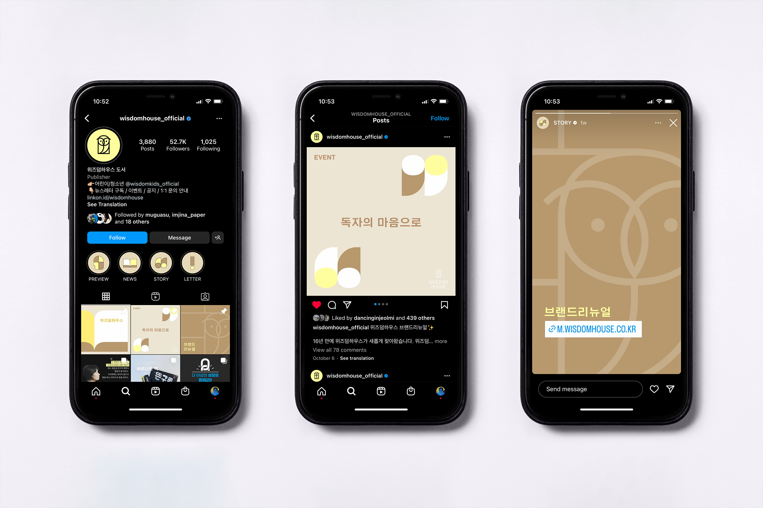
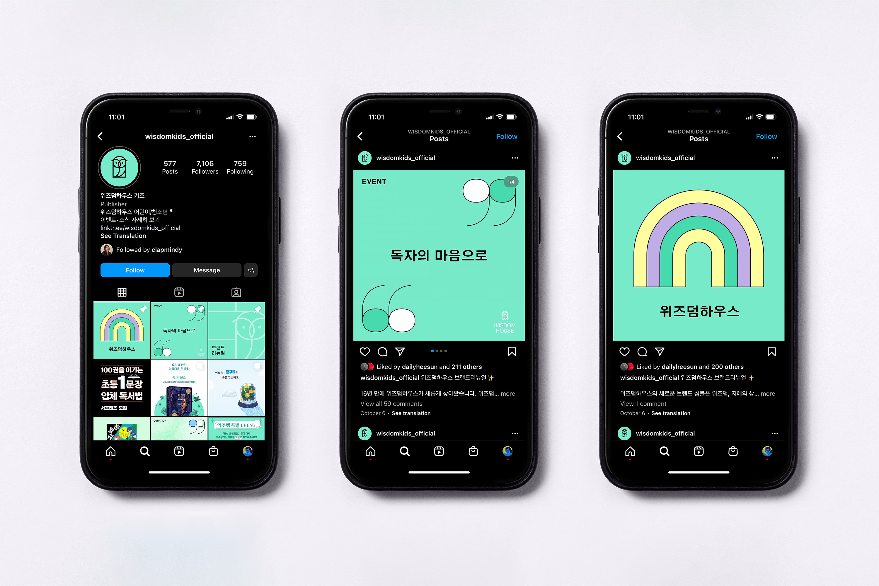
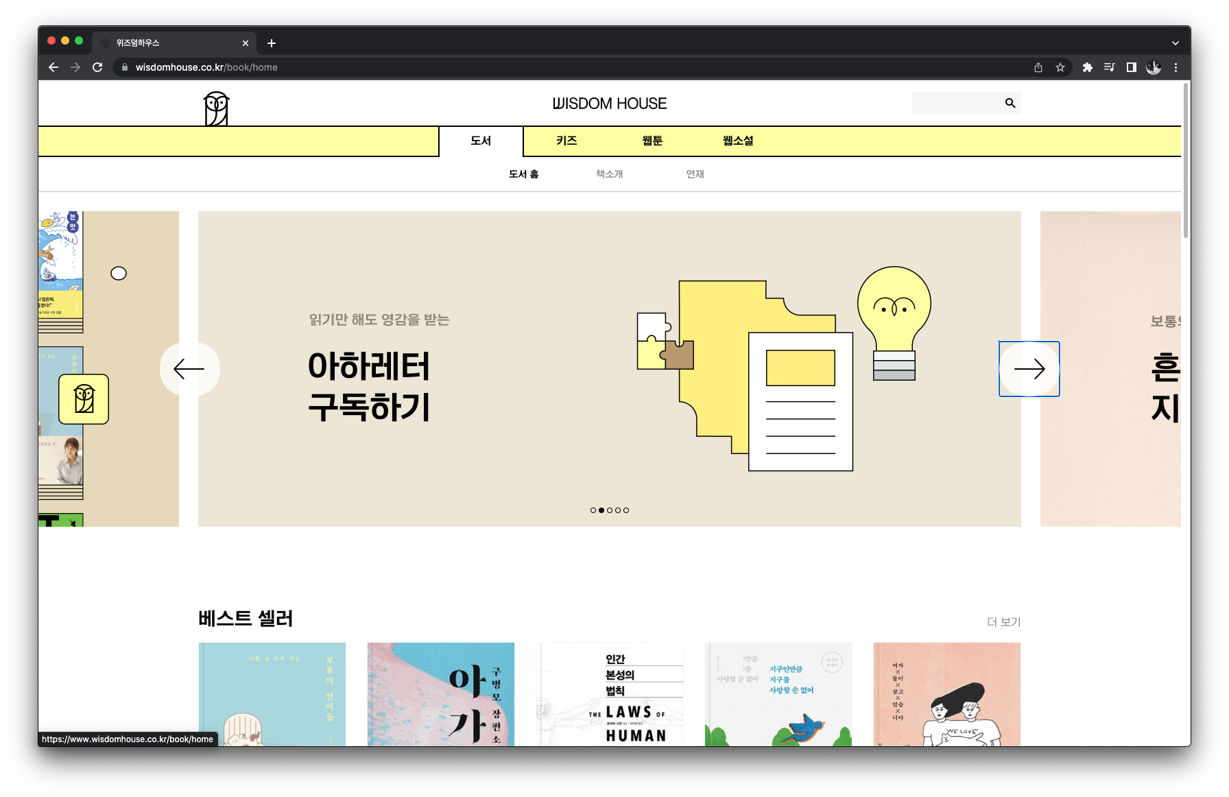
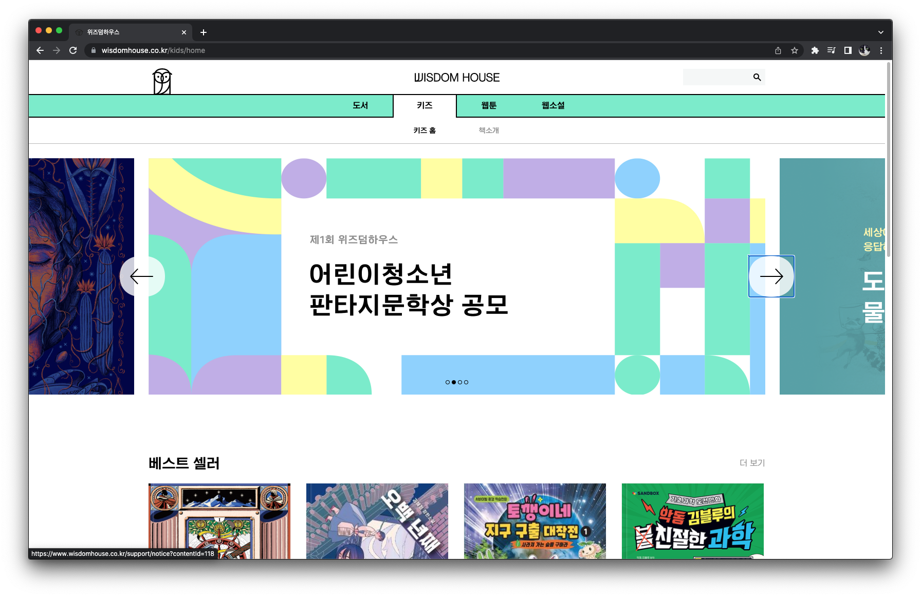
The four business divisions, Books, Kids, Webcomics, and Web Novel, each have distinctly different content characteristics and readerships. Therefore, we emphasized the individuality of visual communication for each division, by actively utilizing the color system for each division. In the book division, which is for general publication, the lemon color was used to symbolize contemporary values. We used mint color in the kids’ division to symbolize sprout-like children and growing youth. In addition, the blue color, which expresses the enjoyment of those who have a preference towards specific genres, was given to the webcomic section, and the lavender color, which contains connotations of fantasy and romantic pleasure, was given to the web novel section.
Application design: WISDOM HOUSE Design Team
Website design: WISDOM HOUSE Design Team


- Creative direction: Heesun Kim
- Art direction: Jaemin Lee
- Design: Youjeong Lee, Hyungwon Cho, Jaemin Lee
- Motion design: Ajeong Kim
- Art direction: Jaemin Lee
- Design: Youjeong Lee, Hyungwon Cho, Jaemin Lee
- Motion design: Ajeong Kim
- Client: WISDOM HOUSE, Inc.
- Year: October 2022
- Year: October 2022
© 2023 studio fnt. All rights reserved.