︎
Selected Projects
About
︎
︎
Case Studies:
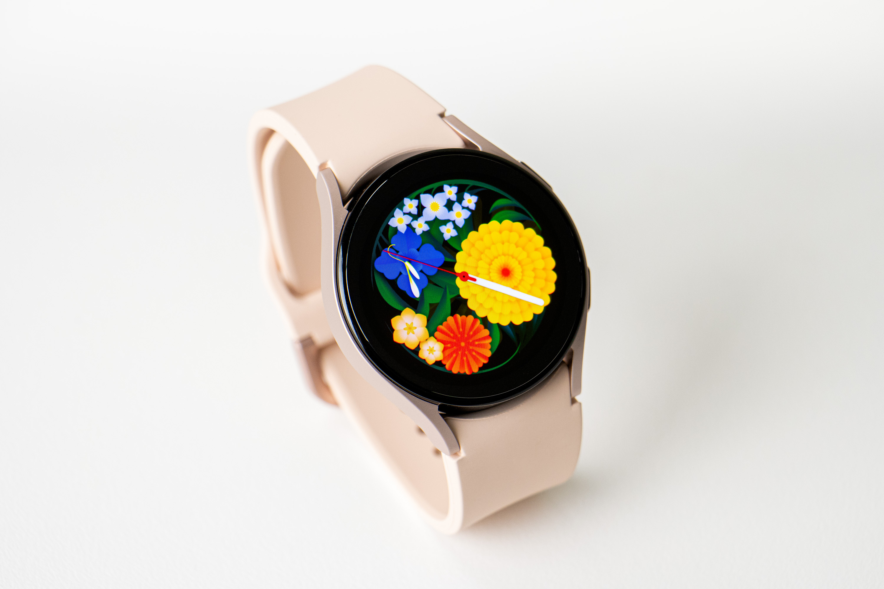
Flower Garden
Flower Garden
started with the question, “What kind of watch face do people want to face?” Although various functions have been added to smartwatches, the basic function of the watch is still being able to tell ‘time.’ We wanted the face of the watch to also express the current season, a brief moment when the world meets the ‘present,’ as well as ‘time.’ Plants naturally came to mind as a device that captures the flow and cycle of the different seasons. As a result, Flower Garden was born, a small garden on the wrist.
︎ See More
Case Studies:
WISDOM HOUSE
WISDOM HOUSE is a Korean publishing company that has been producing high-quality books. Recently, it has expanded its business to webcomics and web novels. Based on all of these contents, we started to create more enjoyable values within the company by connecting their content with other various media such as dramas, movies, broadcasting, and animation. Along with their expansion into these new fields, it was necessary for them to re-establish the brand identity, which studio fnt was in charge of.
︎ See More
Case Studies:
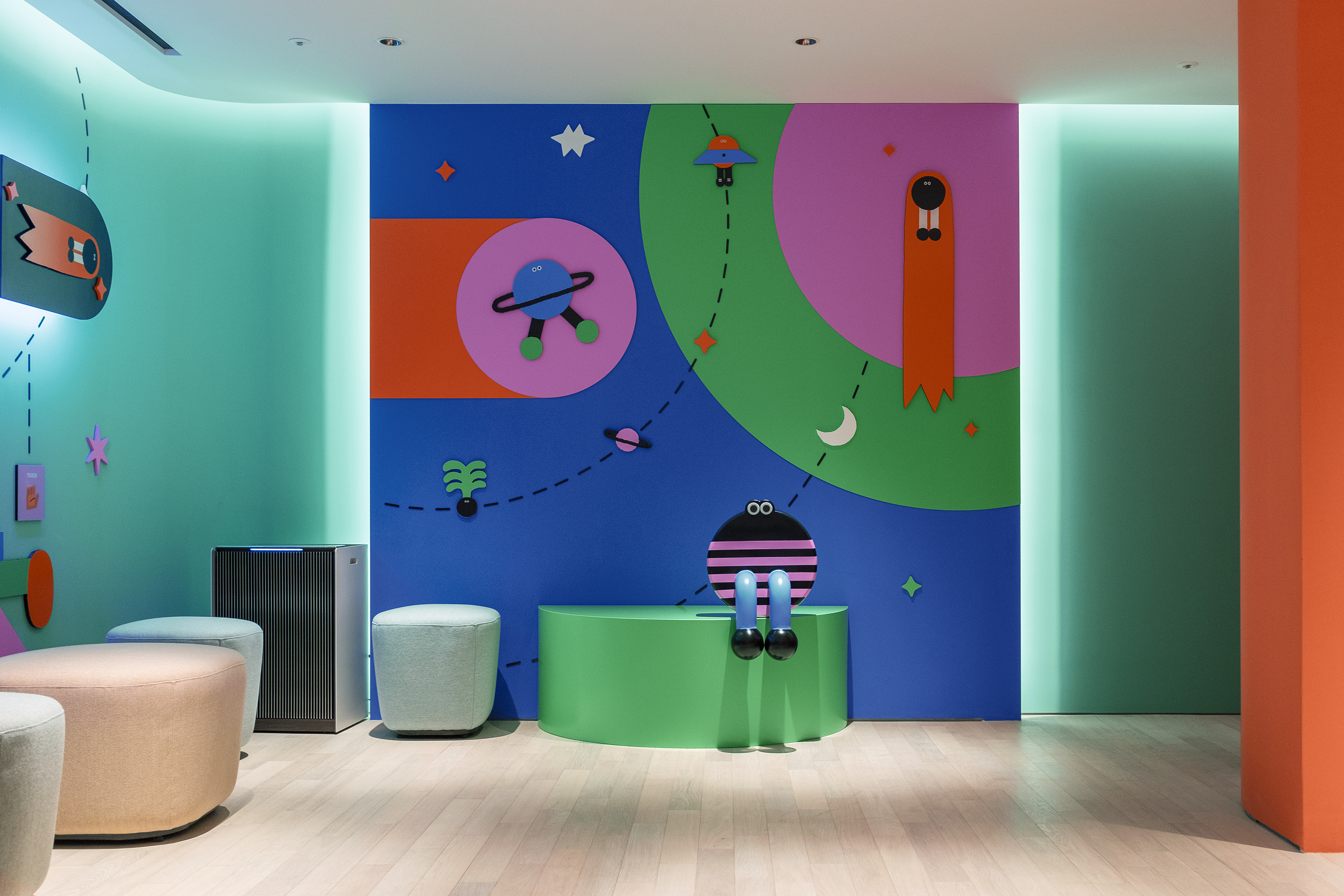
Petit Planet
Petit Planet is a concept and identity of the kids’ division of The Hyundai. studio fnt developed its brand identity that encompasses both lingual and visual aspects; from the brands’ name to the individual graphics.Petit Planet refers to each kid, like a mini-universe, small but with infinite possibilities. The name also aims to convey a sense of experiential space that children and families can visit to enjoy as though an adventure.
︎ See More
Case Studies:
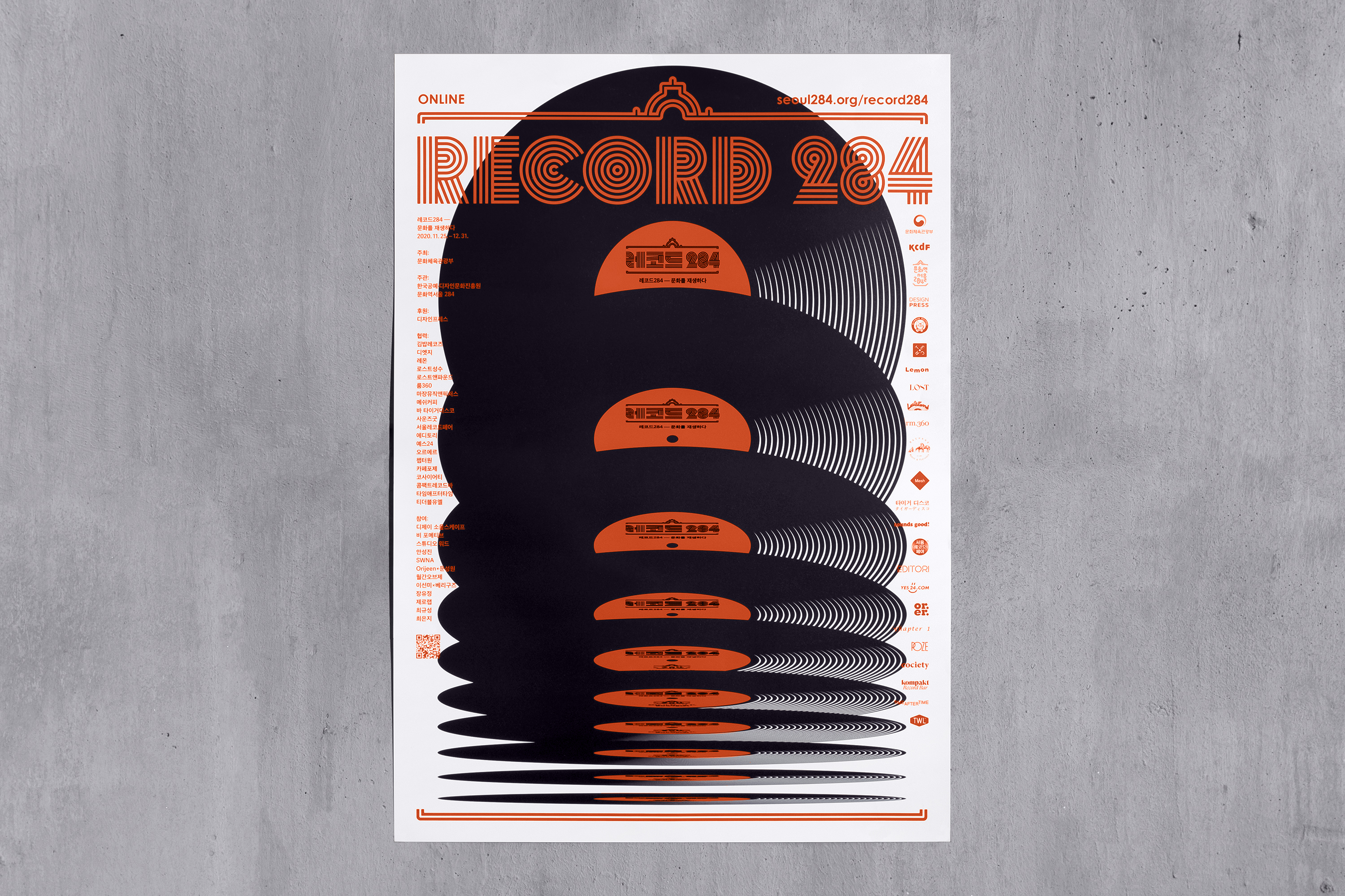
Record284 — Culture on a Turntable
Vinyl records have surpassed their limit of being the oldest music storage medium, and even when the era of CDs and mp3s faded away, it has become a contemporary cultural trend. Culture Station Seoul 284’s special exhibition
Record 284 — Culture on a Turntable
focuses on the new values and possibilities of vinyl records and how they inspire creators and bring new experiences to their daily lives.
This exhibition deals with the music culture created by professionals who have been actively involved in the process of making, producing, and distributing vinyl records, and also the works of artists and designers who were inspired by vinyl records. One can enjoy these works on an online platform, in the Seoul Station Plaza in front of Culture Station Seoul 284, as well as in 10 external cooperative spaces across Seoul.
︎ See More
© 2023 studio fnt. All rights reserved.